TAKEAWAY: Here is a handy list of most frequently used type fonts in European news websites PLUS: We participated in the creation of a new look for L’Equipe Mag, France’s sports magazine; now, three months later, the magazine thrives, and the readers continue to express their approval. AND: Pure Design download: selecting type
Times New Roman, Arial top the list
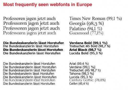
Since our Pure Design download today deals with selecting type, I thought I would share with you information given to me by Handelsblatt.com web designer, Philipp Busse (@pbusse), who has done a little research of his own as Mario Garcia Jr. and I work together with the Handelsblatt.com team on a rethinking of their website. Philipp’s handywork reveals the following (applicable mostly to continental Europe, although I personally think that this may apply to news websites generally).
And the winners are:
Times New Roman tops the list of serif fonts, with 99,1% of all computers having it installed, while (no surprise) Arial is the winner for sans serif fonts, with 99,4% having it.
Other top serifs:
Georgia, 98.3%, Palatino, 94,1%, Garamond, 77,1%
Other top sans serifs (bold):
Verdana Bold, 99,1%, Trebuchet MS Bold, 98,7%; Arial Black, 98,7%; Lucida Bold, 85,3%
Other top sans serifs (light):
Arial, 99,4%; Verdana, 99,1%; Trebuchet MS, 98,7%; Tahoma, 98,3%; Lucida, 95,3%; Century Gothic, 78,8%; Calibri, 45,4%
Maximizing use of cover at L’Equipe Mag
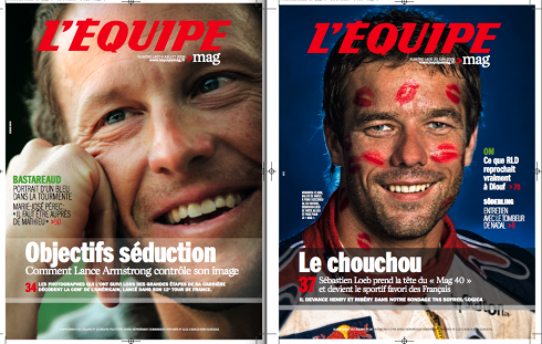
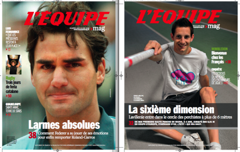
Recent covcers of L’Equipe Mag, which introduced new look April 18
L’Equipe Mag appears each Saturday as part of the sports daily’s L’Equipe edition. Readers of the weekend L’Equipe wait anxiously for their magazine, which supports the newspaper’s all inclusive sports coverage, while adding a variety of features, personality profiles and eye catching photography. In addition, the Mag, as it is called by fans, goes into areas of lifestyle such as travel, fitness, fashion and tech/gadgets.
The new look of the Mag appeared April 18, 2009, while we still work on the newspaper to give its traditional look an overhaul. According to L’Equipe Mag editor, Jean-Philippe Leclaire, readers continue to like the new look:
Our readers are very loyal, and we had to test carefully and make sure we did not change their magazine in ways that upset them. But this was not the case at all. From the start, readers have told us that they like the easier to navigate magazine, the more interesting covers, and the way inside stories are displayed. They still see their magazine in the new formula,but they like what has been done to make reading so much easier and pleasureable
One of the major changes here was to allow for the cover to present more than one story, as in the examples where we put a “transparent belt” on the cover to highlight a second story of importance.
For our initial coverage of L’Equipe Mag’s launch of new look on this blog:
https://garciamedia.com/blog/articles/the_new_look_of_frances_lequipe_mag/
Brotherly duo in the Tour de France
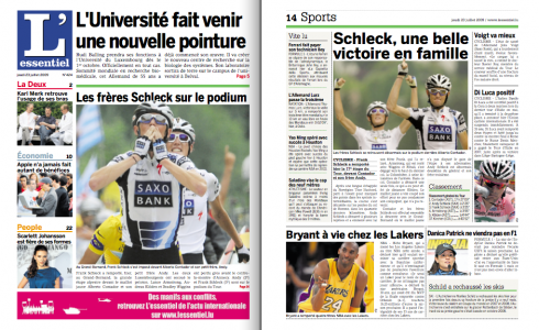
Pages profiling the Schleck brothers in L’Essentiel, of Luxembourg
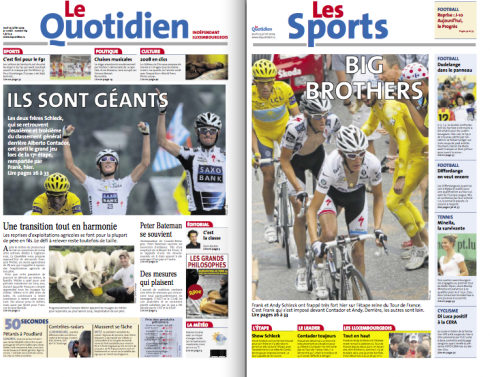
Front and sports section pages of Luxembourg’s Le Quotidien
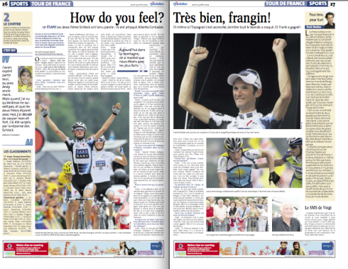
The headline reads: “How do you feel? Very good, brother”
Luxemburger brothers Frank and Andy Schleck are headliners in the Tour de France. Frank crossed the finish line to win the 17th stage of the competition, so the Luxembourg newspapers are giving the brothers plenty of space on their pages.
Here is Le Quotidien’s sports front and inside treatment of the local boys’ accomplishment in France.
Pure Design: selecting type
Here is one of those sections of the book that needs little updating: the way we select type has not changed much, except that we now have more variety of fonts from which to choose, making the task more difficult. We also have to be constantly aware of fonts that develop for specific use on the screen. (See most frequently used webfonts above)
Download entire first section of Pure Design: Words
Now that I have fully presented the first of six sections of Pure Design on TheMarioBlog, I am offering the entire initial section, “Words,” available for download—all 33 pages of it. This may be useful for those of you saving or printing out Pure Design and will be done following each of the remaining sections. At the end of our journey through words, type, layout, color, pictures, and process, I will publish the entirety of Pure Design in one file.
Follow me at www.twitter.com/tweetsbydesign
Follow the Marios
Two Marios. Two Views.
Follow Mario Jr. and his blog about media analysis, web design and assorted topics related to the current state of our industry.
http://garciainteractive.com/
Visit Mario Sr. daily here, or through TweetsByDesign (www.twitter.com/tweetsbydesign)
In Spanish daily: The Rodrigo Fino blog
:
To read TheRodrigoFino blog, in Spanish, go:
https://garciamedia.com/latinamerica/blog/
TheMarioBlog posting #313