This blog post will continue to be updated through Friday. The next blog post is Monday, October 24.
Update #2: New York, Wednesday, 10/20 at 16h
The two-day program brought in a group of editors and designers to discuss how innovative design could make how we read news in digital formats, both easier and more pleasurable.
Roger Black, who directed and moderated the program, insists that an a digital publication can be as compelling and as immersive as print, but that we have focused on on articles pages, which have become saddled with annoying ads and to click-bait to other sites. The result is not sustainable, either for readers or for the news business. He defines the challenge is how we attract readers not just to a page, but to a whole publication. So they come back, and even subscribe!
Roger brought together a group of five “pundits” to challenge five designers for the task of creating new design concepts, to be presented at the Poynter Institute in January 2017. (See the Who's Who of the Conference below)
Before they embark into the creative part of their projects, the five designers chosen to present solutions offered their views and what their thinking is going into the actual sketching of concepts.
These are some of the themes that resonated with all of the designers at the conference:
“People don’t go to the home page anymore……how could we get people to read second article.
“We need to get away from the legacy syndrome that has most websites looking alike, and, more alarming, trying to replicate a print newspaper look.”
“The design of mobile must be uncluttered, easy to navigate and exist to usher in the good content.”
“We should think big in our design proposals. This is an opportunity to come up with ideas that will stimulate publishers, editors and designers to think disruption. Ideas that will have an impact. Yes, the next revolution.”
“Innovative advertising must be a part of the designs created.”
How the designers are thinking before they start conceptualizing
Jeffrey Zeldman
Publisher, A List Apart
Founder, studio.zeldman
Zeldman emphasized that content rules, reminding us that even when the design is not so good, if the content is, the audience stays.
“Design can only do so much, but it can’t solve bad content, or content that is like everyone else’s,” he said.
“Mobile is today’s first screen. So design responsively, focusing on content and structure first. People sit and read on their phones. Design should lead the eye to focus on the most important content. Because phone screens are small, think more modularly about design for mobile, and, remember that 90 percent of design is typography and the other 90% is white space. Both are important. Avoid clutter.”
Three important points from Zeldman:
—Design your system to serve your content, not the other way around
—Remove distractions. Let people interact as directly as possible with content.
—Nobody waits: speed is to today’s design what ornament was to yesterday’s
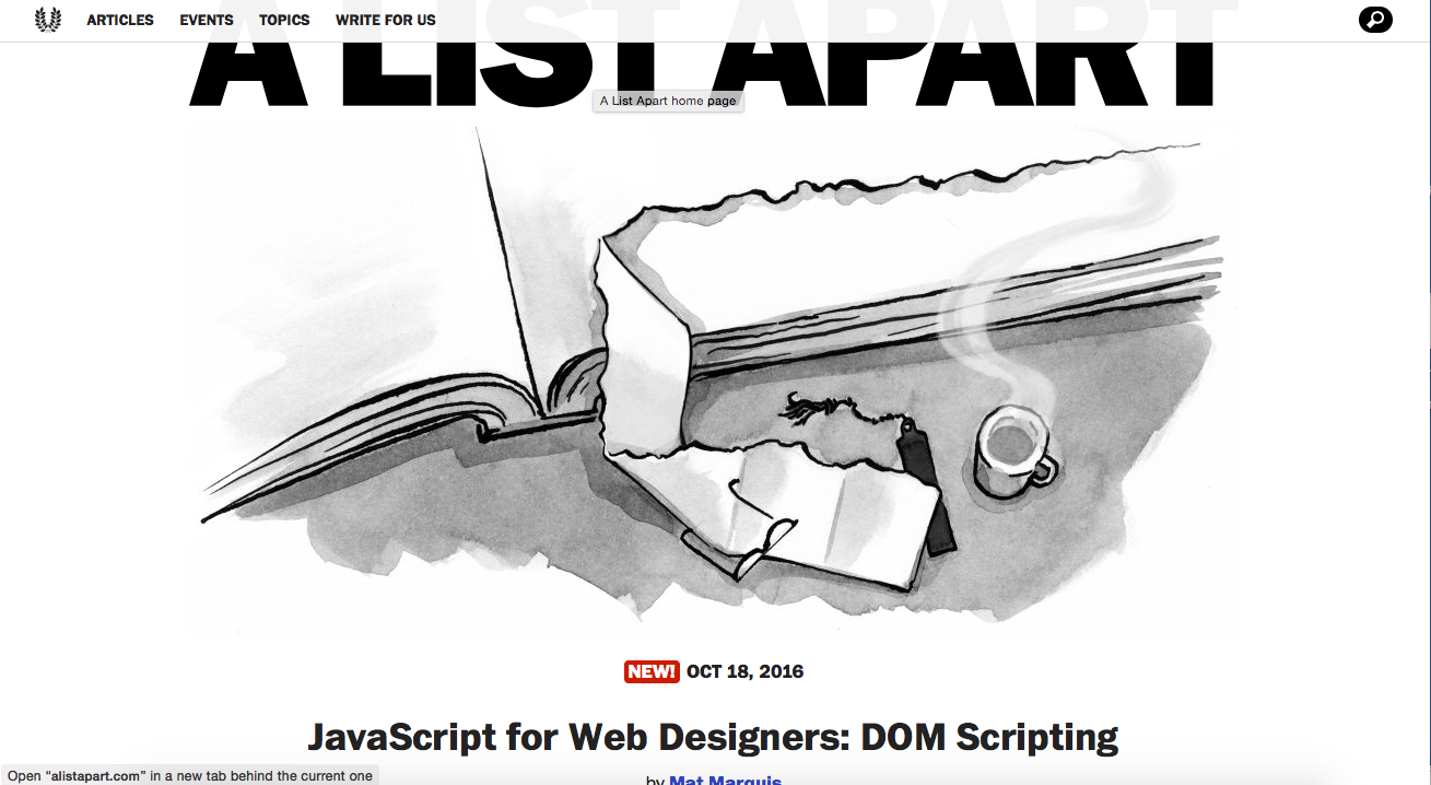
Jeffrey Zeldman: A List Apart
Mike Swartz
Designer, engineer and partner
Swartz said that the design process begins with questions that we should ask before beginning to design anything.
“It is important as a designer to frame your problem well,” he said. “With the issues facing the media today it is important to remember that it is through questions that we find out what works for one organization as opposed to what may work for another.”
And a good reminder for designers:
“Nobody pays you to just make a website look nicer: they are trying to find new readership, to come up with the good business model that makes money,” he said.
Swartz mentioned his firm’s design of MIT Technology Review, which , he says, has great print design, which, in turn, inspired what they did with the website.
“We created a lot of spaces to do things on the web. This kind of home page design allowed us to provide sort of covers, as in print. There is the daily digest at the top of their home page, a cover story with illustration, and then the curated content. You can also sign up for a newsletter.”
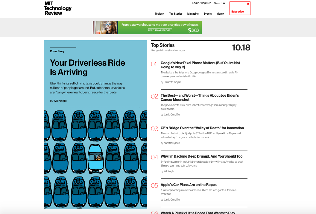
One of Scwartz projects: MIT Technology Review
Kat Downs Mulder
The Washington Post
Graphics director
“In a sense we are kind of stuck and not happy what we are stuck with,” Mulder said, as she went through a list of some of the things that frustrate designers: trying to understand existing frameworks, dealing with business and editorial decisions that influence design.
Mulder admitted that we have come a long way since 1996, when the first Washington Post website appeared with apparently no designer in charge to make decisions about colors, type, and with the legacy of print continuously present.
The result? “We ended up with template based unexciting websites. Mobile design, too, has also been boring,” she said.
Now, however, Mulder says that we have lots of metrics to tell us when people come, when they leave, but a lot of these metrics revolve around money. We are driven by how many people click on an article, how many times they come back.
“But it is hard to measure the quality of the experience,” Mulder said.
Mulder mentioned that one of the roadblocks to good publication design is fear.
“News publications are afraid to change the paradigm.
We’re risk averse. We do lots of experiments, but they haven’t spread.”
Main fear: alienating readers you already have by going with something new. Why disrupt something that is working?
How do they get around it at The Washington Post?
“We find places where we can experiment and roll the experience into the core product,” she said. As examples of this she showed their progress with the tablet edition, and pieces such as A Marine’s Convictions, which got as much as 20 minutes of engagement from users.
The Post took its successful tablet experience to mobile, with an app that has had good reach with the audience.
An example of this was a story about Raising Barriers (A new age of walls—building walls around the world). Also a multimedia story about Obamaa’s Legacy, with every facet of the President’s 8 years in office, designed for mobile devices.
The Post’s Obama’s Legacy a story created for mobile; the Post’s tablet edition, a real success story.
Jared Cocken
Fitocracy
Cocken believes in the importance of blending advertising and editorial content in a manner that the audience finds interesting and allows for engagement.
He says that one of the challenges for designers is what he calls the Attention Economy: “The true scarce commodity of the near future is attention.”
“That is one of the reasons design must make things simple or people won’t do it. What we create must be as simple as possible,” he said.
Cocken cited some not surprising statistics about average time audiences spend on their mobile devices. The breakdown is:
Facebook
50 minutes per day; 6 minutes for ages 15-19 of actual reading.
15 seconds
55% spent fewer than 15 seconds on a page
8 seconds
Average attention span
“Right now we are at the stage where basic design choices matter beyond style,” Cocken said. “We must recognize the difference between reading a printed page and on a screen. Scanning and reading are fundamentally different.”
Cocken, like other designers in the group, emphasized the importance of reducing clutter, creating article pages that are clean and optimized for eye movement.
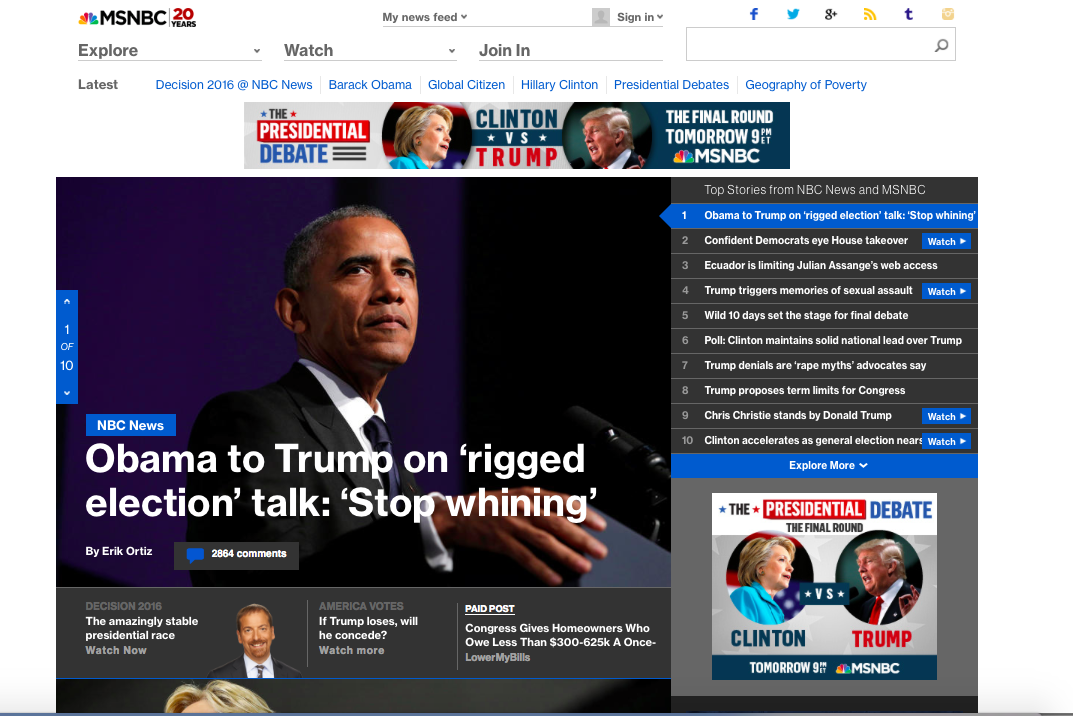
MSNBC: one of Cocken’s projects
Lucie Lacava
Lucie Lacava Design
Veteran designer Lucie Lacava highlighted the three essential reasons for design:
–to promote creativity and innovation
–to reflect current culture
–to reflect the brand
Lucie started her talk with a quick quiz that involved the audience: she showed a variety of websites with NO LOGOS or BRAND visible. It proved that many major news sites have adopted a generic design, and become unrecognizable once you remove the header. “Readers can easily lose track of where they are, if they navigate from one news site to an other,” she said.
When it comes to digital design, Lucie, who has had a long and distinguished trajectory redesigning some of the most important newspapers around the globe, mentioned what she describes as “deadly design sins”:
1. Self negation
“Print design was not adopted on digital platforms, so we ended up with identity crisis.”
2.Digital only
“Publishers hired digital firms to exclusively design for the news media platforms.”
3. Piecemeal redesigns
“Visual branding remained disconnected across platforms.”
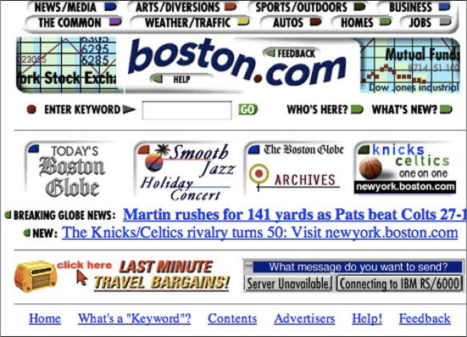
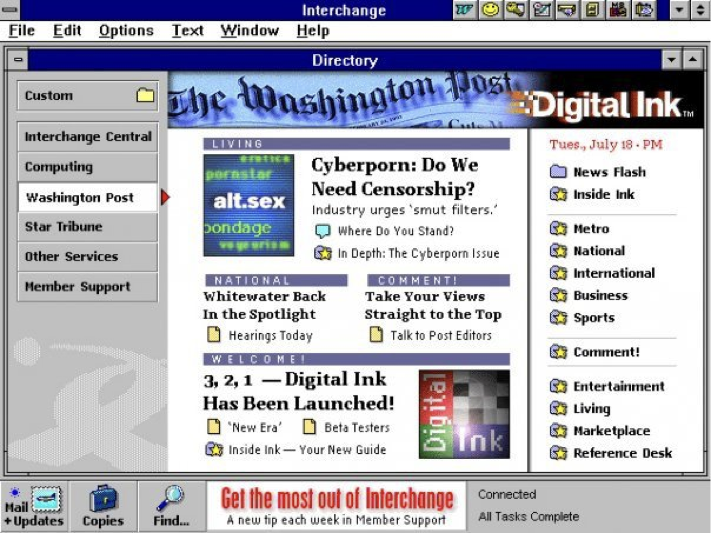

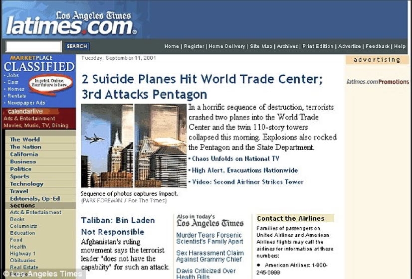
Remember these? Seems like ages ago, and, indeed, we have evolved a lot since these websites hit the market. Lucie Lacava reminded us of early website designs where branding was a neglected issue—and clutter was king.
The Who’s Who of the Digital Design Challenge conference
Roger Black, conference director
Industry experts (pundits):
Megan Chan, director of digital operations, The Washington Post
Susan Mango Curtis, professor at Northwestern University's Medill School of Journalism
Mario Garcia, CEO/Garcia Media, Senior Adviser on News Design/Adjunct Professor, Columbia University/School of Journalism
John Temple, managing editor, Investigative Reporting Program, UC's Berkeley's School of Journalism
Chrys Wu, developer advocate, The New York Times
The designers:
Jeffrey Zeldman, A List Apart
Mike Swartz, Upstatement
Kat Downs Mulder, The Washington Post
Jared Cocken, Fitocracy
Lucie Lacava, Lacava Design Inc.
Poynter coordinator:
Elisa Jackson, Executive Director of the Poynter Foundation