This is the weekend edition of TheMarioBlog and will be updated as needed. The next blog post is September 1.
Die Zeit promotes its exquisite tablet edition as “ears” around its logo in print edition
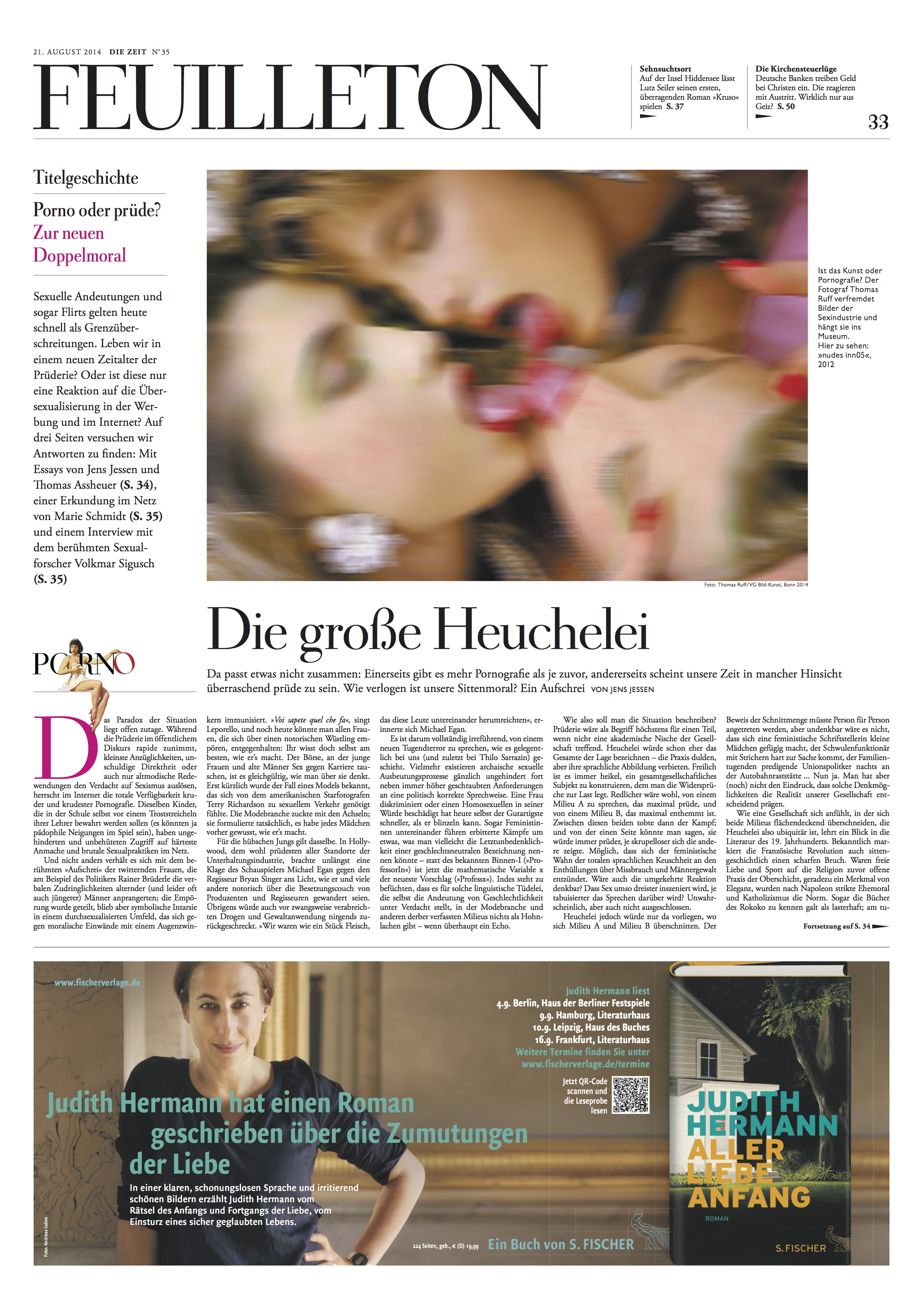
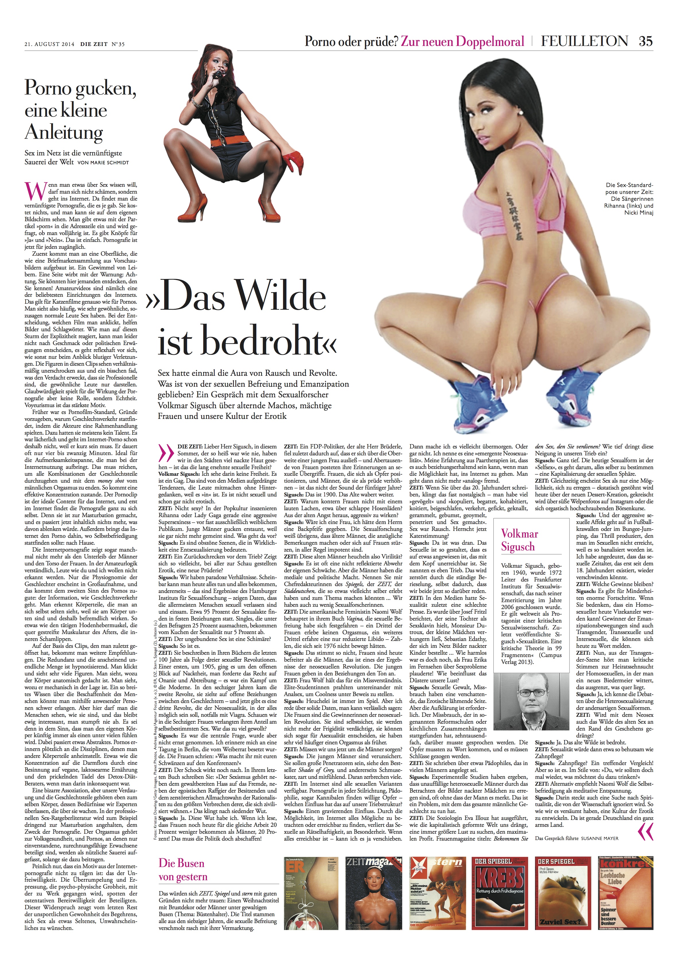
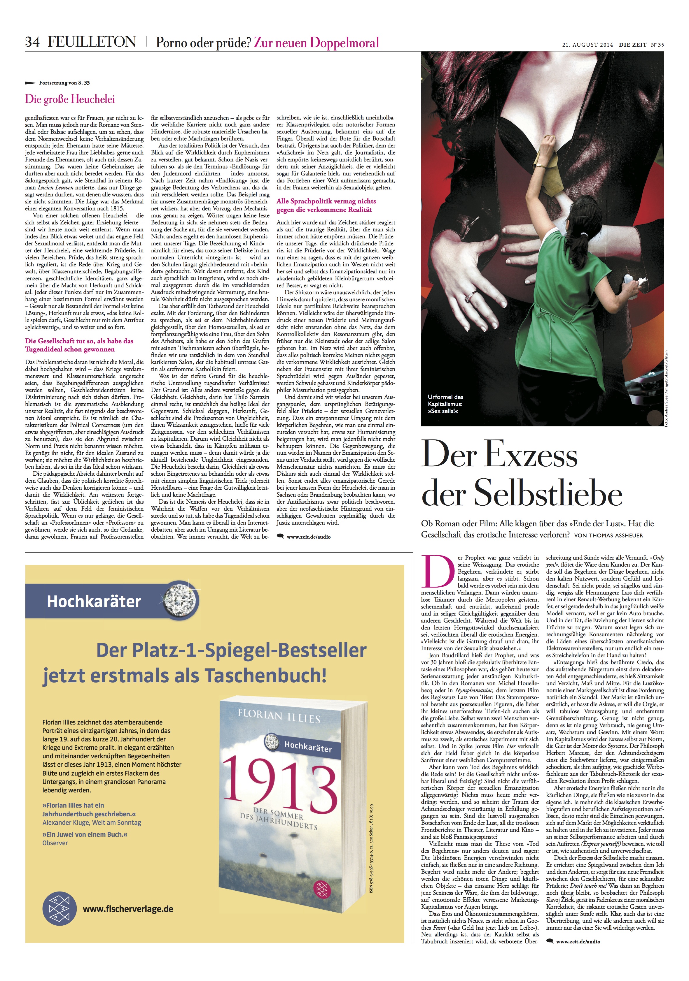
Cover story developed through three inside pages
Perhaps it may be an exaggeration to say that Die Zeit is the newspaper with the greatest evolution ever. Better to qualify that statement with a personal note: It is, without a doubt, the one project in my portfolio of almost 700 titles worldwide in which I have seen the most radical changes–and where the evolution continues almost 20 years after the first radical changes took place.
Indeed. Die Zeit stands as my most difficult and challenging project (go here for the complete story), but one that I rejoice to have been a part of, especially everytime I take a look at an edition and witness the evolution that took place here.
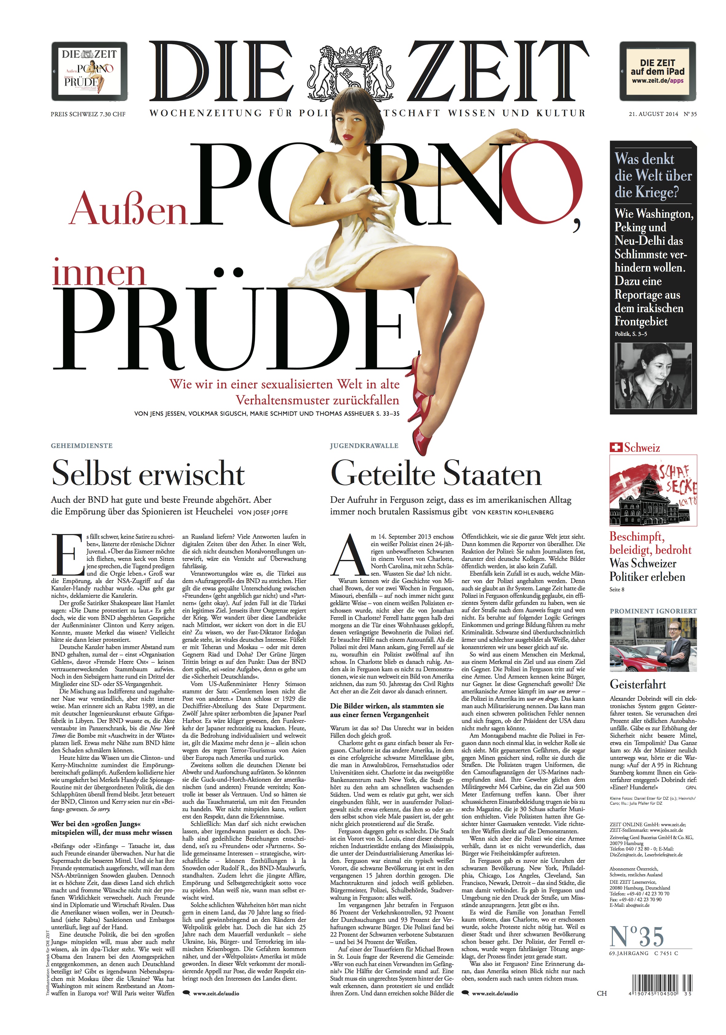
Not only has Die Zeit rethought itself editorially and visually, but it did so while adhering to all those things that made this the smartest, most complete newspaper–published weekly—for an audience that expects and respects in depth stories, opinion pieces and smart treatments of such stories as the one that's the cover story for this edition, titled Outside: Porno; Inside; Prudence.
In addition, it has been, for almost a decade the one German newspaper title that has increased circulation and made money.
Indeed, Die Zeit, Germany's newspaper for the intellectual elite, is a moneymaker. It is also a newspaper that has embraced the digital with its typical zest. Notice that the front page of the print edition has two “ears” around its logo proclaiming its iPad edition is available.
In the words of the publisher
Die Zeit has doubled its revenue within a decade. Rainer Esser, CEO/publisher of Die Zeit, speaks often at media conferences worldwide retelling the success story of his newspaper. When asked about what makes Die Zeit so successful, his standard answer is:
“[…]You can get along very well without reading a newspaper, so each week, we have to prove that we are necessary. “
In the words of the designers
Die Zeit stands as one of the best designed newspapers in the world, with SND medals to prove it. But, beyond the awards in the trophy case, just take a look at an edition of Die Zeit.
In this August 21 edition, Die Zeit includes 6 sections and 68 pages in broadsheet format, with Zeit Magazine included in the package. This is lean back, in depth reading. But, remember, it is a weekly, so most readers start savoring its content during the weekend and keep the newspaper handy for occasional reading moments the rest of the week.
What is the role design plays in this successful newspaper?
I asked art director Haika Hinze and Jan Kny, deputy art director, for their answer. Here is their combined statement:
It is a part of our editorial identity to analyze our world and to express ourself extensive and with lots of passion.
Therefore you will find in our newspaper large antipodes: Long stories next to short stories. Traditional next to Modern.
Provocative next to Well-Behaved.The same applies to the design of our newspaper: You will see a large range of forms and shapes,
always tailored to the the specific story.We continuously developing our design further! You will see and feel the liveliness and the variety of feelings
that comes with the stories that we are dealing with.
At the beginning……
As I look at this edition of 2014, I go back to 1994, not so long ago, but centuries away when it comes to the changes I see in this newspaper.
Some reminders:
—Die Zeit had no color.
—Die Zeit had no photographs (only illustrations and cartoons).
—Die Zeit did not have an art director nor an art department (I encountered a group of production people—the so called layouters—in charge of putting the pages together. To say that this was difficult would be an understatement of major proportions.
—Die Zeit layouters of that era did not welcome the attention and suggestions of an outside design consultant. One day I had a message stuck to the front of my computer screen: Go home.
It is a good thing I didn't, although I was tempted. Returning to warm Florida never had a more immediate allure.
I am glad I removed that message from my computer, took a deep breath and marched right on with a sense of perseverance.
Persevere we did, together with a team of journalists (not all), who wanted change and were ready to effect it.
Change has been the big story of Die Zeit ever since, at every level: in its use of color, photography, illustration, design, and the hiring of visual journalists —our own Garcia Media art director Jan Kny is now the deputy art director full time at Die Zeit (working closely with the talented art director Haika Hinze). Die Zeit has also evolved as a major digital provider of quality journalism, with a tablet edition that is one of the most popular in Germany.
It's because all of this, and for its financial success, that I think Die Zeit stands as the most successfully evolved newspaper in the world. In my book, without a doubt.
Of related interest
Case study: Redesign of Die Zeit
https://garciamedia.com/blog/how_we_did_it_pure_design_case_study_of_die_zeit
SND 35: Die Zeit among best designed in the world
https://garciamedia.com/blog/snd35_awards_3_die_zeit_among_best_designed_in_the_world_again_and_always
Change made a difference in these projects
https://garciamedia.com/blog/pchange_made_a_different_in_these_projects_p
http://www.nytimes.com/2013/04/29/technology/29iht-diezeit29.html?pagewanted=all&_r=0
Die Zeit was long known for its gray layout and long, serious, analytical articles. Not only was the paper written in a professorial style, it also had a near monopoly on classified advertising for academic posts — a lucrative market in a country where everyone who is anyone has a doctorate in something or other.
But Die Zeit got more colorful — both in its layout and its writing style — after Giovanni di Lorenzo, a German-Italian journalist who also has a [TV] talk show, was named editor in 2004.
Weekend Reads
Apple Plans to Announce Wearable in
http://recode.net/2014/08/27/codered-apple-plans-to-announce-wearable-in-september/
Highlight
Apple now plans to unveil a new wearable alongside the two next-generation iPhones we told you the company will debut on September 9. (Funny “joke,” Gruber.) The new device will, predictably, make good use of Apple’s HealthKit health and fitness platform. It will also — predictably — make good use of HomeKit, the company’s new framework for controlling connected devices — though it’s not clear how broadly or in what way. Sure would be nice to turn the lights on and off from my wrist, though — or navigate my Apple TV (caution: Total speculation). Oh. Could things change between now and September 9?
Apple Said to Prepare New 12.9-Inch IPad for Early 2015
Highlight
Apple Inc. (AAPL)’s suppliers are preparing to manufacture the company’s largest-ever iPad, with production scheduled to commence by the first quarter of next year, according to people with knowledge of the matter.
The new iPad will have a screen measuring 12.9 inches diagonally, said the people, who asked not to be identified because the details aren’t public.