TAKEAWAY: Reed Reibstein, the editor and art director of our new iPad Design Lab, describes how we put the book together, learning about the new tablet platform as we went.

“iPad Design Lab” trailer on Vimeo.
By Reed Reibstein, Art Director & Project Manager, García Media
Beginning the book
Mario had been thinking about a book on the iPad for some time, but he asked me to seriously investigate the possibility when I joined García Media full time last summer. From the start, we knew two things: the book would have a digital version and it would be composed of short segments much like Mario’s previous book, Pure Design.
Researching how others had produced books for the iPad, only a few months after the iPad’s release, I found two strategies we could adopt. We could create a PDF, available on all platforms but effectively static, or a more interactive, iPad-only app. Given Mario’s interest in exploring the tablet’s potential with video, audio, galleries and graphics—the “pop-ups” he often mentions on this blog—we decided to pursue an app. Our greatest influences at this early stage were Al Gore’s Our Choice by Push Pop Press and Joe Zeff Design’s The Final Hours of Portal 2. Common to both app-books was a focus on using interactive features to enhance the story, rather than as bells and whistles that were more about impressing at first glance than about reinforcing the narrative.
Leaving the technical aspects of how we would create the app aside, Mario and I discussed a number of potential interactive elements for our book: a video introduction from Mario, tapping on images of iPad apps to expand them to full-screen 10-second videos and tapping on the name of an app in text to view additional information about it. We then met in New York to sketch the design.
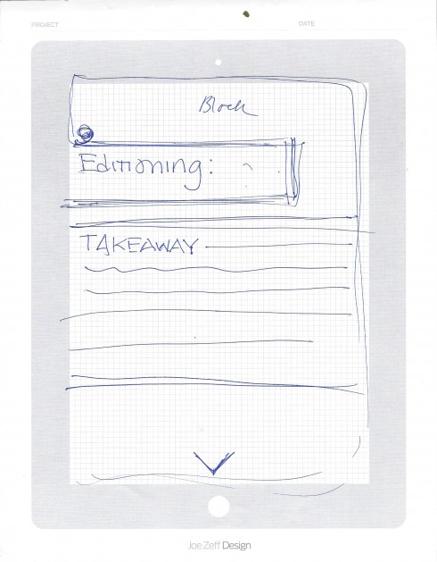
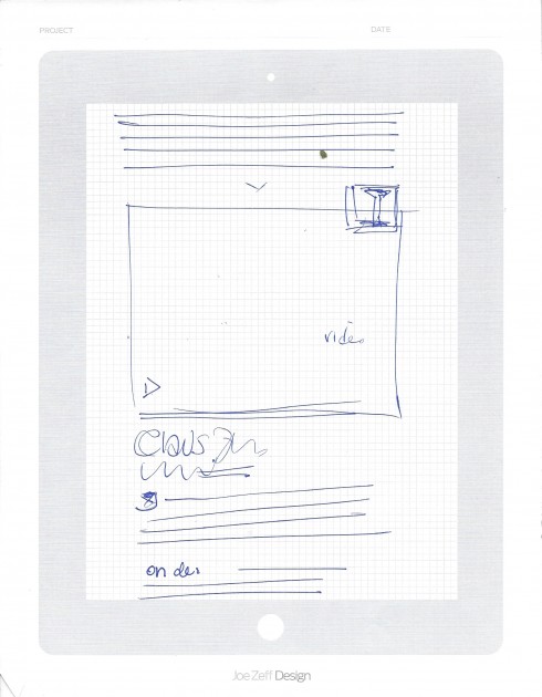
Mario’s sketches showing the book’s design
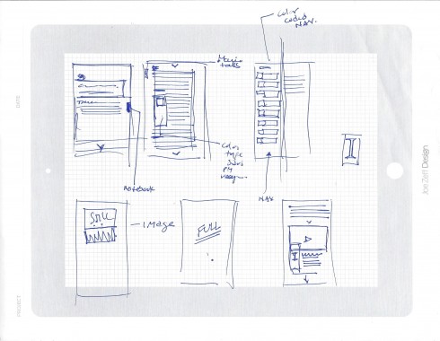
A sketch depicting interactivity—clockwise from top left, a notebook for saving favorite quotes, audio clips titled “Mario talks,” a color-coded navigation overlay, video and images expanding to full screen
A proof of concept
Next, we developed the sketches in InDesign as a proof of concept. Although these prototype pages were static, we were able to start working through how the interactive elements might work. A key feature was the color-coded navigation bar at the top of each screen, which we hoped would make it clear to readers where they were within the book at all times. Staying within the same type family, Fedra from Typotheque, kept the design consistent amid the varying colors and many interactive elements.
_Page_01_thumb.jpg)
Example screens from our InDesign prototype. The column of text was supposed to scroll while the navigation remained fixed at the top.
_Page_09_thumb.jpg)
_Page_11_thumb.jpg)
Structuring the book
While I was busy with the InDesign prototypes, Mario began writing. After reviewing the 15-or-so “iPad Lab” blog posts he had written to date, he and I had created a detailed table of contents. Starting with the “Look & Feel” chapter, Mario wrote the book over several months, tackling it whenever he could—which was often on a long Lufthansa flight. As he wrote, he added potential images and ideas for interactive features. When I edited his drafts, I suggested more. After passing the documents back and forth a couple of times, we had a solid rough draft ready to be put in the prototype.
The first page of the book’s original table of contents
Perfect timing
On January 19, Apple held an event to announce their new “multitouch textbooks” and the program to create them, iBooks Author. In the past weeks, we had discussed that the most promising option for the book was a fixed-layout enhanced EPUB—in practice, an ebook with static pages and some dynamic elements. But watching the Apple event’s live stream, I realized that this platform could do almost everything we had imagined in our InDesign prototypes. I emailed Mario before the event was over, perhaps a bit over-enthusiastic: “I can barely put into words how perfect these iBooks Textbooks and the creation software, iBooks Author, are for our purposes.” Mario agreed, and that day I started learning how to use iBooks Author.
Translating the InDesign prototype to iBooks Author, I soon realized how different these tools were. With InDesign, I had total control over the book’s design, aided by the fact that it was only a simulation of an ebook, lacking any actual functionality. It was almost the inverse with iBooks Author: within minutes I had added photo galleries, videos, audio clips and a glossary to my test document, but I could not reproduce the visual sophistication possible in InDesign. Like other Apple products, iBooks Author can create a stunning result when you follow Apple’s templates, but the program makes deviating from these defaults quite difficult. Color coding, not cropping iPad screenshots, having design elements span multiple pages to aid in navigation—all required a great deal of manual tweaking to get right. And fonts not installed on the iPad itself are not supported, so we were forced to switch from the Fedra family to Futura for headings and Georgia for text.
Another significant difference was that we had to switch from the vertical scrolling motion we had envisioned in the InDesign prototype to horizontal swiping between discrete pages in iBooks Author. After viewing the iBooks Author prototype, rough as it was, Mario and I knew that the ease of implementing interactive elements far outweighed any concerns we had about the particulars of the design. We went with iBooks Author and never looked back.
Images of the iBooks Author prototype. In this version, I attempted—not entirely successfully—to adapt the InDesign prototype’s rounded boxes and color scheme to the new design.
We originally intended to use the glossary to provide information on each app, but ultimately decided to use it as intended by Apple to clarify unusual terms.
With the invaluable consultation of Pegie Stark Adam, we developed a template more suitable to iBooks Author: cleaner, with a simpler structure dividing each page into four units. Working with our design assistant Rachel Needle, we added the rough draft to iBooks Author, splitting it into logical sections and mapping out the illustrations. I went through each chapter over the next few months, editing and designing simultaneously. iBooks Author made creating image galleries a cinch, so we used them generously to feature more examples of apps than we might have with static images. Mario and I procured a number of videos from his colleagues, and Mario recorded the audio introductions to each chapter while waiting for his flight one day in Santiago de Chile. The book gradually took shape, and over the summer we sent the text for final editing by our publisher, HOW Books.
_thumb.PNG)
Screens of the book’s final design
_thumb.PNG)
__thumb.png)
Illustrating the Lab
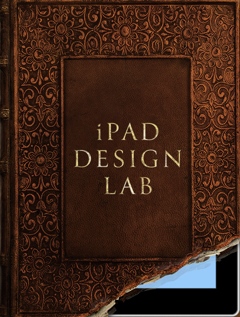
The iBooks Author template, of course, only described the book’s interior. Mario commissioned our frequent collaborators Joe Zeff Design to create a memorable cover. Mario and I were thrilled when Joe Zeff and Ed Gabel sent us their sketch of a leather book cover revealing an iPad underneath—it captured the book’s emphasis in an enduring visual.
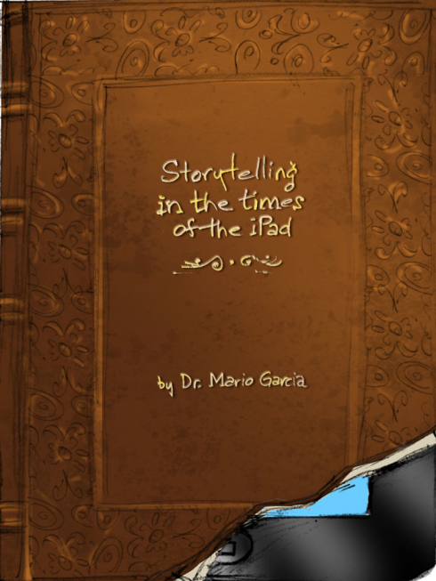
Joe and Ed’s sketch of the cover
Joe and Ed sent us the cover in three states: the intact leather book cover, the torn cover, and the iPad underneath. This allowed us to use the tablet to our advantage by producing a simple animated sequence in Mario’s introductory video, making the cover tell a kind of story itself. More subtly, Joe, Ed and I collaborated on the gilded typography (using Font Bureau’s Canto) to ensure that it worked in all applications. We ended up producing a version of the cover for use at small sizes such as in the iBookstore, where the type needed to be as large as possible to remain legible and the iPad’s metal border had to be thickened to be seen.
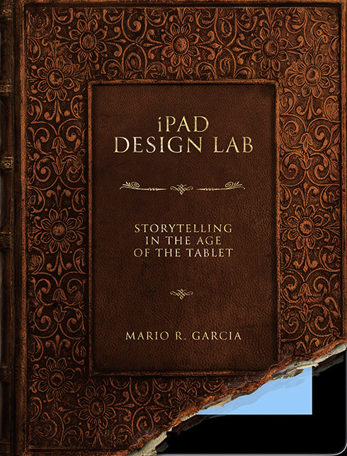
The two versions of the cover: for large sizes and small (below). Ideally, the iBookstore would have allowed us to use both versions as well, but it is currently limited to a single cover for all sizes.
We also commissioned illustrations from the talented Luis Vazquez of Dubai’s Gulf News. Luis read the book’s table of contents and interpreted each chapter in his memorable way (my favorite is for “Navigation”—of course it would be a sailboat!). His illustrations energize the book’s design each time a reader flips between chapters.
.jpg)
Luis’ illustration for the Navigation chapter
EPUBs and updates
The book is now published, following a quick one-day approval from Apple. Now I’m turning my attention to the EPUB version, which will be available in more countries and on more devices than the multitouch textbook is. We’re making good progress on that and it should be available soon. And then, of course, we’ll have to look toward updating the book with new apps and links, as well as suggestions and corrections sent in by our readers around the world. I’ll look forward to seeing the book improve and mature through these free updates.

1st Middle East News Design Conference
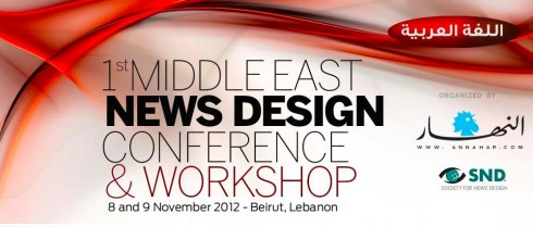
It promises to be a great program, and a historic one, too: the first SND Middle East gathering. Put it on your calendars: November 8 & 9, in Beirut, Lebanon. Sponsored by An-Nahar and SND.
For more information:
http://www.snd20events.com/conference/