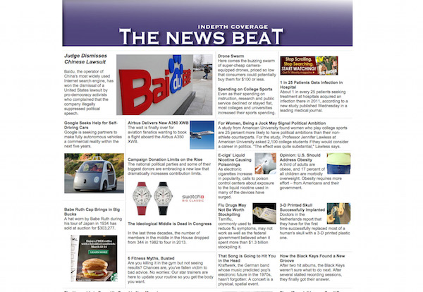
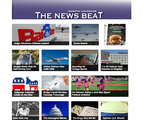
Images from the Engaging News Project show the photo-driven preferred homepage, versus the busier, more traditional look
The 2012 Poynter EyeTrack Tablet Research: users preferred the “carrousel” photo-driven home page versus the traditional newspaper look
Here is a highlight from the study:
“News sites with modular, image-heavy designs receive more page views and have stronger user engagement than sites with more staid, newspaper-inspired designs, according to a report released Tuesday by the Engaging News Project.
“In Study 1, 429 participants were required to stay on the site for 90 seconds before continuing with the study. The modern site received 813 unique page views, while the classic site received 427.”
If we really wish to be precise about it, that was also the preference of print newspaper readers of the 1980s when the first Poynter Eye Track studies were conducted: visuals attract, photos seduce, and I imagine that one study after the other will testify to that for years to come.
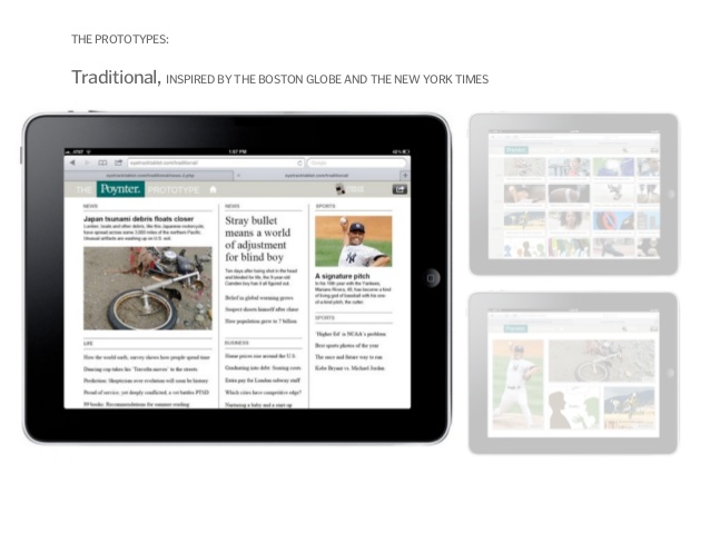
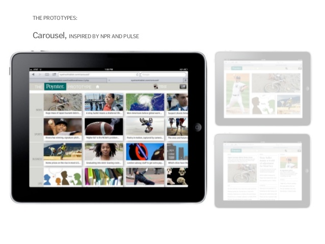
During the Poynter EyeTrack Tablet study of 2012 the results were similar: participants were shown three prototypes for how a newspaper would present its contents on a tablet. Participants were shown three prototypes created for the study which featured the same 20 stories but had different designs for the front page or entryway. One had a “traditional” look and feel, similar to an online newspaper. It had a dominant photograph, a lead headline and headlines for each of the 20 stories in the publication. Content categories were news, sports, business and life. The second prototype was a carousel design with images and headlines for each of the 20 stories. The third was a flipboard design with four images that highlighted one story from each category.
The traditional prototype was the one most similar to what people usually looked at on their tablets. Fifty percent of the readers preferred the carousel design, they said in an exit interview, while 35 percent preferred the traditional prototype, 15 percent liked the flipboard. The carrousel multi-photo navigator was the favorite, just as this most recent study reveals about online homepages.
While we are not surprised about the latest study concerning the most visual home pages as favorites, we fear that now every homepage that is designed will simply populate the screen with many photos with headlines over them.
The reason I mention this is because my team and I find ourselves doing just that, and we must step back, take a deep breath and consider other options. There can be very visual homepage designs that alternate between good uses of photos, illustrations and type. Yes, type as a design element.
What we have seen as NOT working with users is when we try to pile up too many items—and particularly text driven elements—onto the homepage.
Balance and common sense should be the designer’s guide here.
More about the Poynter EyeTrack studies
New Poynter Eyetrack research reveals how people read news on tablets
Poynter ‘EyeTrack: Tablet’ research shows horizontal swiping instinct for photo galleries
http://www.poynter.org/news/media-innovation/171368/poynter-eyetrack-tablet-research-shows-horizontal-swiping-instinct-for-photo-galleries/
What Poynter's EyeTrack Tablet teaches us
https://garciamedia.com/blog/the_ipad_lab_20_what_poynters_eyetrack_tablet_teaches_us