TAKEAWAY:In the Netherlands, De Telegraaf’s new Weekend edition was launched one month ago—-progress continues as systematic design coexists with the visual DNA of this iconic newspaper.
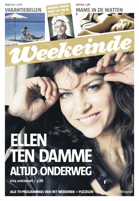
One month after the launch of its new tabloid Weekend section, De Telegraaf readers appear to be enjoying the new content offerings and the design that packages them.
To hear design director Hans Haasnoot describe it: “Our readers are very much loving the Weekend supplement and all that is new,” Hans writes me. “Each week we in the newsroom get more organized and have more fun producing the weekend, and this translates into satisfaction for our readers.”
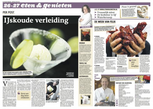
As readers of the blog may recall, De Telegraaf launched its new Weekend package April 7. It introduced a newly rethought Weekend section—full of useful articles to make the reader’s life better, healthier and more fun. Weekend became a tabloid section while Reportage, which was also redesigned and rethought, remained in the broadsheet format as the rest of De Telegraaf.
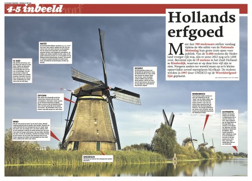
I now look at these pages and admire the visual energy that each of them carries. Recently, a designer colleague I met at a conference, who is familiar with the design style of De Telegraaf, asked me if it was difficult for me to create a systematic look for a newspaper whose design is not at all associated with rules, templates or system.
It was difficult at first: what designer would not be taken by surprise when faced with the front page of Holland’s De Telegraaf? But once I got over that initial shock and asking myself the question as to where to begin, then it was a matter of focusing on this newspaper’s rich DNA, and making sure that it was preserved, as we created a more systematic approach.
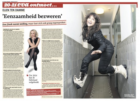
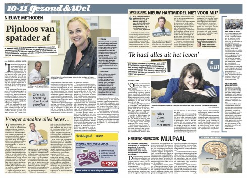
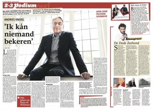
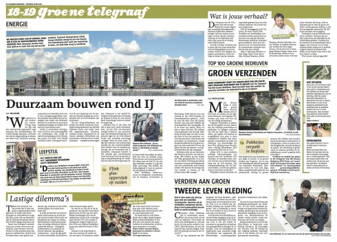
Indeed, if you take a close look at these pages, you will see how the system works:
—Story structures have been created for the different type of stories.
—A color palette ties the Weekend package together and creates differentiators for the various sections, most of which are only two pages, as in Health, Money, etc.
—Created a Center of Visual Impact (CVI) on each page, to generate hierarchy and avoid the former style of too many items equally sized.
So, I told my designer colleague, there is a system for the madness here.
And, what is most important, the DNA and visual branding of De Telegraaf comes through.
Our previous blog posts about De Telegraaf:
https://garciamedia.com/blog/articles/de_telegraafs_weekend_edition_launch_2_a_new_weekend_edition_launched
https://garciamedia.com/blog/articles/de_telegraaf_of_the_netherlands_preparing_for_a_newly_designed_weekend_edit
https://garciamedia.com/blog/articles/de_telegraafs_weekend_edition_launch_2_a_new_weekend_edition_launched
Illustrations for the digital book


Here are two sample illustrations by Luis Vazquez, of the Gulf News of Dubai. We commissioned Luis to create the images that will accompany each chapter of my digital book, The iPad Design Lab: Storytelling in the Age of the Tablet. These illustrations are for the Pop Up and Advertising chapters respectively. Luis has captured the spirit of the book in each of his illustrations, which will be used as chapter openers.
Of special interest today
Bitly data shows the best times to post links to Facebook, Twitter and Tumblr
http://www.poynter.org/latest-news/mediawire/173308/bitly-data-shows-the-best-times-to-post-links-to-facebook-twitter-and-tumblr/
The iPad Design Lab: Storytelling in the Age of the Tablet
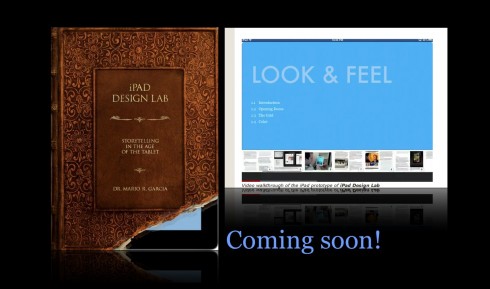
Video walkthrough of the iPad prototype of iPad Design Lab