TAKEAWAY: In preparation for this Saturday’s launch of De Telegraaf’s rethinking of its Weekend edition, today we chat with Saku Heinänen, the Finnish type designer and creator of Freya, one of the main fonts used for the new look.
This weekend is the launch of De Telegraaf’s new and improved weekend edition.
Friday we will profile a full case study of this exciting project for the Netherland’s most read newspaper—- a colorful combination of serious journalism, interesting people features and now, in its new weekend section, tons of tips to make life better.
Part of our work with the team of the De Telegraaf, headed by editor Sjuul Paradijs, weekend editor Babette Wieringa and art director Hans Haasnoot, was to select new fonts for the now tabloid weekend package.
We hit the spot with our selection of Freya as the elegant serif that will look as good in small sizes as on cover story headlines.
A conversation with Saku Heinänen
Today we chat with Freya’s creator, the Finnish designer, Saku Heinänen, type designer and graphic designer, and a professor at Aalto University.
Mario: How did Freya come to be?
Freya is my first complete typeface family, with the texts fonts published in 2010 by Village and the headline fonts finally following this spring.I started drawing type after designing several newspapers and magazines,
and I guess that background has informed and inspired me.
Mario: We have used your Freya in a supplement that , although new, has to adjust to the rest of the package in which it is inserted , the colorful and bold De Telegraaf, whose man news pages we are not changing at this time. Did you ever imagine Freya used in a setting such as this?
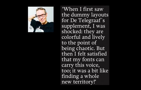
I love to create forms that find their actual voice when used by art directors. My wish is that they will be used in as various contexts as possible,and I am happy that this seems to be so. When I first saw the dummy layouts
for De Telegraaf´s supplement, I was shocked: they are colourful and lively to the point of being chaotic. But then I felt satisfied – – my fonts can carry this voice, too; it was a bit like finding a whole new territory!
Mario: I have often wondered if type designers create a font anticipating that it will be used in a specific type of publication. Do you?
When drawing the forms, I definitely don´t think of any specific publication, but try to create an inherent cohesion, beauty and rhythm, that will gain any piece of graphic design.
The various uses of Freya
Saku sends us these images of how his font Freya has been utilized for a variety of publications:
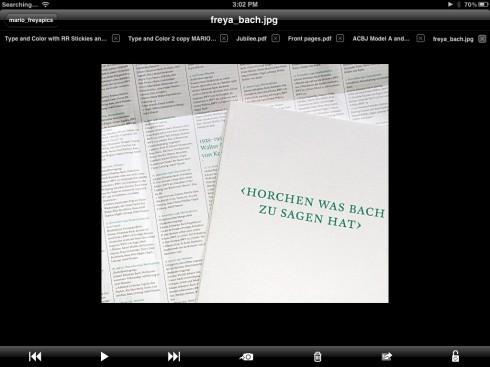
(Bach)
Horchen was Bach zu sagen hat, an anniversary publication of the 100-year-old choir, The Basler Bach-Chor. Design by Büro4, Zurich.
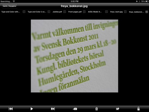
(Bokkonst)
The printed material for the competition and exhibition of the most beautiful Swedish books of 2011. Embossing with spot colour. Design by Fredrik Andersson, Pangea Design. ??
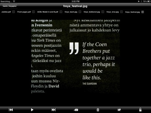
(Festival) Catalogues and magazines of the annual Helsinki Festival. Design by Bob Helsinki.
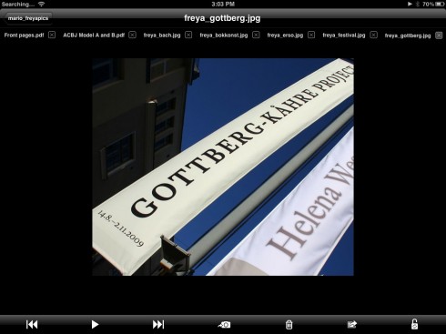
(Gottberg)
Gottberg-Kåhre Project
Invitation, poster and banners for the art exhibition in Amos Anderson museum by painter Susanne Gottberg and sculptor Markus Kåhre. Design by Jesper Vuori.
Freya applications for De Telegraaf’s Weekend edition
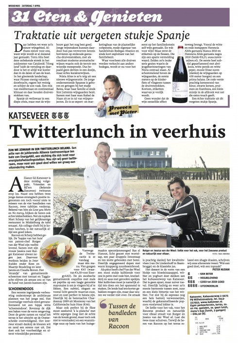
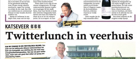
Here is a food page from the new Weekend section of De Telegraaf, with Freya for headlines
De Telegraaf weekend: trio of fonts
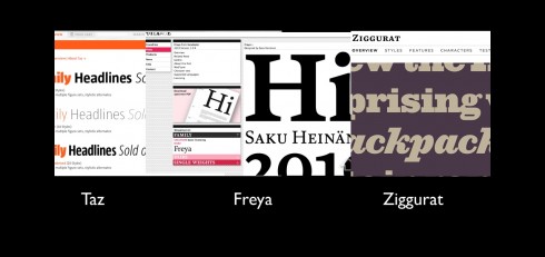
Here is the trio of fonts we utilize for the new weekend edition of De Telegraaf: Taz is the sans serif; Freya is the serif; Ziggurat is used for headers
For more information about Saku Heinänen:
saku@typogra.fi
www.typogra.fi
www.aalto.fi