What’s in a newspaper nameplate?
After 729 newspaper projects, I can tell you that the answer to that question is a monumentally robust: A LOT.
There is not a single redesign of a newspaper or magazine that does not involve long and sometimes heated discussions of the logo, or nameplate, or flag, or, in the most recent terminology, “the branding”. There is always many in the team of any project that do not wish anything done to the branding. I remember sometimes having suggested a simple tweak of a letter, or even just the spacing between letters, only to get a very aggressively delivered: NO.
Of course, in my collective project memory, one change of a nameplate still stands as one of the most interesting experiences of my career, and probably the one that launched it in St. Cloud, Minnesota with the redesign of the St. Cloud Daily Times. Read all about this 1980 project here:
At the HT: a return to elegance
When I arrived in Delhi for the first visit related to this HT project, Anup Gupta, creative director, and his team already showed me the direction they wanted to pursue in terms of a change of a nameplate, seeking inspiration from the newspaper’s beginnings 96 years ago.
Not only were they interested in a return to classic newsletter for the Hindustan Times logo, but also had in mind the creation of a crest to accompany it as part of the branding.
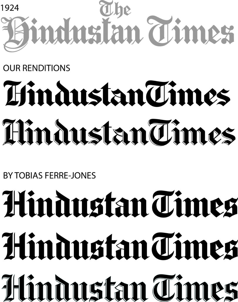
Anup’s team used the original HT nameplate as the basis for how the new one would look. In his own words:
We also worked off the original nameplate keeping in mind the milestone in the next 4 years, when the title turns 100. Needless to say the form we built was brilliantly recrafted by Tobias Ferre-Jones, and his team, to create an astounding and well balanced rendition for Hindustan Times.
HT senior art director Malay Karmakar worked on the original drawing which I saw when I arrived to work with the team:
Reader surveys showed the target audiences’ preference for a modern branding for the product. However, keeping in mind the TAs need to trust a brand with a legacy, we took inspiration from the original nameplate to create a version that plucked that modernistic chord. Anup and I did a few conceptual drafts and modified a few characters in an attempt to create a modern rendition of a gothic letterform. We further added the inline to the nameplate to provide an extra highlight and further sharpen the branding.
Inputs for the crest
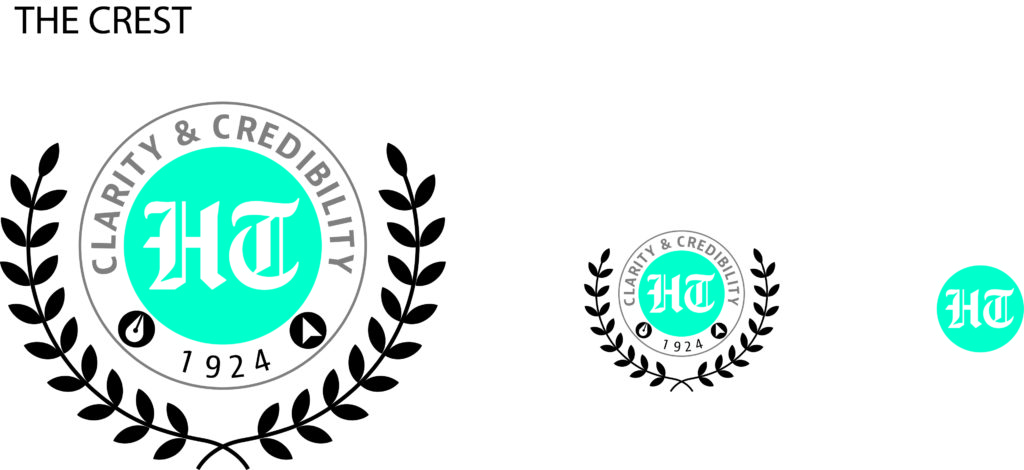
Taking inspiration from a colonial era engraving we crafted the crest to capture the following:
- The laurel leaves : to signify the warm appreciation of our readers
- The journey : from print to digital, signified by the quill and the cursor in the outer brand, framing the year of inception
- The promise : captured in the words Clarity & Credibility
- The brand : presented in the blue button in the center.
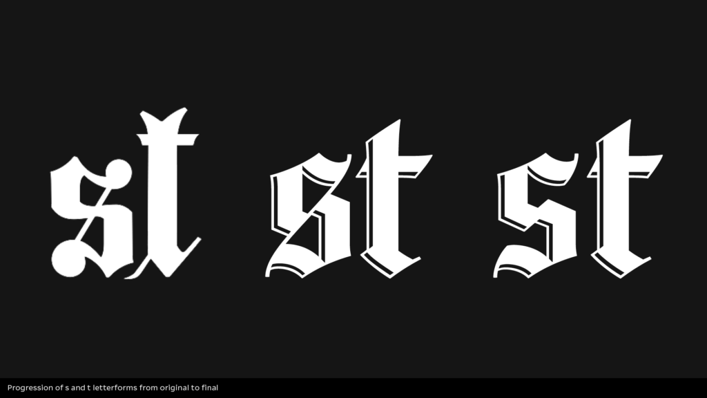
The evolution of a logo
Here you see how the concept of the Black Letter logo evolved all the way to the one crafted by Tobias Frere-Jones and his team in New York City.
The view from the creators
After we had experimented with a series of variations of how the Black Letter would look on the pages we were creating, as seen in the progression above, creative director Anup Gupta and I decided to take the next step: to hire an expert to draw the nameplate to make it as authentic and elegant as possible.
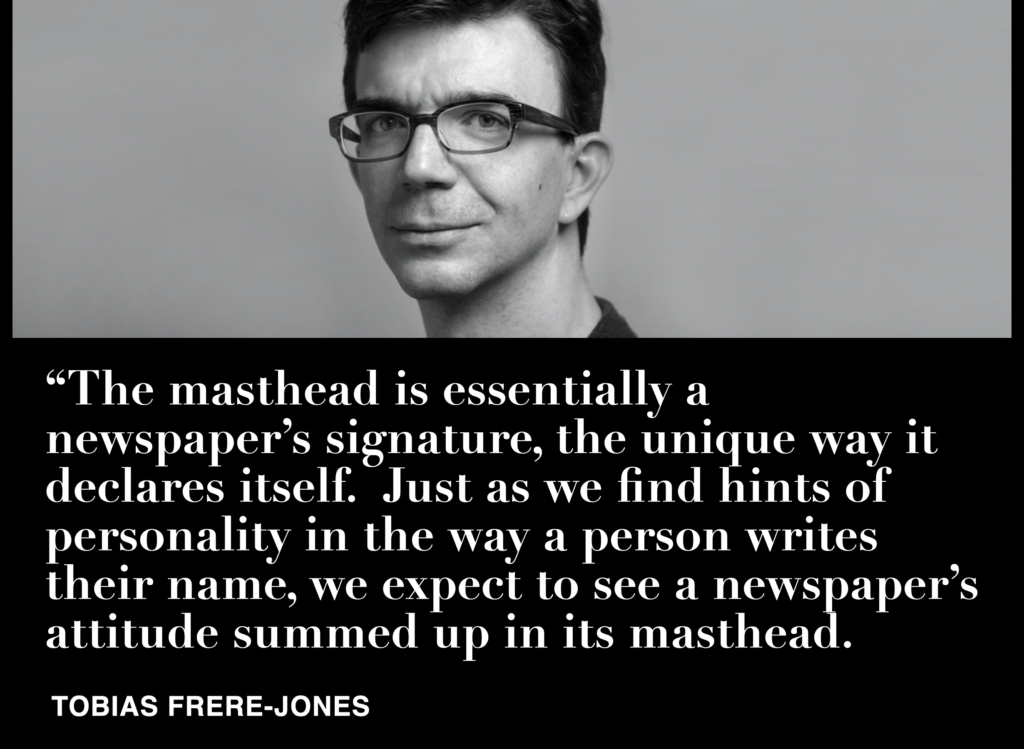
Nobody better than the accomplished American typographer Tobias Frere-Jones for the task. I contacted Tobias and met with him in New York to explain our project and goals. He honored us accepting our invitation to start the process, a once in a lifetime experience for all of us involved in the transformation of the HT.
“HT has a rich heritage in its previous mastheads, which gave us a great deal of meaningful material to draw upon, to have the support of history as we look forward,” Tobias said.
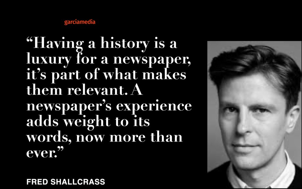
Working closely with Tobias has been Fred Shallcrass, a typeface designer at Frere-Jones Type. Fred grew up in New Zealand, designing magazines, lettering and type for cultural and commercial clients. Since moving to New York, Fred has focused on type, working on branding projects, contributing to retail typeface families including Mallory & Conductor and designing custom typefaces and wordmarks for various clients. I had this chat with Fred:
What was the challenge?
In a general sense, we were trying to balance the influence of the newspapers past with typographic precedent and a desire for an end result which felt contemporary. We removed, added and simplified details in efforts to make the wordmark look refined and current, while holding on to enough that the shapes kept their meaning.
Technically speaking, when you add weight to structures like these, things don’t always go according to plan. The various angles at play push and pull against one another, upsetting the balance between positive and negative space. Finding a spot where these factors would work with the desire for density and width took some patience.
How effective do you think it is to return to a classic branding here?
Having a history is a luxury for a newspaper, it’s part of what makes them relevant. A newspapers experience adds weight to its words, now more than ever.
Here is an image that shows the progression of how the nameplate was created:
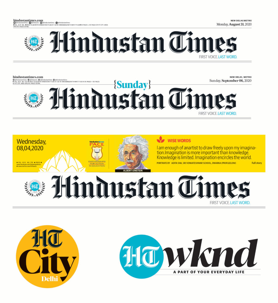
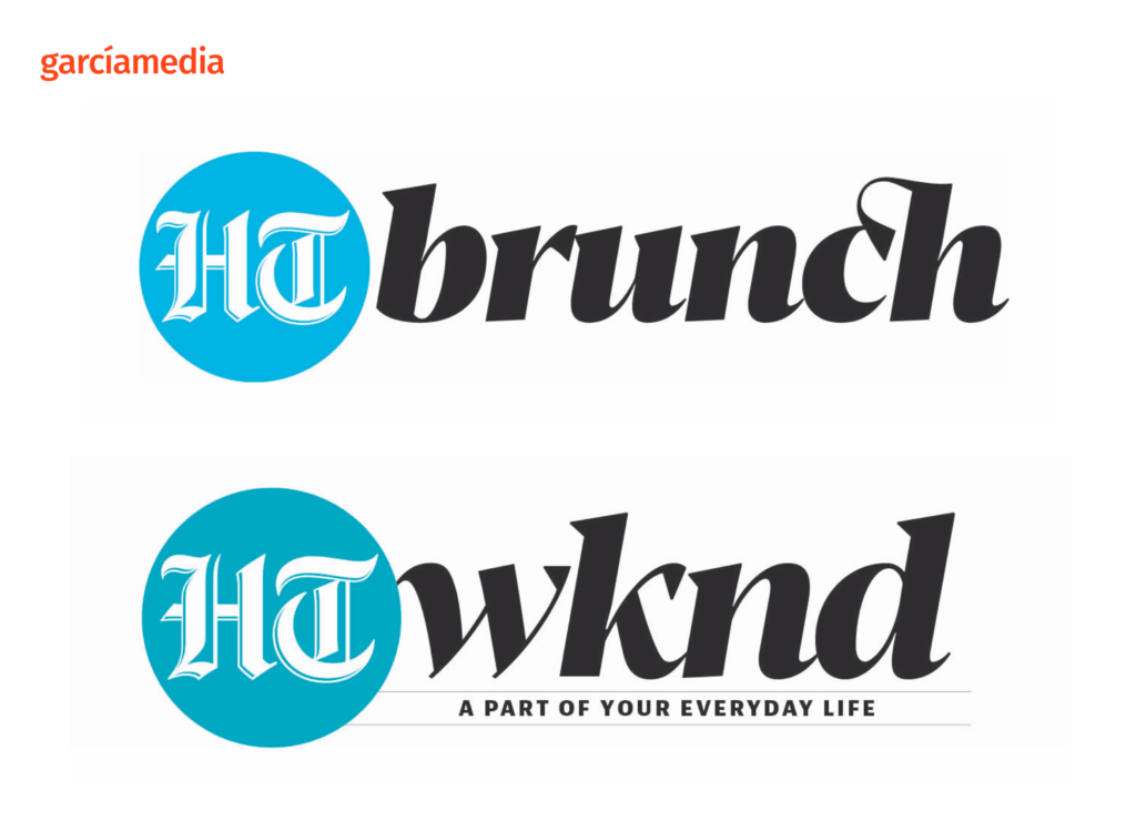
Extending the brand beyond nameplate
Animated history of the HT nameplate
Of related HT interest
http://garciamedia.com/wp-admin/post.php?post=17485&action=edit
Professors: get your review version of The Story on time for fall classes
As an academic, I know the importance of having the right tools to advance our students, especially on the important subject of mobile storytelling. Please drop me an email if you would like to sample The Story in its digital edition: mario@garciamedia.com
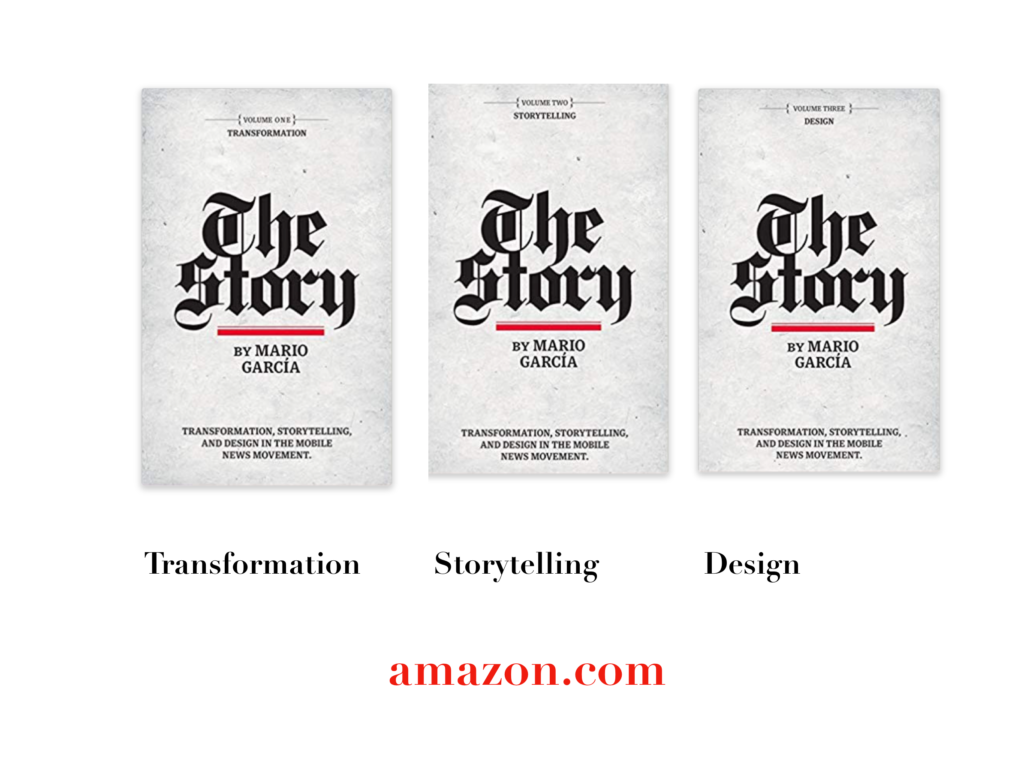
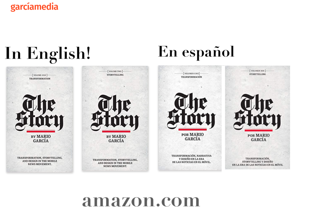
The full trilogy of The Story now available–3 books to guide you through a mobile first strategy. Whether you’re a reporter, editor, designer, publisher, corporate communicator, The Story is for you! https://amazon
Mario to keynote SND 2020
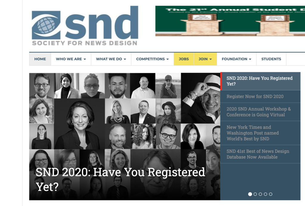
Honored to keynote this SND virtual conference, Oct. 1
TheMarioBlog post # 3256