Update #6: Sunday, March 14, 09:24 EST
TAKEAWAY: We are in Bucharest this Sunday as we prepare to produce the first issue of Romania Libera displaying its new rethinking and redesign. We offer you some “glimpses” of the look, and comment with updates about the day’s preparations. PLUS: An interview with Dutch-based typograher, Peter Bilak, about his new developments, including web fonts and new fonts for Indian scripts
Opening night in Bucharest
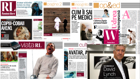
Various pages in collage that offers a glimpse of the new look for RL
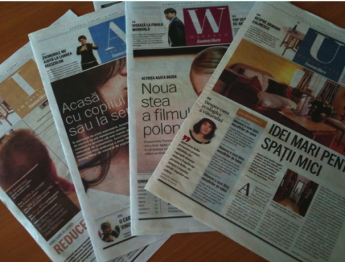
The supplements: real estate, weekend, jobs, home & design
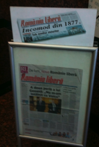
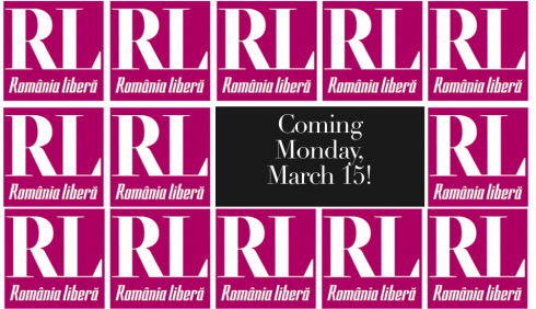
The last edition of the Romania LIbera in its old design stands at the press kiosks
After five months of discussions, prototypes and preparations, today Sunday we gather to produce the first issue of Romania Libera with its new look and rethinking.
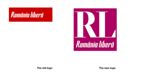
It is a dramatic change for this 133-year icon of Romanian journalism, especially because the red spelled out logo that has graced its front page, newstands and trucks for decades, is saying goodbye, and a new “pill box” style logo, with deep purple as its color, replaces it.
As we discussed this dramatic change, the emphasis was on letting a young generation of Romanians know that, indeed, the Romania Libera in their hands tomorrow is different from the one their grandparents read through the years of political turmoil that this country has endured——including many years under communism following World War II, when parts of its territories were occupied by the USSR and Romania became a socialist republic. For the world, however, Romania is usually remembered for the presence of Nicolae Ceau?escu, the country’s president from 1974 to 1989. His presidency was characterized by his erratic personality cult leading to an overthrow of his government in a December 1989 military coup. He and his wife, Elena, were executed following a televised two-hour session by a kangaroo court. Romania Libera covered all of these events, and remained, for the most, an independent voice.
Even today, as I ask Romanians I meet in the street what they think of Romania Libera, two reactions immediately come to the front: it is not biased, and it is old.
The marketing campaign for the launch of the newspaper emphasizes that the new RL is modern, but the editors are quick to point out in all interviews that the RL continues to be an independent voice, with no affiliations to any party.
I will be blogging throughout the day Sunday, and will keep you updated of our work today.
Romania Libera: the pre-launch marketing campaign
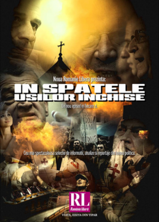
A movie poster environment is used by Romania LIbera to promote its launch of new look scheduled for Monday. This one is all about the newspaper’s coverage of politics, with the “movie” title “Behind Closed Doors”
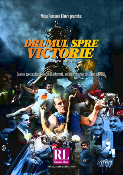
The movie poster concept for sports, with headline: Road to Victory
One of several short video spots shown on Romanian TV about the launch of RL: the campaign follows a “fake investigative report” , one guy asks: What is happening March 15?, another responds: I cannot tell you. Cut. Create the expectations and show the new logo for a couple of seconds.
The marketing campaign is already on and preparations are in order this weekend for the launch of our project, Romania Libera, in Bucharest, Romania.
The marketing guys at RL have put together an eye catching campaign inspired by the movies. Indeed, many of the visuals look like movie posters, with the theme: We Publish Your Life.
Different video segments show spots where a short dialog takes place between two individuals, leading to information about March 15, launch date, followed by the new logo for RL.
The changes at a glance:
1. Content restructuring: our project included not just a change of the look and feel, but also a deep analysis of content rhythm, as well as the specific needs of younger readers.—-Starting on Page 2, content has been shifted from other sections. The Page 2 offers the photo of the day, along with agenda items, quote of the day, day planner; also added a new Photo Interview feature, in which a well known person is given three photos of the day to analyze and present opinions. The new Viata (Life) section: emphasis on younger topics, such as health, fitness, fashion, the arts. An enhanced Weekend supplement, and more about movies, television, celebrities, without abandoning the main stay cultural coverage of books, theater and music.
2. A different set of navigational tools—Starting on Page One, this page is used as an official and complete navigator to the newspaper.
3. New typographic scheme—Two main fonts are used:
Serif: Greta from Typotheque:Greta Display for secondary headlines and logos;
Greta Text for bodytext.
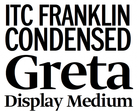
Sans: ITC Franklin from Fontbureau.
Used for lead headlines, summaries, subheadlines, secondary texts.
Jan Kny explains about Greta:
„We picked this combination first to create a look that is fresh and
contemporary, second to meet the needs of Romanian language. And they work together
so well: Greta with its expressive forms,ITC Franklin Condensed with its more minimalist
attitude. Greta is done with special focus on Eastern European
languages with their diacritics and characters.”
The choice of Greta and news from Typotheque
As a sideline to our choice of Greta for Romania Libera: Our year long intern, Reed Reibstein (Yale University ‘11) became aware of our work with Romania LIbera and suggested to Jan Kny and me the new font created by Peter Bilak from Typotheque, who has developed fonts especially suited for Eastern European languages. We looked at it, liked it, asked Peter to send us a sample, and we went from there.
Today, while communicating with Peter, we find out about other new developments at his end, such as:
Web fonts:Peter tells us that his company has developed technology to
use any fonts on the web. “So finally typography online can match what
we are used in print. At the SND (in Lisbon) I argued that today’s web (with
Verdana, Arial and Georgia) is comparable to printed newspaper from
1900, which used Clarendon and Scotch Roman in all newspapers
published in Britain,” Peter writes me.
Good news for designers everywhere: Peter reports that he now offers all Typotheque fonts for web use, but very
soon, he will start licensing the technology that allows safe use of
fonts on the web, so publications could use the same fonts as they use
in print.
Development of fonts for Indian scripts: A second project of interest , especially for thos doing work in India, is that Typotheque started a company
in India specialized in development of Indic fonts, for all major
scripts (Bengali, Devanagari, Gujarati, Gurmukhi, Kannada, Malayalam,
Oriya, Tamil, and Telugu).
I believe we are the first true typefoundry in India (the fonts made in India these days are made together
with text editors to push sales of software, and are usually not
Unicode compliant).Our Fedra Hindi supports Marathi, as Marathi is a Brahmi language using Devanagari script, which we cover.
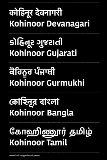
ndian Type Foundry fonts covering various Indic scripts
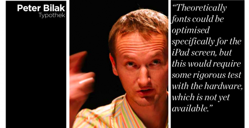
I asked Peter Bilak about use of fonts with the much-anticipated Apple iPad. Here is what he said:
“iPad / iPhone is a different beast, and as such doesn’t support the standard fonts that other Internet browsers support, so one can’t use the much hyped @font-face declaration that many websites start using now. But we figured out how to bring custom fonts also there. A special font format (SVG) can be loaded either via server, as on this example: [http://www.typotheque.com/webfonts/sample_2] A more effective method is to install standard OTF / TTF fonts on the iPad itself. That is not too complicated, but Apple SDK disallows sharing resources between applications, so the font will always work only in one app, and now on the iPad itself.* Custom fonts on the iPhone looks great because of the very high resolution, but it is not clear how fonts will look on the iPad, as the number of pixels per inch is lower, and iPad doesn’t use subpixel rendering (which improves font rasterizing on desktop computers). Theoretically fonts could be optimised specifically for the iPad screen, but this would require some rigorous test with the hardware, which is not yet available.
Peter informs me that Typotheque online web fonts system cover 98% of browsers used today, and the missing 2% are indeed various mobile devices.**
“While Safari, Firefox, Explorer, Chrome, Opera already support print version of fonts (OpenType or TrueType), or special web optimised fonts EOT or WOFF), Mobile Safari supports none of those***. That’s why we use this SVG font workaround. It seems to work, but it is less flexible for internationalisation that we proud ourselves in. So while in Safari, our Latin, Cyrillic, Greek, Arabic, or Hindi fonts work, in Mobile Safari we only cover basic Latin. Hope to cover more languages /scripts soon.”
Peter reminds us:Of course embedding fonts into applications is prohibited by the font’s End user License Agreement, so it is important to clear this with the copyright holders – the type foundry that sells the font license
Of special interest:
According to Wikipedia, the percentage of web browsers that support @font-face declaration is by now 98.63%.
http://en.wikipedia.org/wiki/Usage_share_of_web_browsers
***
For links and more information on these fonts, go here:
www.typotheque.com
www.typotheque.com/fonts/greta_display
www.typotheque.com/fonts/greta_text
http://www.webfonts.info/wiki/index.php?title=%40font-face_browser_support
http://www.evotech.net/blog/2010/01/font-face-browser-support-tutorial/
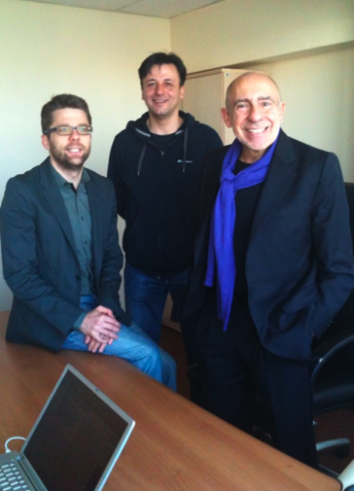
Getting ready for Day 1: Our design team, from left, Jan Kny (Garcia Media Europe), Catalin Dumitru (RL art director) and me discussing front page strategy for tomorrow’s newspaper

Today’s Sudkurier (Konstanz, Germany) includes a page in the financial section with a perfectly cropped photo of Theo Waigel, former German minister of finance, well known for his bushy (beyond bushy?) eyebrows, a visual statement in and by themselves. We thought the cropping of the photo was just perfect. Good work, guys.
Of course, I could not help sending it to my friend Tyler Brulé, the famous editor of Monocle Magazine, and a weekly Financial Times columnist. In his column of this weekend (don’t miss it!), Brulé laments why more men don’t do something about their eyebrows. He specifically writes: Why hasn’t eyebrow grooming for men caught on in the west?
Well, Tyler, let’s start with the former minister.
For Sudkurier:
http://www.suedkurier.de/