A number of students in my class selected one of the several projects they completed during the semester to highlight on our blog. I have asked the students to provide a short explanation of their own projects below.
Meghan Washington, Master of Science in Journalism
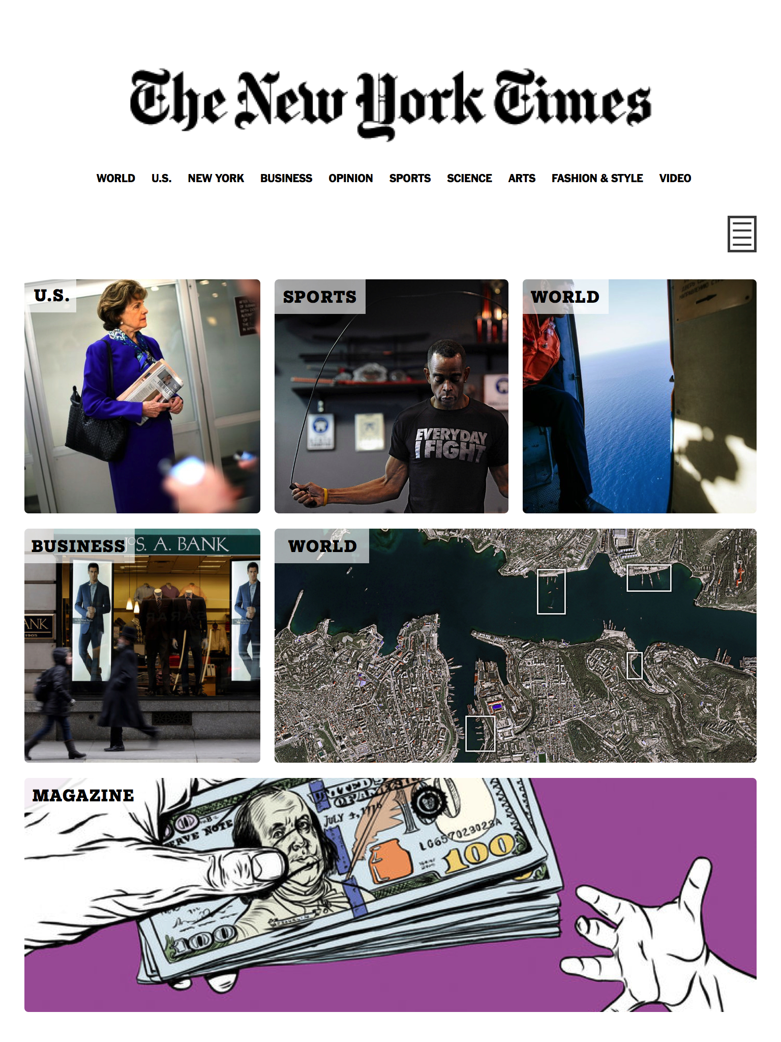
The New York Times tablet edition
I chose to feature this on the blog because I think it exemplifies the kind of tablet-specific app that would serve The New York Times well.
The New York Times’ current tablet app is very similar to the website, which is very similar to the print edition. This app would utilize the unique platform of the tablet by encouraging touch, swiping, and full screen photography.
I tried to keep the Times’ general style the same, with similar fonts and organization of text, categories, etc. I would have this require a $2.99 payment, and of course one would need a NYT digital subscription. It would refresh with new content continuously, like the NYT.
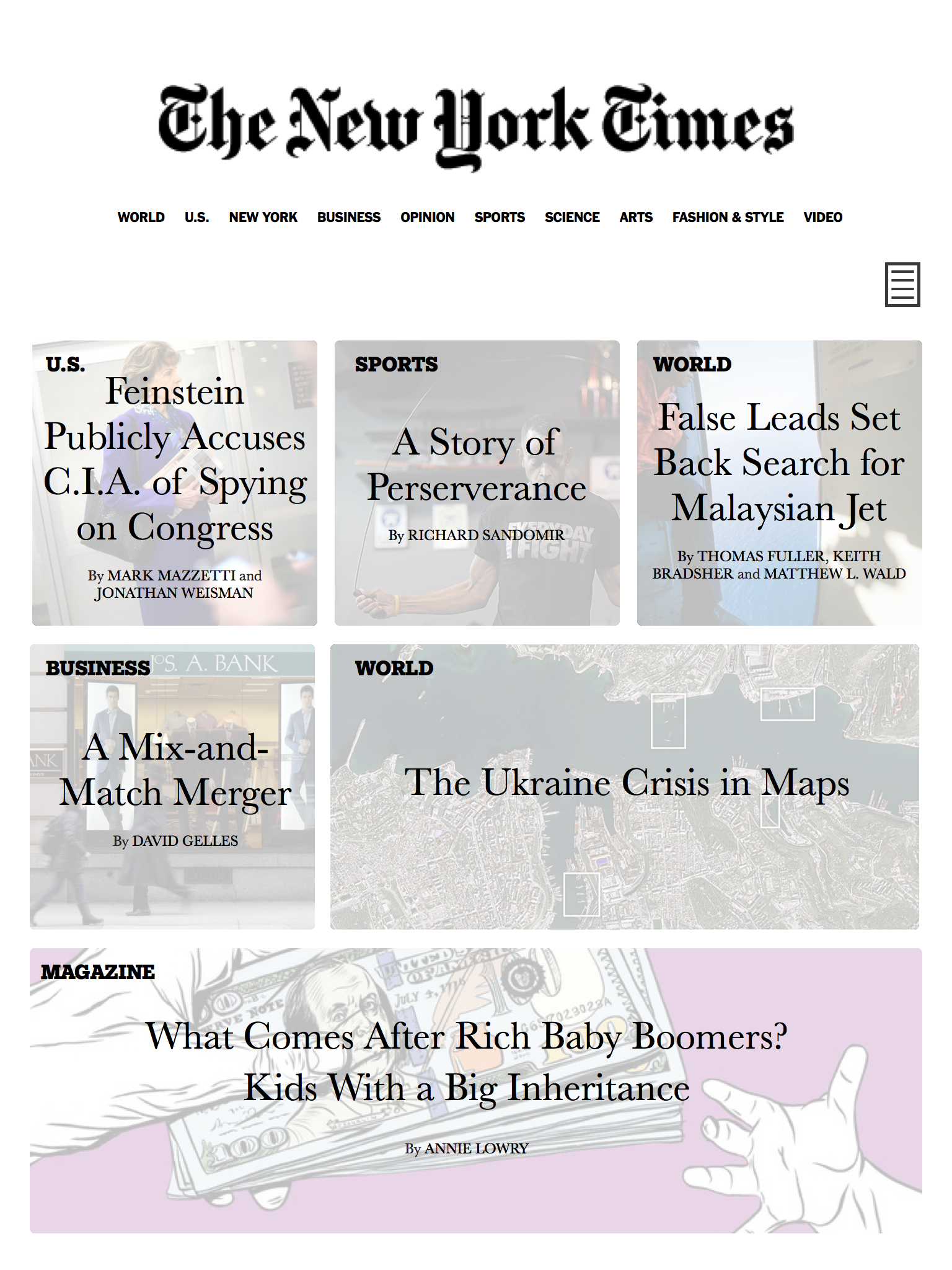
Users would take a brief questionnaire after downloading the app—with the option to opt-out—to assess their news interests. The main page of the app would reflect these interests, with analytical data being collected every so often if these preferences change. The main page would start with images only, and then the user would select the symbol on the top right to see all the headlines and bylines for each story.
Individual stories will highlight photography first, full screen, with the option to zoom in and out by touch. Sliding the arrow at the bottom up will bring the story up with a transparent overlay, keeping the photo visible and as part of the story.
Amelia Bourdeau, Master of Arts in Journalism, May 2015
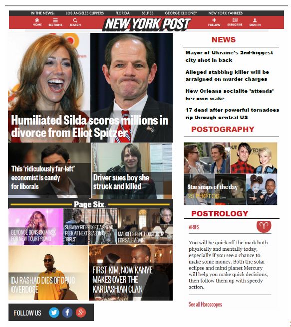
New York Post / Page 6: responsive design
I chose the NY Post and wanted to make the popular Page 6 section more prominent on the mobile and tablet editions, so that one did not have to scroll to see it. The NY Post online editions have a lot to look at – photos, headlines, horoscopes – and I sought to organize the layout better.
I chose this project to feature because it was an effective exercise to learn the importance of consistent source order, organization, and layout. Also, I chose it because I read the NY Post daily.
Jason Myles, Master of Science in Journalism
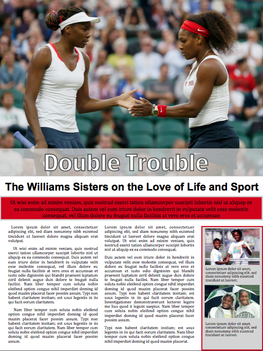
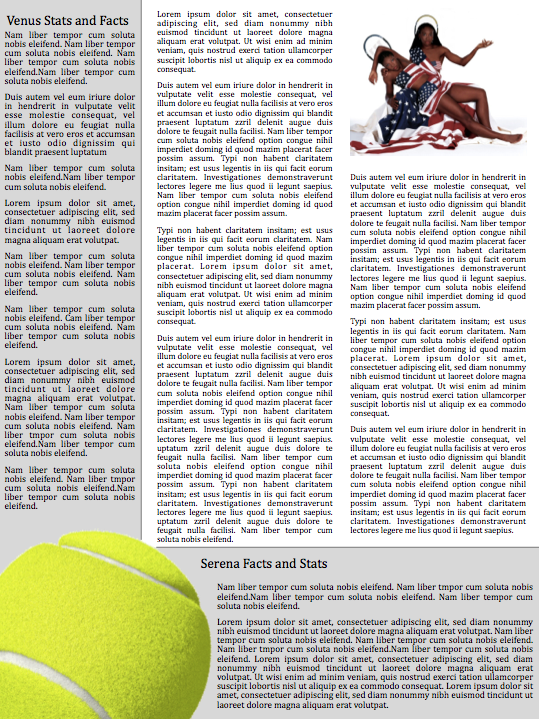
The Williams Sisters: tablet
I chose to revise the project I did about the Williams sisters because I wanted to continue to play around with the “layback Sunday” feel for tablet. As I hope to be able to do long-form feature pieces in the future, I thought it’d be good to revisit one I designed.
I used the red background and border to tie in the pops of red in the large feature photos. I also used the grey backgrounds to separate sections on the same page in a way I thought was clean and distinctive to the reader. I also thought the yellow tennis ball added a nice graphic and pop of color to the second page.
What I learned from this project is that often times you have to try and retry something to make it look right. Many times my original idea didn’t look how I thought it would, so you’ve just got to try something else until you’re happy with the design.
Lena Shareef, Master of Science in Journalism
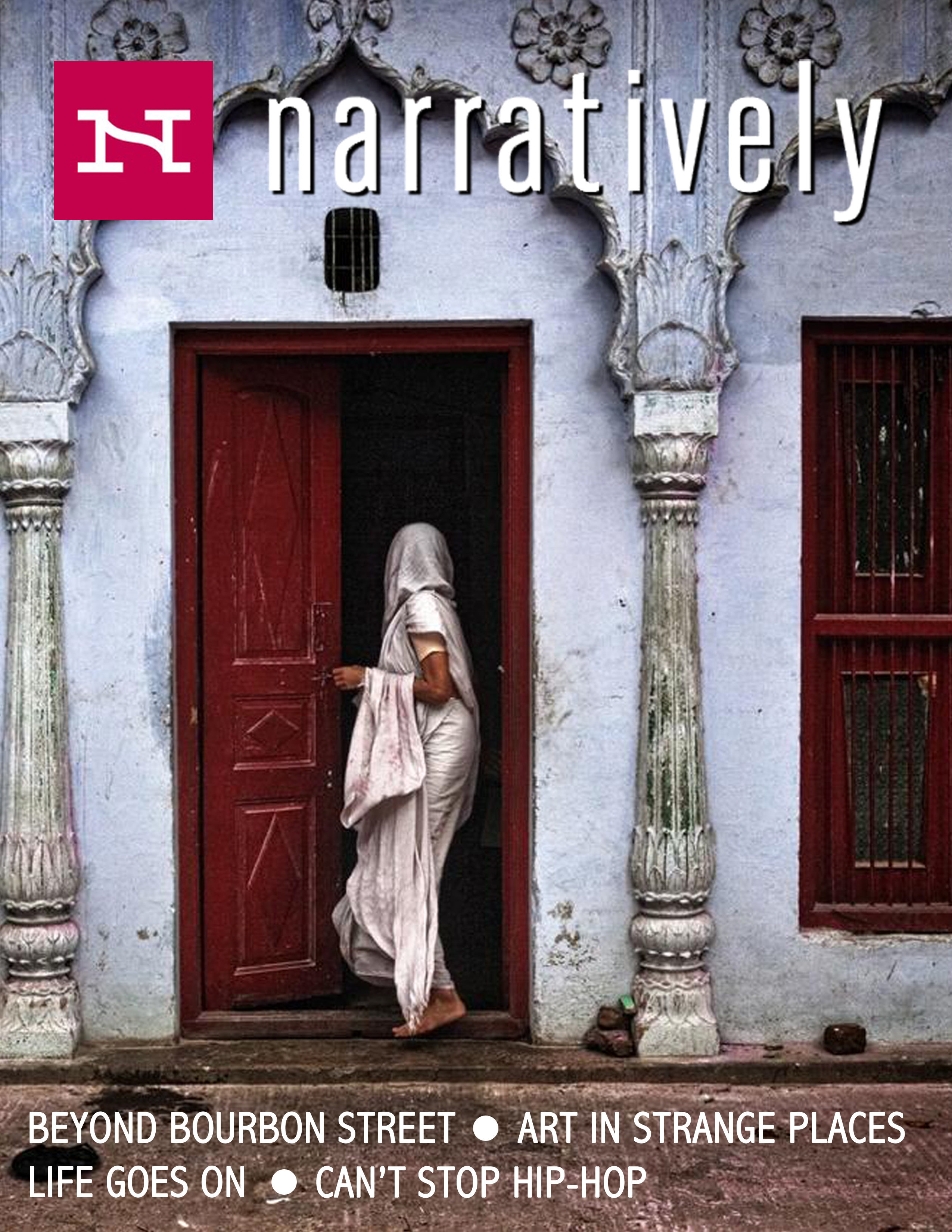
Narratively print edition
This is a design for a potential print magazine pbulication of the website for long-form stories, Narratively. The site covers a different theme or tpic every week and highlights five long-form stories, which can include photo essays, videos, animation, or text, on that them. I imagined this publication to be printed monthly and would feature the beautiful photography that many of the stories have. The cover of the magazine would be one photograph picked from one of the stories from the past month, and the titles of the themes would be printed prominently at the bottom. The magazine would be similar to a photography magazine where the reader can lay back, enjoy the stories and photographs, and eventually display it on their coffee table.
Devyjot Ghoshal, Master of Science in Journalism
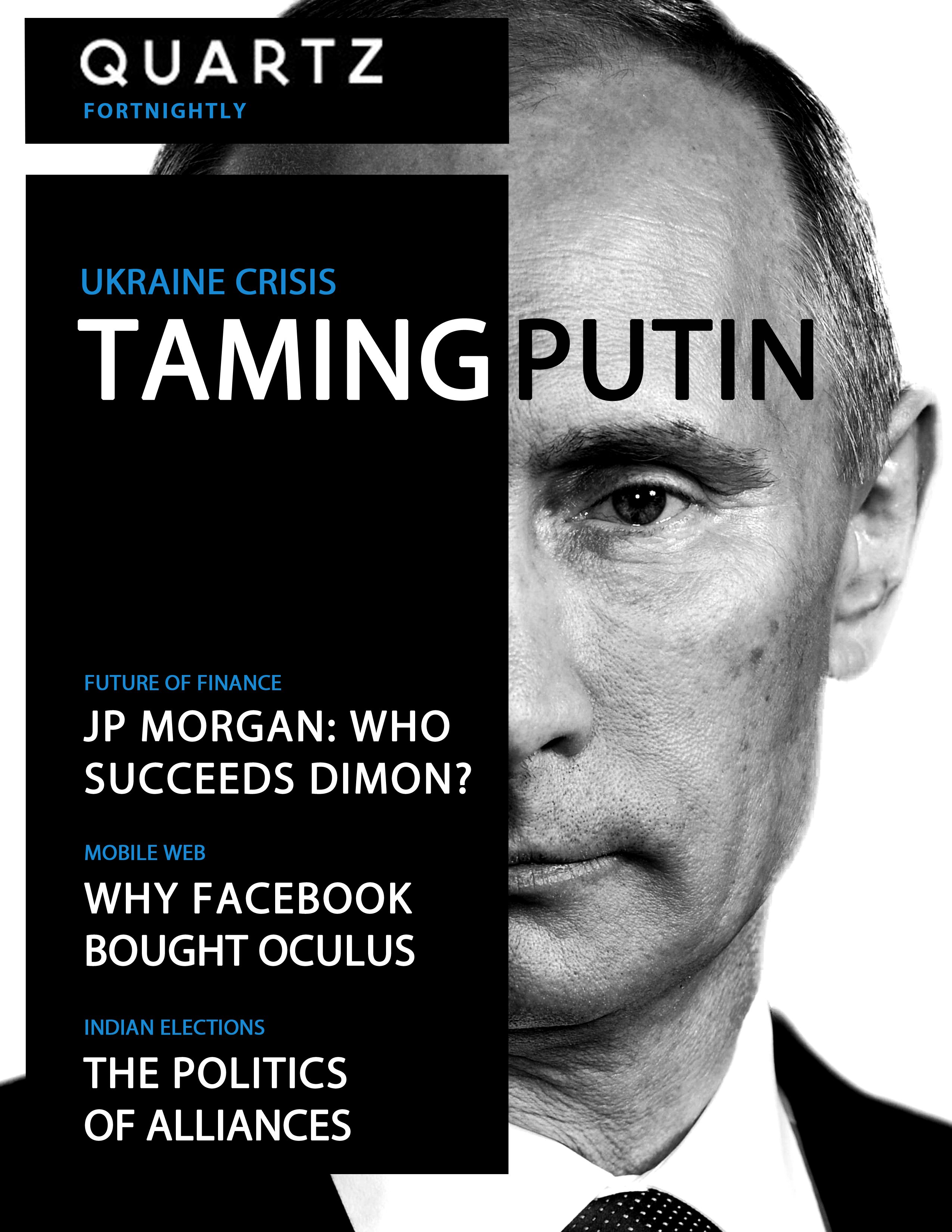
Quartz print edition
BACKGROUND: Quartz [qz.com] is a mobile-first, online-only business publication from Atlantic Media. It describes its readership as “business people in the new global economy”, and its stories are aimed to be at the intersection of essential and interesting. Since it's launch in 2012, Quartz has won critical acclaim and developed an online readership bigger than The Economist in the US.
PRINT PRODUCT: Quartz Fortnightly is a proposed print product that bundles the best of the platform's reporting from two weeks into a smart, slick print product. Although Quartz has a loyal online following, the print product could have two unique functions.
First, since the website is built on an infinite scroll structure, important stories often get buried as the news cycle develops. By using a print product, Quartz could curate not only excellent stories that readers might have missed, but also develop smaller stories into a bigger package.
Second, business publications tend to have strong institutional sales, particularly for print products, which provide critical brand recognition. A well-crafted print product would give Quartz that added visibility and help advance the brand.
DESIGN & INTERACTIVITY: Quartz Fortnightly is designed to mimic the best of Quartz online. The design is clean and simple, dominated by black and white as is the website. The cover has one strong visual, with text layer atop a box to give a sense of the “scroll”, which is central to the website.
Unlike traditional media outlets, Quartz doesn't operate with beats. Instead it has “obsessions”, around which it organizes content. These “obsessions” are in blue (as in the website) and serve a navigation/synopsis function on the cover of the magazine.
Moreover, the modular layout of the cover can be tweaked according to the cover photo, thereby allowing for further flexibility.
In terms of interactivity, QR codes and similar elements could be built into the site. When activated by a reader on their iPad or phone, they could link directly to the web-site to reveal updated and/or in-depth content.
Jeanine Grimaldi, Master of Journalism, graduating Spring 2015
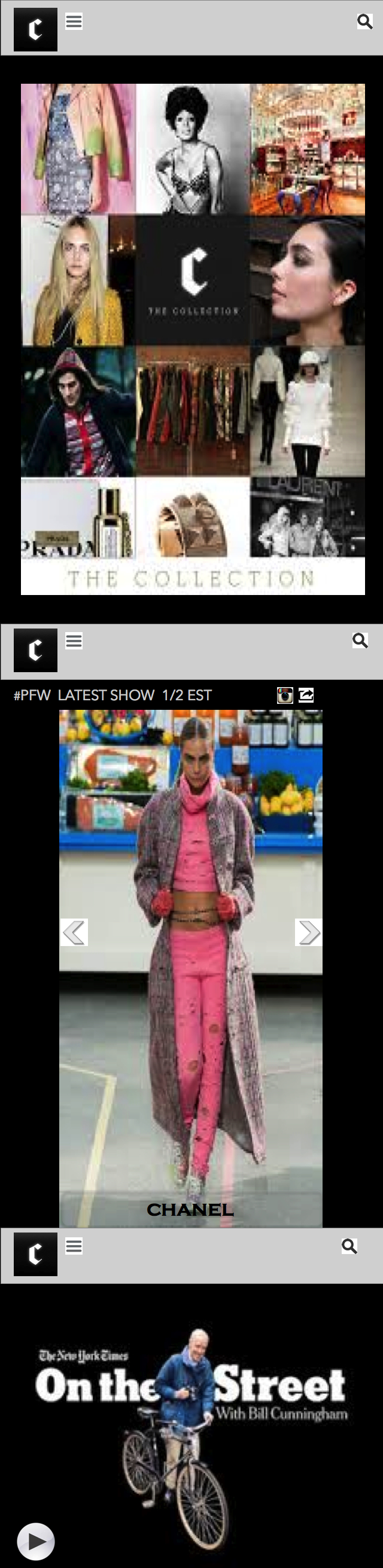
NYT’s The Collection mobile app
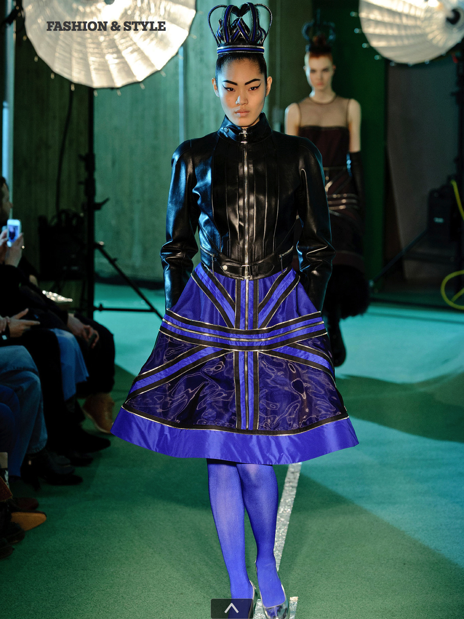
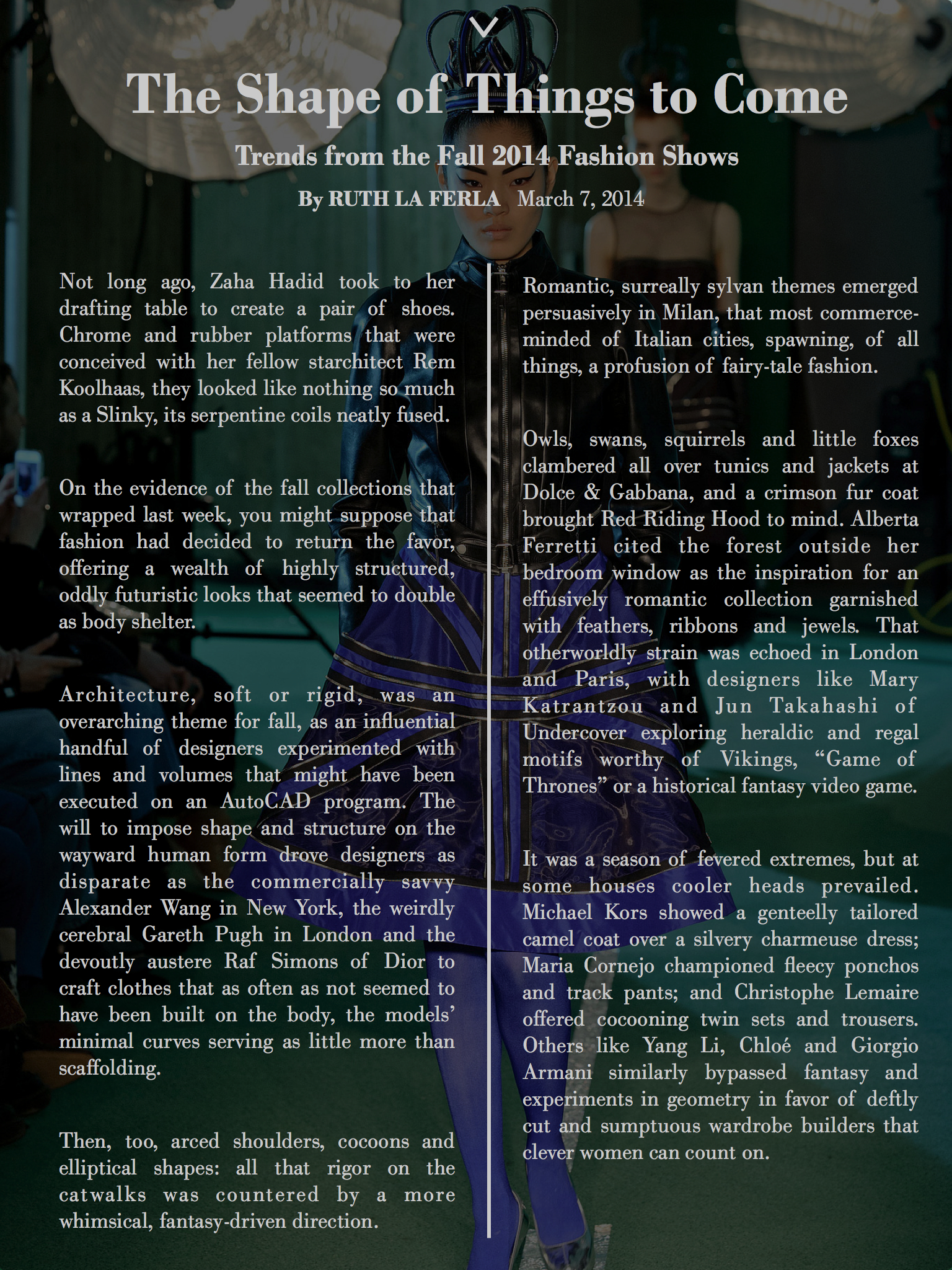
As an avid reader of the NYTimes.com Fashion & Style section, I also downloaded the Collection app (featuring content from the style section as well as T Magazine). Currently, this app is only available on tablet. We learned a lot about the mobile consumer and the need for better mobile design and content from Dr. Garcia and Reed this semester. I chose for this project to be featured because I hope it displays the key selling points of a great mobile content: striking visuals and shareable snack-size content that entices the reader. The opening screen of the Collection mobile app would have squares for different verticals of content (like the tablet app). Readers would be easily able to flip through the latest collection shown at fashion week or watch the latest video report from Bill Cunningham during their morning commute and easily share with their friends on social media. The tablet app has all of these features, but as a consumer I feel I would use it more if it was available on my iPhone.
Mohammed Shariff, Master of Science in Journalism
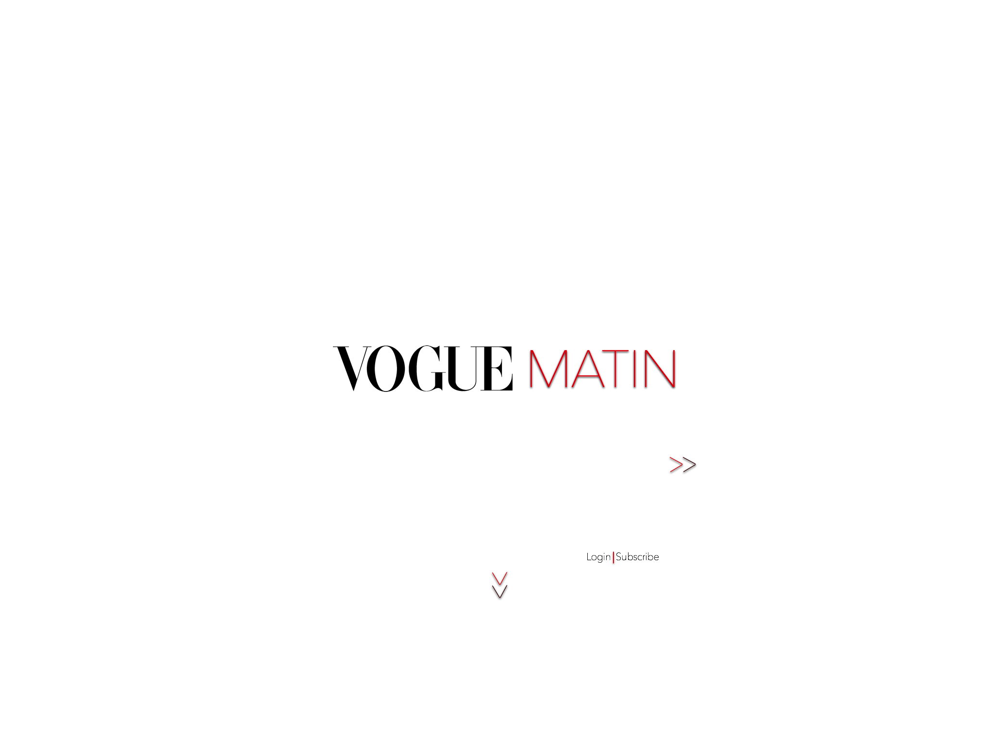
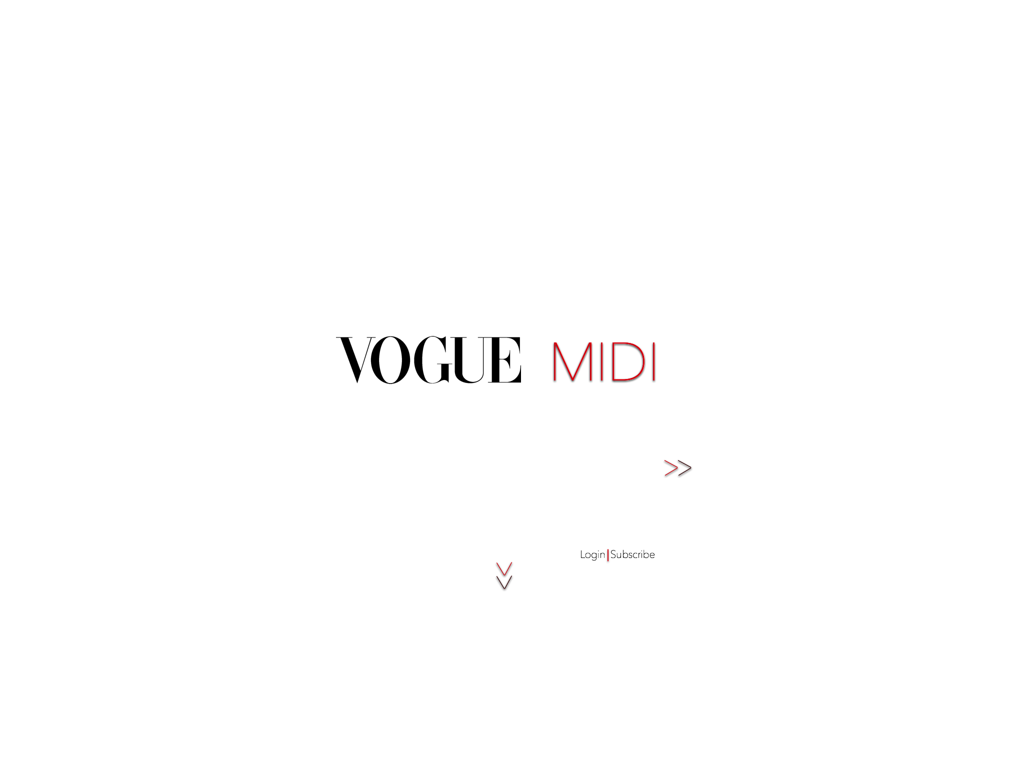
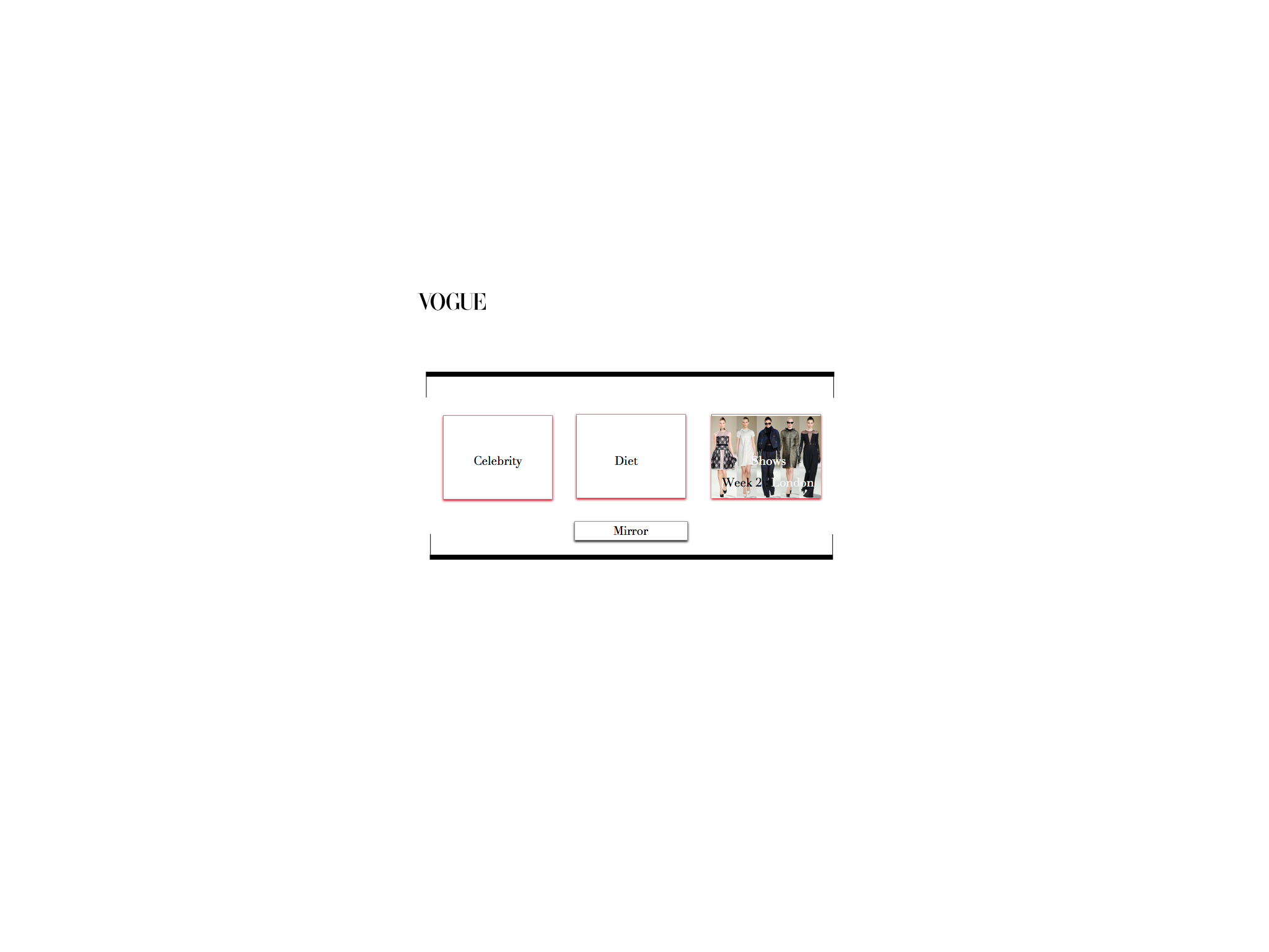
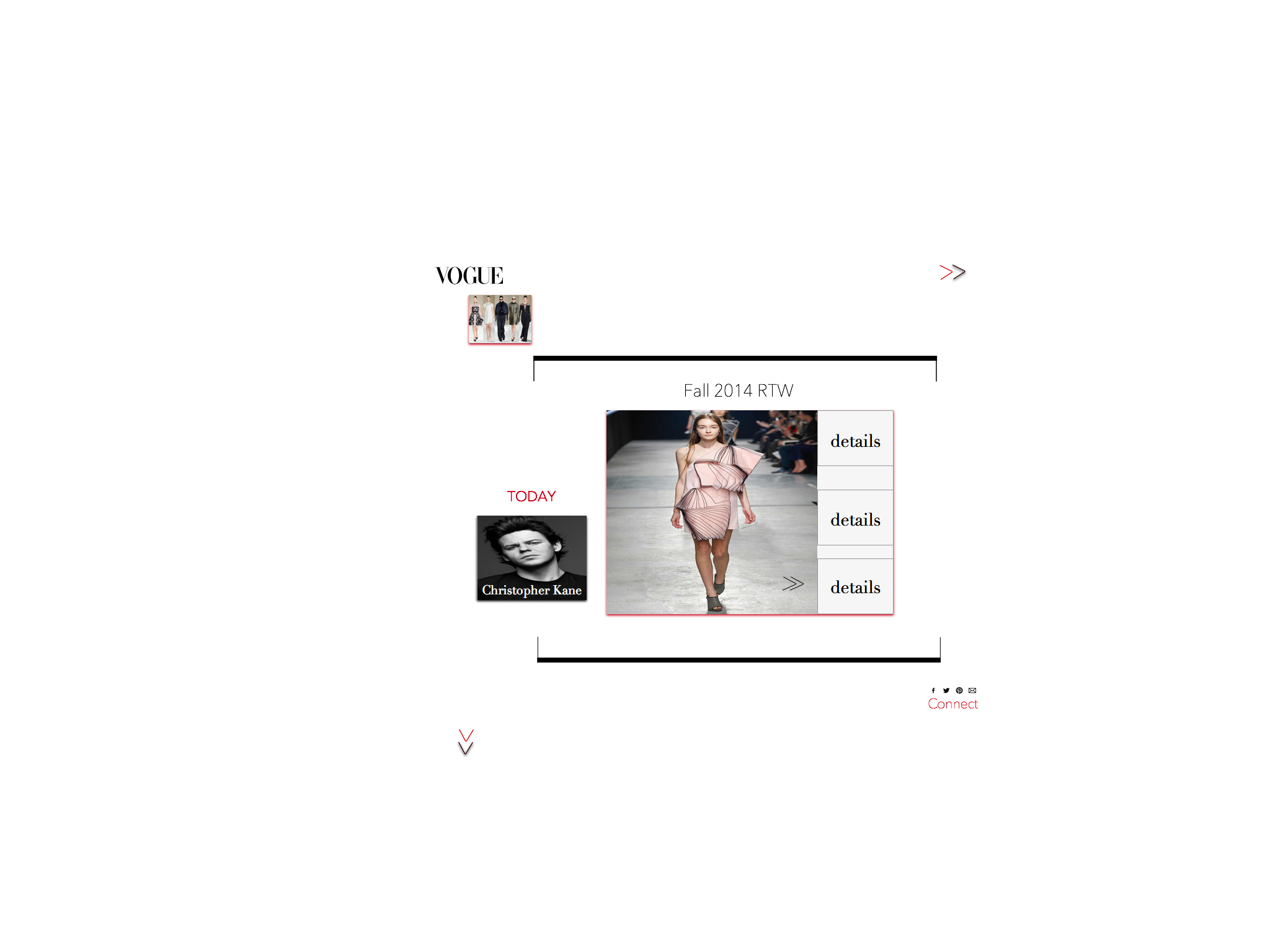
Vogue Daily tablet edition
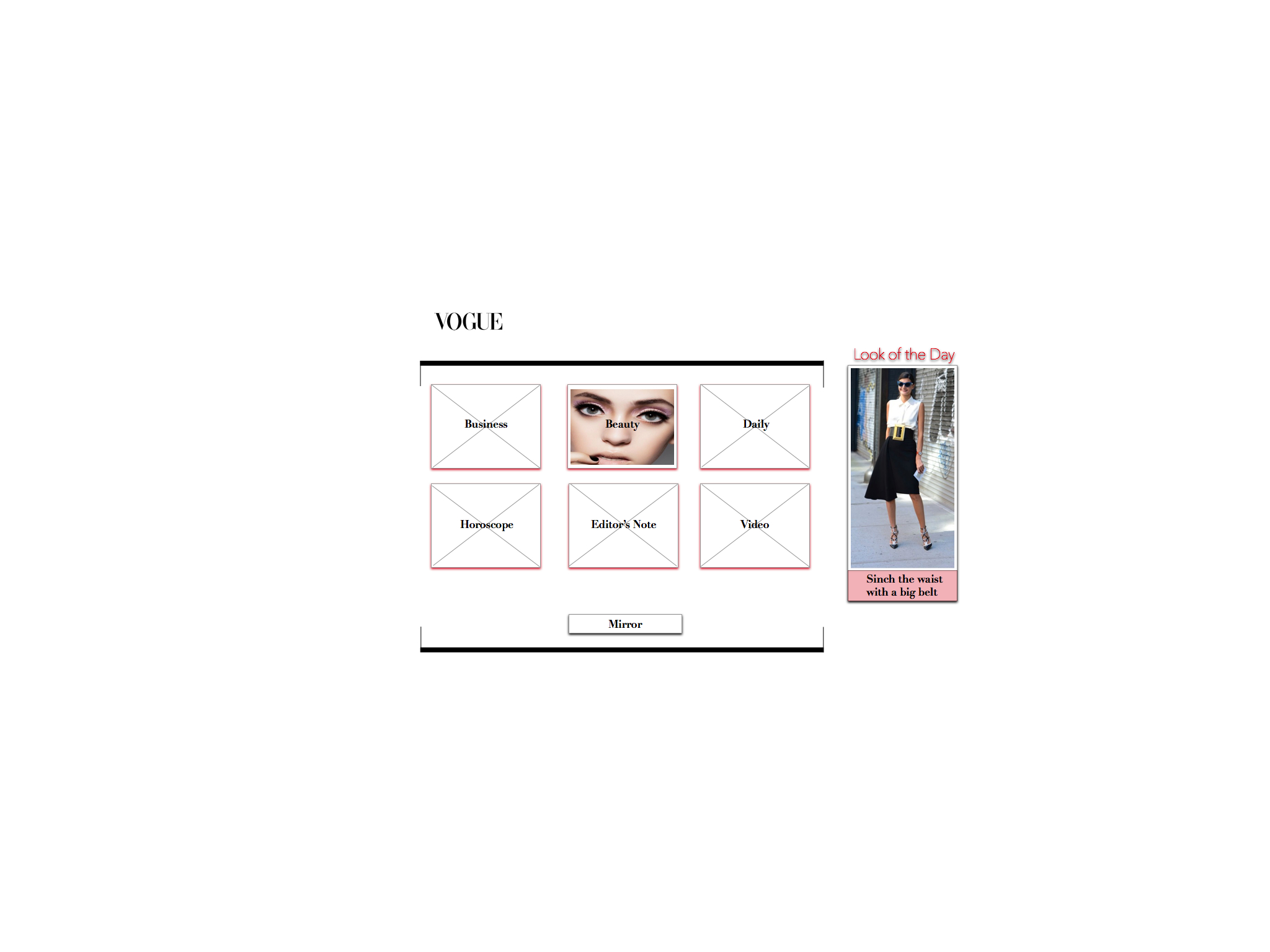
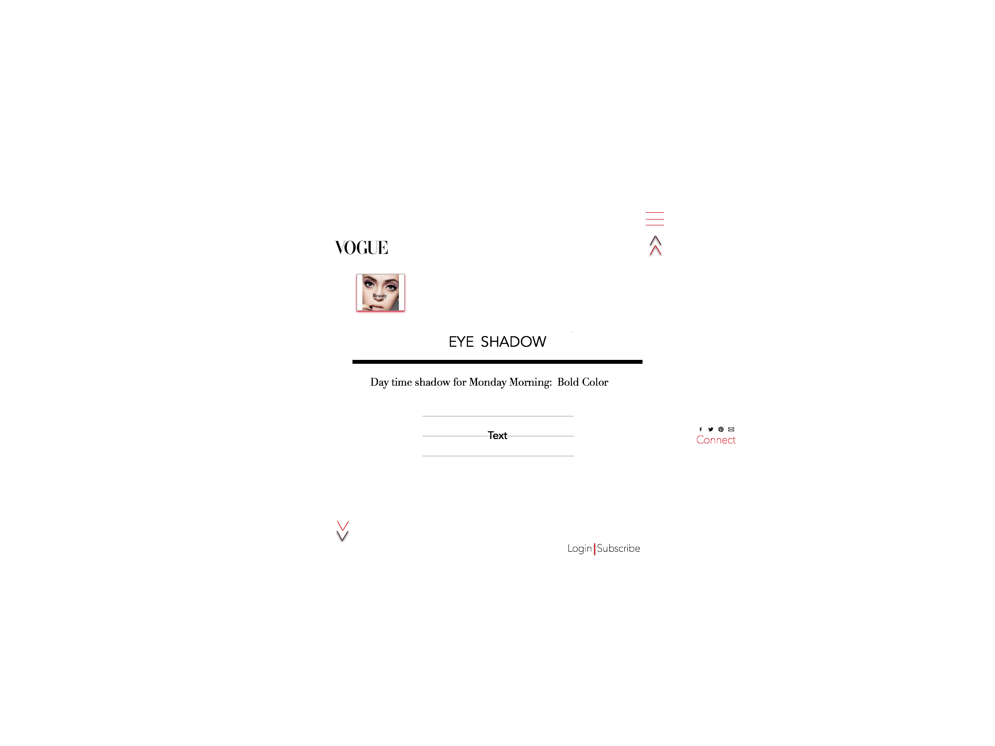
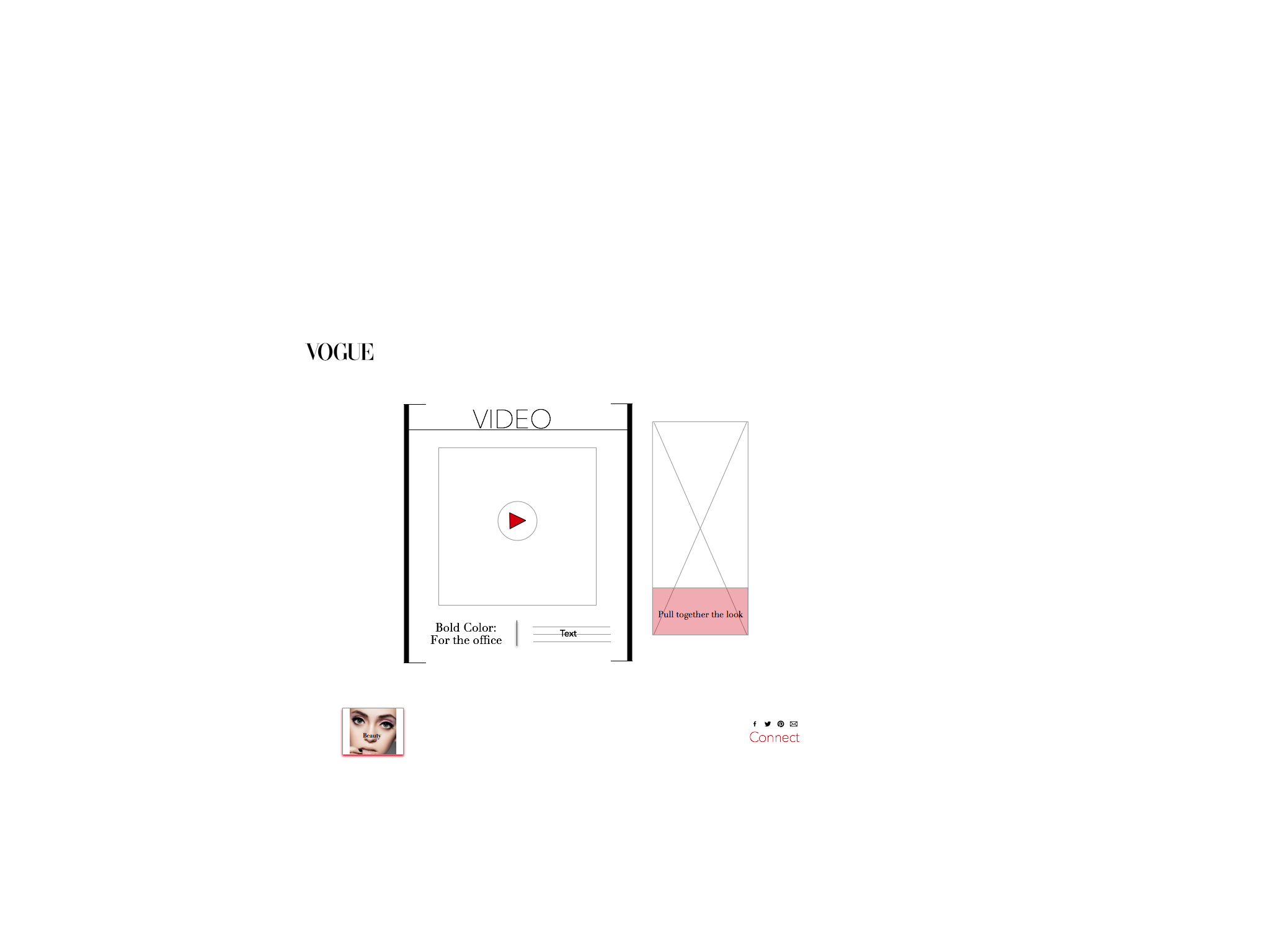
For one of the assignments we were asked to invent a new edition of a journalistic website. I chose to design a daily tablet edition for Vogue.
The tablet will serve as a daily mix of all things fashion. There will be three updates throughout the day: a morning edition starting at 6 a.m., an afternoon edition updated at noon, and an evening edition updated at 6 p.m.
The content will have videos, articles, audio, and photos from editors, designers, models, and celebrities. Fun tutorials with these people will make it a lot more engaging and I imagine it would draw a significant amount of subscribers. Vogue Daily would cost $5 a week. When you click on the mirror it turns to your camera and you can snap a picture of yourself or your outfit and it will be uploaded to Instagram and Facebook with the Vogue icon.
Muzhgan Rasul, Master of Science in Journalism
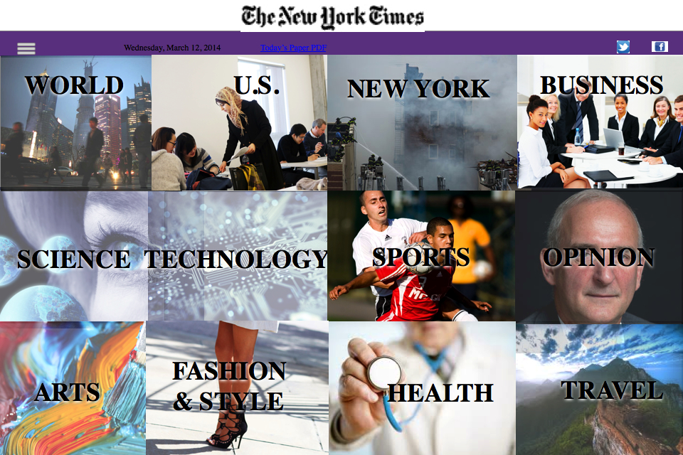
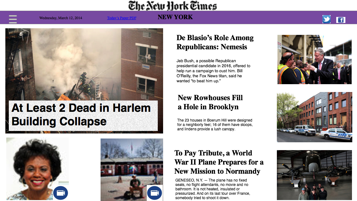
The New York Times tablet
I have chosen to feature this project because many newspapers do not focus enough on their tablet editions. I have learned in Mario Garcia’s class that viewers read more and engage more on the tablet than other platforms. Because The New York Times included its tablet edition in its multi-product bundle as a bonus to regular and loyal subscribers, it should engage its loyal subscribers on that platform because that’s where the readers spend most of their time.
This edition can be updated in the afternoon because it requires some additional multimedia and audience engagement elements. By the end of the day viewers should be able to read more in depth reported stories with analyses in each section, including the opinion section. In the beginning of the day it can have the same stories that were reported for other platforms, but it has to have an element that is specific to the tablet edition, such as video and photo illustrations, and other multimedia and audience engagement elements. If the story is based on data or statistics, graphics and other data visualization tools should be used to tell the story.
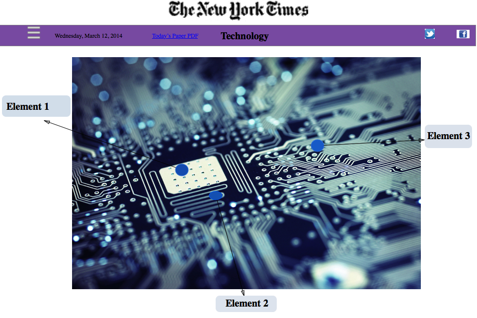
The Technology, Science and Fashion & Style sections should be focused on readers’ engagement. Readers should be able to click on each elements of each photo to view them in a 3-D format to learn more about technological tools and fashion industry. By clicking on a specific element, they can see what it is made from and how it works because the mission of the Technology section is to simplify these stories for readers who don’t know a lot about technologies and to explain it in a simple way using storytelling techniques.