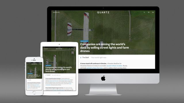
It is a new (responsive) design for www.qz.com
It's a new website for the Quartz website. Several things catch my eye in this redesign. (Our Art Director & Project Manager Reed Reibstein has also written about Quartz, presenting six notable features of the homepage on Medium.)
First, the element of frequency: it is the second redesign for Quartz' website in as many years, a fact that should not be ignored, especially by those of you who are always asking me the question: how often should one redesign a title?
The answer varies, and there is a basic principle I follow: redesign (and/or rethink) when you need it. There is no mathematical formula to the answer. Those days of print redesigns that would be “every 10 to 15 years” are long gone.
In the digital world, where a person comes to visit a “brand” several times a day and may linger on and off between 45 and 90 seconds a day, the issue of frequency for change becomes important.
That is why I like the fact that Quartz has not thought twice about redesigning what was already a good product to make it even better and more visually appealing.
“”In less than two years, Quartz—Atlantic Media’s innovative business news brand—has already gone through three iterations of its site, a fast pace for a media company. We’re keeping a lot of beloved qualities, and upgrading some others in order to continue enhancing the reading experience.,” writes Emily Passer, Quartz'Director of Communications.
This new www.qz.com even has a home page!
Here is how Zach Seward (senior editor) explains why a home page:
“When we first launched, we thought it was helpful to focus entirely on making our stories work well on social media and not worry about much of anything else. Two years later, we think we have the resources and reputation to start giving our readers even more. And we did have ideas along the way, but we didn't want to unveil a homepage until we felt confident that we had the right idea.”
Invisible stories and seductive headlines
Second, the stories and the headlines in Quartz stop you and beg you to read. While the site may have some of the stories of the day that we may have heard about, there is always a headline that advances the story a little further. In most cases, there is an invisible story that you really don't need to read right now, but that somehow you do.
It is no accident that headlines include such words and phrases as “How to…”, “Why..” (something is likely to happen), “The story behind…”, “Here is…” (service, tips, solutions)
Take a look at these:

The new www.qz.com is absolutely easy to navigate
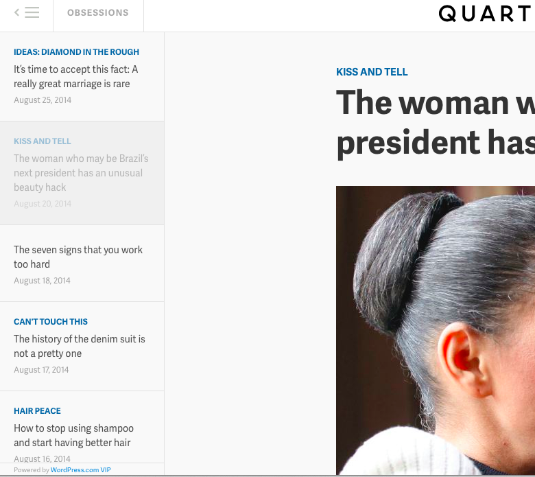
IDEAS: THINK DIFFERENT
Why the Apple-IBM tie-up is doomed to fail, and how it could succeed
(Apple is a focused company. Its financial statements tell the story: Its money is made in hardware. All other activities, such as the important contributions from the App Store, make up an ecosystem that support the hardware volumes and margins. Everyone in the company knows this).
GLOCAL
The story behind India’s rice bucket challenge
( Instead, she has come up with the rice bucket challenge, where people are encouraged to cook or donate a bowl or bag of rice to a poor person.)
HAIR PEACE
How to stop using shampoo and start having better hair
(Turns out that sulfates, the foaming, grease-cutting detergents in shampoo, strip hair of its natural oils and even healthy bacteria)
#@%!
The complete guide to swearing at work
(For those of us with a fondness for profanity, testing the bounds of cursing in the workplace can feel at once satisfying—and fucking terrifying. But fear not, there’s reason to believe that indulging your impulse to drop an f-bomb in the office is worth it, according to some experts.)
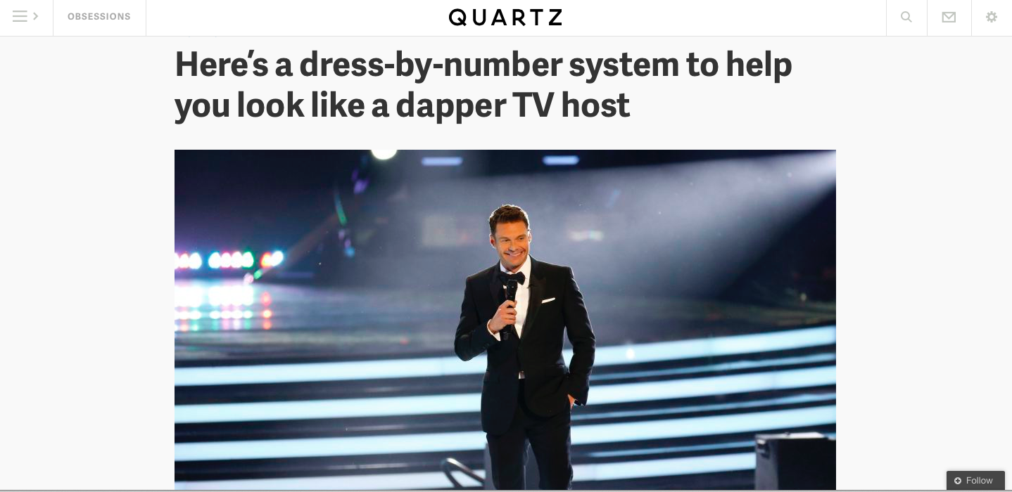
IDOLATOR
Here’s a dress-by-number system to help you look like a dapper TV host
(Indeed, when New York Magazine reporter Benjamin Wallace visited Seacrest’s trailer at American Idol, he found the host’s dressing room “full of suits grouped into ready-to-wear color clusters—black suits with compatible shirt-and-tie-and-pocket-square pairings (and so on for brown, gray, and blue suits)—that let him streamline his dressing process.”)
Inventive advertising strategies in new website
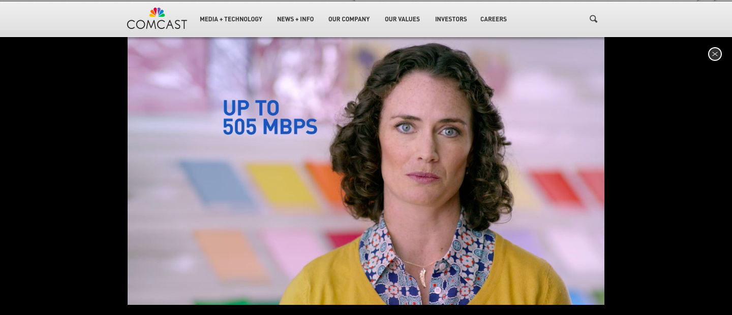
Comcast sponsors The Brief: click on the ad and it is its own mini website
Much is discussed today about native advertising, about being more experimental with how advertising messages are presented on digital and mobile devices,
Here's a quote about the advertising on the new redesign from Joy Robins (VP Advertising & Strategy):
“Quartz was built with ads in mind, not as an afterthought. Our responsive ads, which are organically woven into the reader flow rather than disrupting the experience, are now bigger and even more beautiful—you'll notice this with the full bleed ads across all devices and on mobile where we've tripled the size of our ENGAGE units to take advantage of the constant evolution of mobile screen sizes.”
– we're also offering a new ad placement at the top of “The Brief” homepage (you'll see Cisco there right now) and in line as well
– there may also be sponsored content (clearly labeled) in the top queue of stories when relevant.