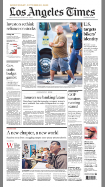
The new front page: a highlight is the larger nameplate as visual lead on the page.
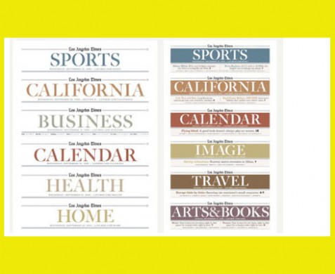
Surprise: color section headers part of a contemporary, not a classic, design.
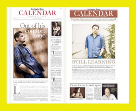
The new Calendar opening page: except for color section header, readers will notice very little change here.
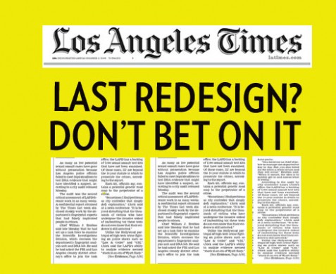
Another redesign, won’t be the last
It is hard to keep with so many newspaper redesigns. Like bank bailout packages, redesigns seem to appear at the rate of one or two per week now. Like the bank bailouts, redesigns aim to cure, to save and to put on a different face on what may be a less than happy situation.
Each of the redesigns unveiled in the past few weeks, some of them mentioned in this blog, have added better navigation to the front page, more color, and, what seems to be a trend, a move towards a more “tabloidy” look and feel.
Perhaps it is just my observation, but we do see a definite trend for the redesign efforts of the Orlando Sentinel, The Chicago Tribune, Sun-Sentinel, and now Los Angeles Times to approximate a look that puts them closer to what we associate with more feature-oriented, tabloid design. In the case of the Orlando Sentinel it is a bit downmarket as well. Wonder if this is a coincidence, or are these titles pursuing the art of attracting a totally different clientele?
Page One remains classic
The Los Angeles Times has always stayed closer to the classic look of The Washington Post or The New York Times in its design. Typographically and architecturally, it has been more snowy Boston than sunny Hollywood, which is why the biggest surprise for me in this latest redesign unveiled Oct. 21 is the use of those section headers with color backgrounds. Looks nice, but it may be the most radical departure from classic to more contemporary or down market.
The larger nameplate, a big plus
However, Page One remains as classic as ever, with more of a sense of verticalism, a robust and larger nameplate at the top and none of the black reverses and overblown navigators of other recent redesigns. My favorite change in the new page one is the treatment of the logo. It is a brand that is recognizable, so why not make it bigger? Good move. It lends the newspaper a retro feel as well. Look in any of Edmund Arnold’s books from the 50s and 60s and you will find large nameplates. At a time when other newspapers have almost swept the nameplate OFF the page, pushing it to the left or right, or simply using an initial letter from the name of the newspaper, the Los Angeles Times says this is who we are and proud of it.
What’s new in storytelling?
It is too early to evaluate this redesign. One must give it a few months to flex its muscles and show what it can do. I don’t see major storytelling techniques changed here, although the huge narrative under the big photo on the first day’s sports page is quite interesting—-is it a caption, a story, a promo? Regardless, it is words that tell a story in large enough type for everyone to read.
Never say this is the last redesign!
Company chief innovation officer, Lee Abrams, in a memo to the staff, has written that the redesign will be the last as he sees the process of change to be more constant and evolutionary.
Well, I would not be so sure, Mr. Abrams. In a world that moves as fast as ours does, with impatient readers and users who get bored quickly with almost anything, redesigns, too, fast become “so 15 minutes ago”.
![]()
For more information about the Los Angeles Times redesign:
http://www.visualeditors.com/apple/2008/10/first-look-la-times-redesign-launched-today/
![]()
Back in Europe, between Zurich and Konstanz, Germany for two days, then back to Delhi on Saturday.
TheMarioBlog posting #126