
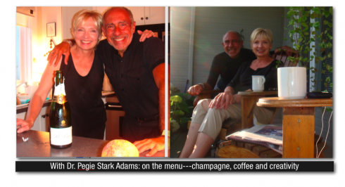
A quick trip to Canada offers more than a chance to visit with my dear friend and colleague, Dr. Pegie Stark Adam, and to enjoy the magnificent hospitality from her and her husband Stuart. While enjoying the pastoral surroundings of Pegie and Stuart’s home, complete with terrace al fresco dining, good champagne, and, yes, an early morning run through the countryside, I also had a chance to become reacquainted with the National Post, a newspaper where design is spelled with a capital D, but functionality seems to be the strategy for every page.
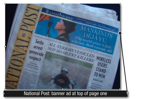
True, the logo of the National Post, and all its inside page headers appear as a vertical unit on the page, but it works, allowing for the rest of the canvas of the page to be utilized for stories, and, for a top of the page ad. Indeed, today’s front page carries a “banner” ad, in the style of online editions.
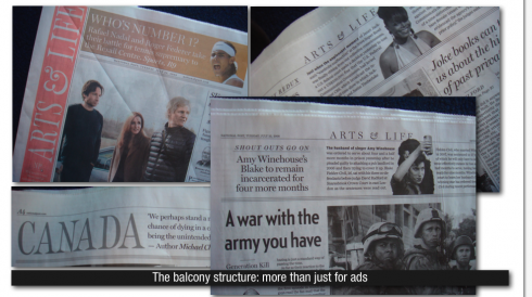
While a balcony concept serves as the top unit of each page, usually for editorial content, it can also house an American Express ad, as we see here. The balconies are all the same dimension, and allow for interesting eye traffic horizontally across the pages. The stories in those balconies pull the reader right in, and do not compete with the rest of what is on the page. These are the type of headlines one finds in those balconies: AS it turns out, less than a second’s worth of Janet’s nipple isn’t that bad, or Amy Winehouse’s Blake to remain incarcerated for four months. Photos of Janet and Amy accompany the short pieces.
The balconies are also used as headers, as in WORLD, EDITORIAL, LETTERS.
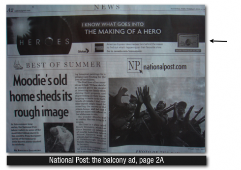
But when the American Express appears there, it is less intrusion, and more a surprise visit by someone you know and welcome.
Many US dailies need to take a page from the National Post’s innovative approach.
AN ELEMENT WE DON’T LIKE: The National Post’s design is 99% excellent, but the bylines are too bold and a little “brutal” for the single column stories; they do work excellently well in those column sigs, but it appears that the same size for both, a standard byline, and a columnist logo, is a bit out of proportion in our view.
WE SEND YOU: www,nationalpost.com
DINNERS WE ENJOY: Pegie’s red skinned potatoes (prepared with a touch of lemon and fresh mint , and Portuguese sea salt) are one of the summer’s surprises. One could smell the minty aroma the moment she placed the bowl of potatoes on the table. Stuart’s grilled steaks, the fresh asparagus and tomatoes, then the strawberry shortcake and vanilla ice cream provided a grand finale. Bubblies and white wine were constant companions as well. Not to mention dinner conversation that ranged from Obama’s prospects, to the techniques of a ballet dancer’s stretching to Yale’s secret societies.
WHERE IS MARIO? Spent the day working with Dr. Pegie Stark Adam and Reed Reibstein on our Yale Daily News redesign. The YDN will launch its new look in September, just on time for the Yale University’s Class of 2012 to get a copy upon arrival on campus. Soon off to Oklahoma City.