TAKEAWAY: Hail the workshop setting to move quickly and efficiently from discussion to execution. The proof of the workshop format is in the success of such projects as Austria’s WirtschaftsBlatt and its Moiblista project where we create a better content flow across four platforms. ALSO: At The Washington Post, a Sunday front page that invites: newsy but full of discovery items
By the end of our two-day workshop: ideas turn into executed sketches for design across the platforms
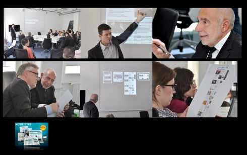
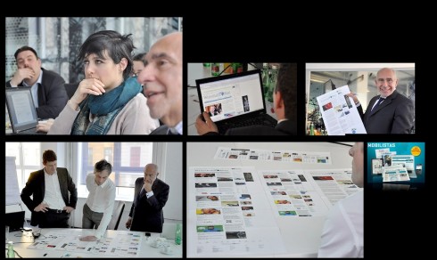
Scenes from the Mobilista 2 workshop/photos by Roland Seper
Top Ellie Tzortzi, digital designer, pays close attention to image on the screen; below from left, Alexis Johann, director of digital publishing, Peter Sempelmann, online editor and I review the first set of sketches for the website/photos by Roland Seper
I spent the last two days of last week conducting the second, very exciting workshop for the team of Austria’s financial daily, WirtschaftsBlatt.
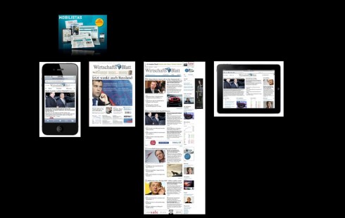
We have worked together on the specifics of the Mobilista project since November 2011. The idea? To create a better and more seamless operation for the flow of content across four platforms: mobile, online, print and tablet.
Under the leadership of Alexis Johann, director of digital publishing, and with the presence of Dr. Hans Gasser, publisher and general manager, we have made great progress utilizing my preferred workshop setting. Playing key roles in our workshop: online editor Peter Sempelmann and digital designer , Ellie Tzortzi.
About the workshop format
For about three years I have switched from a more formal type of discussions leading to action to the workshop format which leads from discussion to solutions that are visible and ready for discussion within the timeframe of the workshop, usually two days.
Forget the days when one got a briefing and returned six weeks or more later with our interpretations of how those views could be presented.
In today’s environment, as I often remind my clients, three weeks is like three months.
Two days, indeed, is like a month. People communicate faster, expectations are higher and impatience sets in.
Practically, speaking, from the point of view of the consultant/designer, it is better to leave the scene of the workshop with an idea of where we stand, what the group likes (or doesn’t), and all of this makes the next step more effective.
Back to Mobilista
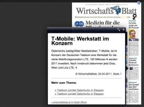
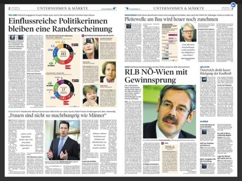
In the amazingly <a href=”https://garciamedia.com/blog/articles/the_design_of_this_newsroom_merits_a_second_look/<br /> ” title=“functional and attractive newsroom”>functional and attractive newsroom</a> of the <strong>WirtschaftsBlatt</strong>, we have gathered now twice, for two day workshops in which we have analyzed the specific needs of this financial media house, where, as we well know, the audience is different, more focused and demanding. The importance of news in real time is key to those who read the WirtschaftsBlatt, representing the business decision makers of Austria and Eastern Europe, since the newspaper specializes in coverage of the ever expanding economic news of these emerging countries that are Austria’s neighbors.</p> <p>During the course of this last workshop we set our goals early: to arrive at a finalized version of how the new website for the <strong>WirtschaftsBlatt</strong> will be organized.</p> <p><strong>Step 1: Information architecture</strong><br /> We spent a half day discussing what areas are important to the users of the website.<br /> Narrowed the scope to four major sections. The design followed from there.</p> <p><strong>Step 2: The look and feel</strong><br /> The new WirtschaftsBlatt will be representative of what I call the new wave of news websites, sophisticatedly simple and uncluttered.</p> <p><strong>Step 3: Responsive design</strong><br /> Following in the steps of such successful recent website redesigns, as that of the <a data-cke-saved-href=” http:=”” www.bostonglobe.com”=”” title=”Boston Globe”>Boston Globe, we have worked with responsive design, one look and feel and architecture that adapts to all screen devices—mobile, online, tablet.
Step 4: The new tablet design
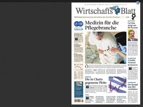
Already, the WirtschaftsBlatt has a highly successful tablet edition, a pdf of the printed newspaper with the caveat that it is constantly updated. Users like it and would NOT want it changed. So, in our workshop we have decided that, while keeping this very well liked tablet edition, we will also move to a more curated type of tablet edition. The combination of offerings should attract newer users, and please those existing ones very much.
Step 5: Integration of the newsroom
Last, but a strong and definitive, NOT least: A very important part of our workshop is getting editors and journalists to see themselves as working across platforms. “You are in the storytelling business and not in the newspaper business,” I have reminded the editors, a very young group, I must add.
Part of our workshop dynamics has included tips for how to give stories longer legs: get audio here , or video there.
The view from the project director
For Alexis Johann, project leader, the workshop approach constitutes a fast and efficient way to get his team on board, and for results of all deliberations to be seen quickly.
It was amazing for me to see, how much progress we made in just two days. We solved problems that we had been working on for weeks before.
Getting the enormous know how and rich experience of Mario Garcia together with the creative potential of our designer Ellie Tzortzi made it possible to elaborate a design that will be a landmark in Austrian news websites.
Not only that, but our Mobilista workshop made great progress with our project to prepare the newspaper for the mobile and social media revolution. I am confident that we will be able to expand our reach, once we start implementing it.
Peter Sempelmann, online editor, interviews me (in German)
http://www.wirtschaftsblatt.at/home/international/people/leidenschaft-kann-toeten-511320/index.do
Our previous blog posts on Mobilista workshop:
https://garciamedia.com/blog/articles/print_makes_an_unexpected_appearance/
https://garciamedia.com/blog/articles/news_websites_prepare_for_next_generation_less_is_best/
https://garciamedia.com/blog/articles/in_austria_the_wirtschafts_blatt_uses_cross_media_to_attract_subscribers
About responsive design:
https://www.garciamedia.com/blog/articles/the_new_boston_globe_website_innovative_functional_sets_the_pace
https://garciamedia.com/blog/articles/an_interview/
The WirtschaftsBlatt existing tablet edition
For ereader of the WB
https://garciamedia.com/blog/articles/theipadlab_e-reader_apps_with_something_extra
Here is how the front page of the newspaper appears. Notice icons on certain stories that have updates
Here is how update looks when user clicks on the icon
Double page spread with updated story
Video shows the process
What the Sunday front page should be
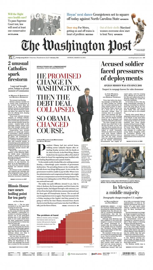
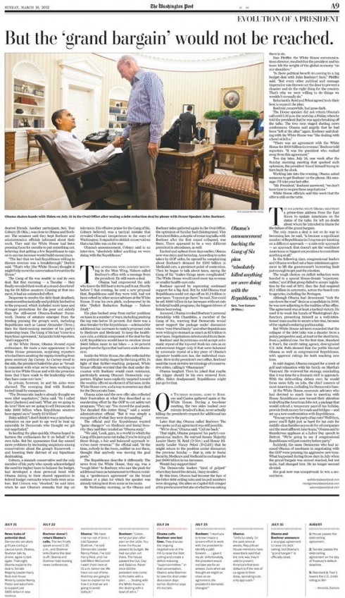
The Washington Post’s Sunday front page: March 18, 2012/courtesy of Jon Wile
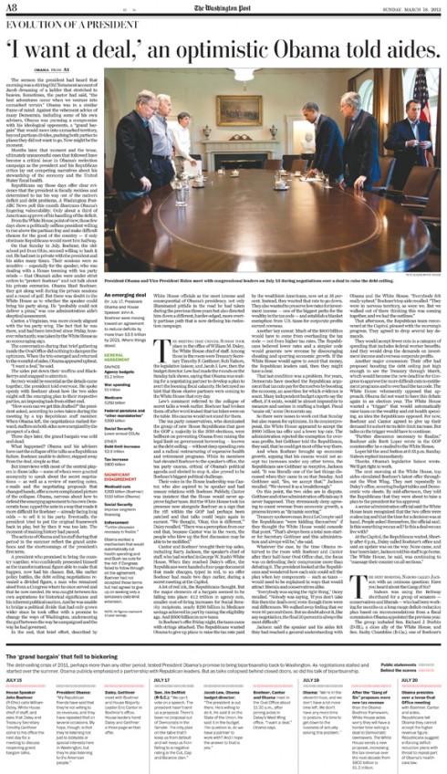
Inside pages develop the Obama centerpiece story across double page spread
At The Washington Post, the Sunday newspaper continues to evolve as one we should keep an eye on. Senior designer Jon Wile sends me this page from yesterday’s Sunday edition.
As you may recall, when I had the honor of working with Jon and the rest of the WaPo team on some enhancements of the Sunday package, the front page took center stage. We created a new set of above the flag promos, with light colors and a more open environment; however, the thrust of the project was to also give the A1 page a sense that there is both reaffirmation and discovery for the reader.
Printed editions of weekend newspapers rank on my list of the most important thing editors and publishers can do to give print a much needed boost. At the Washington Post this is happening. The front page here is representative of how a front page should be: Notice that this front is newsy, with plenty of elements that tell the Sunday morning reader that the team was involved with gathering important news, but the centerpiece on Evolution of a President: Obama and Washington is the one element of that page that is not connected to timely news; it is the piece that makes the reader go back for a second or third coffee and lean back to enjoy it; at the end, the reader feels satisfied and better prepared to discuss the subject when it comes up. The page also invites to this full banquet of offerings on the inside.
Jon Wile explains how the Obama front page came to be:
“The Obama front was the work of many. I was brainstorming Wednesday night with Brian Gross (Sports art director) about how to design this story since we didn’t want to see a big photo of Obama. That would have been expected. So what are the alternatives?
“Brian got me intrigued by the idea of a type attack. I have an illustration and type book on my desk that I occasionally use for inspiration. I flipped through the pages and started to sketch different ideas. The next day Janet Michaud (Design Director) and Greg Manifold (Deputy Design Director for News) helped mold the idea and push forward on the graphic at the bottom.
“On Friday, Janet helped me search over an hour for the PERFECT cutout, something that had mood and Obama looking contemplative. We searched through about 1,500 full-length shots in Getty, narrowing it down to five before settling on the image you see on the page. I also started to write the headline that day, noticing that the type attack worked best when we had three statements in rhythm. Adding some space and color made the all caps treatment a little easier for a reader to digest. The final piece of the puzzle came on Saturday evening when Tim Curran (Sunday editor), J.J. Evans (copy editor) and myself worked on the final display type together. The name of the series is “Evolution of a President,” so I explained my desire for the three statements with one word in each line highlighted to show Obama’s evolution. “
Bravo for Jon and the team!
Those weekend editions
We will be discussing weekend editions more fully in the next few days, as we put finishing touches on what will be a great and new weekend edition for De Telegraaf of the Netherlands.
Yes, that very visually peripatetic newspaper that close to one million Dutch readers come to daily, is making some changes for its weekend edition, starting in April. Together with art director,Hans Haasnoot, , our art director for Garcia Media, Christian Fortanet and I are busy putting finishing touches to what will be an energetic and fun series of additions to the De Telegraaf for weekend.
‘From day one, working with Mario Garcia and Christian Fortanet, made it possible for De Telegraaf to create a completely new supplement in a unique presentation, without loosing the ‘connection’ with the past,” says Hans.
Print thrives, especially on weekends, and De Telegraaf’s new offerings will probably be an example for others to study!