This is the weekend edition of TheMarioBlog and will be updated as needed. The next blog post is Monday, May 4.
It’s s whirlwind for the publishing world as conferences gear up and publisher, editors and designers flock to seek counsel, to check out what other publishers are doing and to rethink their products.
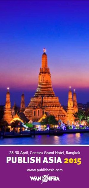
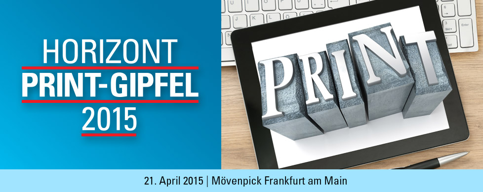
It’s been a very busy last two weeks for me as I have delivered keynote presentations at two conferences in Germany (Horizont Print Summit) and Thailand (Publish Asia 2015), while conducting a workshop for the Philippines Daily Inquirer in Manila.
The themes are similar: lots of challenges for the media today, an attempt to redefine the role of print and plenty of discussion about the organization of newsrooms in the era of the media quintet.
My themes have been focused and consistent, with about five takeaways as the main advice I can offer newsrooms globally:
1. Consider the issue of frequency— and recency. The printed newspaper has lost the time advantage for breaking news
2. Reconsider the issue of the two tempos— lean forward, lean back.
3. Don’t romance print, but redefine its role within the media quintet4. Bring elements of the digital mentality to print.
5. Consider the presence of a mobile editor in your newsroom.
What’s the reaction?
What is different from what it was like even one year ago is that publishers are editors realize the importance of change.
They are also less skeptical about such new platforms as smart watches, and how these will require new storytelling formulas.
Overall, there is a combination of excitement and fear of the unknown, but editors like the reassurance that print is not suddenly dying, but it does require our attention.
What are the disappointments?
I am disappointed in two areas after talking to dozens of publishers, editors and art directors:
a. There are too many newsrooms where large gaps exist between all things print and digital. They operate with separate teams and often in separate floors or buildings. This should not be happening in 2015.
b. There seems to be disdain, on the part of a minority of the editors, about such new platforms as the smartwatch. It is the same type of ignorance first exhibited towards online editions and then mobile editions such as the iPhone. A successful media organization can’t afford to turn its back on the new platforms, and I have no doubt that smartwatches are going to be a vibrant and essential platform, and we must be prepared for it.
I have left both the Horizont Print Summit 2015 in Frankfurt and the WAN IFRA Publish Asia 2015 in Bangkok full of optimism and hopeful that more newspapers are going to begin building paywalls, naming mobile editors, rethinking their print products and considering alternative storytelling templates for their mobile devices.
WSJ online: was it that long ago?
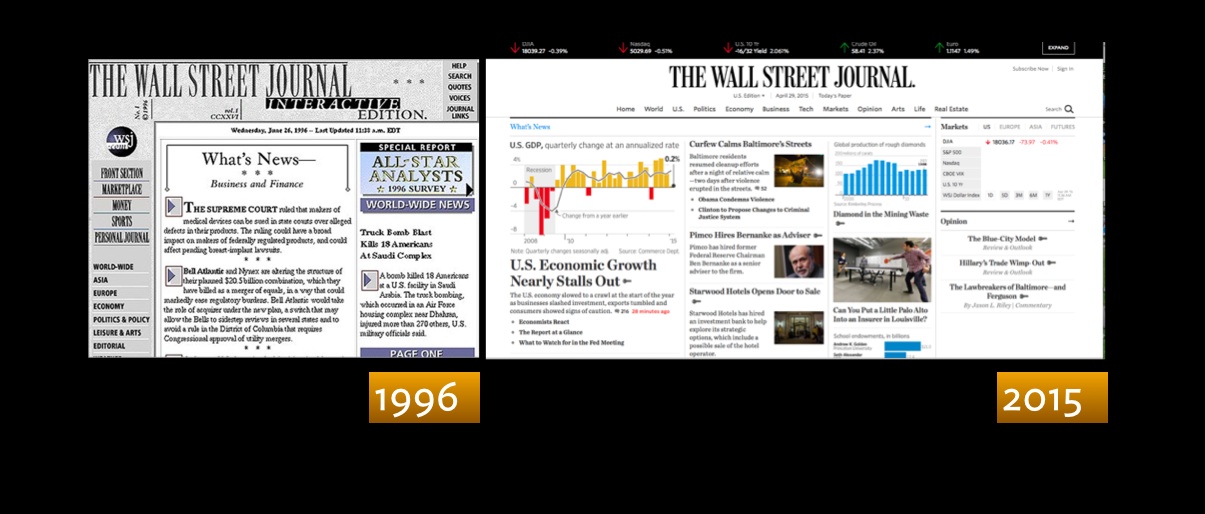
Wall Street Journal launched its first online edition in 1996
Highlight:
On April 29, 1996, The Wall Street Journal launched its first full online news site. It was called “The Wall Street Journal Interactive Edition.”
The newspaper had earlier experimented with an online dialup service and a money & investing website.
Fonts and your resumé
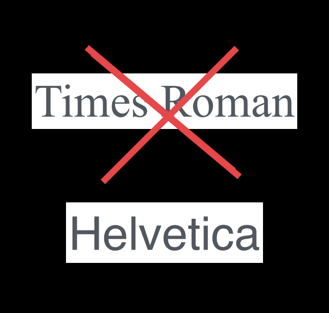
Ouch! No Times Roman in your resumé
The Best and Worst Fonts to Use on Your Résumé
http://www.bloomberg.com/news/articles/2015-04-27/the-best-and-worst-fonts-to-use-on-your-r-sum-
Using Times New Roman is the typeface equivalent of wearing sweatpants to an interview
And the winning font to make a good impression: Helvetica.
No surprise there with the always functional, durable and minimalist Helvetica.