This is the weekend edition of TheMarioBlog and will be updated as needed. The next blog post is Monday, Sept. 17.
Update #4 Friday, Sept. 14, Miami, 13:00
TAKEAWAY: It is, by all standards, an iconic newspaper: USA TODAY has inspired a generation of journalists and designers globally with its color, use of graphics and short stories. Now, 30 years later, it unveils its major redesign of consequence today. This week, TheMarioBlog, has reminisced about USA TODAY and how it has forever changed our idea of newspaper design. Part 5 today: it’s launch day.
USA TODAY is planning a major relaunch of its newspaper, website and mobile platforms, complete with a new logo today, the day before the newspaper turns 30.
High expectations for launch day
I can’t recall so much anticipation and excitement over the redesign of a newspaper in a long time. Today, it’s more likely to see this sense of anticipation with the introduction of a tablet edition, but not necessarily with print products.
However, with USA TODAY, the expectations are high, perhaps because the industry wants print to do well. Editors long for headlines that have positive connotations for a print product.
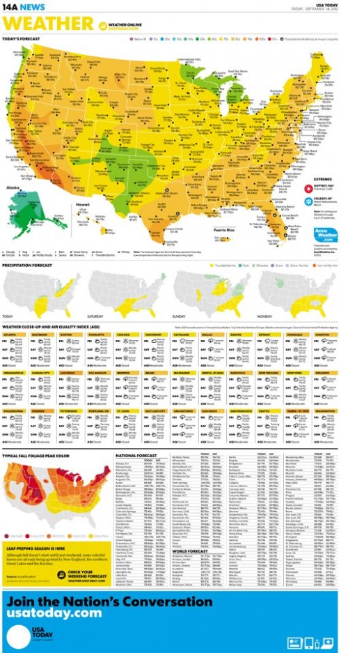
USA TODAY’s new design could remind us of all that which print can do so well—-and not just through a full page weather map that is also tremendously useful and visually appealing.
In a way, what today’s launch of the new USA TODAY translates to, hopefully, is the answer to these questions:
How does a well known and iconic newspaper reinvent itself to tackle the challenges of a multi media society?
According to the official press release, “ the next generation of USA TODAY is an evolution of the brand, with a bold new look that takes visual storytelling to the next level.”
How will USA TODAY define the role of print, specifically, and considering that its audience is tech savvy, sophisticated and well armed with every gadget that provides them with instant news, information and gratification?
In the words of Larry Kramer, USA TODAY president and publisher, “We are making a real investment in USA TODAY, and putting a major focus on reinvigorating the value of print media while introducing new digital products in order to provide our readers with a unique perspective and relevant context on a full range of issues, across all mediums.”
How will USA TODAY position its print product in the midst of a media quartet that involves smartphone, online and tablet editions?
f you read the official press release, it reminds us that “for the brand that invented news on the go, USA TODAY’s new digital offerings reimagine the way to deliver breaking news, money, sports, life and more to all platforms in exciting new “
“We are revolutionizing the way we cover and distribute the news in relevant ways that inform and entertain our readers. This redesign will highlight stronger voices, and further cement USA TODAY’s status as one of the nation’s premier news outlets that continues to reflect the American experience. We are America’s newspaper and we take that responsibility seriously,” Kramer said.
And a question that I would like to ask USA TODAY’s visionary creator, Al Neuharth: If you were assembling a team to start your dear USA TODAY in 2013, would there be a print edition? For now, I have sent the question to Mr. Neuharth and wait for his reply.
Was this a consideration on the part of the team trusted to make the changes we see today? There is one thing we do know, those inside USA TODAY to whom I have spoken feel great pride in the product that is making its debut today.
Sam Ward, senior illustrator at USA TODAY, describes the new design this way:
There’s nothing out there like it.
Taking a look at the new design
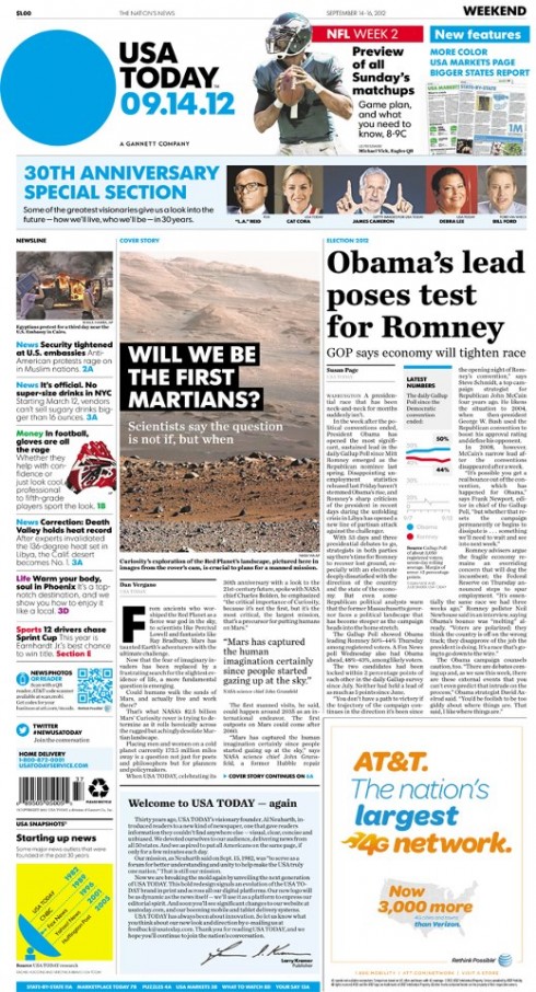
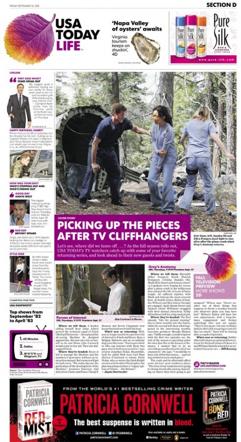
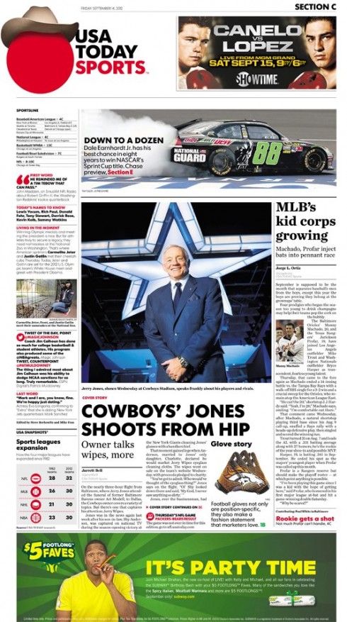
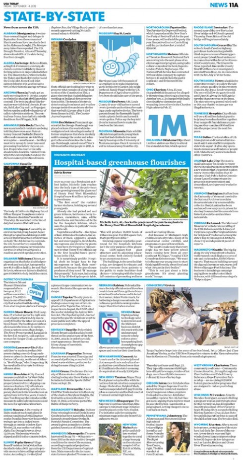
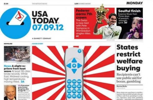
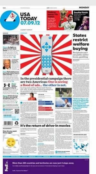
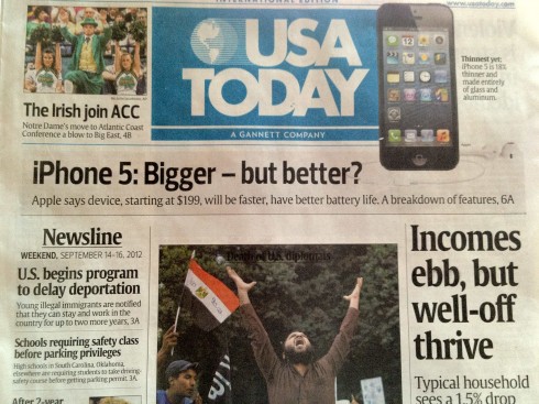
Here is the front page of this weekend’s edition for USA TODAY. Definitely a more text-driven front page, as if, upon turning 30, this new USA TODAY assumes maturity via the small type
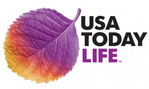
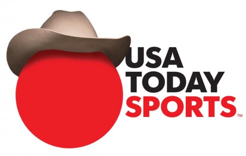
Circles in logo will probably be the most copied item from this new design of USA TODAY: I can see them already, circles in every color lining up at the door of Design, Inc.
Here is the prototype model of the new USA TODAY released just as the new look was to be unveiled
Here are some first impressions after taking a look at pdf versions of Friday’s edition of USA TODAY as it premieres its new look:
Overall look & feel: First impression: a bold, still colorful and contemporary look. It is important to see that the right hand corner, top of the page, the HOT box area, is still well guarded for navigation to inside stories. Good move. What impresses me the most is that the so called McPaper is now a more text driven newspaper, for which short items are not the premium. Perhaps a realization that the short takes will come through digital platforms, while the printed edition may be a more substantial read.
The new logo: Gone is the square pill box treatment of the blue logo and in is a circle, with the distinctive blue connecting us to the familiar. The first word that comes to mind, seeing it only on a pdf version, is “limp”. However, we are likely to see more of these styles of smaller, less “in your face” nameplates for printed newspapers, a combination of saving the real estate of the front page for news and navigation and less for branding. Wonder if they considered staying with the familiar square logo? Will the logo be organic in that there will always something coming out of the circle? That could be interesting and according to the official USA TODAY press release announcing the changes: “USA TODAY’s logo was redesigned to be as dynamic as the news itself. The logo will be a live infographic that can change with the news. It is simple and straight to the point, providing the opportunity for the newsroom to highlight the stories that matter to the nation. This approach builds off of USA TODAY’s long-standing leadership position in visual story-telling. Representing the pulse of the nation, the logo will be used as a platform to express USA TODAY’s editorial spirit – fun, bold and impactful. “
For an explanation of the use of circle in the logo, go here:
http://jimromenesko.com/2012/09/14/usa-today-explains-its-cool-balls/
The new typography: Futura makes an appearance here. It is a custom version of the legendary font, by the type foundry Bold Monday.
Other features:: I have only seen two inside section openers of the prototype so far, so will reserve my comments. The circle concept of the logo continues throughout the inside.
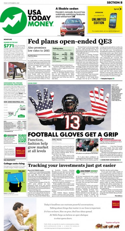
—The Tech and Travel sections have been expanded to include increased coverage.
—Advertising: the new USA TODAY will provide a premium advertising environment across platforms, in what the press release describes as “ opening up the entire browser canvas for marketers to present their products to consumers, enabling them to deliver the emotional impact of television and the drill-down capability of digital.”
Collector’s item
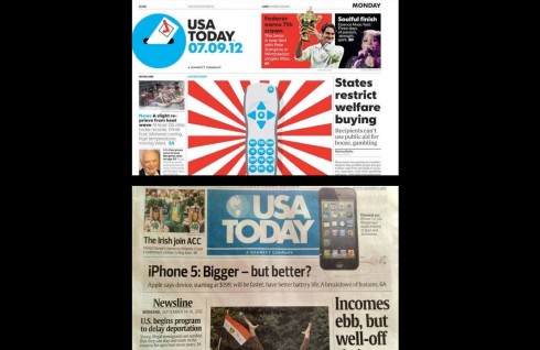
The European edition of USA TODAY for this weekend still sports the old look. I consider my copy a collector’s item.
Of related interest today about USA TODAY
USA TODAY doubling color in redesign
http://www.newsandtech.com/news/article_367cc940-fdbc-11e1-a0d4-001a4bcf887a.html
USA TODAY to introduce new, sleeker look on Friday
http://www.nytimes.com/2012/09/14/business/media/usa-today-to-introduce-new-sleeker-look-on-friday.html?_r=3&ref=business
Best quote:
Christine Haughney points out that “as the newspaper starts to look more like a Web site, its new Web site, which is being unveiled this weekend, reads more like an iPad, with scrolling from page to page, instead of clicking.”
A closer look at the hints we’ve seen of the new USA TODAY
http://apple.copydesk.org/2012/09/13/a-closer-look-at-the-hints-weve-seen-of-the-new-usa-today-redesign/
In USA Today Redesign, Hope for a New Canvas for Web Advertisers
http://adage.com/article/digital/usa-today-redesign-hope-a-canvas-web-advertisers/237183/
Video
http://m.youtube.com/#/watch?utm_medium=twitter&feature=youtu.be&utm_source=twitterfeed&v=SwFEX3KMstE&desktop_uri=%2Fwatch%3Fv%3DSwFEX3KMstE%26feature%3Dyoutu.be%26utm_source%3Dtwitterfeed%26utm_medium%3Dtwitter
Industry experts chime in on their USA TODAY experiences
Steve Dorsey: Detroit Free Press
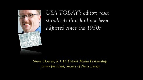
Steve, who is vice president of R+D, Detroit Media Partnership (agent for the Detroit News and Detroit Free Press ), was also the 2011 president of the Society for News Design . Two questions for Steve:
Mario:
What memories do you have of how USA TODAY changed the way you looked at newspaper design?
Steve:
My earliest memories of USA Today, oddly, are from the drive-through at McDonald’s. Before the paper and its accomplished revolutionaries had cemented their new product’s role as the travelers’ newspaper, they were busy changing perceptions about how a newspaper could be more smartly packaged than ever expected before. From the front page configuration, the consistent sectioning, the limit or lack of jumping stories and the smart overall packaging of bigger news, to the new-style rack sales boxes—even making it easier than ever before for people to pick up a coffee and a paper at the McDonald’s drive-through—USA Today was thinking about how to put the news where readers needed it, and make the experience of using it smart and satisfying.
Mario:
As someone so connected to SND and its people through the years, what impact do you think this newspaper has had on designers generally?
Steve:
Some have called it the entertainment paper for its light-hearted approach, or even the McPaper for its predictability—but what’s wrong with being entertained?, or knowing where to find things routinely?
Others have even made fun of its colorful sectioning. But the USA Today perfected printing methods, standards and management of the highest consistency and quality across numerous locations nationally. They developed a color-coding that so many other papers adopted in some fashion or another.
Really, they entirely reset standards that had not been adjusted much since the 50s, they demonstrated the technical limitations of the latest and greatest printing and news gathering technology, and they lead the way as the entire industry struggled to transform itself, exploring color printing’s opportunities. The USA Today asked and answered the question best: What would or should a paper be that sought to serve readers the best, without any baggage or tradition?Then, of course, there’s The Weather Page. I won’t go into the refrain too deeply since it’s been discussed in-depth here recently, but the USA Today weather page did more to push modern information graphics into the mainstream—both technologically and editorially—than almost anything else in the last 30 years. It challenged other publications to step up, in weather, sports and news (and especially military and business) information graphics presentations. It set and continued to raise a technical and editorial bar across the country, and really around the world.
Of related interest:
Steve Dorsey reminds us of this notable: USA TODAY was also named among SND’s top 25 moments of its first 25 years at the San Jose workshop:
http://vimeo.com/album/82041/video/3341458
Jeremy Gilbert, Medill School of Journalism, Northwestern University
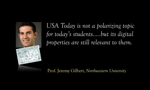
Jeremy is an assistant professor of media product design at Northwestern. Two questions for Jeremy:
Mario:
What memories do you have of how USA Today changed the way you looked at newspaper design?
Jeremy:
USA Today’s ground breaking design helped forced me to think more broadly newspapers as media products and not just visual storytelling devices. USAT emphasized navigation and organization. It was the first newspaper that was explicit about its audience assumptions and seemed to try to design experiences that fit its users instead of asking its users to adapt to its format. When I studied business reporting as a college student, I was given a small book to help me understand how to read the Wall Street Journal. USAT seemed to know its readers would never tolerate that and made a newspaper that needed no introduction. Lessons like the importance of color as a navigational device and matching your news product to the rhythms of your customers’ lives are still relevant for me—even though I have not designed for a print newspaper in years.
Mario:
As a professor, how do your students today feel about USA Today? Is it even discussed?
USA Today is not a polarizing topic for today’s students. They cannot imagine the furor over McPaper. in general newspapers are not what inspires them. But USAT’s digital properties are still relevant to them and broader lessons like varying story length, using alternative story formats and employing color as a navigational device apply to any kind of media product design.
Ron Reason, Design with Reason
Ron: from resistance to acceptance
I guess all the hysteria we saw about “you are turning my paper into USA Today” signaled a resistance to change and a love for the products as they WERE. Seems like there has been less of that uproar in the last couple of years, maybe people are resigned to change, perhaps because of how rapidly the web changes.
Hopefully the new look is a hit across platforms and keeps them in business a long time! Perhaps …an interesting solution would have been to turn USA TODAY into a tab, which we did in a class with Dr. Pegie Stark Adam in 1984— Truly ahead of the times!
Our previous blog posts about USA TODAY:
USA TODAY turns 30: Part 1—Looking into the attic for those early sketches
https://www.garciamedia.com/blog/articles/usa_today_turns_30-part_1-looking_into_the_attic_for_those_early_sketches
USA TODAY turns 30: Part 2—USA TODAY turns 30-Part 2—-A newspaper that influenced all of us
https://www.garciamedia.com/blog/articles/usa_today_turns_30-part_2—-a_newspaper_that_influenced_all_of_us
USA TODAY turns 30: Part 3—USA TODAY turns 30-Part 3—-A weather map that created a global tsunami
https://www.garciamedia.com/blog/articles/usa_today_turns_30-part_3—a_weather_map_that_created_a_global_tsunami
USA TODAY turns 30-Part 4-The first newspaper to do that tango of the serious and the silly
https://www.garciamedia.com/blog/articles/usa_today_turns_30-part_4-the_first_newspaper_to_do_that_tango_of_the_serio
Chatting with Tyler Brulé on Monocle Radio’s new show, The Stack
Listen to my chat with Tyler Brulé about future of print in Monocle Radio’s The Stack here:
http://www.monocle.com/24/shows/stack/
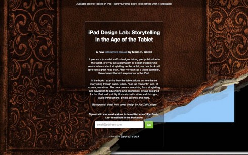
Sign up to get information on my new digital book
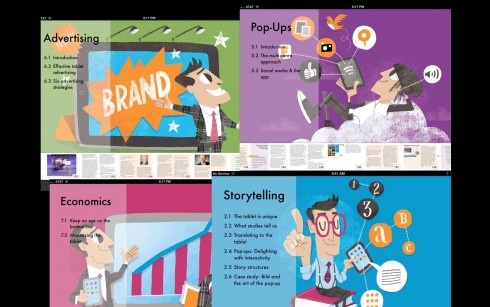
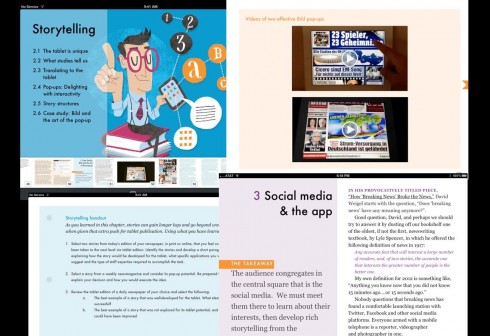
Assorted screens from the book: top, chapter openers all of which are color coded and carry illustrations by Luis Vazquez, of the Gulf News of Dubai; second image, opener of Storytelling chapter, and two inside screens.
As we get closer to publication date for The iPad Lab: Storytelling in the Age of the Tablet, we are now set up so that you can give us your email address and you will automatically be informed when the book is ready for download.
Now you can leave your email address so that you will be updated and informed the moment the book is read for download.
Simply go here:
http://ipaddesignlab.com
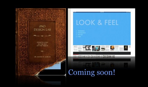
Video walkthrough of the iPad prototype of iPad Design Lab
SND Scandinavia Space 2012 conference
Still time to get a spot to attend the SNDS conference in Copenhagen, Sept. 27-29;
For more information:
SNDS workshop ever. Read all about SPACE 2012 here:
1st Middle East News Design Conference
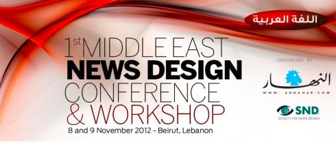
It promises to be a great program, and a historic one, too: the first SND Middle East gathering. Put it on your calendars: November 8 & 9, in Beirut, Lebanon. Sponsored by An-Nahar and SND.
For more information:
http://www.snd20events.com/conference/
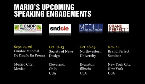
Mario Garcia’s upcoming speaking engagements:
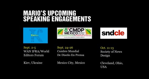
Cumbre Mundial de Diseño en Prensa 2012: Mexico City; September 24-26
http://www.cmdprensa.com/mx2012/
SND (Society of News Design) Cleveland; Oct. 11-13
http://cle.snd.org/