TAKEAWAY: A conference at RIT on the subject of reading and digital platforms leads us to think on the fantastic possibilities that lie ahead if we blend the disciplines PLUS: Conference highlights: from e books to moving type for tablets
It was at a specific moment during the Reading Digital Symposium at RIT (Rochester Institute of Technology) where I gave a presentation during the weekend, that I turned to my iPad and Tweeted the following:
RIT talk: I sense a flirting between the disciplines: technology meets humanities meets design meets storytelling. Nice.
Dozens of retweets and emails later, I am still fascinated by what happened at the Symposium, the smart and interesting people I met, the speakers with whom I had the honor to share the stage, and, most importantly, the level of preparation and excitement that all of the RIT students I met displayed.
Here is how Prof. Charles Bigelow, Melbert B. Cary, Jr. Professor of Graphic Arts at RIT’s School of Print Media described the evolution of he Symposium:
Two years ago, in June 2010, I co-organized an RIT symposium on the Future of Reading. It covered a broad span of topics, from literature
to history to philosophy to design.
For this 2012 symposium, just two years later, I concentrated mainly on the science and art of reading, and the tag line I used was:
“The future of reading is already here, and it’s time to take a closer look at it.”
And that is exactly what this Symposium was about: a look at how we now read on digital platforms. The speakers represented the full range of expertise, among them: Kris Holmes, who designed the pioneering Lucida font family for digital screen displays and operating systems; Gordon Legge , a psychologist and newuroscientist and the author of Psychophysics of Reading in Normal and Low Vision; Steve Matteson, Creative Type Director for Monotype Imaging and David Brailsford ,co-founder of the School of Computer Science at the University of Nottingham (UK), whose research has centered on Document Engineering. (I will provide some highlights of Brailsford’s and Holmes’ presentation s later in this post).
For Prof. Bigelow, the new digital display technologies and devices are radically different from traditional analog printing, but, he emphasizes that “it is all about the image that gets to the retina of the
eye that is important.” It is this thought, he says, that shaped the program he assembled and the speakers.”
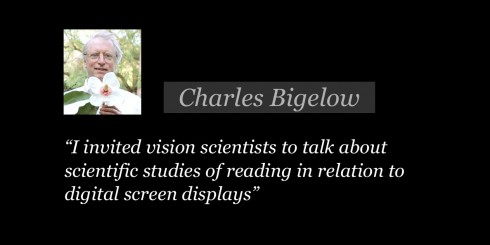
“ …. I invited vision scientists to talk about scientific studies of reading in relation to digital screen displays.
“The typefaces used on smart phone and tablets are, in many cases, not the same as those used in print media, so I invited type designers to talk about creating fonts for the new media. And, of course, fonts are only one building block of a page of information – news, stories, images, etc. – so your talk gave us better understanding of how and why those elements can be put
together across different platforms, while Kris Holmes showed us new approaches to lively display typography, A computer scientist talked about technical issues in getting the e-text to work conveniently across platform (it often doesn’t), and a philosopher discussed the uses of technology by literate humanity – do the new devices make us cyborgs?
A different audience
My presentation at the RIT Symposium was the last of a series of presentations I have given during a three-week trip that covered three continents.
What was unusual and different about this one, and which prompted my Tweet about the “flirtation” of the disciplines, was precisely the mix of speakers and audience, and the expertise and interests they share.
My usual audience is primarily “journalists”: publishers, editors, designers, digital media directors, with advertising and marketing types thrown in.
Here, the word “scientists” is more applicable to describe the 100 people in attendance. And while many or most are interested in typography and design, especially symposium organizer Prof. Charles Bigelow, who teaches in the School of Print Media at RIT, their research is highly scientific, including some fascinating studies of typography through the ages that were presented here.
But, back to the “flirtation”: as I spoke to professors, and, especially graduate students, it is obvious that they are interested in dipping their toes in the neighbor’s pool: find out more about how smartphones will be used for reading, for example, or the best way to design a navigational system for an app.
While my audiences of “journalists” appear to be greatly interested in the concept of survival—-as in the survival of printed newspapers, these “scientists” seem to be less concerned with that, and more fascinated by the prospects of platforms they may create to facilitate reading—including in printed newspapers and magazines.
When Prof. Bigelow first invited me to the Symposium, I confess that I did not understand fully what my role would be in such a gathering. As I prepared my presentation, I became more excited about the prospects of those for whom I would give the talk, and how much I could learn from them.
I was right: I probably learned more than I taught, although I am sure that the audience got a glimpse of how we who design content for the platforms they create think, what worries us, and what we consider to be top areas for further research.
This presentation gave me an opportunity to discuss our current Poynter Institute 2012 EyeTrack for the Tablet, a study that is currently taking place at various centers throughout the United States.
The ideal major
As I exchanged ideas with RIT students, it was obvious that we need to consider the type of major where the “flirting” of the disciplines gets to the next, more formal stage.
I reminded a good friend who is considering returning to school for Masters that yesterday’s proceedings at RIT had made me more aware of what I advised him earlier: create your own program, and if I were you I would involve the various disciplines of digital technology, design, storytelling and even psychology.
Unfortunately, and this may be the same even at RIT, academia takes time to respond to changes in the industry. University departments are like islands, and creating bridges may tax the patient of the most devoted faculty member or student.
Nevertheless, as Prof. Bigelow and I said goodbye on the edge of the RIT campus, we both agreed that it would be a good thing to allow students to customize their programs.
This symposium was a good reminder that the disciplines are linked, that the desires of faculty and students are synchronized to the idea.
I only wish I were younger to start creating my own program, and I would definitely welcome the opportunity to be a part of any academic team that wishes to advance this fascinating conversation.
Conference highights
David F. Brailsford
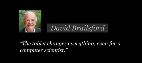
David F Brailsford, The University of Nottingham: gave one of the most fascinating presentations, and these statements stayed with me:
The tablet changes everything, even for a computer scientist
“Key players are now Amazon and Apple
with Adobe in a more minor role. I believe that Amazon and Apple are like the Linotype and Monotype of today.”
Charles Bigelow
Charles Bigelow, the Melbert B. Cary, Jr. Professor of Graphic ArtsRIT: His current research is on the relationship of vision science to typography, the evolution of typographic forms, and typographic “culturomics” – analysis of trends in typographic tastes and sizes in relation to literate culture.
Bigelow discussed typography, with emphasis on historic factors that have had an effect on the “shrinking” of type size. He showed how in the 15th Century type tended to be large. Type size becomes smaller and smaller as vision correction (eyeglasses) become a reality.
“The Protestant ethic valued frugality,” Bigelow said, “ so book print became smaller, and, of course, books were then easier to conceal if authorities came to arrest you.”
In contemporary terms, he said, hardcover books continue to have the larger type, while newspaper and paperback books emphasize smaller.
Kris Holmes
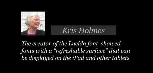
Kris Holmes has designed and co-designed over 100 typefaces, including pioneering system interface screen fonts for Apple Macintosh Systems 7, 8, 9. and OS X. Her Lucida Grande designs are the standard user-interface fonts for OS X.
As I did not sit through this presentation, I asked Prof. Bigelow for highlights, which he gracefully agreed to do. Here is his report:
Holmes’ talk “Moving Right Along” was about the impression of movement and animated movement in typography. She showed historical and modern examples of cursive italic and script typefaces that convey a feeling of the movement of the scribe’s hand. Then she showed examples from “writing masters” in later eras, who created lively pages of sinuous script that were impossible to achieve in typography.
She suggested that the extravagant flourishes of the writing masters were a way for them to show that their art went beyond the rigid limits of metal typography, so they could still attract clients in the era when typography had made the traditional manuscript writing of the scribe nearly obsolete.
Lucida
She then showed pages of her own script designs, such as Isadora, Lucida Handwriting,and Kolibri (there are examples in her “Dossier”), which have a lively look.
Type, motion and the iPad
Then she talked about and showed examples of moving letters that can be displayed on the iPad and other tablet computers that have a “refreshable surface” (fast enough for movie-like illusion of motion).
She explained and demonstrated different kinds of moving type. The mechanical kind of motion can made with software like Aftereffects or Flash, by simple transformations of letters – scaling of size, shifting of position, obliquing, rotating, etc. That is the basis
of much of the “kinetic type” that is popular on YouTube. One of her examples was of letters drifting and falling like autumn leaves.
She also demonstrated the RSVP kind of display (Rapid Serial Visual Presentation) in which words of a text are flashed on the screen one at a time for short periods of time, so that readers don’t have to move their eyes and can let the letters come to them.
She asked the audience if they found it relaxing or irritating. Some found it relaxing, some found it irritating
She also showed “self-writing” movement of scripts, like the “That’s All Folks!” of the old Looney Tunes cartons, and showed examples of her own design. Then she showed full animation of letters in which they run and move like characters in classical animated movies. Thus, she said that (fast) refreshable displays add a lively dimension to display typography and also enable other approaches to displaying text typography.
More Symposium details
http://www.rit.edu/cias/readingdigital/speakers.php#engstrom
Surprise of the day
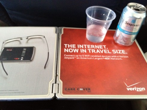
Advertising messages try to catch us everywhere, indeed.
Yesterday, while on a USAirways flight home to Tampa, what a surprise to open the table in font of me only to be greeted by this Verizon advertising. This while the flight attendant calls attention to the special of the day: get th USAirways credit card today, sign up and as soon as you make your first purchase, no matter how small, you get 40000 that “could get you quick on your way to Hawaii”.
As a captive audience at 35000 feet, I imagine that we are all the best of subjects for advertisers, starting right on that table in front of you.
And, no, there was no wi-fi on this particular flight.
Where in the world is Mario?
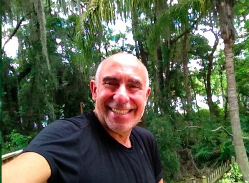
I am at home in Tampa all of this week: enjoying all that nature I have right outside my back door, with the Hillsborough River as a backdrop; some of the trees in my backyard at 400 years old, and sit on an environmentally protected area of Florida, a swamp, where sometimes the most beautiful birds appear, plus huge turtles, the occasional snake, and, on occasion, sleepy alligators. But I have a deck that is 10” high so no danger of alligators approaching us! It is a peaceful and serene setting that I am always happy to come home to.
At home in Tampa, Florida until May 7.
The iPad Design Lab: Storytelling in the Age of the Tablet
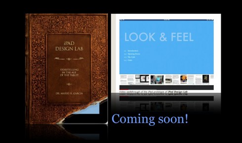
Video walkthrough of the iPad prototype of iPad Design Lab
TheMarioBlog post #1006