TAKEAWAY: They have been maligned for years, described as feminine and in many cases locked in the safety box of features and the key thrown out. But italics deserve better, and good designers always keep italics handy, for that special touch on a page or screen. Today’s Pure Design download is all about those letters with a tilt to the right. ALSO: Postcard from Lagos, Nigeria, part three.


Two new distinct italic fonts: Glosa and Melle Diete
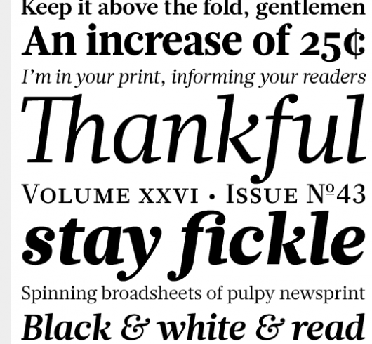
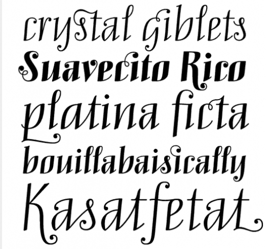
Some italic fonts that we like are Glosa and Melle Diete
In those tropical nights depicted in romantic novels, or in the songs of Gloria Estefan and Celia Cruz, the palms are forever swaying. Thoughts of moon lit breezy nights come to mind, not to mention mojitos, romance and the sounds of the salsa not far behind.
Well, exaggerated as that Caribbean fantasy may sound——and it is perfectly normal for a Cuban American like me—-that is how I feel about italics. Like the tropical palms, italic letters sway and “sway us”. I have always liked them, and I cannot begin to tell you the number of projects over the past three plus decades where I have had a publisher kill the “italics” on the spot.
Why? Don’t these men (usually it is MEN) have a sense of romantic tropical nights?
It is not that, it is that for reasons that escape me, someone trained traditional editors to think that italics are featury, not newsy and are to be used for the Dear Abby column, or for a spread on “Purple is the new Red” headlines in the fashion section.
Note: Typographica chose Glosa and Melle Diete among its favorite fonts of 2008. Both are playful and offer designers a variety of possibilities.
Not that they ever disappeared, but I see a return to italics worldwide. Nothing can be more elegant than the big italics headline—-or just one word—-set in Caslon or Didot or Chronicle Italic. Give it a try.
Guillermo Kahlo photo exhibit in Cuba
Although we all know about Frida Kahlo, the renowned Mexican painter with the unique style and colorful self portraits, we know less about her father, German-born Guillermo Kahlo, a photographer who started his career with newspapers in Mexico, working wtih El Mundo Ilustrado and Semanario Ilustrado. He was commissioned by the government to do architectural photographs, probably his best work. He also took photographs of churches with other photographers for a six-volume survey in the 1920s.
My cousin Mary Granela de Larios, who lives in Camaguey, Cuba, and is married to the well known artist, Orestes Larios Zaak, informs me that her husband’s gallery,has had the distinct honor of being commissioned to do a Guillermo Kahlo exhibit, tomorrow, August 1, at 8 pm, at Galerias Taller Larios. The exhibit is titled: Guillermo Kahlo—Photographer of the Centennial.
Says Orestes Larios Zaak:
“It was Porfirio Diaz, then President of Mexico, who commissioned Guillermo Kahlo to do a photographic documentary of the architectural treasures that Mexico had at the time in celebration of the country’s centennial. Kahlo, who specialized and promoted himself as specialist in landscapes, buildings, interiors and factories, did not disappoint.”
But, Larios reminds us, in the process he also took many pictures of his favorite daughter, Frida, a radical departure from his usual photography, which did not include humans. Some of the Frida photos will be included in this exhibit.
Any of our readers who are in Cuba, or visiting there, here is a rare chance to see the Kahlo photos.
Friday report from Lagos and the Next newsroom

It is Friday and we devote a large portion of the day to the task of finalizing the Styleguide for Next, the new Nigerian daily which launches in a few days here. Styleguides differe from place to place.
Some are very academic, and not too specific. Others, like the one our team (Christian Fortanet and Ron Reason) and I produce is down to the last details. This is a project where I want to make sure that we lock stylistic details down firmly, handcuff the layouters (mostly inexperienced, but eager—-a dangerous combination), and make them “follow” for a while before they begin to “create”.
As such, no detail is left to the imagination in this Styleguide, and Ron makes sure that all journalistic details are offered. When we describe summaries, he comes in to remind the editors NOT to repeat words int he summary that are present in the headline, for example; we discuss the difference between a brief and a compact story structure (a brief should be just that, not more than 8 lines in a one column setting, while a compact is a story of about 100 words). Anything not in that category, then becomes a lead story or a secondary story. WE discuss fact boxes—-how to write them (short, to the point, for finger reading), and where to place them (preferably at the top of the shoulder of a column).
I also put ATTENTION yellow boxes all over the manual alerting designers to DO THIS CONSISTENTLY, or DON”T DO THIS EVER.
Meanwhile, we savour the good, strong and aromatic coffee that is served to us on a tray, complete with shiny white cups and saucers, and a coffee machine that inspired my photo here. No, this is not Next’s marketing campaign. It was just me playing with a copy of the prototype and our afternoon coffee service.
More to come.
For more information about Next, go here:
The official website:
www.234next.com
Previous blogs dealing with Next:
https://www.garciamedia.com/admin/index.php?S=3d288590d403189c70a2b177e20a8bb8577a3b25&C=edit&M=edit_entry&weblog_id=6&entry_id=685
https://www.garciamedia.com/admin/index.php?S=6bed83f06c1beac7b1d0578a3c490f80481ba6b1&C=edit&M=edit_entry&weblog_id=6&entry_id=684
https://www.garciamedia.com/blog/articles/nigerias_next_on_sunday_changing_journalism_one_sunday_at_a_time/
https://garciamedia.com/blog/articles/next_on_sunday_the_new_newspaper_that_raises_journalistic_bar_in_nigeria/
Ad sizes: interesting discussion
If you and your organization are discussing the very necessary and timely topic of generating advertising revenue by offering advertisers different and more innovative options, take a look at the link below.
Charles Apple on unusual ad sizes:
http://www.visualeditors.com/apple/2009/07/yet-another-creative-ad-shape-invades-page-one/.
Download entire first section of Pure Design: Words
Now that I have fully presented the first of six sections of Pure Design on TheMarioBlog, I am offering the entire initial section, “Words,” available for download—all 33 pages of it. This may be useful for those of you saving or printing out Pure Design and will be done following each of the remaining sections. At the end of our journey through words, type, layout, color, pictures, and process, I will publish the entirety of Pure Design in one file.

Follow me at www.twitter.com/tweetsbydesign
Follow the Marios

Two Marios. Two Views.
Follow Mario Jr. and his blog about media analysis, web design and assorted topics related to the current state of our industry.
http://garciainteractive.com/
Visit Mario Sr. daily here, or through TweetsByDesign (www.twitter.com/tweetsbydesign)
In Spanish daily: The Rodrigo Fino blog
:
To read TheRodrigoFino blog, in Spanish, go:
https://garciamedia.com/latinamerica/blog/
TheMarioBlog posting #320