TAKEAWAY: It may not redefine the newsmagazine genre, but the newly designed and rethought (from the back to the front) Newsweek is worth careful attention by all of us in this business. ALSO: We continue weekend coverage of Holland’s NRC Handelsblad and its conversion from broadsheet to tabloid
Saturday morning update: more pages of NRC Handelsblad
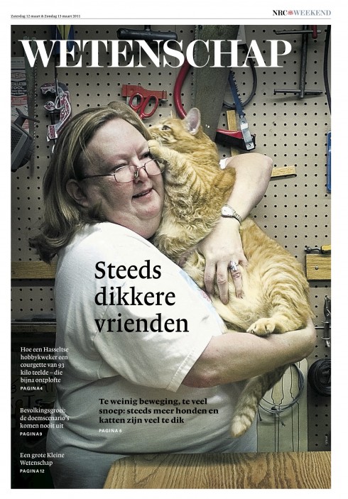
Scroll down for more details on Holland’s NRC Handelsblad conversion from broadsheet to tabloid this past week. Design director Jan Paul van der Wijk sends us these pages from the weekend edition:

Front page of the first weekend edition in tabloid format
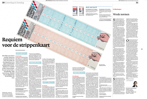
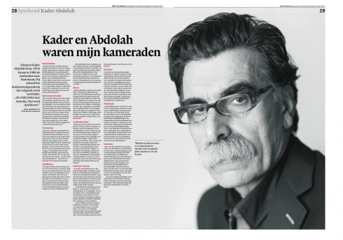
Double page features for weekend edition

Various pages from the Lux supplement
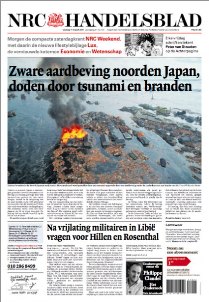
Front page from Friday
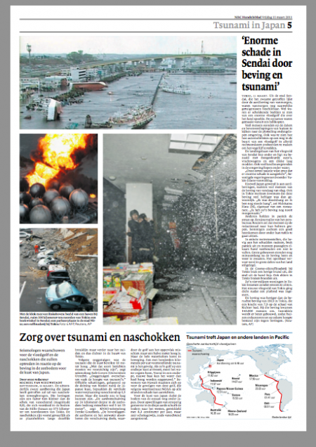
Inside page: news coverage of the Japan tsunami
Tina Brown’s first Newsweek after rethinking is here


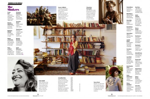
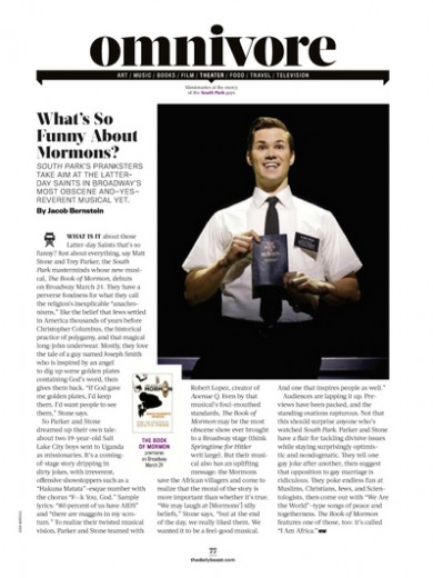
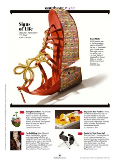
In a Jim Parkinson(with whom we currently collaborate on at least three upcoming project logos) has worked with the new logo, based on the font Tilting. Parkinson reports that the Titling logo was “a perfect way to announce to the readers our new direction, as the whole inside has it running throughout. ” The familiar red box with the logo lettering has stayed. By the way, the new logo is NOT yet visible on Newsweek’s website. Work in progress, I imagine.
![]()
This is the old logo, designed by Jim Parkinson in the 1980s, when Roger Black completed his redesign of Newsweek
The typography: The entire magazine’s design is based on two typefaces, Titling Gothic and Acta (designed by Dino de Santos).
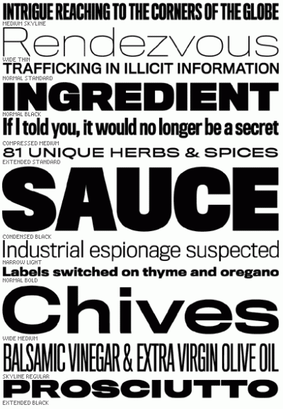
The FontBureau’s Titling
Go here to read an interview with designer Dirk Barnett, who redesigned the new Newsweek.
http://www.spd.org/2011/03/first-look-the-newsweek-relaun.php
Also of interest:

Here are covers showing Newsweek’s last redesign
Here is our ‘“review” of the last Newsweek redesign: we did not like it too much, glad a new one is there now
https://garciamedia.com/blog/articles/miami_daily_business_review—one_month_after_redesign_also_newsweeks_retro-
Want to see an even earlier prototype of Newsweek by Bob Newman? He shared it with us in 2009:
http://www.google.com/search?source=ig&hl=en&rlz=1G1GGLQ_ENUS281&q=Newsweek+redesign+in+TheMarioBlog&aq=f&aqi=&aql=&oq=
What’s Not Hot? Newsweek.
Editor Tina Brown lays an egg in her redesign.
http://www.slate.com/id/2287526/
Tina Brown’s first issue of Newsweek features Hillary Clinton on its cover
http://www.poynter.org/latest-news/top-stories/121946/tina-browns-first-issue-of-newsweek-features-hillary-clinton-on-its-cover-as-focus-on-female-audience-intensifies/
Newsweek’s redesign: I am glad I didn’t judge it by its cover
http://www.poynter.org/latest-news/top-stories/122298/newsweek-redesign-glad-i-didnt-judge-it-by-its-cover…/
Newsweek’s cover delightfully absurd, but not sexist
http://www.poynter.org/latest-news/romenesko/99481/newsweek-cover-delightfully-absurd-but-not-sexist/
Tina Brown: I am now editor in chief of both Newsweek and The Daily Beast
http://www.poynter.org/latest-news/romenesko/108277/brown-im-now-editor-in-chief-of-both-newsweek-and-daily-beast/
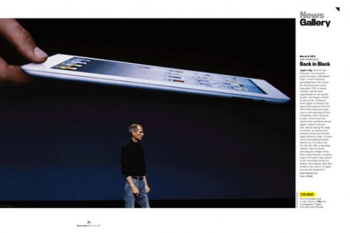
It’s iPad2 weekend in the US
Go here to see a nice comparison video showing the improvements in the iPad 2 web browser over the original iPad. The original iPad came with only 256MB of RAM as compared to 512MB found in the iPhone 4. To me, this is one of the best reasons to get the new iPad2!
http://www.macrumors.com/

iPad 2 Review Roundup: The Critics Are Head-Over-Heels
http://www.huffingtonpost.com/2011/03/10/ipad-2-review-roundup_n_833950.html#s251765&title=Engadget
They are lining up to get the new iPad2. See here:
http://www.bloomberg.com/news/2011-03-11/apple-ipad-2-gray-marketers-first-in-lines-eager-to-resell-tablets-abroad.html?cmpid=yhoo
http://finance.yahoo.com/news/Apple-fans-line-up-to-buy-apf-193384030.html?x=0&.v=12
http://tech.fortune.cnn.com/2011/03/11/muscovite-buys-the-first-ipad-2/?source=yahoo_quote
http://blogs.forbes.com/briancaulfield/2011/03/11/inside-the-frenzy-at-apples-san-francisco-store/?partner=yahootix
http://blogs.forbes.com/davidewalt/2011/03/11/did-anyone-show-up-to-apples-austin-pop-up-store/?partner=yahootix
Apple iPad 2: It Begins … With A Downpour
http://blogs.barrons.com/techtraderdaily/2011/03/11/apple-ipad-2-it-begins-with-a-downpour/?mod=yahoobarrons
Pad 2 sales to start with pre-dawn online orders
New version of Apple’s iPad hits stores; first sales to come with pre-dawn online orders
http://finance.yahoo.com/news/IPad-2-sales-to-start-with-apf-193384030.html?x=0&.v=3
A soggy night in the iPad line
http://tech.fortune.cnn.com/2011/03/10/a-soggy-night-in-the-ipad-line/?source=yahoo_quote
Hong Kongers Pony Up for Early iPad 2
http://blogs.wsj.com/chinarealtime/2011/03/11/hong-kong-shoppers-line-up-early-for-apple-ipad-2/?mod=yahoo_hs
And, finally, don’t miss this iPad2 parody video!
TheMarioBlog post #728
Netherland’s NRC Handelsblad becomes tabloid
TAKEAWAY: In the Netherlands, this week NRC Handelsblad switched from broadsheet to tabloid. We show you before and after, and more to come with the revamped weekend edition as it premieres Saturday in the compact format. To be updated when NRC produces its first weekend edition as a tab.
One less broadsheet in the Netherlands

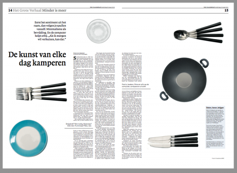
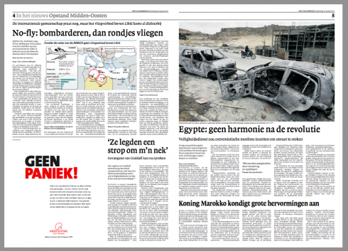
The pages above are from today’s edition of NRC Handelsblad in its new tabloid format
The new NRC Handelsblad front page (daily), six column format, tabloid format

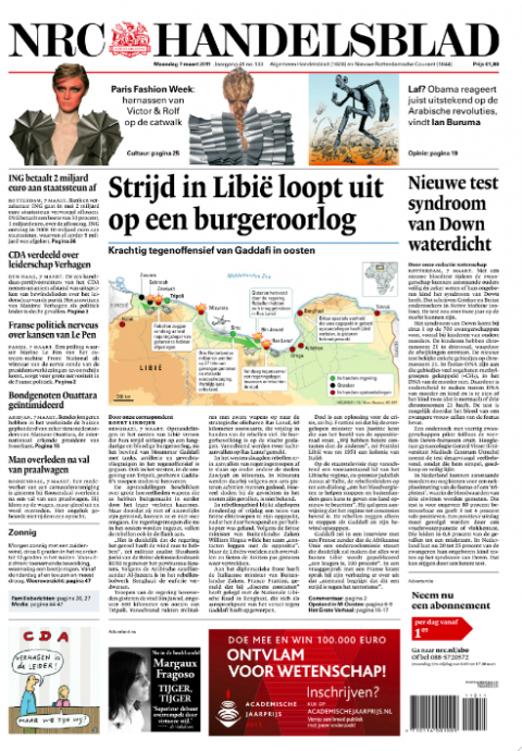
Last edition of the NRC Handelsblad in broadsheet format
With all the hoopla about iPad apps, we don’t hear much about broadsheet newspapers converting to tabloid format these days.
But, indeed, it is still happening—-as it should—-and this week another of the grand dame broadsheets, the Dutch financial daily, NRC Handelsblad
, abandoned its eight-column large format page for a fresh six-column tab.
Design director Jan Paul van der Wijk shares the before and after pages shown here, with the farewell edition of the broadsheet and the arrival of the new tabl.
I was invited to participate in this project, conducting a one-day workshop with the editors/designers in Rotterdam, where the newspaper is published. My involvement was more with the weekend edition, a very full, content driven package with various sections. Our task was how to pace the content of such a monumentally large product in a tabloid format where the natural divisions created by “separate sections” was not going to be a choice.
Jan Paul will send me materials on that weekend edition and we will update this blog to bring you the weekend product plus additional information.
For now, we do like what we see.
Notice that a decision was made here NOT to go with a miniposter cover on the daily front page. Instead, readers will find that the tabloid format front page is still familiar to what they saw in the broadsheet: stories to read that begin and end there, identical typography and just an easier to manage, less cluttered look all around.
Here is how design director Jan Paul van der Wijk describes the experience and he thanks his deputy Paula van Akkeren for the good work on the pages shown above:
For us, as designers, it was good fun working on a tabloid. We are already used to because of our other newspaper, nrc.next wich is published by the same editorial departement. I am until now very happy with the reactions of our readers. They are in a large majority very happy with the design that they found on their doorstep. We had a lot of reactions, and started a phone-in for our readers. Now we are working very hard on our Saturday-edition, and will keep you posted.
Detergents: from large to small containers…
While on the subject of less is best in terms of newspaper formats, I call your attention to an informative and provocative piece that comes from those guys at KubasPrimedia of Canada.
Author Len Kubas compares what the laundry detergent industry execs have experienced with the size of laundry detergent boxes (too big and cumbersome), and how they solved the problem (creating concentrated versions of their products). Using Procter & Gamble as the case study, Kubas shows that “Like most newspapers today, detergent manufacturers used to believe that bigger was better. “
Solution: to concentrate their product. “By concentrating the original product, detergent companies were able to provide consumers with equivalent wash loads in smaller, easier-to-handle containers for about the same price. Manufacturing, distribution, and sales costs were reduced, raising profitability and increasing efficiency across the entire supply chain.”
Kubas creates a word “benefitize” to describe the success story for the laundry detergent industry as it took a look at its product and found successful solutions:
“Benefitize” is not a proper word in the English language, but it is exactly what Proctor & Gamble’s marketers did. They changed the rules and moved from selling quantity by weight to selling benefits as wash loads, which is what their customers were really buying all along.
Then Kubas applies the benefitizing to newspapers:
The broadsheet newspaper is cumbersome, awkward to use, and inefficient in terms of costs and the revenue generated per unit of newsprint/labor consumed.
Apparently, many newspaper execs, including those at NRC Handelsblad, agree.
Go here to download pdf of the Kubas piece:
http://kubas.com/nrc/page5.html
Of interest today
Apple Is Opening A Pop-Up Store In Austin For SXSW
http://finance.yahoo.com/news/Apple-Is-Opening-A-PopUp-siliconalley-2596506916.html?x=0&.v=2
Appeal of iPad 2 Is a Matter of Emotions
http://www.nytimes.com/2011/03/10/technology/personaltech/10pogue.html?_r=1&partner=yahoofinance
Review: With iPad 2, Apple one-ups itself
http://finance.yahoo.com/news/Review-With-iPad-2-Apple-apf-3778973263.html?x=0&.v=1
– Magazines’ iPad Editions Struggle to Keep Your Attention, New Study Finds
http://adage.com/article/mediaworks/magazines-ipad-editions-struggle-attention/149307/
– Hearst’s Carey: Tablets Will Provide 25 Percent Of Magazines’ Circulation
http://paidcontent.org/article/419-media-summit-hearsts-carey-tablets-will-provide-25-percent-of-circ/
– Apple Offers Video Guided Tours of iPad 2
http://mashable.com/2011/03/09/ipad-2/
http://online.wsj.com/article/SB10001424052748704132204576190562423226044.html?ru=yahoo&mod=yahoo_hs