This is the weekend edition of TheMarioBlog and will be updated as needed. The next blog post is Monday, Oct. 22
Update #1: Chicago, Saturday, Oct. 20, 08:28

Purchase the book on the iBookstore
“iPad Design Lab” trailer on Vimeo.
The EPUB version of book is HERE:
To all of those who are writing to let us know that you can’t buy iPad Design Lab: Storytelling in the Age of the Tablet, in your countries, or for your tablet or phone, the good news is that we have completed the EPUB version and it is ready for download via Amazon.com for Kindle: http://tinyurl.com/8u99txw.
Read the Society of Publication Designers’ review of The iPad Design Lab here:
http://www.spd.org/2012/10/must-read-ipad-design-lab.php
Read the review from Dr. Pegie Stark Adam in her blog
http://pegiestarkadam.com/
TAKEAWAY: The Poynter EyeTrack study does it again. Twenty years after the first study, Poynter EyeTrack continues to provide people in our industry with answers to ever-present questions for editors and designers. This time, it is the Poynter EyeTrack Tablet study, which will be officially unveiled at the Medill School of Journalism, Northwestern University today, October 19.
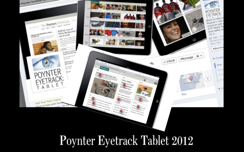
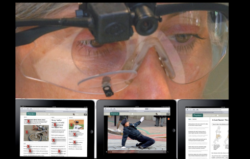

Presenting the results of the Poynter EyeTrack Tablet study at Northwestern University’s Medill School of Journalism; Mario Garcia,Sara Quinn, Jeremy Gilbert, Dave Stanton
I am honored to have been a part of this latest EyeTrack study, directed by Poynter’s Sara Quinn. A group of us, including David Stanton , of Smart Media Creative, and Jeremy Gilbert, assistant professor of media product design,Medill School of Journalism & Segal Institute of Design, Northwestern University, assisted Sara in getting the study ready and the findings analyzed and presented to an eagerly waiting audience.
As someone who was involved with Sara in the creation of the prototype to be tested, an activity which coincided with my researching and writing of the digital book iPad Design Lab: Storytelling in the Age of the Tablet, now available on the iBookstore, it was, perhaps more than discovery, a chance to validate what we had observed in various focus groups around the globe and/or intuited all along.
Sara has presented a detailed account of the findings, and will continue to do so, via the Poynter Institute for Media Studies website: http://www.poynter.org/how-tos/newsgathering-storytelling/visual-voice/191875/new-poynter-eyetrack-research-reveals-how-people-read-news-on-tablets/
So, I would like to dissect some of the highlights and analyze it from the point of view of the editor/designer creating news apps, and our own observations in focus groups settings globally.
That first impression: get on the carousel
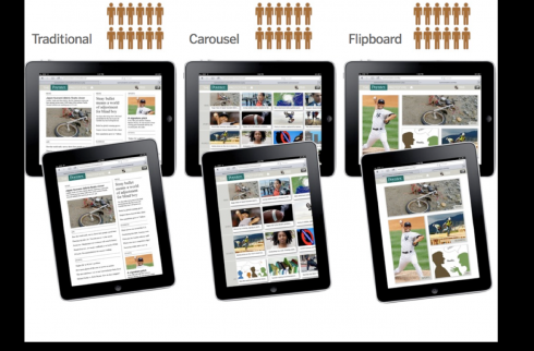
Three styles were tested: traditional, Flipboard and carousel. Image courtesy of Poynter’s Sara Quinn
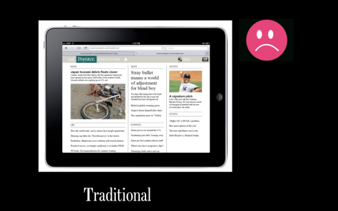
Traditional: resembles the iconic newspaper page
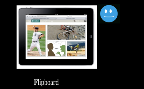
Flipboard style: images lead to navigation
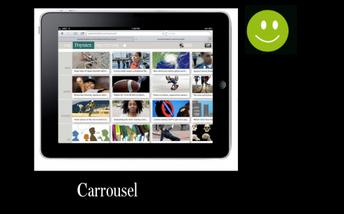
Carousel: visual navigator with swipe gesturing
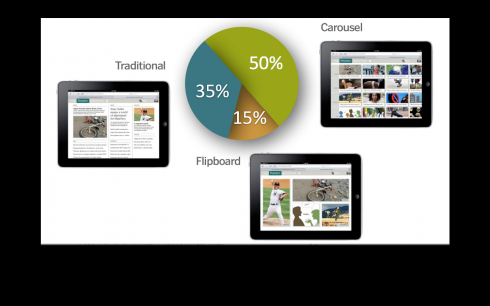
Image courtesy of Poynter’s Sara Quinn
Users in the study preferred the carousel navigator to the traditional navigator (which looked very much like a typical newspaper page), or the Flipboard (inspired by the popular Flipboard app, with large, varied images and minimal text).
I am not surprised at all by this, since I know that those first 10 seconds are crucial to seduce users, and visual seduction is much more effective than text driven seduction (and that applies to any platform, by the way).
The horizontal mode rocks
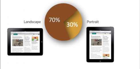
Image courtesy of Poynter’s Sara Quinn
I know that this will be open to debate. I already hear it from individuals who tell me: well, that may be what Poynter’s study tells us, but I still prefer to use my iPad vertically.
Again, I am not surprised that a majority of participants in the Poynter study prefer to hold their tablets horizontally. It is what I observe when I see people reading on their tablets at airport lounges, or on airplanes, restaurants and even the park. It leads to swiping, which is also the preferred gesture: remember, we have been swiping pages since we touched our first baby book.
By the way, if this unofficial report from this grandpa is of any value: All of my 11 grandchildren use the tablet in horizontal mode. Could that point to what the next generation will do?
Yet, there are some wonderfully looking and highly functional news apps out there only in the vertical mode: Try Huffington. and Brazil’s O Globo, for example.
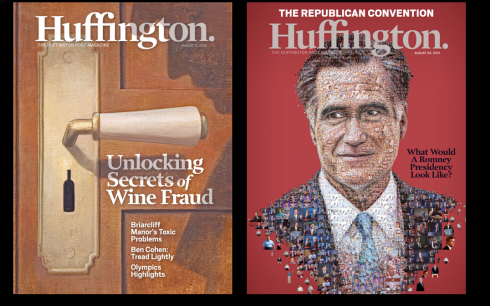
Huffington. magazine app is strictly vertical
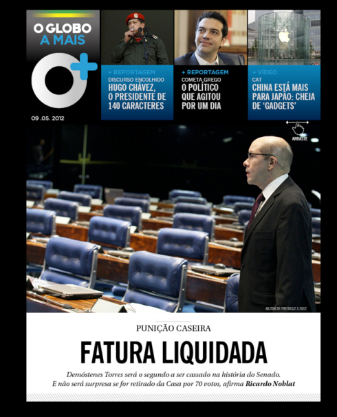
Brazilian newspaper O Globo’s tablet app is vertical also
The finger wants to play
The finger is extremely happy in all of these pop ups from Germany’s Bild
I know that it is perhaps the most often Tweeted phrase from my presentations: keep the finger happy.
But the Poynter EyeTrack study echoes the same feeling, loudly and clearly. Here is how Sara describes it:
Tablet design requires the same sorts of finesse with color, type, image, grid and navigation necessary for print or Web design. But touch—well, that’s the new factor in keeping a reader engaged.
In terms of behavior and gesturing, tablet screens invite touch. More people in the study maintained close contact with the screen, with the finger leading them to where they wanted to go and bringing up that which they wanted to see closer, or to get engaged with.
That dominant element or CVI
Shakira, the pop star, reminds us that “Hips don’t lie”. The eyes don’t lie either.
I am delighted to see that this Poynter EyeTrack Tablet study, again, verifies that the eyes like to enter through one dominant element on the page or screen. When I published my first book, Contemporary Newspaper Design (Prentice-Hall,1978), I called for page hierarchy and the need for a CVI (Center of Visual Impact). We still process information visually the same way.
The behavior of those in the Poynter EyeTrack Tablet study reinforces this: People tended to enter through a dominant element.
The power of headlines/visuals
An item of the research that must be emphasized: An average of 18 items were viewed before people made the first selection to read. This means that some headlines or images on the fronts might have been looked at multiple times before the study participant made a choice to read something by tapping it.
This validates our concept of the starting screen as a map to the journey.
I am sure that this is just as valid on how we create the front page of a printed newspaper or the cover of a magazine today. A page with more items is more seductive and functional than one with fewer items. The early Poynter EyeTrack already pointed in this direction.
We are catering to an audience that equates quantity with satisfaction. Hungry as that audience is for information, it is the job of the editor/designer to use the first page or screen to promote what that day’s menu has to offer. Not to do this is to rest value to the publication.
For journalists today, in addition to remembering NOT to bury the lead, it is also crucial to remember NOT to bury the content.
This new Poynter EyeTrack reminds us in highly specific terms.
What we learned from previous Poynter EyeTrack studies

As I reviewed the latest information from our Poynter EyeTrack Tabletstudy, I began recalling how fascinated we all were as we discovered how readers looked at the various elements on a printed page (1990) or while reading online news (2003). Those early studies were groundbreaking, and continue to be of importance today.
That is why I reached out to my friend and colleague, Dr. Pegie Stark Adam, who has been an integral part of all those previous EyeTrack studies, for her reminiscing. For highlights of the previous Poynter EyeTrack studies, go here: http://www.poynter.org/extra/Eyetrack/note.html
Here are my two questions for Pegie:
Mario:
What to you is the greatest benefit that EyeTrack provides for the industry?
Pegie:
I think that eye track provides some scientific evidence to back up or demonstrate some things we already knew as designers about how people see and navigate. The studies were especially important in the early days when editors were slightly suspicious of design and thought that a lot of decisions were subjective or ‘artsy.’ For example, we designers knew the eye always went to the dominant element first, but eye track showed that for almost 100% of the readers in both the first study and the one done in 2007 and now in the tablet study. Having scientific analysis to show that was and is important.
I liked the fact that more subtle things were discovered as well – Â like the fact that color DOES attract the eye and helps it move from elements to element, like punctuation on the journey through the page. The early eye track study also showed that the Gestalt theory of visual perception pertaining to ‘grouping’ works. Participants did make connections with similar elements, and color did act as a unifying element while a reader viewed a page.
One of the most important findings from the early eye track studies was how much people read. The first study showed lower numbers while the later studies showed higher numbers. After the first study we helped people see how important it was to pay attention to the ‘design of the story,’ helping them think about how the content has to be massaged too. It was W.E.D. (Writing-Editing-Design) thinking that prevailed. The addition of breakouts, quotes, and attention to breaking up seas of gray all contributed to better design of stories. This I think has contributed to higher numbers of actually reading text in the later studies.
Eye track provided a thorough in-depth look at readers and how they read and navigate, rather than depending on anecdotal evidence.
Mario:
Of the early studies we did together, which do you think remain as findings that still should resonate with designers and editors?
Pegie:
I loved the finding that color really did attract attention and more important, it helped the eye travel throughout the page. A strategic placement of color helped the readers enter the page, stop at important entry points and then travel through to the end of the experience. We entered those studies thinking color was powerful and the studies truly showed that.
I am also fascinated by what we found in comprehension. The prototype tests we used (showing one story designed three different ways) to test what readers remembered demonstrated that readers remember more when a story is broken up using charts, Q&A and primers. So, story design it turns out is very important to how people read and remember.
Your ‘iPad Design Lab’ book is a good evolution of the study because it shows how a story can be more engaging when it is interactive. By strategically placing images, color, audio, video, and interactive experiences, the reader gets more involved and I believe remembers more.
In my view
Early EyeTracks confirmed that readers prefer color
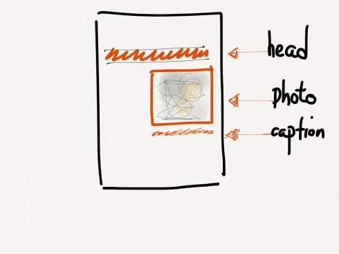
The three items most readers see on a page: Headlines, photos and captions
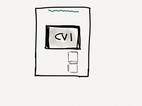
One recurring theme in all EyeTrack studies: create hierarchy, make sure there is a Center of Visual Impact for the eye to penetrate first
In addition to those important points that Pegie has outlined, I think some other highlights of our previous Poynter EyeTrack studies that continue to be the foundation of my work are:
Readers want hierarchy. The job of the editor and the designer is to lead us to what is first, second and third.
Headlines are the top seducers. That is even more true today, with headlines as the first determinant of what content we access in the various platforms.
Captions under photos are among the three most important items viewed on the page (headlines and photos come first). Good editors and designers exploit captions to their full potential, adding information to the story and NOT simply repeating the obvious, or what has already been mentioned in a headline.
Of related interest:
A note from Dr. Mario Garcia about Poynter EyeTrack history
http://www.poynter.org/extra/Eyetrack/note.html
Poynter EyeTrack results: tablet users prefer horizontal swiping
https://garciamedia.com/blog/articles/early_poynter_eyetrack_results_tablet_users_prefer_horizontal_swiping/
Poynter EyeTrack for iPad: a progress report
https://www.garciamedia.com/blog/articles/the_poynter_eyetrack_for_ipad_a_progress_report_and_some_prototype_screens
https://www.garciamedia.com/blog/articles/new_eyetrack_study_learning_how_news_apps_tablet_users_eyes_and_fingers_mov
A royal marriage in Luxembourg

Giant special edition of the Luxemburger Wort to celebrate today’s marriage of the Crown Prince Guillaume
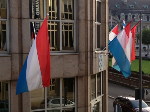
Flags all around Luxembourg buildings to celebrate the marriage of the Crown Prince Guillaume—photo by Frank Deville
Our Europe blog correspondent, Frank Deville, tells us that all the flags are out and all preparations GO for today’s marriage of Prince Guillaume. The European royals will be converging in Luxembourg for the event, and the Luxemburger Wort has prepared a special giant poster edition of the couple.
Unlimited edition champagne and chocolates are in all the shops of Luxembourg, and flags are flying everywhere. Crown Prince Guillaume marries Belgian fiancee, Countess Stephanie de Lannoy.
