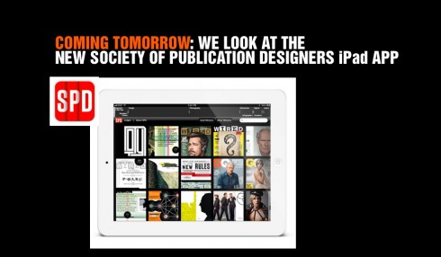
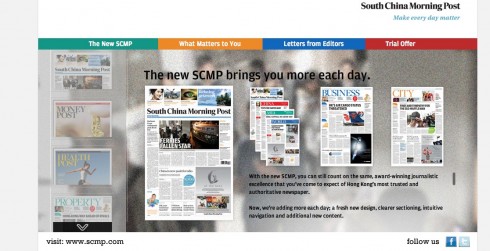
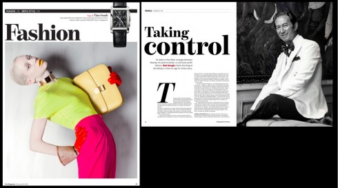
TAKEAWAY: We profile what I consider to be one of the first iPad apps to serve as catalogue and curator of materials. Here we see how the Society of Publication Designers has compiled its list of award winners into a solid, attractive, easy to navigate app. We interview its creator, Josh Klenert, about the process and the challenges he encountered.
Tablets and TV: strange bedfellows
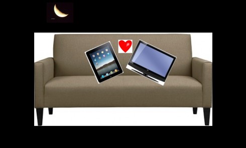
You will find this Nielsen study fascinating, but not surprising.
We have known all along that the iPad is the evening companion, and that we use it in the evening more than during the day.
However, this new Nielsen study adds a different dimension to our evening cozy relationship with our tablets: In the U.S., 51% of iPad use is in bed or in front of the TV .
It is called multi tasking of the relaxing type, I guess, and this adds more power to our argument for strong evening editions of news apps. Already our projects at Colombia’s El Tiempo as well as the Gulf News Tablet of Dubai (see case study Monday here) have dedicated evening editions, a practice I recommend to all planning a news app.
It is a great opportunity to create evening editions that combine the long narrative, the short takes, some great pop ups and that send us into a peaceful, relaxing end of the day.
And the winners are…..
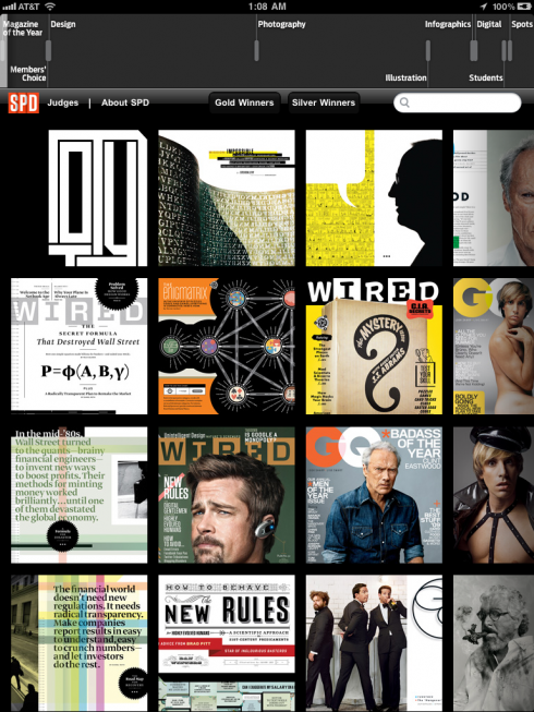
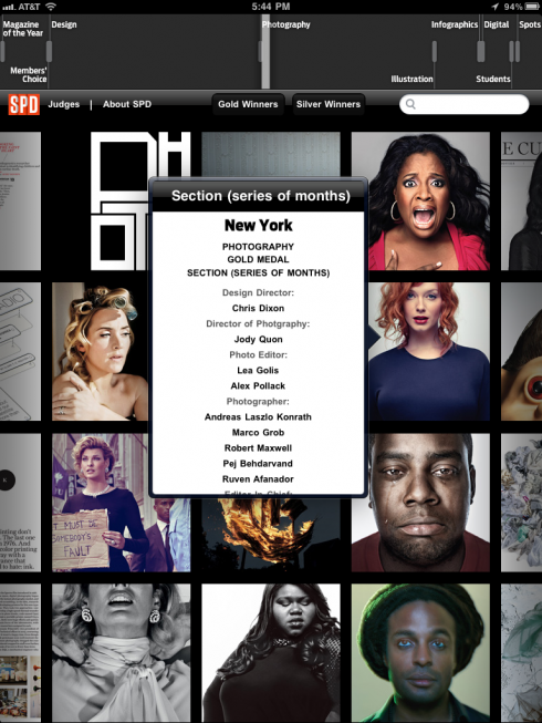
Here is an elegantly and functionally designed app, for the Society of Publication Designers, and it is one of the first I see where the iPad app turns into catalog/curator for offering a vast amount of visual information at the touch of your fingers.
Created by Josh Klenert, Co-Vice President, SPD, this app offers publication designers and anyone interested in design, typography, color and creative thinking generally a window into the best of the best. Categories in the navigation bar include Gold Winners, Silver Winners, with subcategories such as Magazine of the Year, Member’s Choice, Photography, Illustration, Digital, etc.
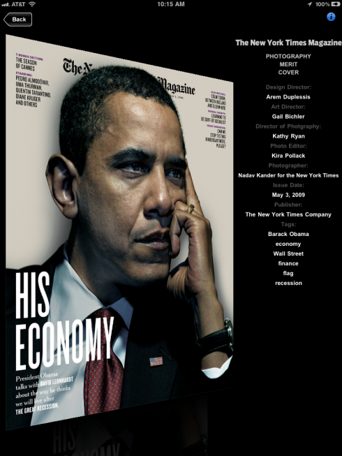
For each image of the winning entry, there is an Info button that can be touched to show the credit lines of who participating in its creation.
I have missed more pop up moments here, so I asked Josh about it: “That was by design. We were trying to keep it simple. Even the press-and-hold credit preview, in my opinion is a nice “easter egg”. Nice if you find it, but covered if you tap into the thumbnail. We left the pop-overs for “About”, “Judges”, etc.”
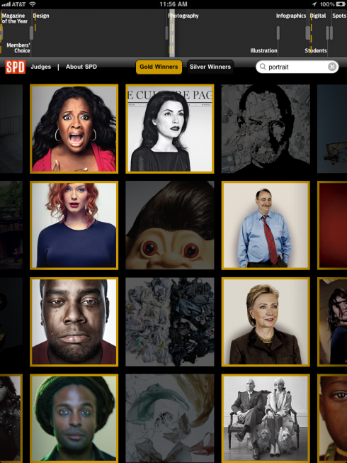
Simplicity, indeed, prevails here, but in a user friendly, attractive display. The main attraction are the images of the winners, which one can sample individually and carefully, not missing any details.
Pop ups for the judges allow us a larger view of their pic. The Photography section is especially strong as is the Magazine of the Year entry.
All in all, I can see where this first effort by the SPD may become a model for other groups, such as the Society of News Design (SND) www.snd.org to start using this marvelous tablet platform to extend how they present their catalogue of winners.
I also imagine that in its next edition, SPD will take what has been an outstanding first effort beyond to incorporate more pop up moments, some audio/video interviews with the judges, and even clips from the winners in the digital categories.
A three-minute interview with app creator Josh Klenert
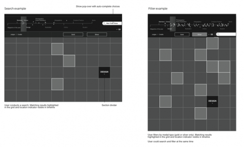
Josh shares wireframes prepared during the creation of his SPD 45 iPad app
Mario: .Josh, what was the biggest challenge as you developed this interesting and visually appealing app for the SPD?
SPD as you know is dedicated to the best in editorial design, photography and illustration. So, on one hand, the bar was very high for this app and on the other hand we knew that immediately we would be working with an incredible library of work. We at SPD felt that there was an opportunity to complement our hardcover annual, not replace it. (link: http://bit.ly/SPDstore )
We felt a utility-based app could be a winner. My first step was to sit down with a IA/UX colleague, Dominic Poon, and sketch out a few ideas with the basic understanding that we had to keep it simple and leverage many of our existing assets. From there, the challenge was the same as any project in any medium: execution. How can we develop this with the highest quality as quickly as possible? With wireframes in hand, I reached out to Balance Software (link: http://www.balance-software.com/ ) with whom I have collaborated in the past. Based on the content of the app, I was able to get them on board for development.
Mario: What have you applied in the design of this app which is based on your impressions and learning from what you have seen in apps over the past 12 months?
As evident at last Friday’s SPD gala, there has been some amazing work done on the iPad over the last 12 months. Just looking at some of the finalists from this year—Martha Stewart, WIRED, People—there has been some incredible work done. That said, we are just at the beginning of the life cycle of this new platform. Think back to web 1.0 when magazines and newspapers first got on the the web.
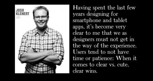
Having spent the last few years designing for smartphone and tablet apps, it’s become very clear to me that we as designers must not get in the way of the experience. Users tend to not have time or patience: When it comes to clear vs. cute, clear wins. If the text takes too long, the video does not start right away, or the radio takes too long to stream: as a user, I’m out. On to the next app.
The app store is littered with novelty apps that you use once or twice and then forget about after a week. Creating an app that the user comes back to regularly is a bigger, more exciting challenge. When we designed the UX for SPD 45 we immediately threw out several complicated scenarios and kept coming back to the experience we launched with, which is really just two screens: the main thumbnail view and the full-screen view. I did not want us to get in the way of the user.
Also, there is a different level of patience that has to go into the development of an app, especially from the features and functionality point of view. For SPD 45, we have our list of features we want to get in over time. Like many developers, we have our “must-have” and “nice-to-have” functionality. I’ve come to acknowledge that once you release an app it’s not “done,” but just the beginning.
Lastly, user feedback is an incredible asset. Between the SPD board and the magazine design community at large, we were able to solicit great feedback during the development cycle that was able to influence this version and future versions.
Mario: I see your app as one of the first in the field of cataloguing and curating: were you specifically thinking of this purpose as you developed your early sketches?
That’s an interesting point of view. At its core, SPD’s mission is just that. With its annual competition we curate and catalogue the best in editorial design, photography and illustration in print and digital. The app is just another execution of its mission and a new way to browse or find that work. As Dominic described the navigation as “exploratory.” The great thing about the app is that it allows for this to happen anywhere you take your iPad: in a meeting, at a photo shoot, on a plane, etc.
Of special interest
One of my former Syracuse University students, Tom Palmer, currently an iPad concept designer himself (as you will soon see in the San Francisco Chronicle app), has offered valuable comments and critique of our South China Morning Post iPad 2.0 version. The links to specifics of his critique are here:
Clickable reporter e-mail address and section front scrolling:
http://dl.dropbox.com/u/16068280/GARCIA_MEDIA/SCMP_design_notes_PALMER.jpg
Columnists and column widths:
http://dl.dropbox.com/u/16068280/GARCIA_MEDIA/SCMP_design_notes_PALMER2.jpg
Use of color and vertical photographs:
http://dl.dropbox.com/u/16068280/GARCIA_MEDIA/SCMP_design_notes_PALMER3.jpg
Navigation bar:
http://dl.dropbox.com/u/16068280/GARCIA_MEDIA/SCMP_design_notes_PALMER4.jpg
TheMarioBlog post #777
On the fourth day: South China Morning Post design evolves
TAKEAWAY: The evolution of a redesign: today’s South China Morning Post shows how the editors and designers adapt to the new ways of presenting information.
Ink+Beyond Presentation Video
I recently participated in the Ink+Beyond conference (April 29-30) sponsored by Newspapers Canada in Vancouver, BC.
Now the organization has posted a video where I discuss highlights of my presentation:
Of interest today
– UK: Publications Seeing Impressive Tablet Engagement
http://paidcontent.org/article/419-publications-seeing-impressive-tablet-engagement/
First paragraph of this entry:
No wonder newspapers and magazines are so keen on iPad editions. Not only do apps give them a retail environment in which to charge – tablet users also spend a lot of time reading their publications…
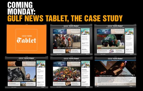
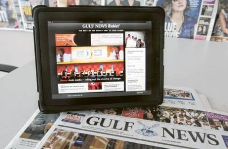
Gulf News of Dubai launches its first iPad app
Courtesy of www.gulfnews.com
The Gulf News today officially announced that it has launched its first iPad app, and definitely the first one in the gulf region to publish two daily editions, Morning Coffee and Going Home.
As we at Garcia Media were directly involved in the conceptualization and design of the Gulf News Tablet (working closely with Gulf News design director, Miguel Gomez, as well as editor in chief Abdul Hamid Ahmad, we plan to post a proper case study blog about our experience here Monday.
For the Gulf News story, go here:
http://gulfnews.com/business/media-marketing/gulf-news-launches-ipad-app-1.809639
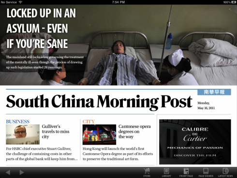
iPad app edition today
Here are some selected screens of the SCMP iPad edition for
Thursday .
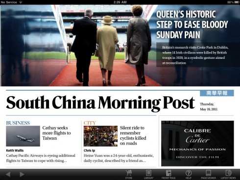
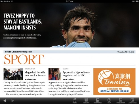
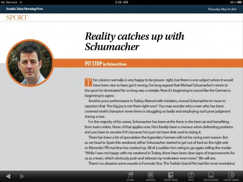
As the SCMP design evolves…

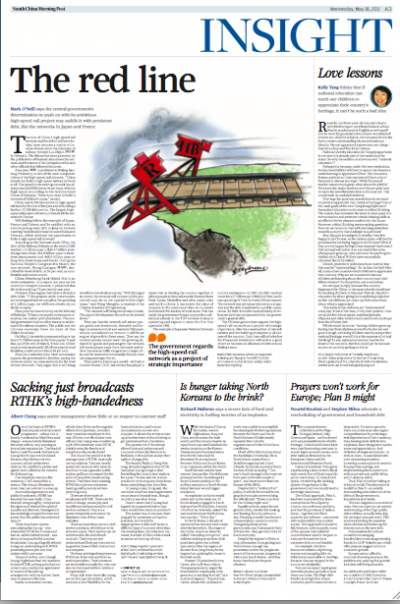
These pages of the South China Morning Post show that the daily gymnastics are helpful as the editorial and design teams continue to strive forward with the new features introduced Monday.
Usually it takes the average redesign project about three weeks for the team to get comfortable with the new set of rules. The fact that the changes at the SCMP are not just limited to visuals, but include content and the rhythm in which it is presented, allow for perhaps a little longer period of adaptation. However, so far so good. Some stories for the front page coming in longer than they should, but nothing alarming. We see an enhanced used of photos, graphics, secondary readings.
TheMarioBlog post #776
The iPad Lab case study: the South China Morning Post introduces app version 2.0
TAKEAWAY: It is a week of “everything new” for Hong Kong’s South China Morning Post as it relaunched new content, design, total rethinking across platforms Monday. Today, in this iPadLab segment, we discuss in more details the introduction of the SCMP’s iPad app edition, version 2.0
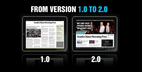
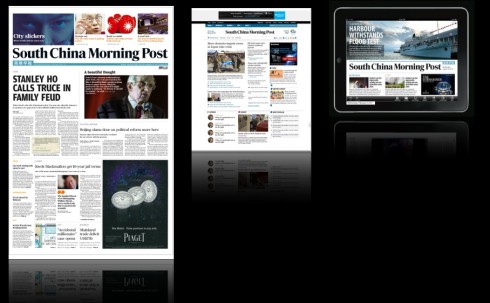
Comparing versions 1.0 and 2.0 for selected screens
The creating of a news app’s second version
Just as the local Hong Kong readers woke up to a new, revitalized, more photographic and colorful edition of their printed South China Morning Post, a global audience which follows the SCMP’s via the iPad edition were able to witness what we internally call version 2.0 of the iPad app that the SCMP introduced in its 1.0 format last November.
As I always say, three weeks in the life of the iPad is about six months in real time. So it was about time to introduce a new version of the iPad app and we have done it.
Working together with the dynamic and talented digital team at the SCMP, headed by Etienne Maccario and Ben Abbotts, we planned our strategy early, and parallel to the work we were doing with the overall rethinking of the printed edition of the newspaper.
We knew, of course, that the iPad app would have to pick up branding elements, color palette, typographic schemes, etc, but we also know that iPad app editions need to emphasize their own identify, benefitting and capitalizing on what the tablet can do best: motion, pop ups, extended use of photography and videos.
Our early sketching for version 2.0 below
Evolution from first to second set of sketches
What is a 2.0 version?
First, it depends on the extent to which version 1.0 carried the content and the design. For some publications, the 1.0 version has been merely an e-reader, a first entrance into the world of the tablets, which is plausible and definitely better than no tablet presence at all.
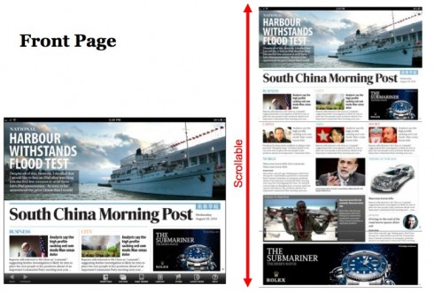
For the SCMP it was an app that followed the newspaper format quite closely. See the illustrations here and you will see that the home page imitated a sort of miniature of the SCMP’s front page.
This was good for 2010 and for a 1.0 version, but we already knew that our version 2.0 would start doing what a second tablet version should do: to branch out of the newspaper paradigm and to start moving in the direction of a unique tablet identity, not just in look, but in content as well.
Developing and designing news tablets is a constant evolution, which is what makes the process so exciting.
We should have a 2.5 version in the makings soon, perhaps for a September introduction, enhancing the value of the tablet, exploring more of its pop up possibilities and taking us closer to that 5.0 version which I fantasize about with the team. In my view, by then we will have separated the tablet edition totally from a “newspaper look and feel” and we will have taken a page from non-news apps that are exploring the concept of the documentary, curating content and creating content suites.
As I sketch some of these ideas, I am also aware that many news outfits, including the SCMP, are still waiting for the tablet to yield income so that they can hire more personnel to man the tablet edition. This, too, will take time, but we must be prepared for when the moment is opportune.
What is new in version 2.0 at the SCMP?
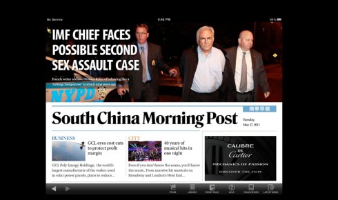
When you open the app, you see that photography plays a key role.
A landscape only design prevails here, and it is explained to users (see image here). Each section opens with the landscape image and a headline and summary superimposed on it. Navigation follows. The internal pages are simple, following a two or three column grid. Typographically, headers match what we have introduced in the newspaper, with Freight as the main font. Headlines use Amplitude.
A swipe navigator allows for instant page viewing at the bottom of the screen for easy navigation.
Although there is a the DNA of the SCMP immediately visible in this edition, it is obvious that we now have a distinct look for the tablet edition.
How about the content and selection of stories?
Unlike version 1.0 of the SCMP app, where the content of the newspaper was more rigidly followed, in this 2.0 version the lead story of our app edition may be a different one from the one played in the newspaper.
Editors are aware that for the tablet edition, there is a global audience, who come to the SCMP app to get news focused on Hong Kong, China and Asia , the strong suit of the SCMP.
In the printed newspaper, however, sometimes the lead may be a world story, as it should be.
From day one of the new 2.0 version, this distinction was obvious, which made us all proud.
Today’s pop up moments

Bild continues with follow ups on the story of the arrest in New York City of Dominique Strauss-Kahn, managing director of the International Monetary Fund, in connection with the alleged sexual attack of a hotel maid at his $3000 per night suite.
In today’s pop up, Bild offers a comparative view of how life has changed for DSK: from a graphic of the Sofitel Hotel suite where he spent his last night as a free man, to the small cell of the notoriously dangerous Rikers Island jail in Manhattan, where he will join the crammed environs in which 14000 inmates wait for court hearings.
In this second pop up, Bild has fun with the fact that the Munich football stadium has a reputation as being the most health food/vegetable conscious of all. Follow the pop up for some vegetable fun.
TheMarioBlog post #775
The marketing of the South China Morning Post relaunch
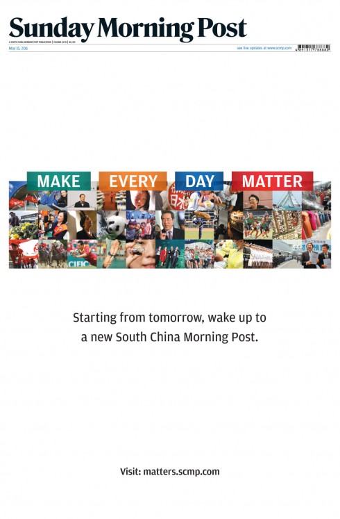
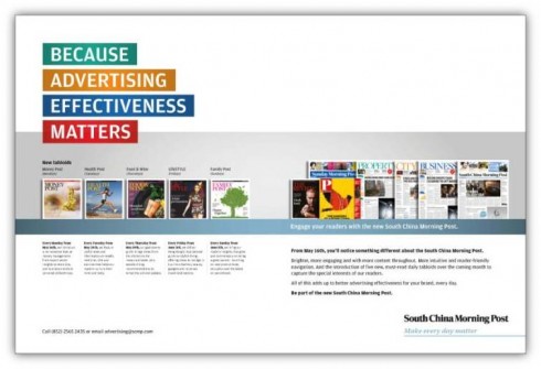
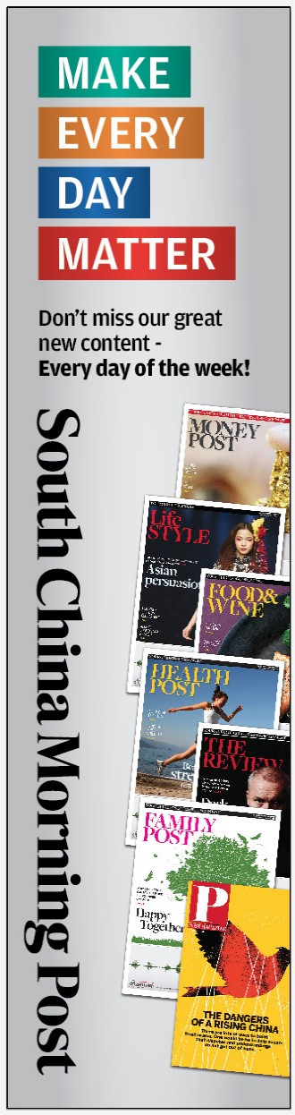
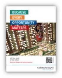
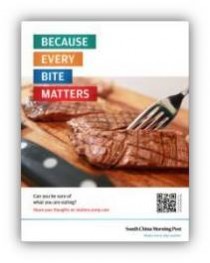
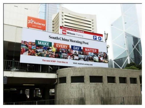
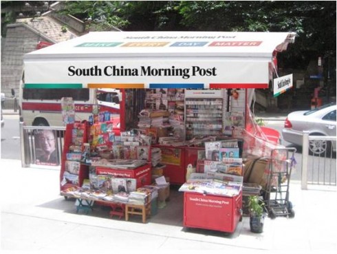
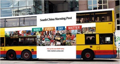
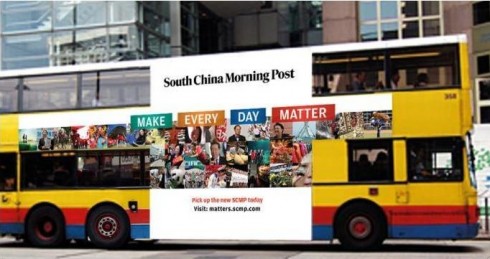
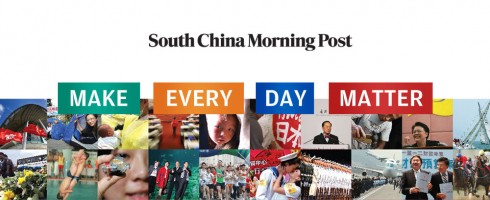
TAKEAWAY: While we labored over typographic styles, photo sizes and color palettes, the marketing department of the South China Morning Post worked right by our side for the past 8 months. Anne Wong, marketing director, wanted to know every detail in the process before creating her campaign. That campaign, Make Everyday Matter, has now accompanied us thru the relaunch and has enough power to become a brand statement for years to come.
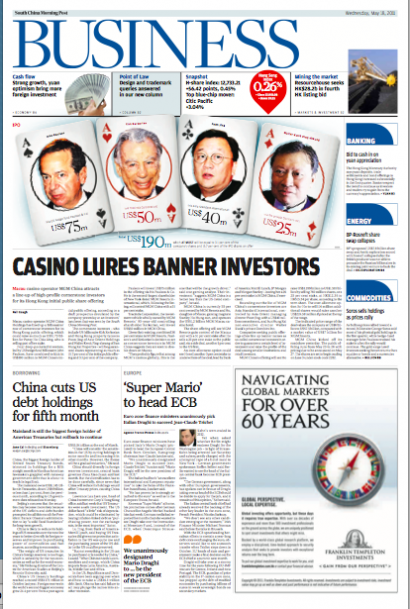
The front pages and the Strauss-Kahn story
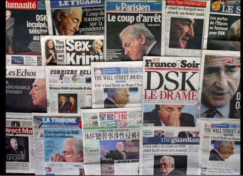
Big headlines for big story with all the elements that sell: sex, politics, money
A French newspaper kiosk shows the headlines for the story of the day in France: the arrest in New York City of Dominique Strauss-Kahn, managing director of the International Monetary Fund, in connection with the sexual attack of a hotel maid at his $3000 per night suite. The story of Strauss-Kahn assumes greater importance as he was widely expected to become the Socialist candidate for the French presidency. The story is also on the front pages of Hong Kong newspapers. As one editor put it to me here last night: “This story has it all, sex, politics, power and money.”
An all encompassing marketing campaign with a simple premise
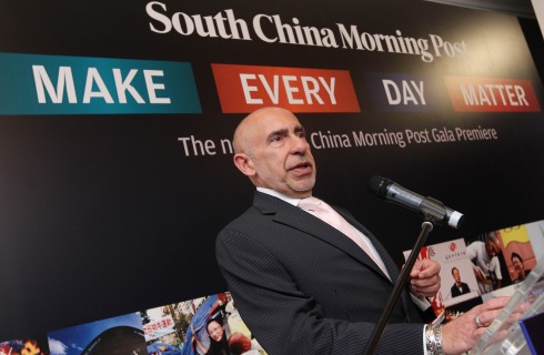
I speak to the gathering at a gala to launch the new South China Morning Post against the backdrop of the Make Everyday Matter campaign (photo by Edward Wong, SCMP)
Anne Wong is diligent, smart, a woman who perseveres, listens carefully then presents her ideas in an easy to understand manner.
So I was not surprised when her final marketing campaign for the relaunch of the South China Morning Post appeared this week, a great companion for a fantastic project, the icing on the cake. I usually don’t devote space to marketing strategies here, but here is an exception.
Anne and her team devoted months to studying what we were doing, sitting in long strategy meetings with editors and designers——something that many marketing types simply don’t do. I now realize what a difference it makes when the marketing people are organically built into the process from day one, as opposed to making a hasty appearance during week 21 of a 24 week project.
Anne knows that she and her team. which includes Michael Chu, assistant director for brand management/strategic marketing, have major challenges ahead of her: attracting younger Chinese readers living in Hong Kong, not alienating the core base of ex patriates who trust the South China Morning Post now for 108 years to bring them their news in English, and, making sure that the newspaper readers feel that they need the SCMP to be well informed about Hong Kong, China, Asia and the world. They are also quite aware that the digital revolution has brought with it other platforms to satisfy the informational need function. I have seen Anne and her team reach out to the various platforms, not just print.
It is important to mention that Anne’s team at the SCMP is small in size, but obviously large in talent. Among them is Wayne Knowles, Creative Director , who was instrumental in making sure that the campaign had an infusion of good ideas from the start. “We did everything except the website in house with Wayne’s small creative department,” Anne reminds us.
A campaign on display
From billboards on buses and throughout the city, to point of purchase displays, to insinuating the Make Everyday Matter statement into stories that, indeed, deal with people who make everyday better, this is a far reaching campaign, and, as I told Anne during our gala evening in Hong Kong tonight: a campaign with legs.
The statement Making Everyday Matter is simplistic, and effective because of it.
Who can be against making everyday matter, and better?
Don’t we wish each of our days was better than the last?
Doesn’t the idea of making everyday better entice us to do something to achieve it?
A short interview with Anne Wong, marketing director, SCMP
Mario: What was the major challenge as you planned this major marketing campaign to relaunch the South China Morning Post?
Anne:
The South China Morning Post is 108 years old, but we needed to grow younger and be more relevant. It is about proactive evolution, not desperate revolution; what we had was still winning awards and enjoyed a body of loyal existing readers.
However, there always comes a time to state your position more boldly. Our brand values have always been: trust, credibility, authoritative, insightful. But the new media user wants more: engagement, interaction, social currency, quick takes. The one common thread amongst all readers, past, present and future, is the drive for information that empowers them to make better decisions, understand the world around them more fully, enable them to engage in a social community more effectively. Our brand tagline “Make Every Day Matter” reflects a portfolio of products that help them do just that.
Mario: How do you see the work of a newspaper company marketing director today different from let’s say five years ago?
Anne:
Five years ago, newspapers weren’t competing so hard for a share of reader time. Now they’re competing not only for time but also finding it harder to differentiate and provide nuanced content in a timely enough fashion that is valuable to readers. Today, more than ever, it’s more important for media companies to define their unique product and brand values. This requires a firm understanding of the target audience and what matters to them across various media platforms. Brand advertising was probably unheard of for newspapers 5 years ago – it was always product advertising. Now with the commoditization of news, it’s the brand promise that will help differentiate.
Here is how the campaign appears in its various formats:
Promoting the supplements
Front page wrapper
Prior to the launch, this wrapper was used around the front page, promoting the coming event.
Banners etc
Teaser ads
Buses, billboards, newstands
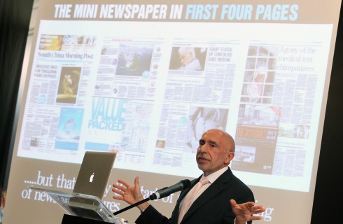
Introducing the concept of the mini newspaper inside the newspaper: the first four pages of the South China Morning Post ideal for scanners
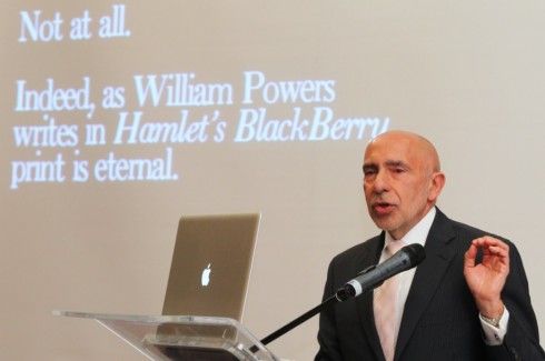
Promoting the notion that print is eternal, as quoted from William Powers’ Hamlet’s BlackBerry during gala presentation
Today’s pop up moment
Bild offers us a marvelous sports pop about a German national goalkeeper playing for a team now 0-4, so the question is: is he losing the Cup?
TheMarioBlog post #774
South China Morning Post: new beginnings in a new Hong Kong, new China
TAKEAWAY: Today, Hong Kong’s best known English language daily appears with new look, new content, daily tab supplements and changes across the platforms. It culminates an 8-month project in which we examined every column, every page.
Hong Kong’s premiere English language daily introduces changes
Billboards like this one on a local bus appear all over Hong Kong. Tomorrow in TheMarioBlog: the marketing of a newspaper’s relaunch
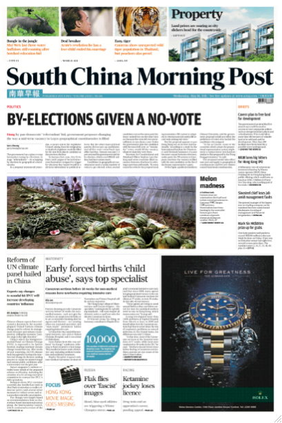
Here is today’s front page (first edition)—will update as more editions appear
South China Morning Post introduces changes across all three platforms today
Midnight and the press is running in Hong Kong, printing the first edition of the SCMP
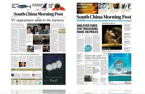
Before and after front pages (in the prototype stages of the project)
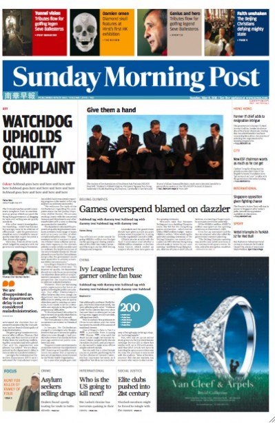
Prototype of the Sunday front page for the South China Morning Post

Opening of Asia section: notice column of visual briefs, where many photos from around Asia tell a mini story via caption
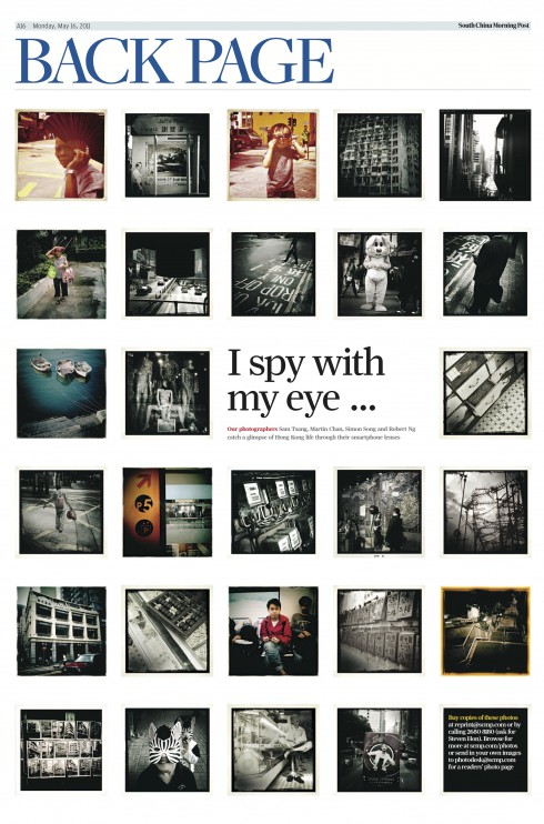
The Back Page of Section 1: photographers in the staff of the SCMP use their smart phones to take pictures during assignments; the editor invites readers to send their own
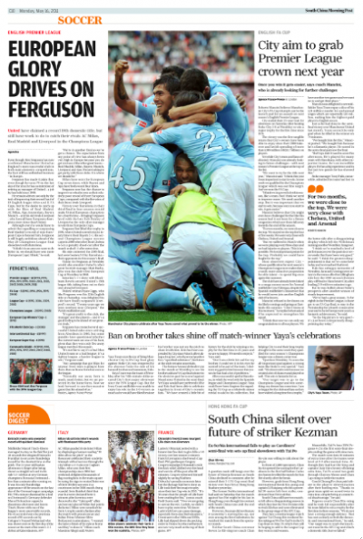
Inside sports page
My first impressions of Hong Kong’s South China Morning Post are from 2005 when I arrived in the city of skyscrapers that sit on hills like bleachers in a football stadium to redesign The Wall Street Journal Asia.
Here we were converting the big WSJ broadsheet to compact size, but everyday, folded and wrapped in a small cotton bag, would be the South China Morning Post hanging from the door knob of my hotel room.
It was big, contemporary looking and a bit schizophrenic in terms of headline sizes, the stories it displayed on Page One—-one day heavily into the local political scene, the next a sort of cinema noir story about murder in one of those narrow alleys one finds behind the 78-floor towers. So each morning I would look at the SCMP, and, although I liked the energy and modern feel its typography and design evoked, I always wondered silently what I would have done with it if given an opportunity.
That opportunity came in mid 2010 when I had a call from then editor Reg
Chua, who, coincidentally was the editor of the Asian Wall Street Journal when we converted it to a compact format. It was a surprise t hear that Reg was now editor of the SCMP, but also to hear that my friend Steven Tan, with whom I had worked in a redesign of The Star, in Kuala Lumpur, Malaysia, had also joined the SCMP as manager. We agreed to meet and it was like going home to sit with Reg and Steven and map out the rethinking of the South
China Morning Post that premieres today.
(Note: Reg accompanied us in the first stages of the project but resigned in April. He was replaced by acting editor Cliff Buddle, a veteran of the SCMP, whose enthusiasm, talent and professionalism allowed for a seamless transition and eventual culmination of the project).
In the beginning
The Hong Kong of 2011 is not the same I discovered I’m 2005.
Following the much celebrated transfer of sovereignty over Hong Kong from the United Kingdom to the People’s Republic of China in July 1997, Hong Kong has continued to grow upwards into the sky, but continues to provide some od the world’s best shopping, especially of the luxury kind. It is a young place, and one seas a sea of very young faces at every street corner while waiting for the traffic light to change; those double decker buses with the gigantic Gucci or Prada billboard ads on the side often resemble school buses, young faces peering from the windows.
This is the challenge for the South China Morning Post: to attract these young people and to convert them into habitual readers. Although these young people are bilingual , it is chic to speak Cantonese or Mandarin more so than English. The new SCMP would like to show them that it does not have to be, and that reading the English daily will allow them better opportunities both at home and abroad.
Although the newspaper’s marketing campaign, created by Anne Wong, SCMP Marketing Director, echoes this (Make Everyday Matter), the real proof is in how the editors develop consistent content strategies that prove the point daily.
New content, new navigation
From the very beginning, I was aware that this project would not be a mere cosmetic exercise, or another redesign (of which the SCMP had plenty in its 108-year history).
Instead, the task—-and the challenge—- would be to rethink the 108-year-old English language of Hong Kong for a new generation,a new Hong Kong and, of course, the new powerful and vibrant China.
And, as with newspapers everywhere we had to address the issue of how a printed newspaper thrives and survives in a multi platform world.
The mini newspaper concept
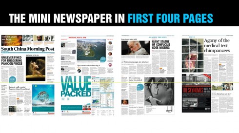
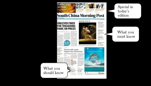
The first four pages constitute a mini newspaper: if the reader goes through these, he/she gets a good idea of what is going on
<
In a world with tons of information transmitting 24/7, and with impatient readers/users, the newspaper has to offer the type of content flow that adjusts to the lifestyle of those who consume it.
We created the mini newspaper concept to serve that purpose.
The mini newspaper is actually the first four pages of the new South China Morning Post: The front page with the news that you must know plus a window to the best of the inside,the second page a briefing agenda to Hong Kong and China today,with the photo of the day and quotes of relevance; page 3 a second front page packed with more news you should know before getting out to work; page four, focusing on one big theme of the day.
If all that a reader in a hurry reads is those four pages, he has a thorough idea of his world today.
Starting with page 5, the rest of the sectionalized content appears, starting with China news.
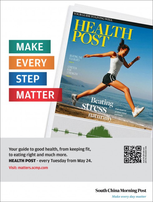
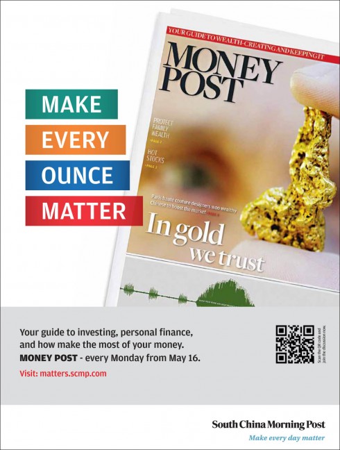
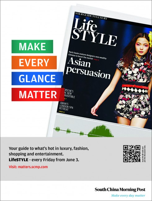
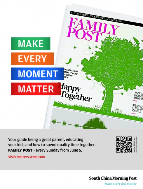
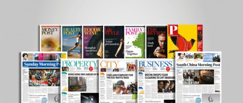
Daily tab supplements
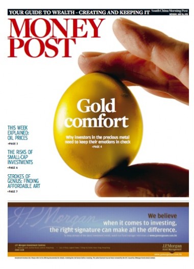
Today’s tabloid section: Money Post, a weekly guide to business and finance news, consumer information
Three of the five new supplements, all tabloids, appearing daily
There will be new lifestyle topics covered through daily supplements in tabloid format,from Health to Food to Money, these subjects which redefine the concept of news and extend it to embrace that which is important in the readers’ lives.
The logo
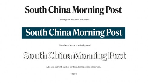
There was never a discussion of changing the logo of the South China Morning Post, but we wanted to clean it a bit, give it more style, and I wanted to. Trey the impact it would have with a blue background color, reversing the letters in white.
As we often do, we commissioned Jim Parkinson to take a look at the logo and offer us hips ideas, which he did in his usual masterful way (see below). The reversed blue logo appealed to many in the management team, so it was decided that we would use it for the Sunday edition.
The typography
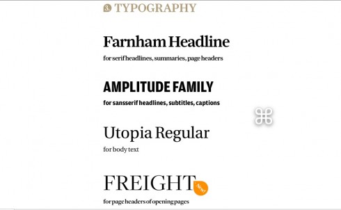
The type scheme selected for the new SCMP combines
Farnham and Amplitude for headlines; Utopia for text; and Freight for headers.
The colors
img src=“https://garciamedia.com/assets/uploads/blog/color_coded_scmpjpeg_thumb.jpg” style=“border:0;” alt=“blog post image” width=“490” height=“274” />
Part of the process to ease navigation is the color coding of sections.
We created the color palette you see here, assigning specific colors to the various sections and subsections of the newspaper, inspired by the backdrop of colors that is this magnificently scenic city of Hong Kong and its surroundings.
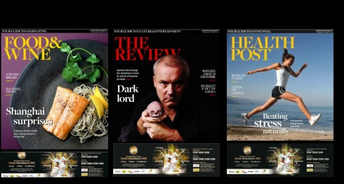
The Post
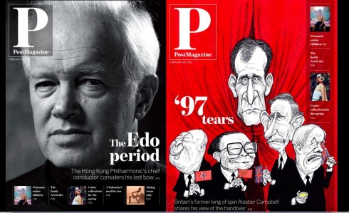
On Sundays, the SCMP publishes Post Magazine, a semi glossy publicación with a variety of content such as features, fashion, food and wine, design, lifestyle and interviews.
Here we created a different logo emphasizing the letter P for Post, and allowing for a systematic index navigator on the cover.
The SCMP iPad edition is here
Home page of the new iPad app edition for the South China Morning Post
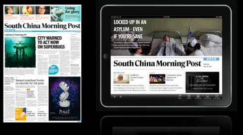
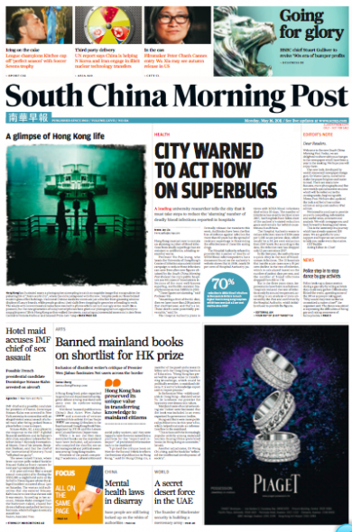
Important to notice that the lead stories for print and iPad edition are totally different, underlining the importance of differentiating: the Hong Kong edition of the printed newspaper may emphasize a very local story, while the more global audience of the iPad edition craves features and more analytical stories. In this case, the printed newspaper carries a story on health: Hong Kong must act now to contain an alarming number of blood infections from deadly superbugs that are resistant to antibiotics, a leading researcher warns. Here is where a dedicated iPad edition editor makes the difference.
The iPad edition also opens with a health related story, but, in this case, about mental illness in Chine: the mainland still lacks a law governing the treatment of the mentally ill. Here is where the presence of a dedicated iPad editor makes the difference.
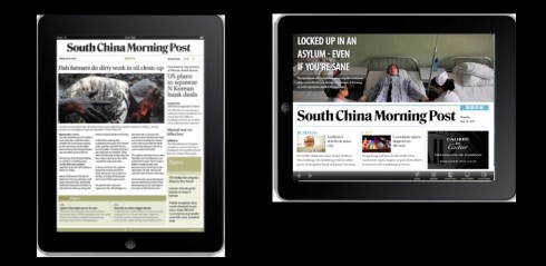
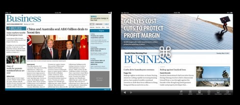
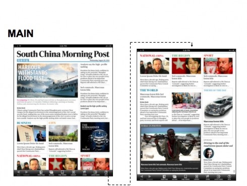
Here you see the evolution from the 1.0 to 2.0 versions of the South China Morning Post iPad app edition
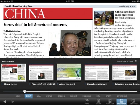
Opening of China section: notice screen by screen navigator ready at the touch of screen
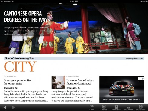
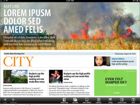
Opening of City section
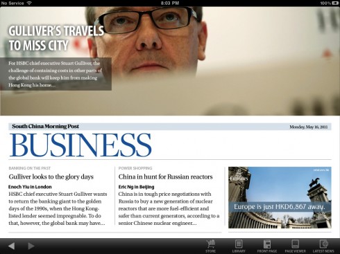
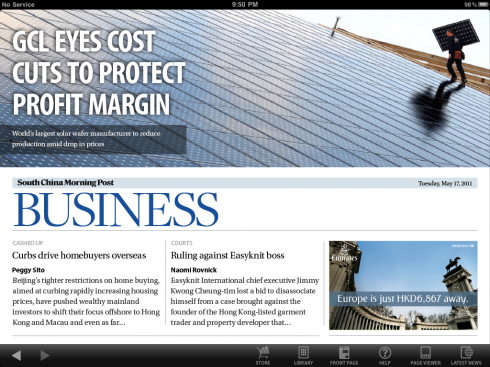
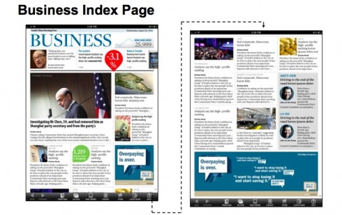
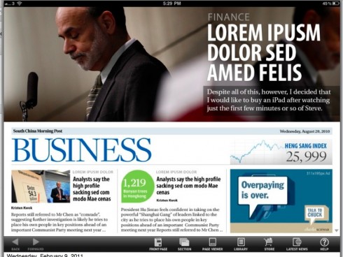
Opening of Business section
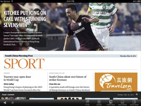
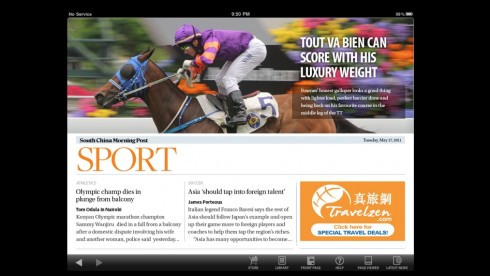
Opening of Sports

One photo from the photo gallery
While the South China Morning Post launched its first iPad app, version 1.0 in November, we thought it would be timely to develop the 2.0 version to coincide with the launch of the printed edition.
Working closely with Ben Abbotts and Etienne Maccario, of the SCMP Digital Team, we decided to evolve from that 1.0 version which was more like a miniature replica of the newspaper, and to emphasize the larger photos, which will also be a trademark of the new printed edition.
In addition, we pick up the color code, typographic scheme and overall look and feel here.
The team
We counted with the assistance of a wonderfully creative team to achieve the good results shown in the South China Morning Post that premieres today: our Garcia Media art director, Jan Kny; the SCMP’s art director,Troy Dunkley. For the Post Magazine’s redesign our Garcia Media art director was Nai Lee Lum, working closely with the Post’s art directors,Steve Ellul, and Catherine Tai. Other SCMP designers involved: Stephen Case, art director (Graphics & Illustration), Editorial; Simon Scarr, graphics director; Carl Jones, team head, Design and Layout; Ung Mah Pheng, Editorial Production Manager; Matthew Masiruw, Design trainee
For the digital platforms: We at Garcia Media worked with the SCMP’s digital editor, Ben Abbotts, Mario Garcia Jr. , of Garcia Interactive, continues to work with Ben on further development of the online edition; I work with Ben on the iPad edition.
Today’s pop up moment
Bild takes us to the Cannes Film Festival and you can play with the Palm d’Or.