TAKEAWAY: The Daily has made several favorable improvements since its January 2011 premiere. We have a chance to revisit it.
A newly revamped The Daily: Four (of 5) Stars
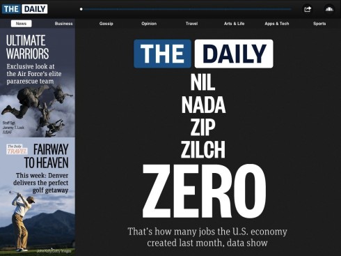
Opening page of this weekend’s The Daily, with some new design features
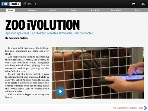
More videos and pop up moments appear

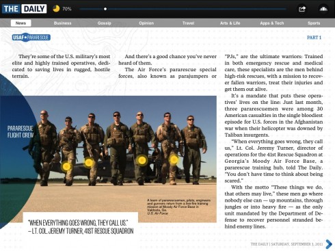
Here is opening of special series on the Air Force
Tap photo and mini story will appear, see below
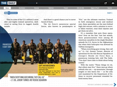
Mini stories upon click of photo, a great feature to enhance storytelling
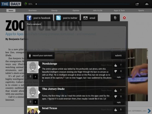
It is easy to share stories through Facebook, Twitter, and email, as well as add your written or audio instant comments
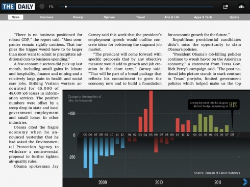
Graphics are animated
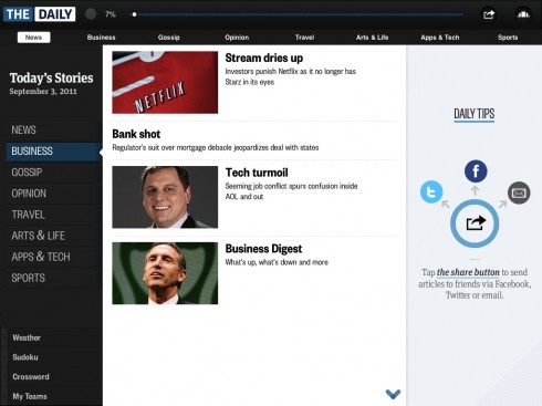
This is the new table of contents page, which replaced the more visual carousel as the opening navigation
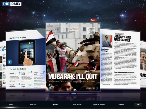
This was the original carrousel navigator, now exiled under a small button: why?

Go vertical for opening of Arts & Life

Daily Travel: a bonus to the reader, good content, great presentation, pop ups
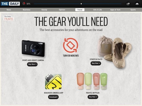
Nice feature: go shopping while reading the Daily Travel section
We first discussed The Daily , the so called first newspaper created specifically for the iPad, when it premiered in January of this year. We were not so impressed by it at the time, except for that visual carrousel navigator, and, what to me represents the best newspaper advertising in a tablet.
Now, almost 9 months later, we have decided to revisit The Daily .
This is version 1.1 officially, but it is so much better that it seems more like version 2.5. It is now closer to what a news app should be like.
There is still a bit of content schizophrenia here: does it want to be serious and authoritative, or does it prefer to wear the more heavily mascaraed look of its sister publication, the New York Post.
Indeed, any publication that includes Gossip as a category and part of its content navigator probably wants to be the bad girl in the party.
That aside, I like a lot of what I see in this newly revised version of The Daily .
The finger seems to be happier here too, with graphics that move, photos that allow for click and read (as in the case of mini stories in today’s series about those star parachuters in the Air Force.
There is more video, more interactivity, and the ads are still primo material worthy of a second or third look by anyone working with their advertising departments to bring true-tablet ads to the iPad.
But, why did that deprecate that gloriously visual carousel with the big images? That was nice and innovative, and intuitive, easy on the eyes, the brain and the finger. Why did it get hidden under an icon on the upper right, replaced as the default navigation view by a more mundane table of contents summary?
Does anyone know? Did focus groups exile this wonderful feature? I hope not.
The Daily Travel is a great bonus, and one can go shopping here too.
And the social features are more comprehensive than most other news apps. Facebook, Twitter, and email sharing are par for the course, but the integrated comments system is an unusual touch. I love the idea of audio comments, taking advantage of the tablet’s capabilities.
Kudos to The Daily for evolving and getting much closer to what an effective, visually appealing and finger seductive news app should be.
The Daily Travel has a rotating feature that indicates to turn the iPad for “more information”. Upon doing so, we are in vertical reading mode. For those debating that hot topic—-scrolling versus swiping—-there is much more swiping than scrolling. The table of contents is one of the few places where scrolling takes center stage in The Daily.
The shape of things preferred.