Update #4, Monday, April 18:38 Vienna, Austria
TAKEAWAY: No matter what language or alphabet is involved in the design changes to a newspaper, website or tablet, there are some essential, universal values that prevail, as our recent work shows.
Three design essentials, regardless of language
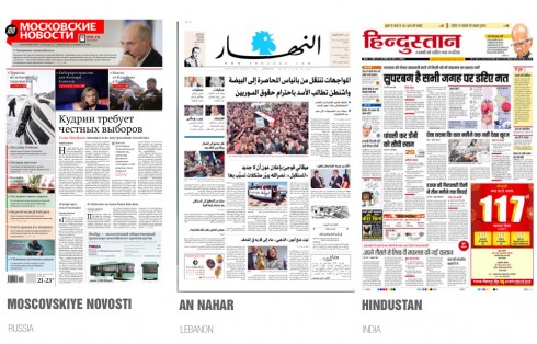
Front pages of Moscovskiye Novosti (Russia) in Cyrillic; An Nahar (Lebanon) in Arabic; Hindustan (India) in Hindi
With the launch of three recent of our projects, all in non Latin alphabets, I have received dozens of emails from across the globe with one interesting question: how can you design a publication using an alphabet that you don’t know well.
Indeed, a valid question, but one that I usually answer the same way: there are some universal values in terms of design that apply to all, and that provides me with a good start. Second, one cannot do these projects without having a good copilot who understands the language and the characters used to communicate. Third, it has been my long standing philosophy to work very closely with the local art director. If all these requirements are met, then the rest is a matter of following the steps one would follow in any redesign/rethinking process.
What are some of those universal values that apply to any publication, regardless of language?
Make the information easy to find.
Make the type easy to read.
Make it attractive.
Moscovskiye Novosti of Russia uses the Cyrillic alphabet. Of interest: Cyrillic became the third official alphabet of the European Union, following the Latin and Greek alphabets.
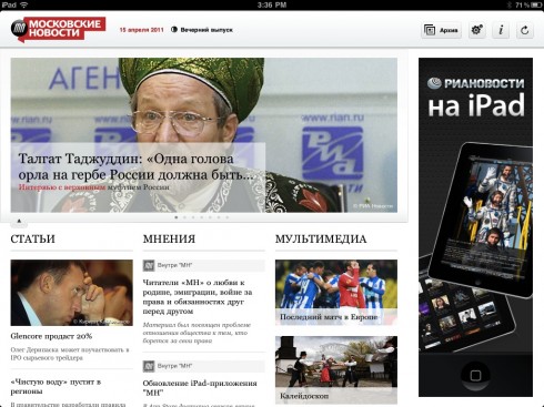
Today’s landing page for the Moscovskiye Novosti iPad app: Cyrillic alphabet
An Nahar of Lebanon is in Arabic—Of interest: The Arabic script is written from right to left, in a cursive style, and includes 28 basic letters
Hindustan of India is in Hindi Of interest: It is one of the 22 official languages of India and is used as the primary official language of the Republic of India.
—-
I have personally also worked with the Greek alphabet as we redesigned Athen’s Ta Nea, the Hebrew alphabet for our collaboration with Israel’s Haaretz, and Malayala with India’s Malayala Manorama
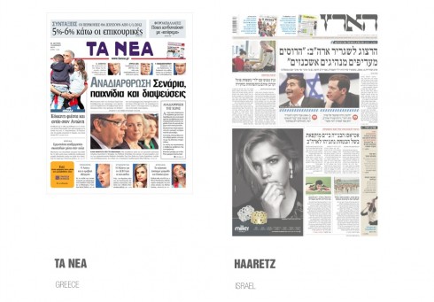
Recent front pages from Greece’s Ta Nea (left) and Israel’s Haaretz. My work with these newspapers took place during the 1990s
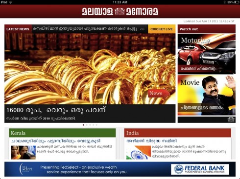
A news landing page from our recently launched iPad app for Malayala Manorama of India, published in Malayalan
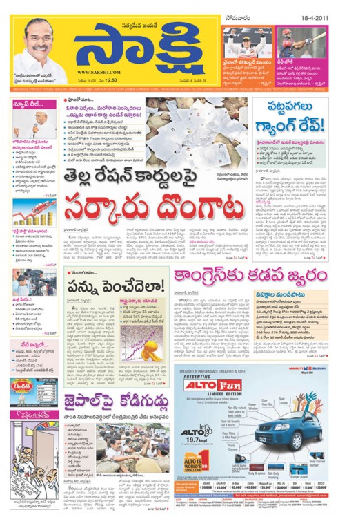
Front page of our project in Hyderabad, India, published in the Telugu language.
Read more about it here: https://garciamedia.com/blog/articles/new_daily_in_telugu_language_for_hyderabad_india
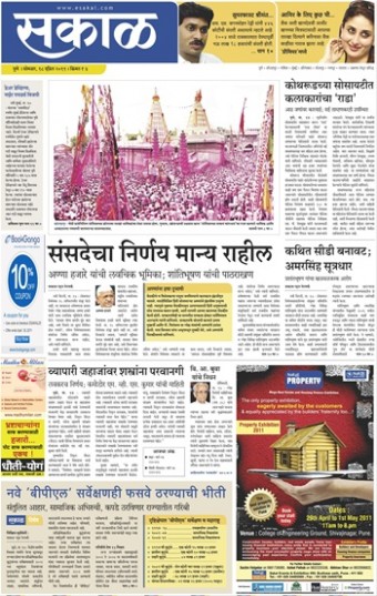
Front page of our project in Pune, India, published in the Marathi language
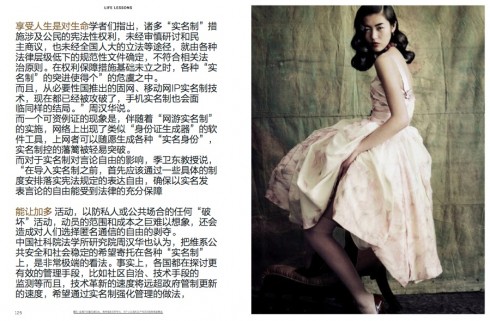
And in Chinese….
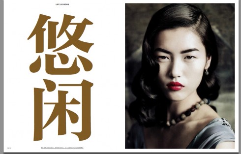
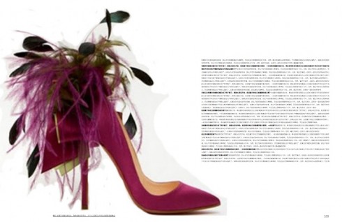
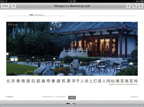
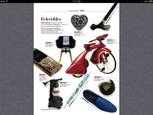
It is all about China and we prepare for the possibilities of that market with a one of a kind project: the creation of the first official magazine ever for the Shangri La hotels. Indeed, it is work that we are currently carrying out in Hong Kong. My copilot for this project is the super talented New York-based designer Nai Lee Lum, and we show you here a collection of pages from the prototypes. The magazine, to be called Shang, premieres next month at all Shangri La hotel properties worldwide.
We will, of course, case study the launch of Shang in this blog.
Nai, a native of Hong Kong, kept enlightening me about Chinese calligraphy: “Each character represents a symbol, it is pure art, Mario,” Nai would remind me during our many work sessions.
And here is a case where the alphabet itself influenced the design. From the start, when I first saw the Chinese characters on the page, I decided that this would be a very minimalist design, to allow for the beautiful characters of the Chinese alphabet to stand out forcefully and aesthetically.
The challenges
It may sound ironic, but perhaps the most difficult challenge for me when working with non Latin alphabets is to convince the editors that we must use a minimum of 9 points for text. Not that we don’t have to convince editors and publishers of Latin alphabet newspapers about the same; however, when the alphabet is foreign to me, I am always told “we can read it fine in 8 points” and, of course, what can I say if I do not read the language in question?
But readers everywhere appreciate our efforts to get text type up in size. Vision deteriorates with age the same globally, and I think nobody should ever use text in less than 9 points, regardless of alphabets.
When dealing with Arabic, there is always the difficulty of reading flow, since Arabic is read from right to left. I am presently working on the iPad app for An Nahar of Lebanon and I must do each of my sketches as if it was a Latin alphabet reading mode left to right, then simply flip the images on the screen!
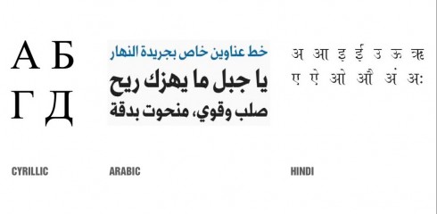
And of the Indian languages, I do prefer Hindi for one simple, aesthetic reason: notice the illustration above and how the top of the letters is rather linear, unlike Malayalan, which in my view, is more a combination of miniature elephants and snakes intertwined in some type of strange tango.
WoodWing’s Xperience seminar May 24-25
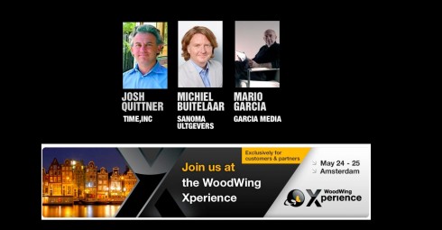
I am honored to be one of three keynote speakers at the upcoming WoodWing Xperience seminar in Amsterdam May 24-25
I did a previous keynote for a WoodWing Tour function in London in 2010.
For those interested in attending, here is more information:
May 24-25, 2011, Amsterdam, Netherlands
http://xperience.woodwing.com
WoodWing launches Open Format for Interactive Publications
The launch of ofip is an initiative of WoodWing Software aimed at developing a standardized data format for interactive publications, such as digital magazines, newspapers, books and brochures.
For more information:
http://www.ofip.info/Open_Format_for_Interactive_Publications/Home.html