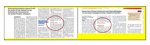
TAKEAWAY: Break up the text and advance the story. Some newspapers, such as Salzburger Nachrichten (Austria), and Daily Xpress (Thailand), above, colorize subheads for greater visual impact.
Behold the subhead, that most minuscule of all navigational tools in the designer’s box, but, alas, how effective to allow for “finger reading” as today’s fast paced and impatient readers decide to move around the content of a story at their pace, sort of “I already know the first part of the story, so let me jump to this next segment, which appears interesting.”
The Germans call their subheads “zwishentitels”, the Spanish “entretitulos” and in Latin America they are referred to as “ladillos”. No matter, subheads are the ultimate navigational tool, placed just at the transitional point of the story, where they pull the reader into the next segment.
Especially in longer text—-more than 25 inches—-but not necessarily limited to that length, subheads are exactly the right formula to get us from here to there within a story. So, if you are in the middle of a long analysis of the outcome of the US Democratic Primary election, suddenly you read the subhead that reads: What next for Hillary?
Your finger leads you to that one spot, alerts your eyes, and you continue reading, or perhaps you begin reading the story there. We notice in EyeTrack research, that today’s reader is anything but disciplined. He/she may read a headline, skip the introductory part of the story, and move right to where that subhead signals an interesting or provoking segment of the story.
In that sense, well placed, well written subheads are sort of like huge rocks in the middle of a lake, allowing you to jump from one spot to the other.
How to write subheads? Treat them as mini headlines, but keep it simple: one line subhead works better than two.
How to design them? Make them at least one point larger than the size of the text in the story, but two points is even better. Make them bold, and I prefer them in a striking sans serif font, for contrast.
And, please, allow two lines of white space above them, since the finger must be able to find these little gems of information, and the white space helps.
FREQUENTLY ASKED QUESTION: Is the use of big capitals in the middle of text as effective as a subhead.Not at all. Subheads convey information, move the story along and guide the scanner to a certain spot, while initial letters are mere decoration, lacking any utility.
WHERE IS MARIO: Working in Tampa all week.