TAKEAWAY: Again, editors are faced with drastic changes on how they conduct their business (think iPad); again, some of them are skeptical; again, they will join and, who knows, maybe this time it will all be smoother than the transition from print to online PLUS: A book designer says “good riddance” to print.
Accepting yet another revolution in our midst—not easy for some
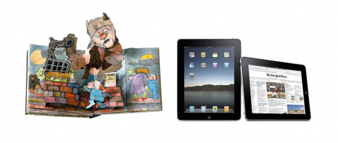
With the iPad we say good bye to the static and linear, and hello to a pop up book of storytelling possibilities:
As another week starts, and as we are totally involved in discussions about the introduction of the iPad with a variety of newsrooms, I can’t help but think that, suddenly we are in the midst of this highly influential but relatively small new gadget, and, yet, so many practicing editors I know have NOT fully accepted the presence of online in their worlds.
How are these same editors going to advance beyond online editions and into iPad editions?
Not that I have an answer to this, but I have already heard enough about the doubts of these ultra conservative editors to know that we will have to create sensitivity workshops to deal with this aspect of whatever program we offer for iPad introductions.
Suddenly, the past takes center stage for me. I recall my experiences in newsrooms across the world when major changes took place there.
Editors are NOT necessarily the most progressive people when it comes to change—-especially of the technical kind.
First, the color revolution
When color was first introduced to newspapers, in the late 1970s for most, early 1980s for a majority, it was common to sit in a newsroom and hear opinionated editors voicing their anti-color beliefs.
“Color will cheapen the core of what we are,” would say one editor.
“Color is for the tabloids, for papers who cater to the uneducated,” would say the other. “No serious newspaper will fully embrace all that color.”
(Meanwhile, the management of the newspaper was embarking into major investments to get color presses ready and running!)
And so, editors were dragged in the proverbial kicking and screaming mode that is now a cliché, but so true. In typical fashion, not only did they embrace color, but soon enough we had to move in with the color use brigade to control abuses of color, as many liked color so much that they resorted to doing Carmen Miranda samba numbers on their pages. By the time, USA Today arrived (1982) any newspaper that did not have a weather map in all color (which in summer can be all yellow and red hues) went shopping for one quickly.
Newspaper editors usually go thru three major mood swings when it comes to something new: first, rejection of the new idea; second, professional acceptance ; third, ownership of the idea. “I was all for changing the logo from the start,” proclaims the editor of the newspaper during the gala introduction of the new look and new logo, don’t mind that he was the first one opposing prototypes that did anything but KEEP the old logo.
Similar reactions were voiced when the first of the classic broadsheets, as in The Wall Street Journal Europe and Asia, moved to tabloids. Again, the change had doubters at first, then joiners, then, voilá, “we always thought tabloid” reactions.
Along came online editions
When online editions established themselves as “here, now and forever,” again, at first edtiros gave us the usual lines:
“It is not news till it appears in print.”
“Nobody wants to read on a screen, scrolling up and down into an endless pit of type”
“Online eliminates surprises. We all like to run into that story on page 17 that is hidden, but good. No such surprises online.”
In this case, however, many editors went along with this kind of reasoning——for too long! The result? Well, we are all aware of the result. A stampede-like rush to recognize that online is, indeed, here forever, and that people DO read on a screen (do they ever? If the Poynter EyeTrack study is an indicator, more stories are read in their entirety online than in print), and that WE all had to do something about streamlining operations, integrating print/online, and realizing that life for the journalist in the newsroom (should I say, for the storyteller?) would never be business as usual.
iPad in the horizon
So now come the tablets.
The iPad is so far the most prominently heralded, and it is about to make its grand entrance.
I hear the rumblings of that initial opposition again.
“Why would someone have an iPad, an iPhone and a laptop? Which would be better to read the news?”
(This editor usually thinks that nothing beats ink on paper and the experience of reading a newspaper or magazine that you hold in your hands, fingers touching paper).
Then, comes the natural confusion: what would I put on the iPad edition that is NOT already on my online edition?
Let’s not forget the tech guys, please
If we are talking reminiscing about the introduction of new things in our business, then let us not forget those technology guys and gals. They become protagonists and take center stage when technical innovations come to the front.
They did when color first appeared.
They are the ones who knew how color ink landed on the page, and therefore were privvy to what could and could not be done.
True to form, the techies of the times loved the word NO.
Designers would dream up color fantasies, but the techie would say: No way you can do that.
The list of CAN”T DO was always longer than the list of CAN DO.
And we would sit there, feeling impotent, as we did not know the intricacies of color printing: the techies always had the last word———usually NO.
Funny, I hear the same now about the iPad, with the techies holding back, playing it super safe (maybe this is wise at the start) and creating a little tension in those meetings when eager editors and designers meet the cautious techies.
So, we are likely to see a lot of very plain beta versions of iPad publications in the early stages. It was the same when papers converted from hot to cold type, or black and white to color. I have lived thru these transitions.
Maybe we all should have learned something from those experiences, mainly: be adventurous, try and fail, regroup and reorganize, try it again.
The potential of the iPad is too tremendously big to go out with just a flip page by page of the publication as we learn to use the new gadget.
Read on, as Apple is putting together guidelines for those entering the world of iPads.
One iPad guideline to ponder upon
Don’t miss this piece aboutSinclair Lewis realistic novel.
For iPad to truly do what it is supposed to do, there must be enhancement and interactivity, two highly desireable qualities for almost every story.
Here is how the Apple’s guidelines address the issue:
Enhance Interactivity (Don’t Just Add Features)
The best iPad applications give people innovative ways to interact with content while they perform a clearly defined, finite task. Resist the temptation to fill the large screen with features that are not directly related to the main task. In particular, you should not view the large iPad screen as an invitation to bring back all the functionality you pruned from your iPhone application.
So let’s get everyone together in the room: the storytellers, the designers, the editors and the techies (don’t forget marketing and advertising, please), and let’s learn from the mistakes of the past and move forward positively knowing that the iPad (or a similar tablet) are likely to offer us the most profound and significant change in our mode of operation.
Embrace it. Discover it. Go for trial and error——and tell the techies in your midst that you know it may be tough, but you wish to try it, anyway.
Like in the pop up books: surprise!
Well, you don’t really have to be so radical!
On the other side of the spectrum, as we deal with the introduction of the iPad, are those who say “good riddance to print” and declare that they ONLY wish to work with the iPad or other tablets.
Not so quickly, I say. Print is not dead, print is not dying; ink on paper will be part of the offering—-but only that, a part of the whole.
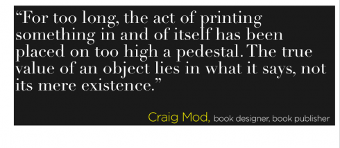
But Craig Mod, a self-titled computer programmer, book designer and book publisher, thinks differently, declaring that: “Print is dying. Digital is surging. Everyone is confused. Good riddance.”
What I like about Mr. Mod’s analysis is his statement that content is king, and that instead of arguing about pixels versus paper, as many print aficionados often do, it is more useful to focus on whether the technology is a good match for the content. Mr. Mod let us believe that the positives we attribute to what he calls the “physicality” of printed products, particularly books, is not really so grand . Instead, he argues that it doesn’t really matter which vessel we choose to read on, since the content will always be king.
Amen, and something to remember for every editor arguing that “print only ” is where it’s at for information.
Read all about it:
http://bits.blogs.nytimes.com/2010/03/05/a-former-book-designer-says-good-riddance-to-print/?partner=yahoofinance
TheMarioBlog post #499