TAKEAWAY: We continue our work with the new Moscovskiye Novosti, the iconic Russian weekly that will now reappear as a daily in February ALSO: In Luxembourg, Le Quotidien introduces its new look.
Envisioning a design across platforms
Yesterday we presented a brief history of Moscovskiye Novosti and the important and influential role it played since its arrival in 1980, pushing for an end to the cold war and ushering in perestroika.
Now, a team of editors, reporters and designers prepares to launch the legendary MN as a daily, planned for February 2011. The clock is ticking and we are busy with meetings and plenty of hands on workshops to design not just the printed newspaper, but all platforms.
As we get closer to agreeing on that important first step of “look and feel”—-what readers will perceive from looking at the front page of the newspaper in 10 seconds——we now devote most of the day today to a continuation of our discussions for the digital platforms, online (a project led by Mario Garcia Jr. through Garcia Interactive), and the iPad app, of which I am the chief architect.
Of special interest:
The new team of the MN, especially its digital division, is rather young. They were mere children when the Soviet Union collapsed and the new Russia emerged. They have grown up knowing the role that the MN played in the history of their country, but were not readers of the newspaper; and, of course, there was no digital version of the MN when it started.
So we all see the digital editions of the MN to have personalities of their own, while adhering to the visual and branding elements of the printed edition. While the printed edition may be more text driven, the digital editions will be more visual, with multi media elements enhancing the good content.
That is our task of today: to extend the brand, to preserve the rich history, but to look at the new platforms, very especially the iPad app of the MN, as opportunities to bring that well known and respected Moscovskiye Novosti content to new audiences in richer, more visual presentations.
We will continue to report our progress here. Stay tuned. Meanwhile, with an unseasonably warm Moscow in November, I go out early in the morning for a run on the edge of the River, the pleasant sights of the historic city a real visual treat.
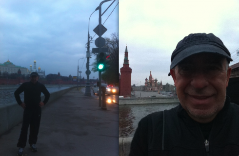
Here I am this morning, running around Red Square
It’s launch day for Le Quotidien of Luxembourg
Flip through the section fronts of the new Le Quotidien of Luxembourg, which introduced its new look today
Just as we announced in our Monday blog, Luxembourg’s French language daily, Le Quotidien, premiered its new look today.
Frank Deville, who reads it daily, sends me a video he made to show off the section fronts.
The look seems to be more poster like, with each section front opening with a large image, surrounded by text. The grid for each of these section openers appears to be quite systematized, a template that is duplicated for all fronts.
I am contacting executive editor Denis Berche to get more information, so this blog will be updated later in the day.