TAKEAWAY: Our email basket is full with pdfs arriving from places as distant as Colombia and Hong Kong, plus Sweden. The talented art directors of El Tiempo, South China Morning Post and Goteborgs Posten and WirtschaftsBlatt send me pages for review, which I share with you.
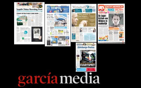
Reviewing the Garcia Media print redesign work of the past few months: South China Morning Post (Hong Kong), El Tiempo (Colombia), WirtshaftsBlatt (Austria), AD (Netherlands), Goteborgs Posten (Sweden).
El Tiempo, Colombia
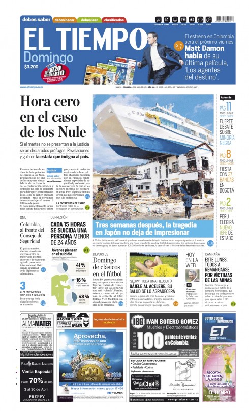
A recent Sunday front page of El Tiempo
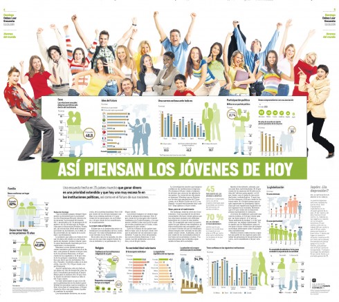
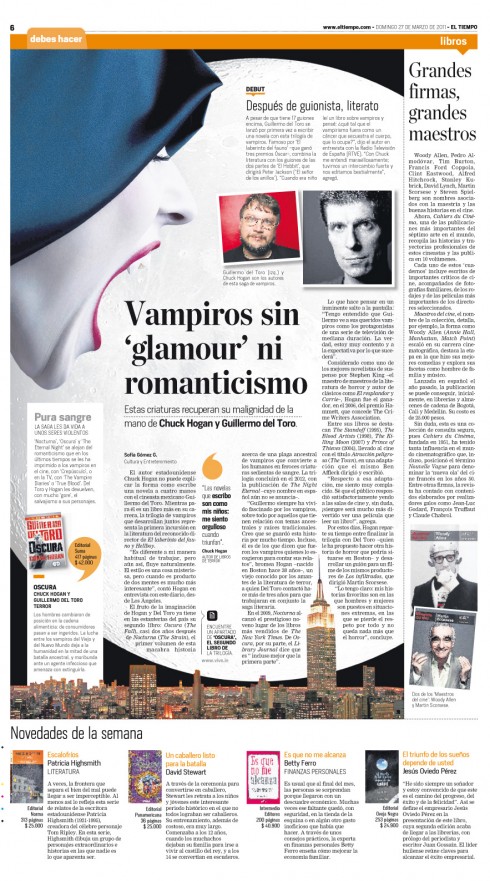
Book 2 piece: How do the young people of Colombia think today
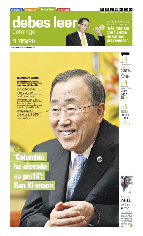
The redesign of a newspaper evolves as time goes by. Rarely does one see the very best of the plan within the first few weeks, so it is grand to see how El Tiempo, Colombia’s national newspaper, has followed the plan that was launched when El Tiempo premiered with a total rethinking of its content organization and design inOctober 2010. As you may recall, El Tiempo’s management decided to review content flow, breaking down through the traditional barriers of “departments” and, instead, dividing the newspaper into three color-coded sections: What you must know, What you must read, What you must do. Just as the focus groups had indicated, readers loved it from the start. Today 8 months later, I am delighted to see the pages sent by El Tiempo Design Director, Beiman Pinilla. His talented team has kept the idea alive, and, not only that, but enhanced it.
“The design and content changes continue to make progress day by day,” Beiman writes me, “and the readers continue to love the new, faster way of reading El Tiempo.”
Follow the El Tiempo relaunch case study here:
El Tiempo: At 100, a fresh proposition journalistically, visually, digitally
https://garciamedia.com/blog/articles/el_tiempo_at_100_a_fresh_proposition_journalistically_visually_digitally
El Tiempo: reactions to the new concept
https://www.garciamedia.com/blog/articles/el_tiempo_r
South China Morning Post
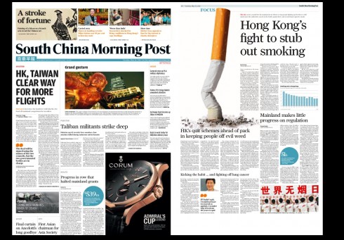
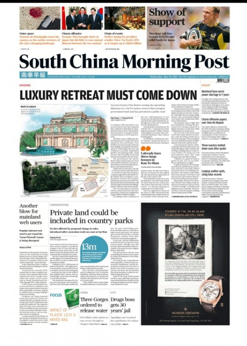
These recent pages from Hong Kong’s South China Morning Post sent by Design Director Troy Dunkley.
We completed the rethinking of the SCMP in May.
“Things appear to be settling down pretty well and we’ve had lots of positive feedback since the relaunch,” Troy reports.
For more details about South China Morning Post:
On the fourth day South China Morning Post design evolves
https://www.garciamedia.com/blog/articles/on_the_fourth_day_south_china_morning_post_design_evolves
Goteborgs Posten, Sweden
For other blog posts on the Gotebrogs Posten:
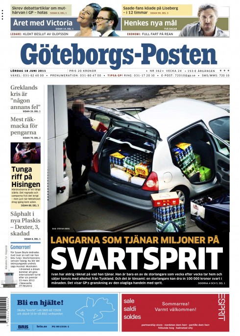
Here is a recent page one from Sweden’s Goteborgs Posten, sent by design director Mats Widebrandt. For the GP, it is always experimenting and evolving, and I have accompanied Mats and the GP team in various “experiments”, including the switch from broadsheet to tabloid, for 17years.
The spirit of the mini poster dominates the front page of the GP, with easy and practical navigation to the inside of the newspaper. Interesting to see how the GP editors and designers manage to travel that tricky road of providing visual impact starting on page one, with serious, in-depth journalism through every inside page. It happens here daily.
Goteborgs Posten: experiments that work
https://garciamedia.com/blog/articles/goteborgs_posten_experiments_that_work
WirtshaftsBlatt: Austria
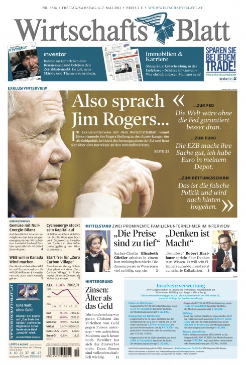
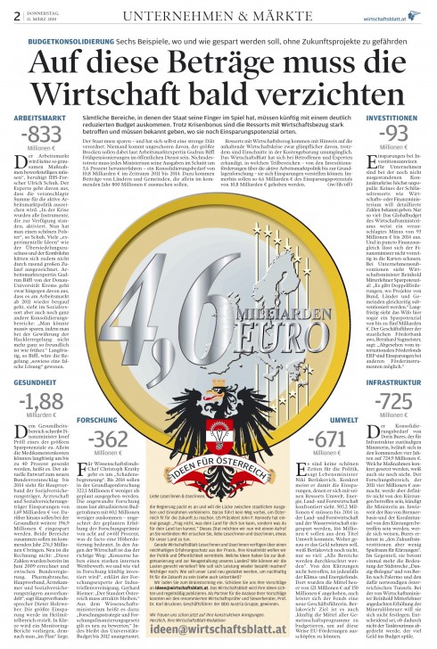
Our association with the WirtshaftsBlatt is a long going one. Several times a year I visit the WB newsroom and work closely with the team, including Design Director Jan Schwieger. Through various workshops in the past 2 years, our idea has been to make the WirtshaftsBlatt , which is a financial daily, more visually appealing. Dr. Hans Gasser, publisher and general manager of WirtschaftsBlatt, CEO of WirtschaftsBlatt and also President of the Austrian Newspaper Assiciation, has given us clear directives that he wants this newspaper to have an attractive design. “You don’t have to look dull in order to be a serious financial newspaper,” Dr. Gasser has said at our workshops repeatedly.
For more blog entries about the WB:
Austria’s WirtschaftsBlatt introduces new front page
https://garciamedia.com/blog/articles/in_austria_wirtschafts_blatt_introduces_new_front_page/
In Austria: WirtschaftsBlatt uses cross media to attract subscribers
https://garciamedia.com/blog/articles/in_austria_the_wirtschafts_blatt_uses_cross_media_to_attract_subscribers
It’s all about the brand
https://www.garciamedia.com/blog/articles/it_s_all_about_the_brand
WirtshaftsBlatt and the path of the story
https://garciamedia.com/blog/articles/wirtschafts_blatt_and_the_path_of_the_story
The Netherland’s AD: one week after relaunch
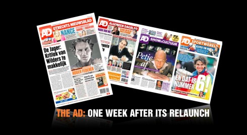
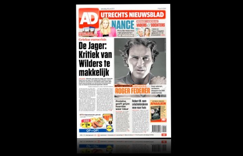
Front page of the AD’s weekend edition
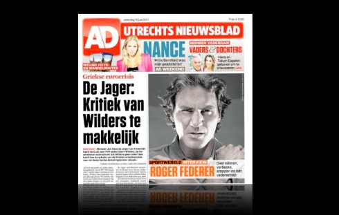
Close up of the upper portion of the AD’s front page
Pages 2-3 open up with the main theme of the day, coming from page one
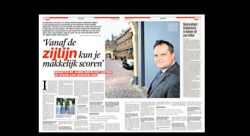
A main personality-oriented feature treated as double page spread
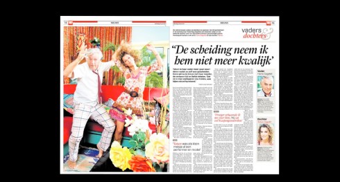
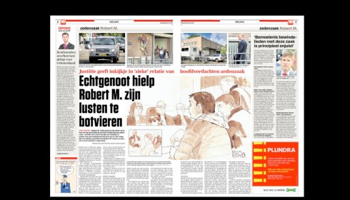
Treatment for news feature with dominance of photo
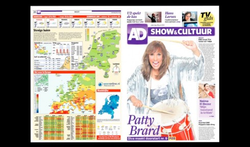
Right side: opening of the newspaper’s second book—Show and Culture
Inside double page spread of the Show and Culture section: color purple distinguishes this section
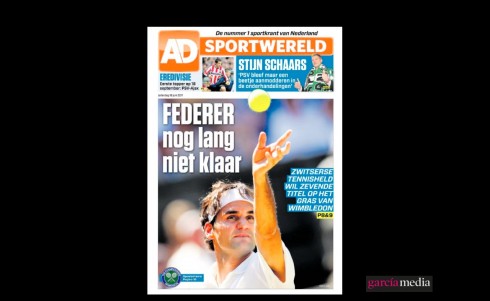
Opening of the sports section: orange
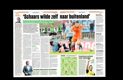
Inside spreads of sports
I am always proud when I review a recent redesign project and see the concept evolviing beyond the coldness of prototypes.
This is the case with the Netherland’s AD, published in Rotterdam. This weekend’s edition is a joy to review, page after page. I like how our idea of color use with type is finding a place on each page.
Take a look and tell us what you think.
It is color as punctuation, to use my colleague Pegie Stark Adam’s apt description. It is color as staircase, one color that starts at the top and moves the reader around the content of the page.
Here is one project where we have been more adventurous in the colorization of type.
The design team: For AD, I worked with our own Garcia Media art director, Christian Fortanet, and the AD’s design director, Jeroen De Haas
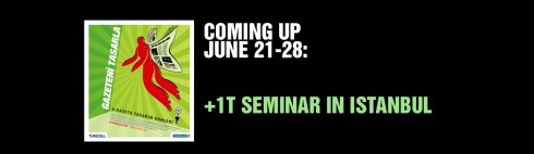
I am preparing my presentations as I participate, for the second consecutive year, in a well organized and interesting seminar in Istanbul.
The +1T Newspaper Design Days is sponsored by Turkey’s daily newspaper, Zaman. This will be the sixth edition of the +1T Newspaper Days program.
According to Fevzi Yazici, design director of Zaman, this program is especially designed for design students, to attract them to the world of visual journalism. However, professional journalists and designers also participate in the event.
“Our +1T Newspaper Days program is based on the idea that art (design) students and journalim students have to come together to get best newspaper design. So Zaman’s design staff organized this event to give future newspaper students an opportunity to accomplish this mission.”
This year program includes presentations by well known Turkish journalists. In addition: photographers Reza, George Georgiou, Vanessa Winship; Infographics artist ,Jeff Goertzen, of the Denver Post.
The seminar runs for 8 days June 21-
The seminar takes place at the Zaman’s hearquarters in Istanbul.
The title of my presentations are:
For print: Survival in the times of the iPad and Beyond
iPad :Creating that news app that is uniquely special
For more information:
http://www.arti1t.com/