Today’s Bild Zeitung and Obama
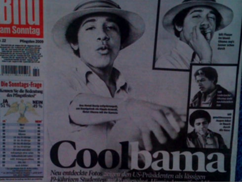
Interesting treatment of an Obama feature in one of my favorite Sunday papers: Bild Am Sonntag, and we bring it to you courtesy of Frank Deville in Luxembourg, who never misses an edition of the Sunday Bild. As always, they manage to do a double spread with the “surprise” feature of the day—always timely, always the pleasant surprise of the day.
A Parisian dinner and magazine conversation

At home with French Vogue publisher, Delphine Royant, and husband Olivier Royant, editor of Paris Match, and their cat Asmara.
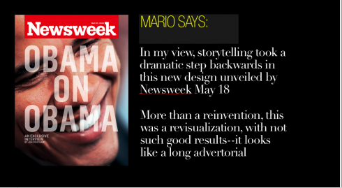
It was a lovely and entertaining dinner with two of France’s top magazine personalities, Olivier Royant, editor in chief of Paris Match, and his wife Delphine Royant, publisher of the French Vogue. We were between the delicious tomato and mozzarella salad and the wonderful wiener schnitzel when Olivier asked me: Mario, what do you think of the new design of Newsweek?
Truly I had only looked at the first edition, cover story Obama on Obama, so my impressions were mixed but quick: I thought that the magazine had made a conscious effort to look like some type of monthly supplement that is inserted into another magazine, a sort of advertorial that goes on longer than the usual 6-8 pages. I promised I would take a look at another edition, which I did.
I make it a point not to use my blog forum for critiques of redesigns, knowing that there is more to the process than what actually appears: prototypes are created, discussed and tossed away. Sometimes what finally appears is FAR from what the designers involved meant it to be.
So take this as a sort of “questioning of intentions” more than a critique.
Ironically, one thing that caught my eye is the contents page, which uses the New week title, omitting the s—-yes, a play on the word. It backfires.
There is more missing in this design than the “s” in Newsweek for the contents page.
The entire drastic change spells a little of desperation. Psychologists usually advise their clients going through rough periods in their lives NOT to make any major changes during the time of the crisis, as they may regret them later. The same applies to magazines and newspapers, I think.
While I am an advocate of reinventions (it ‘s what I do with my projects all the time), I also believe that any true reinvention begins with an inventory of what should not be abandoned in the process-—for Newsweek, storytelling has always been among what the editors do best. In this reinvention, it is storytelling that has suffered the most. This, at a time when what we need to emphasize is the way we tell stories efficiently and functionally for an audience that is more impatient, better informed and totally undisciplined in the way they tackle text.
What I think of the new Newsweek look
Typography: The font utilized is not strong enough to carry the type of content that goes here; it is skeletal, so minimalist that it does not engage you by just looking at the headlines; the content here is stronger than the way it is presented.
Storytelling strategies: Blocks of text are thown on the page with little , if any, attempts to enhance storytelling—-except for interesting and detailed time lines and other elements that usually appear at the very bottom of the page, totally disengaged from the story they accompany. This seems to be a pattern. I doubt that the designers doing this (studio called Number 17) thought of this project as a journalistic design. I have seen fashion magazines—-and catalogues—-in the Scandinavian countries that resemble this type of approach. In their case, however, the publication is there to showcase photos of models, the text is not even secondary. At Newsweek, text is what we buy the magazine for, or at least that is why I continue to subscribe.
In my view, storytelling took a dramatic step backwards here. Were any editors involved in the process? The old dog in me says that this became a Design with capital letters sort of project. More than a reinvention, this was a revisualization—with not such good results.
Preserving the mag’s DNA: In terms of conveying the spirit of Newsweek (or preserving it?), nothing like that happened here. While the new Newswekk perhaps aims to be hip, it is sort of “retro confused”-—part tabloid, part The Economist wannabe, part advertorial supplement (big time).
Content restructuring: The magazine’s division into four content areas is good, and I do like that, especially the Scope section, which moves fast and seems to have been the most journalistically designed of all; however, the design for each opener is a disaster in terms of navigation. Indeed, there is a sort of belt, in red, that crosses the page with headlines of what ‘s inside that section. Great idea. Execution? Not clever at all. Type too small, no sense of hierarchy. Like with type elsewhere, there is a great disconnect between utilization of type and type functionality. When this happens, the entire concept collapses. It does here.
True, this is only their second issue. Design evolves. Editors take a good look at what they are doing, and fix things (my hope). They also listen to what readers tell them.
Why I keep my subscription
I have been an avid Newsweek reader for decades. I will continue to subscribe, primarily because I like the stories, and, especially whatever Fareed Zakaria writes about. I will follow Zakaria even if he writes his stuff in five point Futura on the back of a subway system map (that is a stretch).
Which goes to show what we have said all along: it is all about the content.
However, nobody should have to suffer a bit to access it.
I mentioned earlier that my reason for writing this blog is to sort of question the intentions behind the Newsweek project? I welcome comments from anyone associated with the project, of course.
The official story of the reinvention of Newsweek
Kathleen Deveny, wrote:
There is a type of NEWSWEEK story that I used to love. In the 12 years that I have been an editor here, we have done hundreds of them. When the stock market plunged on a Friday (back when that was rare) or a gunman opened fire on Capitol Hill or a celebrity contracted a fatal disease, we “scrambled the jets,” sending reporters out into the field with orders to file dispatches to writers waiting in New York or Washington. We killed ourselves to dig up one or two exclusive news nuggets and find a few fresh photos. We stayed up all night, writing, editing and producing stories, pushing up against our deadlines. It was fun—thrilling, really. We told ourselves it was NEWSWEEK at its best. And for a long time, it was.
And now it’s not. In a world of endless Yahoo headlines, Wall Street Journal e-mail alerts and 24/7 cable coverage, scrambling the jets isn’t enough. News has become a commodity. You can find the kinds of stories that we used to do as covers—scientific breakthroughs or trends like white-collar layoffs—on the front page of The New York Times. Web sites like The Huffington Post and Politico.com are siphoning off readers. And even as the daily buzz of information rises around us, our advertisers have turned away, or fallen on hard times themselves. Revenue and ad pages have declined. We reduced our workforce by 160 people to around 400, mostly through a voluntary retirement program. Last year, the magazine’s 75th, NEWSWEEK slipped into the red.
Our new design, created by the graphic-design firm Number 17, is meant to be less daunting, more entertaining and easier to navigate. It will be divided into four clear sections: short newsy items, essays and commentary, longer features and cultural coverage. It will be printed on higher-quality paper, which instantly will make it feel better in your hand. I think the new design is sophisticated and airy, and makes the stories we work so hard on seem more inviting. “We tried to maintain the DNA of NEWSWEEK, while bringing it up to date,” says Bonnie Siegler, cofounder of Number 17.
What some of the reviewers say
Some have called it perplexing, others schizophrenic, or even the anti-design, go here for more information:
The New York Post
http://www.nypost.com/seven/05192009/business/news_weak_maneuvers_169978.htm

Links to recommended weekend reading, courtesy of IFRA Executive News Service:
Power of Print Conference: redefining newspaper format
http://www.editorsweblog.org/newspaper/2009/05/power_of_print_conference_redefining_new.php
– Power of Print Conference: innovating to boost circulation and profits
http://www.editorsweblog.org/newspaper/2009/05/power_of_print_innovating_to_boost_circu.php
– Power of Print Conference: the importance of newspapers knowing their audiences
http://www.editorsweblog.org/newspaper/2009/05/power_of_print_the_importance_of_newspap.php
– Murdoch says no to U.S. government newspaper bailout
http://blogs.reuters.com/mediafile/2009/05/28/murdoch-says-no-to-us-government-newspaper-bailout/
– USA: Newspapers plot survival as quietly as they can
http://blogs.reuters.com/mediafile/2009/05/28/newspapers-plot-survival-as-quietly-as-they-can/
– USA: Yahoo Consortium Newspapers Starting to Book Local Ads
http://www.poynter.org/column.asp?id=31&aid=164321
–
– USA: MediaNews to Begin Customized Printing in Denver Homes Next Week
http://www.poynter.org/column.asp?id=131&aid=164252
– Sergey Brin: Newspapers can still prosper but need time to “figure it out”
http://blogs.zdnet.com/BTL/?p=18770
– In the slimming race the Plastic Logic e-reader beats the Kindle DX, but can it fatten the revenue of the newspaper industry?
http://www.editorsweblog.org/multimedia/2009/05/in_the_slimming_race_plastic_logic_beats.php
Mama turns 80

It is a busy and fun weekend for the entire Garcia clan as we celebrate my mom’s 80th birthday—-yes, Maria Ofelia Garcia, who does not look those 80 years at all, will be the star of the show tonight as we celebrate her big day in Miami. Her four grandchildren and 10 greatgrandchildren—along with some 60 family and friends—are all ready to sing Happy Birthday to the matriarch of our family. More tomorrow!
Feliz cumpleaños, mamá
Follow the Marios

Two Marios. Two Views.
Follow Mario Jr. and his blog about media analysis, web design and assorted topics related to the current state of our industry.
http://garciainteractive.com/
Visit Mario Sr. daily here, or through TweetsByDesign (www.twitter.com/tweetsbydesign)
:
To read TheRodrigoFino blog, in Spanish, go:
https://garciamedia.com/latinamerica/blog/
TheMarioBlog posting #273