Update #2, Wed., Feb 24, 11:37 EST
TAKEAWAY: Taking a look at those colorful press kiosks with dozens of magazines, one ponders many questions about the future of print, but, more precisely, what makes for a good magazine cover? We turn to one of the world’s busiest and most recognized magazine designer, Robert Newman, for answers to our curiosity. PLUS: Coming soon, next installment of 40 Years/40 Lessons: Mentors.

We spend time with that magazine design guru, Bob Newman, who takes time off meeting his deadline to chat with us about magazine covers
Who’s that girl on the cover?
Perhaps this blog post was inspired by my dinner last night with Olivier Royant, editor of France’s Paris Match. Or by the fact that Rodrigo Fino, of our Garcia Media Latinoamerica, who is working here in Paris with me, has a hobby of taking pictures of news kiosks he sees around the world in his travels.
Of course, we are here to complete a prototype for France Football, the twice-weekly magazine devoted entirely to football, so our daily conversations are about covers, inside spreads, navigation and the like.
However, as I looked at the photos of how kiosks in places as varied as Fortaleza (Brazil), Miami and Buenos Aires, I had to agree with Rodrigo’s assessment that all the covers look the same. Is there no experimentation in magazine cover design anymore?
Who better than my friend and colleague Bob Newman, a man who has designed hundreds of magazine covers during a stellar career——and who was on deadline, closing another magazine, when I contacted him——to answer my question. With a six-hour time difference between us——Bob is in New York City—-I sent Bob the images, and then had him respond.
Why the sameness?
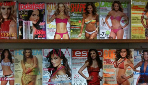
Who is that girl in the swimsuit? Research shows that all readers like the image of the girl in a bikini
Mario: Bob, what do you think of how similar these covers look?
Bob: I can’t get over the photo you sent with all the women in bathing suits. It’s the same cover, over and over. Astonishing.
One thing about kiosks/newsstands, is that they’re really not a relevant factor in the US. We urban dwellers give them a much more imporant focus than they really have in terms of actual sales. Of course newsstand sales are down just about across the board, but there are still plenty of magazines in the US that sell hundreds of thousands and even over a million copies on the stands. They are primarily women’s magazines. I think that sales for men’s magazines are slight, and sales for newsweeklies and business mags have plummeted. So any study or comments on newsstand presence in the States really has to be about women’s magazines (and tabloids, which are essentially women’s mags with celebrity content). The equivalent of that photo you sent would be an American stand with Us, People, In Touch, Life & Style, Star, etc., all with multiple-image covers, big, bright yellow headlines, and lots of cover lines. But for those magazines, newsstand sales are still essential. There’s a huge swing between a good seller and a bad, and that means, for starters, a lot of money gained or lost, as well as status and hype.
On the subject of sameness, Bob Newman cites a topic——testing—-which may give us the answer to why so many covers end up looking alike. When you take a cover to test, people tend to favor the same things. Here’s Bob’s take on it:
In the US, practically all magazines now do cover testing, often for every issue. TV Guide tests every cover with multiple stories and images. We did the same thing at Southern LIving and Cottage Living; tested every cover. And one thing testing does is it slides everything to the same place. You certainly could make the argument that the sameness of cover design is a direct result of constant testing. I really believe that. People like women in bathing suits, so those covers test well, so that’s what gets run. At TV Guide, they always ask people if they like little extra photos on the cover. Of course they say yes, who doesn’t like some extra photos? So they always run extra little photos.
What sells on a cover?
I personally think that the story is the main ingredient. Once you have the good story (the one people are extremely hungry for), then design/graphics/photography do the rest.
Then we also come into the territory of appealing to the masses, versus the more elaborate (or abstract) covers, which do not guarantee success at the newstand. Bob presents this point very clearly here.
The determining factor in success has to be how well it sells. A cover can look different or pop off the newsstand, but does it sell in numbers like the rest? I find it odd that the more that Star, Us, etc. began to look alike, the more copies they sold. There’s no logic to that, but it’s true. How do people differentiate between those magazines, or the various swimsuit magazines in your photo? It’s probably and unfortunately less about the design, and more about the celebrity pictured. For example, since I’ve been consulting at TV Guide, I’ve found out that their covers sell best when the star on the cover looks most like they do in their TV show. The more they are in character, wearing the character’s clothes and facial expression, the better it sells. They recently had two successful beautiful cover shots of actresses out of character, both stars of big shows, very attractive, smiling, but both covers were sales disappointments, because they didn’t look enough like they do on TV. It’s obvious when I look at those newsstands that it’s first and foremost about who is on the cover. If you can attract eyeballs with that, then they look at the cover line. That whole process can’t take more than a second or two at the most. Covers that are distinctive probably require too much time and energy to gaze through and to understand.

TV Guide’s cover
Bob Newman on TV Guide covers
“TV Guide tests all their covers, like many magazines. Their testing consistently shows that readers like the small added photos in the strip on the side of the page. That’s been the response at every magazine I’ve worked at that has tested covers. The readers always say that they want more pictures, more of everything. The question in my mind is whether there’s value in that, or they’re just responding to a question that isn’t really that essential to their engagement with the magazine. Arguably the value of the pictures is that it makes the magazine seem more valuable, more packed with stories and variety. The downside is that the cover loses its graphic potency, and the main image is cramped and overpowered to some extent. But the bottom line, does that detract from the overall success of the cover on the newsstand? Probably not.
What sells in American newstands may be different from other places
Different places sell magazines differently.
In my experience, there is ONE constant: people want MORE items on the cover, more of the cover as navigator. I see this in focus groups around the world, and in a variety of extremely different magazines, from the general interest mags to sports to business. More seems to be better for readers on the covers of their magazines.
Oh, how about iPad mag editions?
And, by the way, if we get ahead to Apple’s iPad: I can see the end of the single-topic cover when you iPad your magazine. Of course, there will be ONE topic that is the traditional “cover story”, but I see the second best topic mano a mano with the main one. And also think that the iPadization of magazines will bring us the multi-cover magazine——cover one, cover two, cover three, with advertising providing cover four! But, let’s not get ahead, and get back to magazines as we know them today:
Back to American newsstand sales. The bulk of American magazines are sold in either supermarkets, Wal-marts, or drugstores. Only a tiny fraction are bought at Barnes & Nobles type bookstores, airports, or actual newsstands. I don’t have any hard figures, but I’d guess it’s something like 95%. I think there was a time when both Maxim and Cosmopolitan were kicked out of Wal-mart for being too sexually provocative. That cost them dearly, and they have to consciously not do certain things to maintain their presence in those stores. Supermarket sales are all about display and position. But it’s also about people waiting in line, and picking up copies and looking at them. So it makes sense to have more coverlines, because they’re probably going to spend a little more time closer up to the cover than someone would at an airport or newsstand.
In difficult times, reach for the safe teddy bear
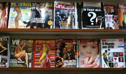
Which one would you pick and take home?
The magazines always market themselves more than newspapers do, so Bob is right when he tells me that in tough economic times (we are still going thru them, by the way), magazine people are scared to try anything different. “No one is going to break away and try something different or groundbreaking. If something works, they’re going to stick with it,” says Bob.
Beyond selling on impulse, what else do magazine covers accomplish?
Obviously, we have always talked about a magazine (or newspaper) passing that important “coffee table test”. So, the cover sold the magazine, but we want readers to read it once they got it.
Bob agrees:
Another key function of the cover is to get the person who has already bought the magazine to read it. That’s what we refer to as the coffeetable or desktop as newsstand. It’s not enough to get them to buy it; you also need them to read it. Advertisers are paying for reader engagement. They want to see that readers are spending time with each issue. So the mags have to entice readers to actually pick up the magazine and read through it. People are busy, and it’s easy to let magazines sit on a table for a week or a month. A series of appealing headlines can get a reader to pick up the magazine and start looking through it.
Sex, nudity and the Jolie-Pitts factor
I am not surprised to hear Bob tell me that provocation through sex, nudity and perhaps the gossipy tales of famous people is a selling factor. Our culture is extremely voyeuristic, and we don’t lack willing participants, from politicians like John Edwards and Mark Sanford, to sportsmen like Tiger Woods, and, of course, la Jolie, Madonna, Rihanna, Beyonce and dozens more. Bob laments that if one is looking for creativity or forward thinking on magazine covers, we are not going to find it.
They are purely about commerce these days. Covers that are provocative are only that way to drive sales, and today’s idea of provocative appears about 99% of the time to be sex or nudity, which I think of as phony provocation. A naked celebrity is considered edgy and gets news. But there’s no way that a big mainstream magazine is going to consciously do something to provoke its readers. They’re too scared of losing subscribers, or of boycotts, or of getting kicked out of Wal-Mart.
Bob’s favorite magazine covers
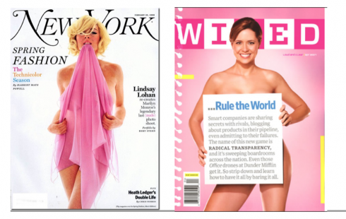
Guaranteed to surprise: New York, Wired
We agree on two that are always surprising, energetic, and different: New York and Wired.
They’re smart and different from issue to issue, and they provoke and engage at the same time. They also have a lot of energy, and feel very unique and distinct, full of character. And they engage in a conversation with the reader/newsstand buyer.
Covers that surprise

Cover of DIVA
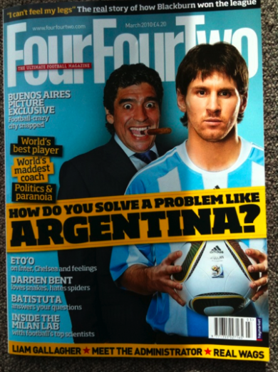
Britain’s Four by Two
Rodrigo Fino’s blog about this topic: in Spanish
http://www.garcia-media.com.ar/blog/post/diferenciaciones-de-portada-ii/84
Photo of the Day: Paris


Don’t miss the next installment: 40 Years/40 Lessons

TheMarioBlog post #491