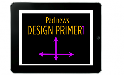
TAKEAWAY: This is the first of what I hope will be a series of short discussions about designing for the iPad, with emphasis on the design of news. Nobody I know is ready to write the book on iPad news design yet, so my intention is to reflect the discussions that emerge for me and my team daily as we tackle the “how to transfer the storytelling process” from print to iPad—-or other tablets.
Update #3: Thursday, 11:20EST—More layout diagrams added
USA today reports 115000 downloads of its iPad app!
Read it all about in the Poynter website:
http://www.poynter.org/column.asp?id=134
Interesting discussion of iPad design for news sites
http://www.niemanlab.org/2010/04/three-ipad-design-choices-that-will-influence-how-we-read-news-online/
The above mentioned link is one of the earliest “critiques” of what we have seen so far for news sites on the iPad.
Of course, if you go by what you hear in the newsrooms so far, the average comment is something like “I am disappointed,” or “Well, not what I expected, some of these news sites are plain duplicates of the print product,” or “I was expecting more bells and whistles.”
Wait a minute, I say. This is only the infancy of the iPad and news apps. We are barely out of the maternity ward here, and you want this baby to crawl? Not to mention sing and dance?
I understand the feeling, but the reality is different. The baby will crawl and walk and run, in due time. As for bells and whistles? That is another story, technically speaking, and in terms of newsroom resources, and the very important factor of creativity and the role it plays. I found myself telling someone in a meeting yesterday that we need to hire some of the guys creating games for Playstation, for example. I also found myself telling a manager that new hires may be in order across the board, from advertising to marketing, if an organization is serious about its role in the tablets, a role that I think everyone needs to be preparing to play.
However, and let’s not forget this for a minute: the foundation of what goes into an iPad news app is good storytelling, what some refer to as “traditional journalism” (a term I tend to dislike, it makes the main ingredient sound like yesterday’s cough medicine). The veterans in the newsroom are KEY to what we are doing, but you need the new fish in the tank as well.
So, about the design for news….
From what we know (and our knowledge is more about planning and experimenting than based on research and usability studies, which I am not aware many exist), these are the three important criteria when designing your news app, which in most cases is based on an existing printed product.
First, create the storyboard for how you plan to carry content from one platform to the other.
Second, identify your publication’s “signature”—what makes it distinctive and special and familiar, and make sure that transfers to your iPad design.
Third, create what I call the “iPad tempo”—-the moments that will connect items and topics, provide continuity and pace the content.
In that sense, and in a very basic and general approach, which is all we can do when we teach first steps in any subject, one must arrange the iPad tempos to include:
Overview, Editor’s Choice, Signature Moment, Destination Moments
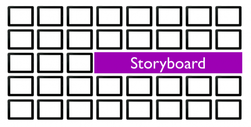
A key first step: do a diagram of your storyboard, so that you can pace content, strategically place destination moments. This is essential in a non-linear platform.
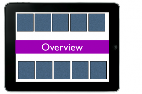
The overview offers the user an instant look at all that today’s edition includes, allowing for quick choices. I like to emphasize that perhaps this SHOULD NOT follow the order that such content follows in the printed edition. After all, as users we are all our own editors, so offer the sampling in terms of, for example, PEOPLE, not necessarily according to sports, entertainment, politics.
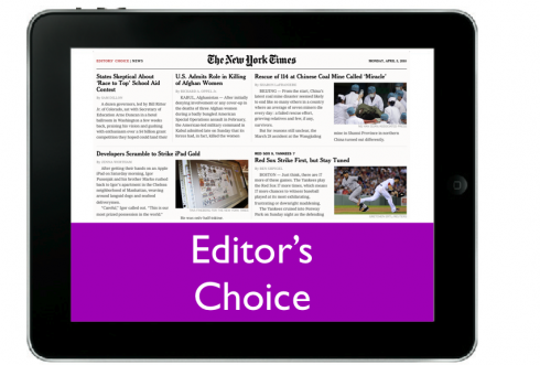
Editor’s choice of best stories NOT to miss: nothing new here, users have little time, editors who are in the know HELP users make decisions as to what is essential reads for today. Users appreciate the editor’s knowledge and insights. I use here the one from The New York Times, as good as it gets. Perhaps it could be more pictorial. Editor’s choice is the “mini newspaper” in the iPad. If that is all I read in the morning, I know what’s going on.
Getting a sense of direction
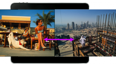
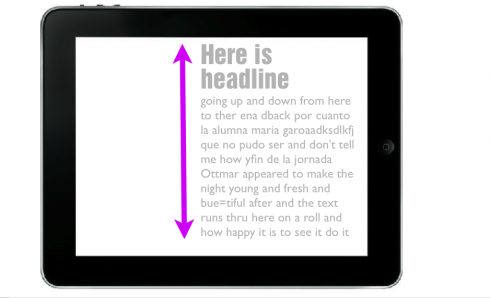
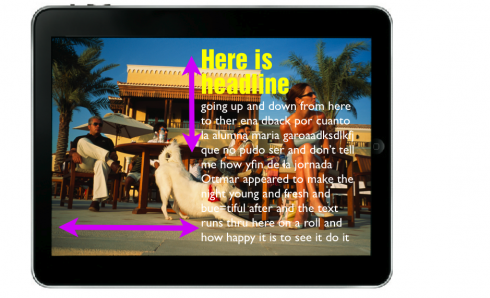
One important design decision, to create a comfortable sense of movement for your screen. Here we show one usual way of doing this, with images and other pages moving with a flip to the right, while text and headlines, the reading motion, with up and down scrolls. This, however, is NOT the only way to go. Yesterday one of the art directors in the room showed me one version of his news app with only “horizontal” motion
Photos used for the above sketches courtesy of Maggie Steber
Other iPad links of interest today

New entry into iPad land: GQ Magazine, now you can download the April issue
– Mathias Döpfner, Chairman & CEO, Axel Springer
http://www.charlierose.com/view/interview/10952
– Advertisers Spend Big on iPad, But Potential Far From Proven
http://www.clickz.com/3639994
– Catching The iPad Wave: Seven Thoughts
http://www.mondaynote.com/2010/04/05/catching-the-ipad-wave-seven-thoughts/
– The iPad’s scary counter-revolution
http://www.ft.com/cms/s/0/c2b991ca-42a4-11df-91d6-00144feabdc0.html
– IPad release fuels mobile debate over Web vs. apps
http://www.poynter.org/column.asp?id=134&aid=181058
The “collision” between traditional print design and iPad design
(This was in yesterday’s blog but I leave it on this post, as I consider it to be relevant material)
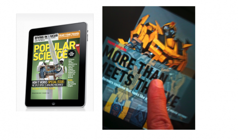
Perhaps one of the most talked about publications on the iPad is Popular Science, and, indeed, I have received dozens of messages from people who tell me to make sure I don’t miss it. I have reviewed it, and many of the features here are quite attractive. Images take center stage, but then you click on screen, and the accompanying text comes in a sort of transparent strip. Finger up and down gives you something to read. Finger across gives you more images. The demo was quite instructional and provided users with red arrows that would guide them thru the process.
So, it was with great interest that I read Khoi Vinh’s review of the iPad, which included specific reference to Popular Science, and has become one of the first pieces I have read to address the issue of design strategy on the iPad. Vinh writes:
“…..this inaugural issue of Popular Science on the iPad, while gorgeous and impressive, is also gimmicky, repetitive and unusable. It’s a noble attempt, but it’s also a disappointment.
Vinh mentions something we all need to think about: the collision point between interaction design and traditional publication design, one in which the latter prevails.
I had drawn a similar conclusion as I read TIME Magazine’s iPad edition while flying from Miami to Frankfurt last night. I kept going from TIME to Popular Science. I am aware that these are two very different publiations: one devoted to news and features, the other a specialized journal with greater possibilities for multimedia applications.
However, in terms of their design for the iPad, TIME stuck pretty closely to its print format, at least on this inaugural iPad edition. Popular Science is quite ambitious in letting you know immediately all that the iPad can do to put wings on the printed edition.
I know that we will devote much thinking to designing for the iPad, and nobody has the answer today. We can only comment on what we see.
But the questions are going to be in my head as I download other apps, and as I discuss the issue with editors and designers in newsrooms around the world. Do you have the same questions?
Design related questions as we study the iPad
1. How much of the print edition is transferred to the iPad? Should we do a page by page, like TIME has done in this inaugural issue? I tend to say YES, because, as a reader of TIME for over 35 years, I felt very familiar with the look and feel, and the rhythm of my TIME on the iPad. However, the iPad enthusiast in me kept waiting for a little bit more of what I told my colleagues at Paris Match is the Follies Bergere moments, when the pop up book, well, pops in front of your eyes.
2. In both Popular Science and TIME, photos dominate—-not a bad thing, and I maintain that photography will play a protagonistic role in the tablets, and we have not even scratched the surface here. The question remains: is the big double page photograph that sits there waiting for a headline and text layer to land on it the answer? What else can be done with photographs? Should we use photography for more “mini storytelling” than we do in print? The examples out there this week don’t do that. I think that photos can jump from their linear and static mode into something beyond that, but what?
3. The question of flow and rhythm: I like TIME’s content bar, which allows you to jump to where you want to go at anytime, defining your own rhythm for how you read the magazine.
As we design storyboards for the iPad and other tablets, do we need to create the Follies Bergere moments here and there, but combining them with more traditional panels? Would TIME’s inaugural edition benefit from a little more movement for some of the content?
In traditional print we always talk about the importance of “destination pages” that change the rhythm and the pacing of the content, a sort of cleansing of the palate, like that sorbet between soup and salad at the restaurant. Well, in iPad land, perhaps we need to create destination moments.
I am happy to see that only five days after the iPad landed in our midst, we now are turning our attention to design and the role that it will play as we cope with how to take traditional print design elements into this new platform.
Five years from now, I can see that designing for tablets will have come into its own, with some traces of traditional print design visible and acting as a sort of foundation, but with 80% design that is precisely customized to cater to the needs of those who get all their information exclusively on a tablet. Until then, we need to study how we travel through the “transitional years” that started last Saturday when the iPads made it officially into the world.
Two links of interest
Two links on advertising on the iPad :
Good discussion of the role of ads in news apps:
http://www.niemanlab.org/2010/04/full-screen-ahead-wsj-ipad-ads-fuse-logic-of-print-online/?utm_source=feedburner&utm_medium=feed&utm_campaign=Feed:+NiemanJournalismLab+(Nieman+Journalism+Lab
Apple may be starting its own ad service
http://www.engadget.com/2010/04/06/apple-to-announce-iad-adkit-mobile-ad-platform-on-thursday/