Update #3: Saturday, June 25, Hamburg, Germany, 18:34. This blog post will be updated during the weekend
TAKEAWAY: It is sort of “go modular” for those usually multi layered, multi colored newspaper pages in Turkey. My recent visit to participate in the +1T Design Days seminar yields pleasant surprises. Meanwhile, 300 plus design students in attendance at this yearly event promise that continuity for good media design is in store for Turkey.
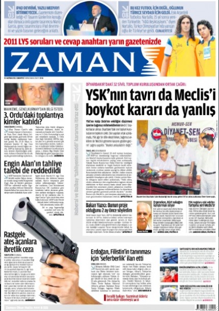
Zaman: the Turkish daily leads the way in establishing orderly design in Turkey, while preserving the energy and colorful displays that are a staple of traditional Turkish newspapers
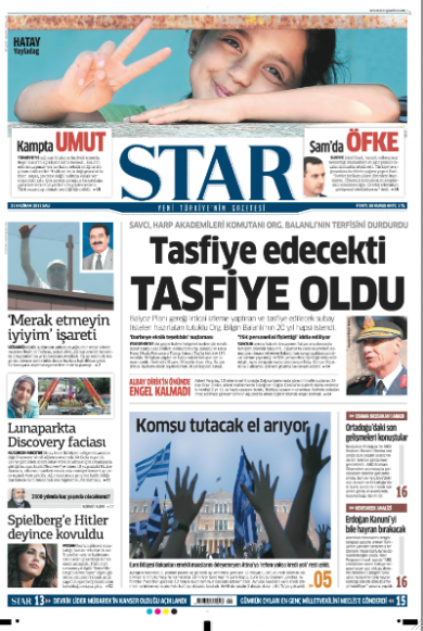
The Star: latest entry to the Turkish scene of nicely designed newspapers
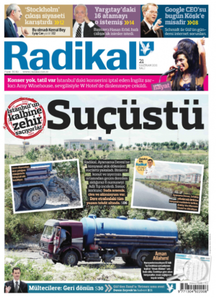
Front page of Radikal, published in tabloid format
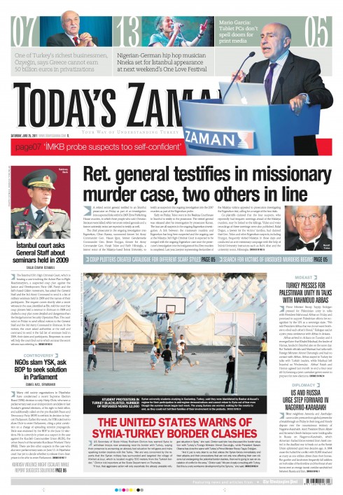
And here is front page of Today’s Zaman (the daily English language edition): look who made it to the top of the page?
I spoke to some 320 students at the +1T Design Days conference Friday, and, as always, a great experience to see the eager, glowing faces of what may be Turkey’s next generation of media designers.
I spent the morning discussing print projects, the afternoon all about iPad news app development. The audience was attentive, interested and full of questions at the end.
During my short stay in Istanbul, I was able to see a good sampling of the daily printed newspapers. Unlike 10 years ago, when Turkish newspapers appeared to be competing with each other for the Most Clutter on the Page Award, I am happy to see that now there is a move afoot to produce newspapers that are better organized, including how the designers manage color.
Such titles as Zaman——sponsor of the +1T Design Days seminar—-have traded chaos and confusion, as in photos overlapping texts, and texts superimposed on illustrations, with ragged text structures, for more modular , easy to follow layouts. IN each case, however, we still have the DNA of Turkish newspapers: lots of color, vibrant energy through typography and graphic display.
Newcomers to the ranks of the well organized are the Star, as well as a smaller format newspaper , Radikal.
Of course, you still have the well known dailies Hurriyet and Milliyet and Sabah, providing the more traditional Turkish newspaper design fare of chaos accentuated by over the top presentation of everything from headlines to photos, and corloful fruit bowls at every step. I imagine it would be difficult to streamline all titles here.
However, based on my post session conversations with the students in attendance at the seminar, their sights are on working with what they call “international design” .
Milliyet, Sabah stick to the more chaotic design styles
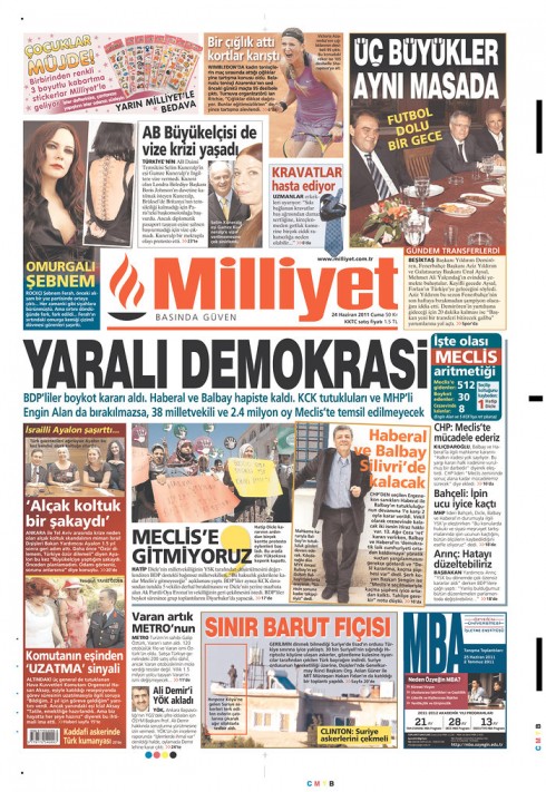
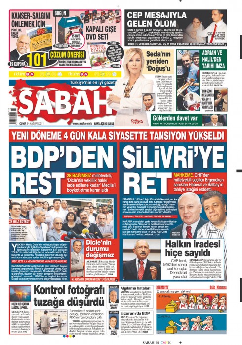
Milliyet and Sabah represent the more traditional style of design for Turkish newspapers: chaotic and over the top presentation
For story on my presentation:
Mario Garcia: Tablets don’t spell doom for print media
http://www.todayszaman.com/news-248407-mario-garcia-tablet-pcs-dont-spell-doom-for-print-media.html
The title of my presentations were:
For print: Survival in the times of the iPad and Beyond
iPad :Creating that news app that is uniquely special
For more information about the seminar:
http://www.arti1t.com/
TheMarioBlog post #793
Stylish simplicity and selling the hotel experience
TAKEAWAY: It is all about seducing with simplicity it seems for hotels these days. We show you the new Westin Hotels campaign as we also continue to update our work for Shang, the Shangri La Hotels’ new magazine.
New Westin campaign: elements of well being
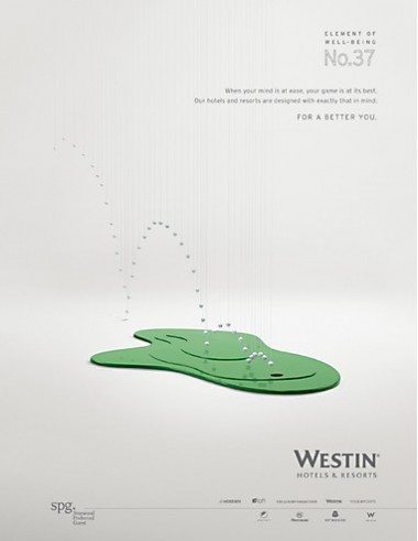
ELEMENT OF WELL-BEING N°37 When your mind is at ease, your game is at its best. Our hotels and resorts are designed with exactly that in mind. FOR A BETTER YOU.
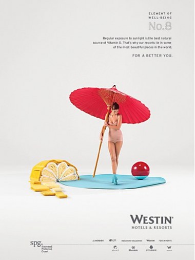
ELEMENT OF WELL-BEING N°8 Regular exposure to sunlight is the best natural source of Vitamin D. That’s why our resorts lie in some of the most beautiful places in the world. FOR A BETTER YOU.
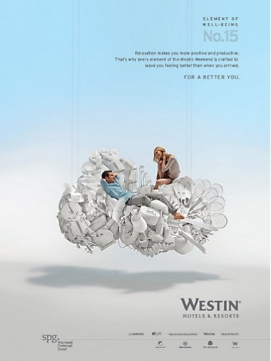
ELEMENT OF WELL-BEING N°12 A good night’s sleep is proven to reduce stress, improve focus and bolster memory. Our Heavenly Bed has been engineered with exactly that in mind. FOR A BETTER YOU
It is all about simple design that seduces, I maintain.
It is what we tried to bring to Shang, the new magazine of the Shangri La Hotels (below).
Now we also see simplicity as key for a new campaign for the Westin Hotels . Created buy BBH New York, the campaign, which cost $30 million, is all centered around images shot in the studio——not the hotel’s rooms or lobbies, as we are usually accustomed to seeing with hotel ads. Westin’s campaign tries to sell you the experience, and it is titled, “Elements of Well Being”.
The images, shot by French photographer Grégoire Alexandre, who specializes in fashion and high-end editorial work, there is a retro element in the look and feel (see images here), and, most importantly, your eye is instantly lured to the illustrations.
TheMarioBlog post #792
Introducing Shang: the new magazine of the Shangri La Hotels
TAKEAWAY: It was a extraordinary project for me and for Garcia Media, the type that you simply can’t refuse. Our assignment: to design the first ever magazine for the luxury Shangri La Hotels, with emphasis on Chinese language. As the magazine had never existed before, we had, at the start, carte blanche to create a product that guests would be proud not just to find in their rooms, but that they would want to take home. And so Shang was born. PLUS: Headed for Istanbul and the yearly +1T Newspaper Days conference
Luxury feel on every page
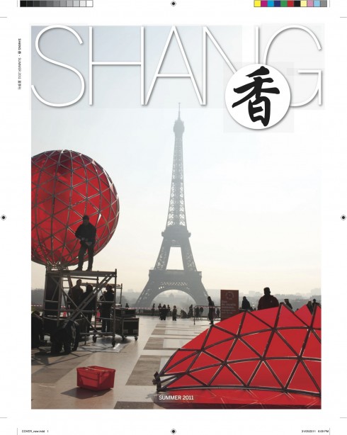
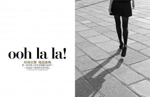
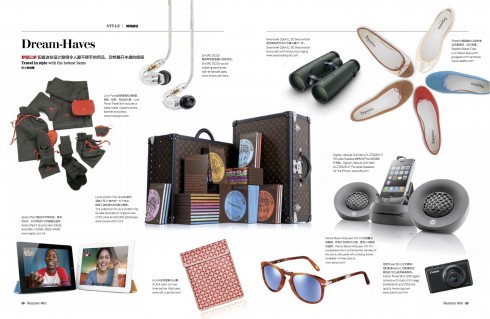
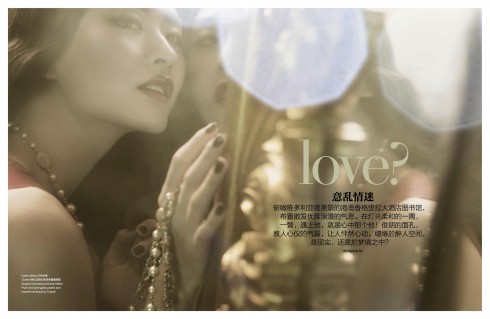
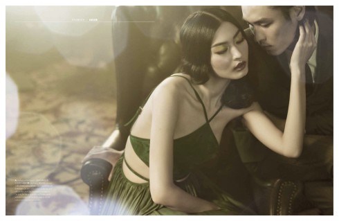
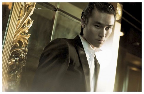
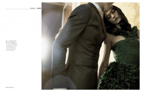
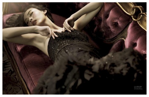
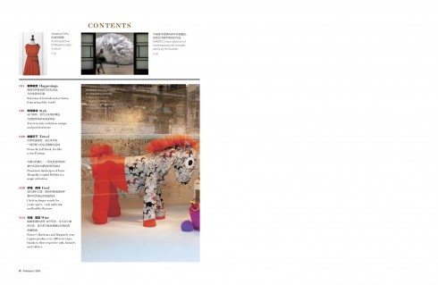
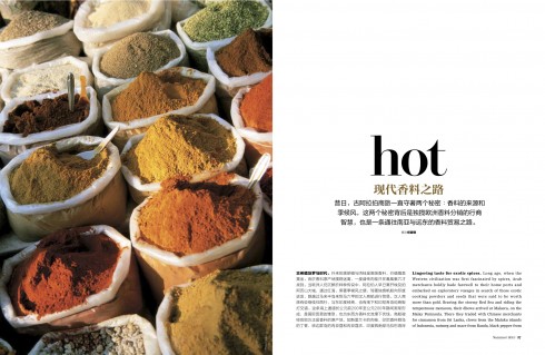
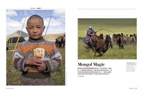
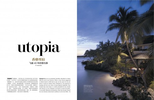
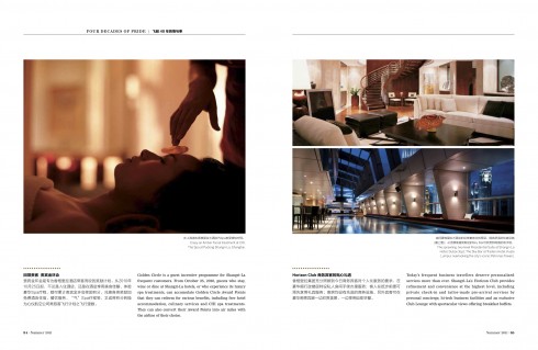
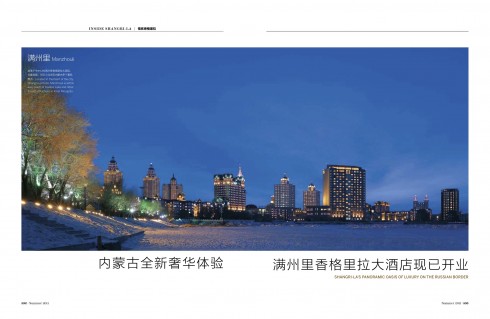
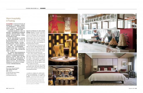
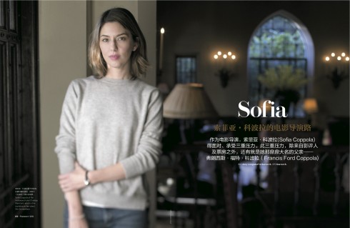
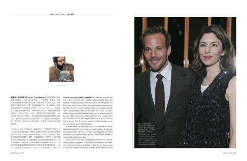
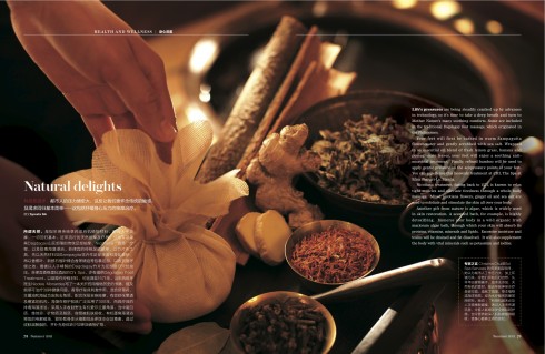
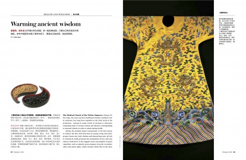
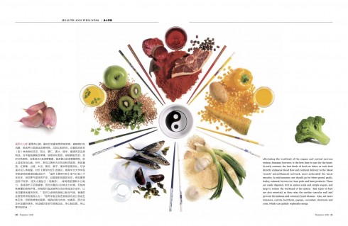
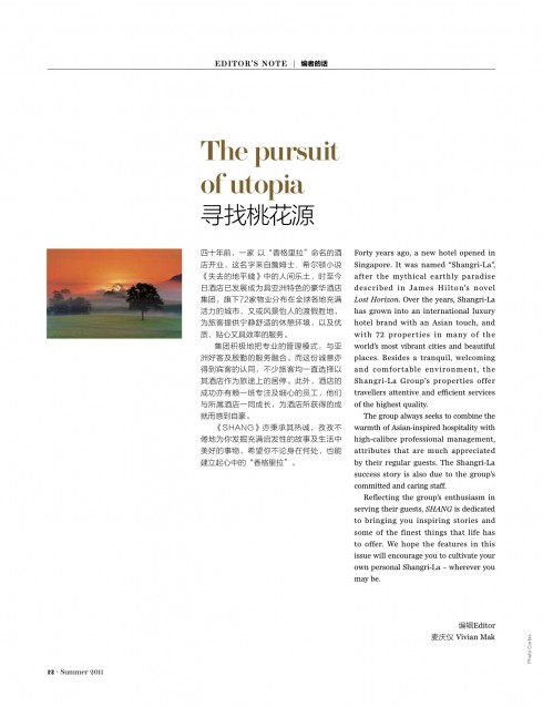
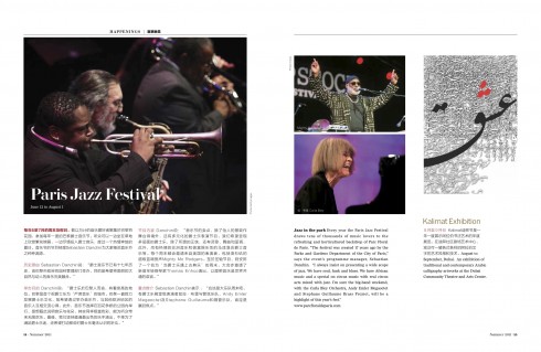
Above a variety of pages from the inaugural edition of Shang, the new magazine for guests of the Shangri La Hotels & Spas worldwide
As soon as I knew about our assignment to create the Shangri La Hotels’ first ever magazine, in which Chinese language would be the primary one (with English as secondary), my first step was to engage that talented designer and art director, Nai Lee Lum, to accompany me on the project. Nai brings with her a distinguished 25-year career with Fortune, among other publications, and, as a native of Hong Kong, wonderful knowledge of Chinese and the intricacies of selecting the right typography.
For Nai and me it was a marvelous start when we met in New York City, which is home to Nai, and had a mini workshop to brainstorm. We covered a table in front of us with everything you can imagine related to luxury brands, five-star hotel magazines, plus publications that we both liked, all in glossy paper, with spectacular photos and a look and feel that inspired readers of a casual publication not just to look, but to read as well.
AS a result of this workshop, our first sample pages emerged, with Nai carefully selecting Chinese language fonts that would reflect the elegance and uniqueness that the Shangri La Hotel management wanted to bring to its first ever magazine. Although the Shangri La Hotels are turning 40 this year (with this celebratory first issue), it had never published a guest magazine before.
I must admit that we had little to go on in the way of a briefing other than the simple: make it luxurious, tempt the readers to take the magazine home, provide an environment that approximates what the Shangri La Hotels are all about: an oasis of peace, tranquility. After all, the hotels take their name from a fictional place described in the 1933 novel Lost Horizon by British author James Hilton. As a frequent guest of the Shangri La Hotels myself, especially in Hong Kong, I know first hand that each night guests find more than a chocolate on their pillow. In addition, there is always a book mark with a passage from the novel Lost Horizon, always inspiring meditation.
The magazine, we were told, must capture the spirit of the hotels.
“We are excited to have the opportunity to publish a magazine that not only sets new standards in Greater China, but in the world – for we have adopted a fresh new approach for a globally distributed hotel magazine. This would not be made possible without the help of Dr. Mario Garcia,” says Sylvia Lee, Head of Marketing, who was project leader.
“The category of hotel magazines already sees a lot of high quality publications produced globally, and now, the Shang magazine has raised the bar even higher. We insist on making our contents relevant and insightful to our readers, and we furthermore introduced a unique design concept that works magically for our bi-lingual publication. We are not the first to use both the English and Chinese languages, yet to allow the bi-lingual types flow so spontaneously and naturally, with the types becoming part of the graphics, we are probably the first. It certainly brings out the beauty of the Chinese language, and this makes us so very proud. Again, this is all credited to Mario’s wonderful design concept.The client is very happy to see the end product clearly delivering a high value to their hotel guests, and they look forward to working with us to ensure the Shang magazine continues to outstand,” Lee said.
Minimalist approach
For Nai and me, the first challenge was the accommodating of the two languages: Chinese and English.
However, notice, that our strategy is to present a key headline word in English, with the summary for that headline in Chinese. This is, more than a side by side translation, at least at the headline level, a parallel use of the two languages.
The grid used is very strict, mostly two columns, with white space choreographed as a key in our grid composition.
The moment I saw the first sample pages (shown below) and the beauty of the Chinese calligraphy, I was fascinated by the character of each letter—- art, for sure. Nai would play with color and type as well, going for solid gold in some letters, and explaining to me that in Chinese, one character says a lot about what the words mean, from sadness to happiness, for example. We soon decided that white space would be our companion on this interesting journey.
A magazine that will be read by guests at luxury hotels and spas worldwide should not overwhelm with visuals. As I walk through the large rooms and hallways of Shangri La Hotels, I always get the feeling of openness, that oasis that Shangri La, as in the novel, is all about. We tried to bring that spirit to the pages of Shang.
At the moment, Shang appears ONLY as a printed magazine to be distributed at all Shangri La Hotels.
Here is how Nai Lee Lum describes her experience and her choices for Chiinese font:
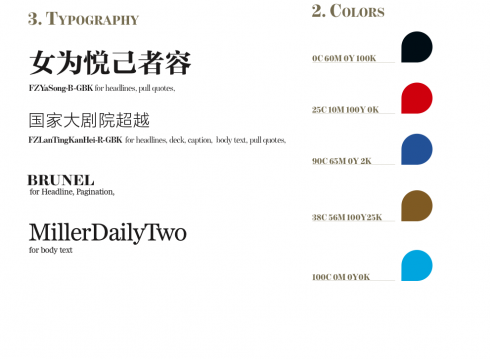
Working with Sylvia’s team was a real Shangri-La experience. They kept our idea alive and enhanced it.Contents are pure love with righteousness. The fun part of the project was selecting fonts.There is a difference between Chinese and English language fonts.Chinese font does not have x-height, uppercase and lowercase as in English. The structure of these standards will need your design skill to have your mission accomplished.I chose Song style as one of the headline fonts, simple, modern, dignified and elegant. A reasonable thickness of strokes, eye-catching and easy to read. Founder-shaped structure tends to be more plump, smooth focus, Chinese and Western culture have a more perfect match.
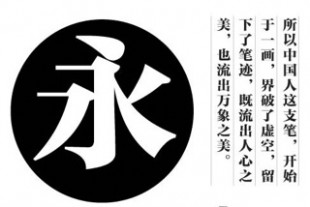
Our early prototypes
Here we show the early prototypes that established the guidelines for the concept:
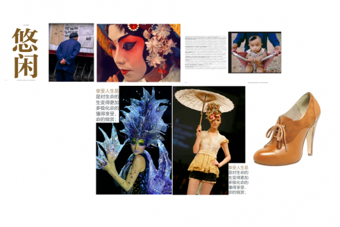
Very early mock up of pages so that Nai and I would lay the foundations for the look and feel of Shang (which was not named at the time)
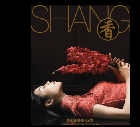
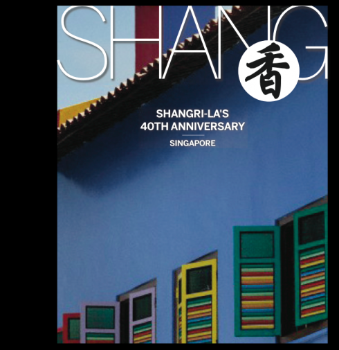
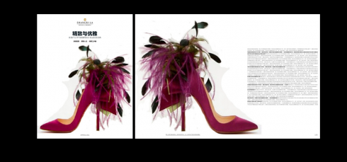
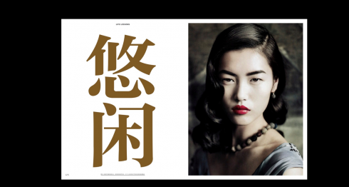
Dealing with the specifics of style
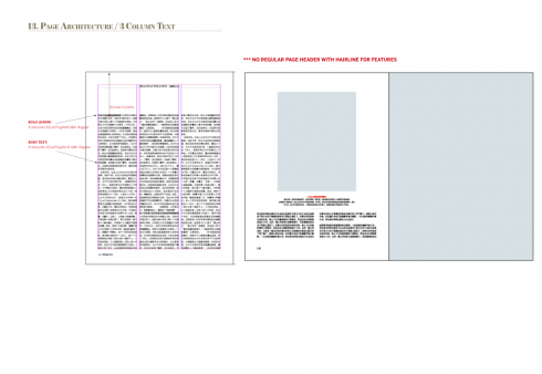
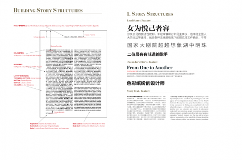
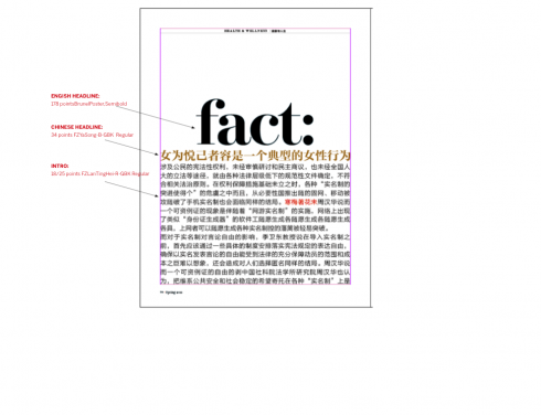
These are assorted pages from our Shang styleguide, with very specific details as to storytelling, spacing, grids, typography and color.
