Updated with new images of “fd” Tuesday, Dec. 15, 11;53 EST
TAKEAWAY: No bells or whistles, just simple, classic, elegant and easy to navigate design make the financial daily “fd” a thing of beauty.
Simple name, simple visual approach that works
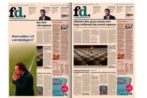
Today’s edition of the “fd” in the Netherlands carries a spaeda ad placement over Page One
It is called simply fd, yes in lowercase, the f in black and the d in a sort of turquoise. That is the short way of identifying this Dutch financial daily whose official name is Het Financieele Dagblad.
Not that the fd, printed in all its peach colored paper splendor ,is new. It was founded in 1943, but I had not seen its most recent look.
In today’s edition, a spaeda advertising appears over Page One.
Inside, an attractive 7-column broadsheet, a reminder of how precise and elegant broadsheets can be when designers adhere precisely to a same-column-width configuration.
The short “fd” flag allows for good navigation (within the grid) at the top of page one. However, in addition, the fd carries a full summary navigator in the style of the Wall Street Journal’s What’s News.
A great display of hierarchy, ample use of white (should we call it “peach”?) space between elements, and clearly defined story structures (the briefs are nice and breezy) make this newspaper one of my most interesting discoveries in recent months.
Tip for the fd editors: Please display your online edition URL more prominently on page one! I had to struggle to find it, at the bottom of the navigator.
This information should be next to the date, as high as possible. Go www.fd.nl
You are not likely to find the “fd” I have in my hands winning in design contests.
What it lacks in the pizzazz and glamour that tend to seduce judges, the fd has plenty of in the important areas of design simplicity, ease of navigation, legible type (especially for texts), and the compactness of 20 pages, which are more than plenty to report the financial stories of the day. Busy readers of the fd can savour the satisfaction of getting through their morning newspaper quickly.
Now, if only I could understand Dutch!
Note:
Since we published this blog earlier today, we have heard from Hans Spoelman, Chief of Design, at the “fd”, who has sent us pdfs of today’s edition, along with this note:
Thank you for your comments and your advise in your blog today.
Hereby I send you the frontpage of today. With and without the add.
Besides that I will also send you some pages we made in the last two year.
Some of them were prizewinning at The European Newspaper Design Competition
last year and the year before.
Read more about the “fd’s” redesign (by Mark Porter) and its typographic elements:
http://www.fontshop.be/details.php?entry=226
TheMarioBlog post #440