Update #4, Saturday, Feb. 6, 01:58 EST
TAKEAWAY: More pages of today’s Il Secolo XIX, of Genoa, which went to a smaller, more compact format Feb. 3. Two days later, the newsroom—-and the readers—-become familiar with a new way of presenting information, in two sections.
Pages from today: Saturday, Feb. 6, 2010
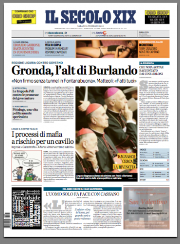
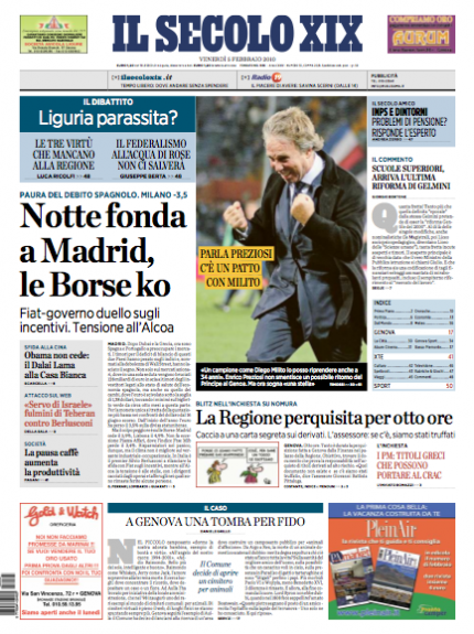
Saturday front page. In this case main photo related to lead story
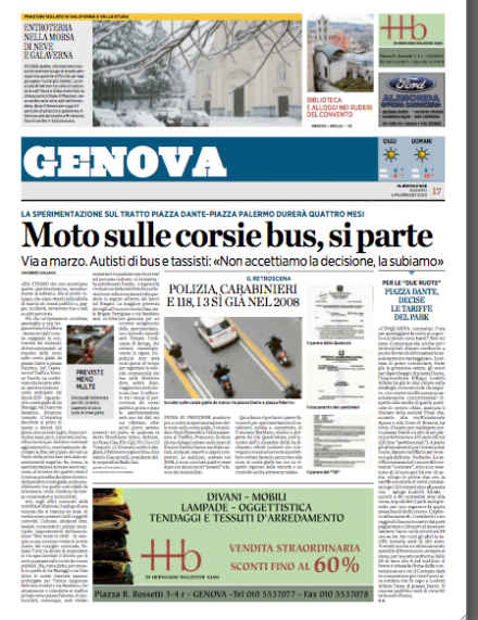
Opening of the local section for Genoa
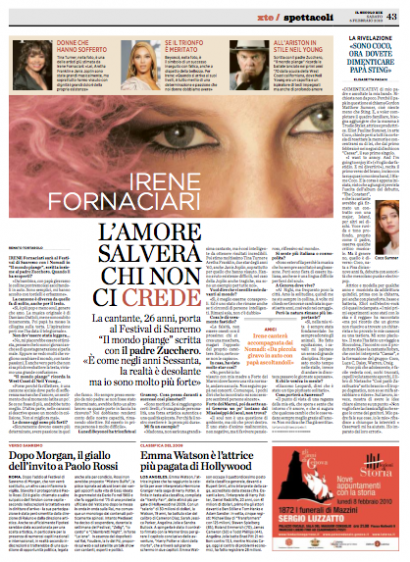
A feature page from the entertainment section “xte”
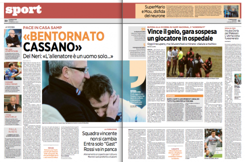
Sports opens with a double page
The sixth finger? Not quite

Behind the scenes: I always say that every project has a moment, usually during presentation of prototypes, when an idea will be killed on the spot.It could be an italic headline, a circular header, or something as simple as a gray screen behind a box. I believe that it makes those in charge of making choices feel so good when they can cut something out of the presentation.
At Il Secolo XIX, we all thought it would be the use of these yellow strips for the Page One lead photo. I thought it would add color, give us another point of entry for scanners, and create immediacy where one needs it the most on the front page. Much to our surprise, and even though Genoa is a conservative town, with a conservative newsroom, the yellow strips survived the first, second and final cut, wtihout as much as a comment. I, of course, kept my joy to myself (or shared over drinks later with design director Massimo Gentile and our own art director Christian Fortanet). At one point, publisher Carlo Perrone simply asked if the yellow strips would not be a little too much, but it was a comment and not an order to take them out. Editor Umberto la Rocca liked the yellow strips, but wondered how readers would react. So, the yellow strips made it to the finish line. Three days later, not a single call from anyone, so I think we are safe to put it here.
From Massimo: “Well, both Perrone and Umberto, like all the other editors, asked me about the yellow strips from time to time during the redesign process. They kept asking if I thought the yellow strips were too much. I said: It is not whether I like them or not, it is the power and punch they give the front page that matters. Now, the yellow strips are in, and nobody asks about them anymore. They are here to stay.”
From Christian:: “This is one of these great ideas that made it and did not stay in this big box that all of us designers carry around, full of great ideas that were killed before they had a chance. My advice to designers, get all those good ideas out of that box of fear, and put them on your computer screen and apply them. You will be surprised, as we were here.”
Front page of Friday, Feb. 5, Il Secolo XIX. Main photo on the page comes from the top navigator.
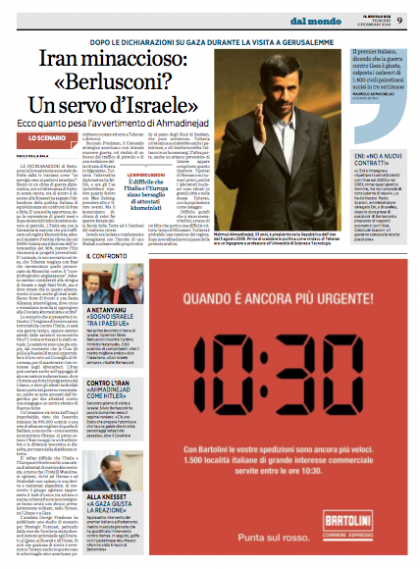
Inside page of news
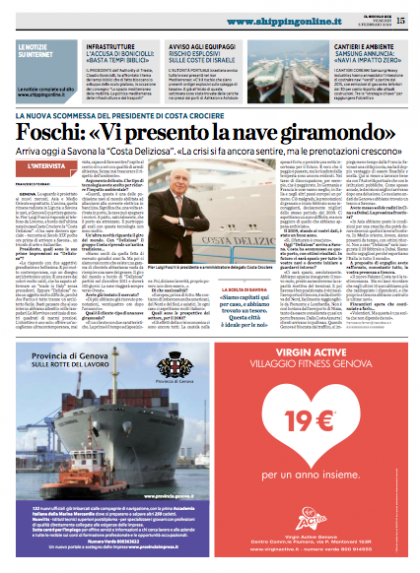
A page devoted to shipping news, an important part of Il Secolo’s coverage for its port city
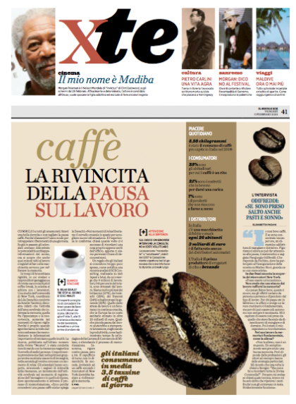
Section opener for features xte: cover story all about coffee and good coffee breaks at work
We continue our coverage of the launch of a new look and compact format for Genoa’s Il Secolo XIX. One important part of this project was to create better navigation, starting on page one, and to provide a layering system for hierarchy of various story structures on inside pages. Some of the examples shown here present how the new layering is carried out by a newsroom that has been diligent and disciplined in introducing the new styles.
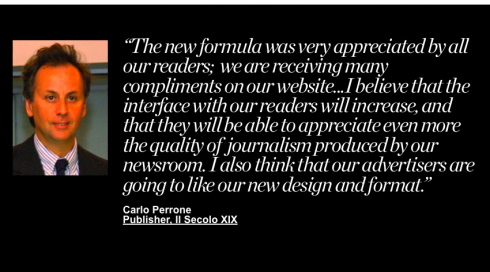
Here is how Carlo Perrone, publisher of Il Secolo put it:
Our readers love the new Il Secolo, as they find that it is still familiar, but with new elements that make it easier to read. But I am also happy to say that our newsroom has risen to the occasion, and they are truly enjoying how stories and images appear in this new design. A happy story all around for this project.
Yesterday’s blog post for Il Secolo XIX:
https://www.garciamedia.com/blog/articles/genoas_il_secolo_xix_in_new_format_new_look
The new Il Secolo format: measurements
The new Il Secolo page is exactly 344 mm by 465 mm.

– A Hint at Apple’s Mobile Advertising Plans (Location, Location, Location)
http://gizmodo.com/5464403/a-hint-at-apples-mobile-advertising-plans-location-location-location
– iPad Changes Equation of Newspaper-Subsidized E-Readers
http://www.poynter.org/column.asp?id=131&aid=177206
– Will Steve Jobs Deliver Salvation for Newspapers?
http://www.rationalwalk.com/?p=4794
Don’t miss it

TheMarioBlog post #476