
Purchase the book on the iBookstore
The EPUB version of book is HERE:
Now available: The EPUB version of iPad Design Lab: Storytelling in the Age of the Tablet, ready for download via Amazon.com for Kindle:
http://tinyurl.com/8u99txw.
TAKEAWAY: The time has come to consider the more robust, but only one section, printed newspaper.
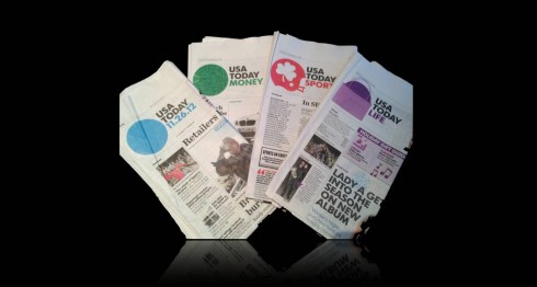
The Nov. 26 edition of USA Today: four sections, 32 pages, but very flimsy sections at that
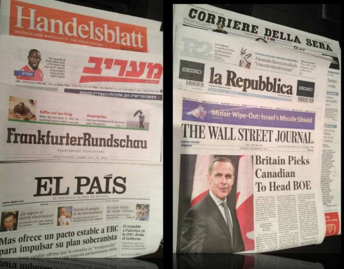
All of the titles above are one-section daily newspapers

The Nikkei, Japan’s financial daily, is a broadsheet, one section newspaper
I was flipping through the Monday, November 26 edition of USA Today and could not help but feel that this was a rather flimsy and anemic version of the iconic newspaper.
It included its trademark four sections: news, business, sports, Life. However, each of these sections tended to disappear in your fingers.
To be exact: 10 pages of news, 6 pages of business, 10 pages of sports and 6 pages of Life.
A total of 32 pages for this edition—which is just about right for a Monday-Friday publication. It included SIX full page ads.
By the way, USA Today is not an isolated case with its barely there individual sections. In my home state of Florida, my hometown newspaper The Tampa Tribune is rather anemic most days, and so is The Miami Herald down in South Florida. The Tampa Bay Times seems to have more meat on its bones, and I hope it lasts for them, too, but it is not what the then called St. Petersburg Times used to be.
The case for the one section newspaper
Recently, in an interview with New York Magazine about the end of the print edition of Newsweek (which will print its last issue in the US on December 31), editor Tina Brown commented about what it feels like to have what she described as a “wan” newsmagazine in your hands.
“It (Newsweek) always seemed wan, and that affects the way you read it. That was one of the big problems,” she said. “I’ve always been very enamored of European newsmagazines—the Spiegel kind of magazine, which has an energetic, high-low approach to news. But those magazines also need a lot of pages—there’s something about the way a magazine looks and feels when it doesn’t have advertising that is unbelievably disappointing, both as an editor and as a writer. Pages are not meant to be adjacent to one another. They need the advertising to give it body and fullness. There was always that sense of Newsweek being not the full-bodied thing that it ought to be.”
I believe that the same holds true for newspapers.
A newspaper must feel robust—or at least well fed—in your hands.
A multi section newspaper that includes six page sections conveys a message of desperation (“not enough advertising”) and it is only justified if we go by the old adage: create sections so that people can share their newspaper at home.
I would like to have $1000 for every time I have heard that comment around the globe. Perhaps there was a time when this was true, and, for some countries and cultures, this is still true (but those are the countries where newspapers are still fat and thriving, where daily newspapers feel necessary and are expected with much anticipation).
The printed newspaper as a solitary experience
In many places, however, I believe that the newspaper is a lean back, solitary experience. It’s as if we have a sense of communion with those pages we hold in our hands. We look forward to that little time (it gets littler every time) with our favorite daily or weekly.
It is me and my newspaper. Period.
I remember, many years ago when we were redesigning The Philadelphia Inquirer. At the time of the launch, the marketing director appointed a top advertising firm in New York to come up with a campaign, which it did.
I will never forget the reaction to that campaign, which included images of a person sitting in a park bench, with his copy of The Inquirer open in front of him. Standing behind this person, three other people reading over his shoulder.
The Inquirer’s editor at the time, Max King, made a comment that stuck with me to this day:
“People don’t read newspapers as a communal activity. They may share their newspaper, but it is one reader at a time, a highly personal activity.”
Those advertising creative folks went back to the drawing board quickly. Their beautifully presented sketches had missed the mark in the most essential part of the campaign: enjoy your new Inquirer and make that daily experience more unique and personal.
In 2013: consider the one section daily paper
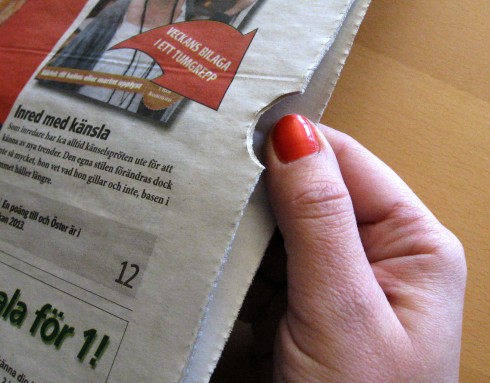
It’s perfectly fine to do a one section newspaper, especially since now indexing is available. Magazinet, a weekly in Sweden, is the first newspaper to have adopted the indexing technology. (Photo: courtesy of Tolerans, www.tolerans.com)
If I were creating the concept forUSA Today—-or any new newspaper, for that matter——in 2013, I would not increase the number of pages, but I also would abandon the notion of all those sections, recommending, instead, a well paced series of “content buckets” that do not necessarily have to adhere to the traditional sections (except for sports, maybe).
It would be a one section daily read.
Let the reader flip through the pages of a 32-page newspaper where the surprises abound, and where perhaps the ads are used to cleanse the palate between content buckets. If this newspaper is a compact, then stitch it so that it holds itself together better.
Nowadays, indexing is also possible, so that readers can access the start of a new “section” or content bucket easily.
With the right mix of stories, this could be a printed newspaper that would become necessary, easy to handle, but that does not apply sectioning rules that may have worked well then, but not now.
Something to think about for those who are serious about rethinking their printed newspaper editions.
For more about stitching and indexing of newspapers, go here:
www.tolerans.com
Of interest today
Future to launch new digital-only magazine for iPad
Highlight:
Future Publishing, which has found success on Newsstand since the launch of the Apple product 13 months ago, says ‘tech.’ will be its ‘biggest digital magazine launch’
http://www.journalism.co.uk/news/future-to-launch-new-digital-only-magazine-for-ipad/s2/a551276/
Take a video tour of iPad Design Lab
“iPad Design Lab” trailer on Vimeo.
Read the Society of Publication Designers’ review of The iPad Design Lab here:
http://www.spd.org/2012/10/must-read-ipad-design-lab.php

Keep up with Mario Garcia Jr. via Garcia Interactive: helping transform online news since 1995.
www.garciainteractive.com
Here’s a gift you don’t have to wrap!

It’s official. The Christmas/holiday shopping season is here.
Here is a suggestion for someone on your list, the digital book iPad Design Lab: Storytelling in the Age of the Tablet. No need to stand in line, no need to buy wrapping paper. Just send it to someone you think might enjoy a book about this magnificent new platform that is the tablet, and how to maximize its potential for storytelling.
Here is how you can get the book:
The original version of the book is the multitouch textbook version available on the iBookstore for iPad (iOS 5.0 and up):
https://itunes.apple.com/book/ipad-design-lab/id565672822. This version includes video walkthroughs, audio introductions to each chapter, swipeable slideshows, a glossary and a sophisticated look and feel.
Apple only sells multitouch textbooks in certain countries at this time, unfortunately. Copies are available in at least the following countries: Australia, Austria, Belgium, Canada, Finland, France, Germany, Great Britain, Greece, Italy, Latvia, Luxembourg, The Netherlands, Poland, Portugal, Romania, Slovakia, Spain, and the United States.
For those in other countries and without an iPad, we have made the book available in a basic edition for other platforms. This basic edition includes the full text of the original, along with the images and captions, but lacks the other features such as audio and video. It is available on the following platforms in many countries:
Amazon Kindle: http://amzn.to/SlPzjZ
Google Books: http://bit.ly/TYKcew
Scribd: http://bit.ly/PQTwla