Update #3: Amsterdam, January 10, 13:31
TAKEAWAY: Storytelling is often best carried out through infographics. That’s our subject today: New York Times graphics that tell the story without the non essentials. ALSO: Financial Times’ new series on capitalism and how it is illustrated. PLUS: Poynter seminar has scholarship available
Poynter mobile seminar has scholarship available

Regina McCombs, of the Poynter Institute for Media Studies (Faculty for Multimedia and Mobile), tells me that there is a scholarship still available for her seminar, Developing a Smarter Mobile Strategy.
Deadline Wednesday, Jan. 11
According to Regina:
“Even if you’ve got some mobile products under your belt, we’ll help you learn to develop mobile news content and revenue strategies. You’ll gain insight into improving the working relationship with vendors and better ways to use your mobile metrics. We’ll help you sort through the issues in creating smart phone and tablet apps vs. using the mobile Web. Most importantly, you’ll deepen your understanding of the journalistic power of mobile and of how the public is consuming information on all kinds of hand-held devices, from simple phones to tablets.”
Anyone with questions, contact Regina McCombs, The Poynter Institute, regina@poynter.org. Or call her: +1 727-553-4228; cell + 1 612-695-3447.
The simple graphics that tell the story
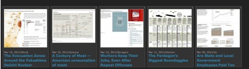
Some of the New York Times graphics in a collection
Today’s blog is prompted by an email from Jim McManus, an artist and infographics expert, who wrote me:
“Last week I was looking at your recent blog post about the Washington Post and the good work they’ve be doing there and I was struck by how easy it is to miss the consistent high quality when you look at a paper either daily or infrequently. Somehow when you collect the work over a period of time and review it in the manner in which you did on your blog you can more easily see how great the work is. I noticed a similar effect with a collection of NYT graphics I found the other day. In addition to being well-crafted and easy to follow, most of these graphics are remarkably rich with information. I find that combination of rich information and elegant visual storytelling to be quite compelling. “
Indeed, Jim, and thanks for sharing. I have taken a look at these graphics myself. I, too, see how well crafted they are, how simple it is to follow the information that each one conveys, and, most importantly, how free of decoration, bells and whistles, they are.
These graphics represent the best of visual storytelling with substance and appeal.
They remind me of one of the greatest messages that Nigel Holmes, master of the infographics, used to tell participants in our Poynter Institute seminars.
“Make sure everything in the graphic has a meaning, because if you don’t attach a meaning to it, the readers will.”
How true!
Conveying the essence of the story quickly
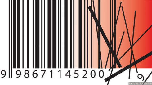
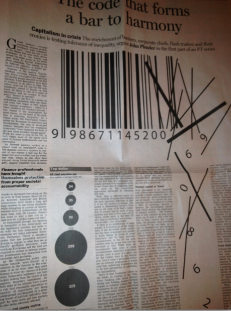
If graphic symbols and icons help us understand a story in a matter of seconds, then this one from the current series running in the Financial Times, does it best.
I first looked at it in the FT Weekend edition while flying across the Atlantic Sunday, and it made me want to read more about the series.
Now I have found the headline for the first installment in the series, and then the image makes all the more sense: Capitalism in crisis: The code that forms a bar to harmony
The NYTimes Election 2012 iPhone app
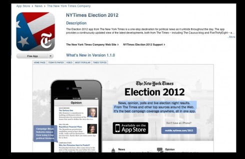
As an American, I am extremely interested in the Presidential Election that will consume so much of our attention this year. So, what happy news to hear that The New York Times has created an app that will allow us to keep up with coverage from The Times and from around the Web, all in a new phone-friendly feed. I have already downloaded it to my iPhone and will start getting the results of the New Hampshire primary today.
Of special interest today
– The UK Guardian Claims 500K iPad App Downloads
http://www.minonline.com/mindigital/19708.html
– UK: Guardian iPad edition now includes Weekend magazine
http://www.guardian.co.uk/help/insideguardian/2012/jan/06/ipad-edition-weekend-magazine