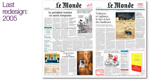
It has been three years since Le Monde, France’s iconic daily, changed its look. In 2005, the design aimed to get rid of what some referred to as its austere look, with heavy columns of text, and not much display of photography. With that redesign, carried out by Palmer and Watson, came the addition of a large color photograph on the front page ( big step forward for LeMonde), as well as a typographic overhaul, with a new version of Matthew Carter’s Rocky, that very attractive font. Of course, the intention of that new design formula was to capture younger readers, something that has become a cliché statement as editors and publishers haul out a new design.
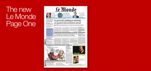
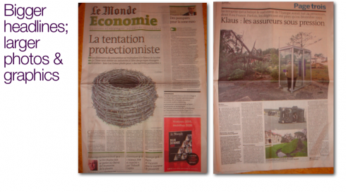
Last Monday, LeMonde appeared with a new look——redesign a la lite, I would call it—-introducing a navigation bar to highlight three stories on the inside. Headlines on Page One appear bigger and heavy rules separate topics. Page Three displays a single topic and a huge five-column photograph and what appears to be a dramatic cut in the amount of text presented. For LeMonde, this is, indeed, a big step, approximating a popular newspaper or magazine more than the classic, text-driven icon we have grown accustomed to. I bet this new Page Trois has some editor crying in a corner.
Inside page layout does not present too many changes, except for those 12 point black rules to separate topics. Indeed, this LeMonde is more pictorial, but that is the limit of the “new” in this relaunch.
Briefs are still not so brief, but they do appear (progress!).
Perhaps the more dramatic visual change is in the second book, Economie, where major pieces are displayed with large headlines, illustrations and with a series of secondary readings that do help readers get through reportages and analysis of economic news.
There are no surprises here, just a good basic clean up, a bolder use of headlines and photographs, and, for LeMonde, an approximation in 2009 to what many other dailies worldwide already did ten or more years ago.
To me, the surprise, is that now it is normal procedure for even the most classic of newspapers to make design changes three years after introducing its last redesign. It is a good thing. Constant evolution is better than paralysis for the sake of tradition.
![]()
For a Spanish-language blog devoted to Le Monde’s redesign, see Juan Varela’s Periodistas 21:
http://periodistas21.blogspot.com/2009/01/le-monde-tambin-se-aprieta.html
How is The Chicago Tribune doing as a tab?
With its very first tabloid edition launched Monday, the Chicago Tribune eloquently makes the argument that it’s time America’s big-city dailies seriously consider converting to a compact format.
http://www.mediaweek.com/mw/content_display/news/magazines-newspapers/e3ie53ceefa152782efe7cde031521d7135
New Russian owner for London Evening Standard reveals plans
Speaking for the first time since the acquisition of the London Evening Standard, Evgeny Lebedev has told MediaGuardian.co.uk that the paper’s new Russian owners will invest £25m in the newspaper over the next three years.They plan to increase coverage of the arts, culture and business to revive its flagging circulation, he said.
http://www.guardian.co.uk/media/2009/jan/26/evgeny-lebedev-reveals-london-evening-standard-plans
To read TheRodrigoFino blog, in Spanish, go:
https://garciamedia.com/latinamerica/blog/
TheMarioBlog posting #178