TAKEAWAY: Those Wall Street Journal tabs in Europe and Asia are sporting a cleaner, bolder look since yesterday. We take a look, while reminiscing about our own experience with this venerable financial daily. Doing the Murdoch mambo.
Navigating into a more complete What’s News
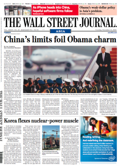
New front page, Wall Street Journal Asia: bolder, more photo emphasis, What’s News is out
Before and after of front page of WSJ
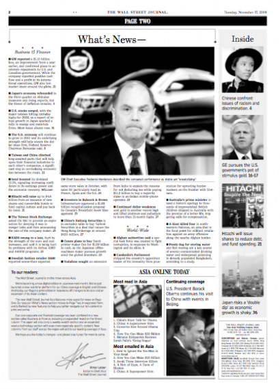
What’s News is now out of Page One and a full navigator on Page Two
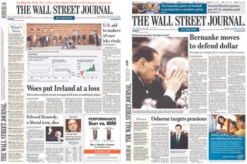
New section front look for WSJ Asia
New inside page, Wall Street Journal Asia
Anyone who ever worked with a new design for The Wall Street Journal, as I have several times, knows that the front page navigation column, titled What’s News, is, indeed, the one best read part of the legendary financial daily’s front page. As I was told by a long time editor of the WSJ, “this column first appeared about 80 years ago when the then editor decided that readers of business news are busy people and they appreciate short summaries of the news on page one”.
So, it is no wonder that this What’s News element was one of the top items on any pre-redesign briefings at the WSJ. I made mental notes about it, mostly: Don’t mess with the What’s News. My involvement with the WSJ took me through various changes through the years (introduction to color ,2001 , conversion from broadsheet to tabloids in Europe and Asia 2004, conversion to narrower width ,2007) .
I found this to be logical, since all the research showed that What’s News is one of the best read features of the newspaper—-and one of the first read by over 90% of all WSJ readers. In fact, I have found myself often saying that whoever introduced that navigation device with summaries of all major stories on Page One was truly a visionary, who not only anticipated the needs of busy readers, but who, in a sense, created the first navigation scrolling device.
I also remember specifics about our “tampering” with What’s News. Example 1: I tried to put some small images as part of the What’s News. (“No, readers do’t want visuals there, not at the expense of three or four story summaries,” an editor once told me. Example 2: When we took the US edition of the WSJ to color, we immediately realized that if we wanted to make a statement about it, What’s News would be the ideal place to do so. That’s how that champagne background color first appeared there, still retained on the US editions.
One big change: What’s News OUT of Page One: how can that be?
Now, with the new look for the Europe and Asian editions of the WSJ, I see that What’s News is OUT of the front page.
“How can that be?,” I asked myself upon seeing the new redesign. I wish I were a fly on the wall of the offices where so many of the former WSJ editors I worked with are sitting right now, to see their reactions. In retrospect, perhaps we saw this coming. For the past few months, the What’s News had become an anorexic version of its old self, appearing as a skinny rail on the left hand side of the Europe/Asia editions, one gentle push away from disappearing from the page. Now that push has come—-sending it to Page Two.
What the editors appear to be saying is that they recognize the importance of navigation fully, thus expanding it and giving What’s News most of the second page; history takes a second seat to practicality perhaps. I wonder how readers will accept this, as I have always questioned the effectiveness of those Page 2 navigators, thinking that perhaps they come too late. The New York Times does it this way, as do many other publications. Time will tell how those traditional WSJ readers react to this important change. Of course, in our recent relaunch of Handelsblatt, the German financial daily, the full navigator is on the last page, a flip away from the front page. For what is worth, if I were creating a Wall Street Journal-style newspaper from scratch in 2010, I would have a What’s News navigator on Page One. In fact, Page One would be primarily a navigator.
Other than this, the most significant obvious shift in this new redesign of the WSJ Asia/Europe is the larger presence for photos on Page One, and new section headers. No surprise here, however, as I know that since the NewsCorp takeover, in 2007, all WSJ editions have begun to steer away from the traditional waltz and do a little Murdoch mambo.
I have not yet seen an entire printed edition, which I will as I reach Europe next week. For now, the changes seem positive, preserving the DNA of the newspaper, but taking it to its next level. It is obvious that this is a more colorful, photo-oriented product for the era of Murdoch. Designers involved have probably have fewer restraints that we did when we embarked into previous redesigns. When I see the large photo on Page One of the Asian edition now, I can only remember the long discussions about two column photo treatments on Page One.
One such discussion that comes to mind involved a fashion industry business related story: David Pybas , still design editor with the WSJ, and I were addressing the issue of perhaps using photos of runway models to enhance a graphic. “Models on Page One?” said a page one editor, and his question was already an indication that we were headed into trouble. However, we managed to put miniature images of models next to the graphic.
Perhaps we did start our move to a sort of guarded mambo (if there is such a thing) back in 2004.
In the pre-Murdoch era, the WSJ was not seen as a carrier of photographs, not on Page One anyway. Gravitas came through graphics and those pencil vignettes of personalities.
Evolution is, indeed, precious to watch.
The official statement about the changes
According to the Dow Jones press release on the change: A redesigned Wall Street Journal Asia makes its debut today, featuring expanded coverage, additional print and online content, improved navigation, further integration with the online edition and a vibrant new look.
“The exciting improvements and additions being introduced with today’s edition of the paper represent a significant step forward in the development of the Journal’s regional franchise,” said Almar Latour, the Journal’s Editor-in-Chief, Asia. “These changes embody our increasing coverage of Asia and are the latest fruit of Dow Jones’s investment in this region’s editorial resources.”
Key elements of the redesign include:
· A new front-page layout, including a bolder masthead, “sky boxes” and navigation bars, and enhanced stock-market listings at the top of the page
· A much-expanded What’s News section and a guide to the day’s top online articles on page two
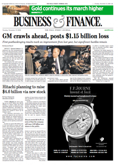
· A new Business & Finance section comprising the former Money & Investing and Corporate News sections and providing more extensive markets coverage and statistical analysis, including the Deal Journal Asia column
· An enhanced World News section with pages dedicated to Asia, the Americas and Europe, Middle East and Africa, drawing on the unrivalled global reporting resources of the Journal and Dow Jones
· A daily in-depth feature that goes behind the news and gives the full story
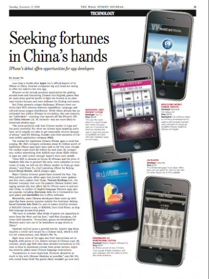
· An expanded weekly Technology section, featuring “Tech Bazaar”, a recurring write-up about Asia’s latest gadgetry
· A new weekly column offering selected content from the Journal’s recently launched Web site, China Real Time Report, a comprehensive resource for news and analysis on China
· An expanded Heard on the Street column, essential reading for financial professionals, corporate decision-makers and retail investors
· Weekend Journal Asia: the weekly leisure and lifestyle supplement continues on Fridays
For more information about the WSJ redesign:
http://online.wsj.com/article/SB125845052807351847.html#articleTabs%3Darticle.
TheMarioBlog post #423