Update #3 : Sunday, 11:52 Bogotá
TAKEAWAY: It was 10 months in the making but today El Tiempo appeared in the streets of Colombia . It is a dramatic change from the newspaper of the day before, a different way of looking at content and how it flows from page to page. This first edition is robust in its content, photography, design and the variety of topics it covers. More importantly, it is an example of how printed newspapers can change to adapt to the requirements of a multi-platform world. PLUS: It is a new popular newspaper, Diario Mio, for Colombia, starting Oct. 12
El Tiempo’s video presenting the new concept, with all the main players of the project discussing it for the public (in Spanish). Take a look!
Flip through the blue section of El Tiempo today: Debes Saber (what you must know)
Flip through the pages of El Tiempo today: Debes Leer (What you must read)
Flip through the pages of El Tiempo today: Debes Hacer (what you must do)
Flip through the pages of Saturday’s El Tiempo: the last day with the old styles
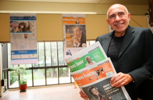
Giant banners showing the section front pages hang over the atrium of El Tiempo’s building/EL TIEMPO photo by Gerardo Chávez
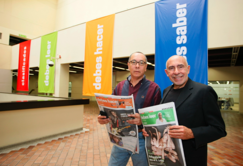
El Tiempo art director Beiman Pinilla and I posing in the atrium of the building, with banners for all the different new sections/EL TIEMPO photo by Gerardo Chávez
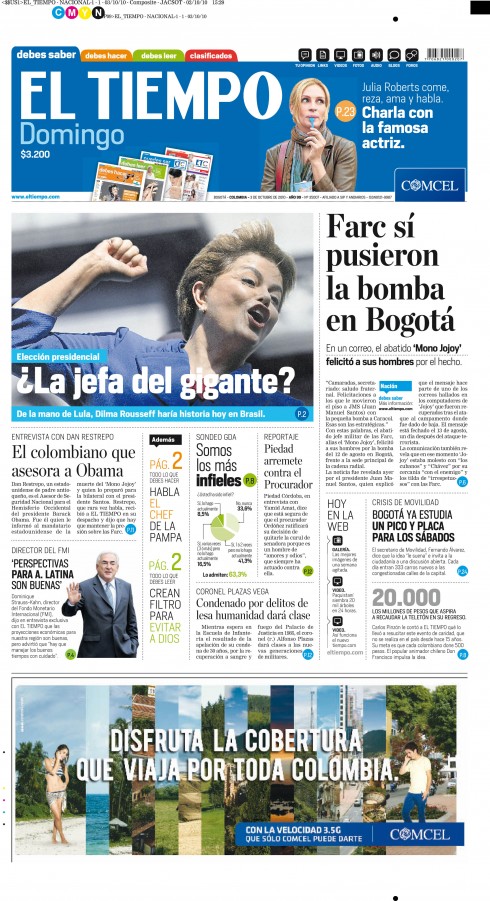
This is the front page of today’s El Tiempo
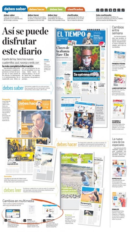
This is the page that explains the new concept to the readers in today’s edition of El Tiempo
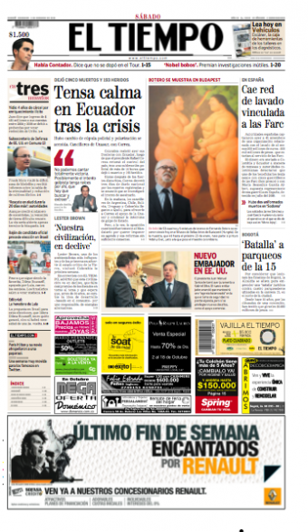
This is the front page of the last edition of El Tiempo before the changes of today
It was a quiet production day as it rained outside most of the time Saturday.
The excitement of producing the first edition of a new concept was obvious among the editors and designers. And, of course, there was always the nervousness of meeting deadlines——sorry to say that we missed it for over 40 minutes!——selecting the right photo (designers and photo editors will forever disagree with the right photo to pick, and today was no exception). The photo on Page One is that of Brazilian presidential candidate Dilma Rouseff, the candidate every expert believes will become the first female president of Brazil.
Those who follow the Dilma——as she is commonly referred to——narrative assert that the 62-year-old grandmother is a tough lady with a strong left wing ideology, who was a guerrilla leader,and who has been one of President Lula’s most effective cabinet members. Dilma is also described as an ill humored, hardcore intellectual, one whose many plastic surgeries have not been able to soften.
It is within this framework that we spent hours discussing the selection of the Page One photo of Dilma. The editors and designers wanted a more “colorful” photo on Page One, but the ones with color did not show the real story of Dilma, as described in the text. The one photo that did, which we showed on Page One, had her fist up in the air, the facial expression typically Dilma, but, said Sandra Rojas, the page designer, “it is not a photo that our presses would reproduce well.”
At the end, I reminded Sandra and others gathered for this decision making process, this is all about the story, and the photo of Dilma with her fist up is the one that tells the story; reproduction issues should take a back seat. We all agreed, and now the photo is on Page One of today’s editions, and it looks pretty good——thanks, Mr. Printer!
Hard breaking news at the closing
Then, just about ready to go, a breaking news of consequence for Colombia: Mono Jojoy, one of the strongest leaders of the FARC, who was ambushed and killed recently, had written an email to his guys congratulating them for the bombing August 12 of a popular Colombian radio station.
This pushed the lead story that was already there to an inside page, and required some rearranging of elements, but nothing too difficult.
The presses rolling
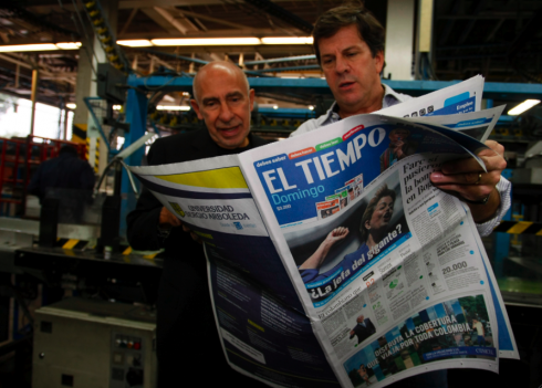
El Tiempo editor Roberto Pombo and I examine that first edition of El Tiempo rolling off the press
It always happens when I enter the huge pressrooms where newspapers are printed, sort of a giant cruiseliner, orange cylinders making noise, page after page printed and rolling down where employers collect them. I feel the joy of knowing that this is the culmination point of our efforts, and that soon all the stories, photos, illustrations and graphics that we have collected will be in the hands of thoursands of readers.
On the first day of a new concept, I wish I could be present at every home when the newspaper is consumed. Me sitting there sharing coffee with the family, asking what they liked or did not like, or me in the middle of the Transmilenio subway car, watching as commuters read Debes Saber, or are they getting into Debes Leer? Or me jogging thru one of Bogota’s very green parks, when I spot someone devouring the orange Debes Hacer section, a smile on her face.
Of course, this is a fantasy, and one that dates back to my days at The Miami News, where I would take the bus on the way home, at the end of my day, and the bus turned into my own laboratory to observe how commuters in the Miami of the 60s read our afternoon edition. I would change seats just to observe a reader from another angle. Call it early EyeTrack, but to this day, I get a special thrill from the experience of seeing a reader read a newspaper that I have been involved with.
Now we wait for reactions from the readers.
Indeed, the negative ones will come first, as is always the case. People who like the new concept just have another cup of good Colombian coffee, smile and enjoy it. The ones who hate it, they grab the phone, call the operator at El Tiempo and tell her to cancel the subscription. That is how it usually works.
We are standing by. Our work is almost completed. The cake is frozen. It is exactly what Broadway producers feel at opening night, or the film director who has just put the final version of his film in the can.
My project #568 goes out to the readers!
In following the Debes Saber, Debes Leer and Debes Hacer philosophy of the new El Tiempo, for us now it is all about Debes Esperar.….
You Must Wait!

El Tiempo’s typographic framework
Today’s edition of El Tiempo displays the new typographic fonts introduced to coincide with the many other changes carried out throughout: simplicity, easy navigation and functionality. So we have substituted Poynter Agate, which has served El Tiempo well for a decade, with Heroun Sans; the serif font, ITC Modern, used for headlines has been replaced by the elegant Mercury Display; but Nimrod remains for texts—-excellent legibility.
The team
This project was carried out with the García Media Latinoamérica team (Buenos Aires) : working closely with me, Rodrigo Fino and Paula Ripoll (senior art directors), Remigio Badano Sola and Romina Cupé (art directors). We worked closely with El Tiempo Art Director, Beiman Pinilla and his team.
A new popular newspaper for Colombia
Meanwhile, on October 12 a new popular newspaper will appear in the streets of Bogota.
Named Diario Mio (My Daily), the newspaper will charge 500 pesos, barely a few cents, and will have the usual dose of celebrity news, city life and sports. I am told that there will not be blood or sex in this new newspaper, which is published by the same company as El Tiempo The design studio in charge of creating the look of the newspaper is Cases & Associates.
And rumors also have it that Metro—-the king of free daily newspapers worldwide—-is planning a Bogota edition, which was supposed to come out in October, but has now been postponed till early 2011.
Further testimony that printed newspapers are created in 2010, for those who may doubt the value and permanence of print.
Coming Tomorrow: Part 4—-The Day After Reactions
TheMarioBlog post #647
TAKEAWAY: The majority of El Tiempo editors have embraced the new concept that premieres Sunday, Oct. 3; others have a wait and see attitude. Now the process is to explain the concept to readers and to advertisers. So far so good. See the marketing department’s efforts to promote the El Tiempo that is about to launch. PLUS: A new sports daily for the UAE: see Sport 360*
Once our concept for the new El Tiempo was crystalized, then the next step was to discuss it with the editors in the newsroom, who would ultimately be the ones implementing it.
Since our blog yesterday, several of you readers have sent me emails with the specific—-and valid—-question: How in the world do you sell this to editors?
In fact, one person wrote me: “My editors would have a heart attack if we proposed that we tear down the walls, and take away the headers with the names of their sections.”
Indeed, it is not easy to sell NEW anything, especially to editors. But I knew that we could do it, and that we had to present it as what it is—-a no nonsense, practical approach to presenting information.
For those who argued that when you tell readers You Must Read (Debes Leer), you are arbitrarily directing them to a very specific comment, our answer is: isn’t that what editing is all about? Isn’t that what newspapers have done for over two centuries. Every newspaper editor I know SELECTS stories that he/she thinks readers would be interested in or need to know. That is a fact of daily journalism in any platform.
It was that which we used as we worked with the different groups of editors at El Tiempo.
Three reactions among editors
Today at lunch I took the time to ask Jose Antonio Sanchez, the one editor of El Tiempo who was project leader for the journalistic side of our work.
Mario: Jose Antonio, what has been the reaction of editors here as you worked with them on zero numbers with the new concept? How difficult was it to make the changes internatlly?
Jose Antonio:
Not difficult at all, or less so than I had anticipated. I can tell that the editors I have worked with here have fallen into three distinct categories: those who like the project, consider it innovative and are having fun implementing it; then there are the skeptics, not sure how it will go, but are willing to give it a chance, wait and see; then there are a minority which feel that the old way is the best way to do things, and I know that , somehow, they are hoping that the new concept will go away, so that they will be able to go back to their old ways
Obviously, this is not surprising. Editors in a newsroom usually fall into those three baskets, regardless of the topic at hand.
As we work on Sunday’s edition today, I see designers working closely with editors, a buzz in the newsroom, everyone trying to write a better headline, pick a more impactful photo, having fun.
Selling the concept to the readers
While the editors and designers put together the pages, discuss content and plan ahead, the El Tiempo marketing department is enjoying the early results of their all encompassing campaign to introduce the new El Tiempo to readers nationally.
It is a campaign that covers all bases: taxis, buses, billboards, airport advertising, the subway system, and, of course, radio, television, online, in-house ads.
I will show you here a gallery of how the new El Tiempo has been presented:
This is a video shown just before the most popular telenovela airs each night on Colombian television
This is the general promotional video shown nationally throughout the day on television
Segment to promote the Debes Saber section only
Segment to promote the Debes Leer section only
Segment to promote the Debes Hacer section only

This is what passengers using Bogota’s subway, Transmilenio system, will see on the cars
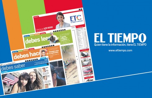
Here is a view of how the campaign appears at airports throughout Colombia
Billboards with the new campaign: this one in Bogotá, but similar ones nationally.
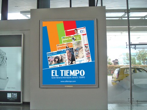
Typical posters seen through various stores and locations nationally
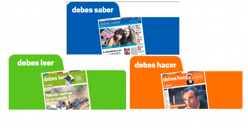
Images to be used in various forms of transportation, from buses to trains to subway system
Selling to the advertisers
The advertisers have been gun ho on El Tiempo’s new concept from the first time they saw a prototype, about three months ago.
Immediately, they were curious as to the traffic that the new content segmentation would attract, and how their products could appear as part of the new concept.
The success of the focus groups served to give their enthusiasm a more scientific base: readers loved their new El Tiempo in those focus groups; even the oldest and most traditional had something good to say about the new content distribution, and said they were willing to give it a chance.
Friday I spoke to El Tiempo’s advertising director, Santiago Alvarez, a happy man who had just closed out Sunday’s edition, the first with the new concept.
“We had projected advertising sales of about US$400,000, but we are now at US$550,000,” Alvarez told me. “This is very good and speaks volumes for the interest that our advertisers are showing in how the new content is distributed and how they can attract new clients to their products.”
“There was NO problem of perception whatsoever about this new concept,” Alvarez said. “In fact, the segmentation of content has been a plus for us so far.”
Will Alvarez sell the advertising according to the three sections: Debes Saber(Blue), Debes Leer (Green) and Debes Hacer (orange)?
Yes, says Alvarez, with the blue section having the highest premiums for obvious reasons. It includes the front page and the most breaking news.
“But we consider the Debes Leer (green) section high premium too, the newspaper’s editorials, best columnists, appear there,” he said.
The orange section, with all the lifestyle topics is the one where Alvarez hopes to truly go for advertisers they don’t have now, such as more cinemas, restaurants, health related clients, concert promotions, etc.
Alvarez, who was also in charge of the marketing campaign, says that it has had a very good reaction. It has been massive and very nationally oriented, at a cost of US$1.5 million.
El Tiempo building prepares for launch
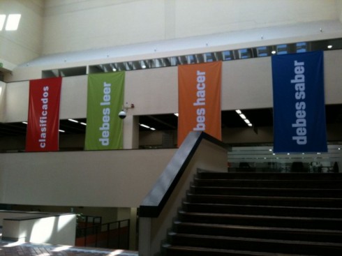
The concept of the color coded books is obvious when one enters the El Tiempo building’s atrium—-big banners with Debes Saber, Debes Leer, Debes Hacer, Clasificados, hang from the citizen to welcomd visitors.
Interested in reading about our redesign of El Tiempo in 2006?
http://www.newsdesigner.com/archives/002457.php
Tomorrow: The new El Tiempo premieres
El Tiempo Case Study; Segment 1, The Concept
https://www.garciamedia.com/blog/articles/el_tiempo_at_100_a_fresh_proposition_journalistically_visually_digitally
To read the El Tiempo case study in Spanish, visit Rodrigo Fino’s blog:
http://www.garcia-media.com.ar/blog/post/todo-puede-debe-cambiar-i/126
Also in Spanish, El Tiempo case study, continued:
http://www.garcia-media.com.ar/blog/post/todo-puede-debe-cambiar-ii/127
Here it is: UAE’s new daily sports newspaper
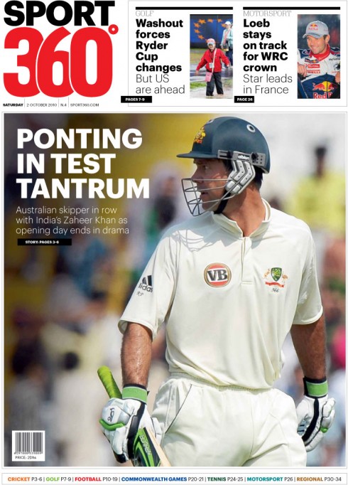
Here is front page of Oct.2’s Sport 360 published in Abu Dhabi, distributed through the UAE
There is a new English-language newspaper making the rounds in the UAE, the much talked about sports daily!
Yes, Sport 360 is already here, having launched the tabloid edition this week, with a digital component, and all the news you want to know about sports in Dubai and surroundings——plus the rest of what happens in the sports world, which is, of course, of major interest to the high number of ex pats who live in the UAE.
We have downloaded a front page from the newspaper’s website. Front page is a poster-styled concept, with two navigators to inside content at the top. WE are hoping to get more information in the days ahead.
If we follow the website’s navigator, we see that the content strategy is divided as follows: football, cricket, motorsports, tennis, golf, US sports, other sports.
This culminates years of rumors about the new “UAE sports daily”, some as early as 2006. We had heard during our last visit to Dubai only a few weeks ago that the launch of Sport 360 was imminent, but even then, nobody was saying when.
The questions linger: is there room for another daily newspaper in the already crowded UAE printed newspaper market (at least six English-language dailies)? Will a sports-only daily attract the sufficient number of readers required to sustain it?
My take is that content is key. Sport 360 must be able to provide exclusive stories that such newspapers as the Gulf News and The National might not offer on their sports pages. In addition, they must be aware of the variety of nationalities in the UAE. It cannot be too British sports oriented, or US football/basketball, or Indian cricket. A tough balancing act, and one we will watch with interest in the months to come.
Sport 360 must offer something extra, or to paraphrase the words from that show stopping number in the American Broadwaymusical Gypsy, You’ve Gotta Have a Gimmick.. It was good advice for those strippers in the show, it is good advice for new sports newspapers in a crowded newspaper market.
Sport 360 is a publication of Gulf Sports Media, and will produce the newspaper out of twofour54, Abu Dhabi’s media hub.
Best weekend read
Without a doubt, I am recommending that you read Cyrus Highsmith’s piece, based on a presentation he gave at Matthew Carter’s AIGA Boston Fellows Award ceremony on September 24, 2010.
Cyrus’ piece is funny, insightful and, for those of us who read books on our iPads as well as the real thing, the printed book, it is just a delightful way to realize that, indeed, print is eternal, if only because of its smell.
Enjoy!
The Smell of Books
http://type101.fontbureau.com/smell-books/