It is the day after the launch of the newly rethought Yale Daily News.
The weather is perfect for celebration: a late summer day, the sun shining, the campus alive with that ‘back to school” feeling in the air; students smiling, new backpacks in tow; professors in suits carrying books under their arms as they cross the scenic campus of Yale University.
I take an early morning run through the center of the campus and take it all in: again, my days as a professor at Syracuse University enter my head, joining the endorphins that come naturally with the run. I start with a long sleeves shirt, but take it off one mile into the run, as the thermometer climbs.
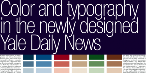
Students get the first edition of the YDN relaunch
I see students reading the Yale Daily News, and I wish I could have the technology to read their minds, test eye movement, and get instant reactions. But I control myself and keep running.
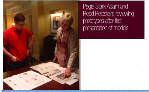
Pegie and I meet to do our own critique of the edition, which we will share with the staff later: the morning after post mortem.
The Bravo Email
Editor Andrew Mangino tells us that he is getting good feedback, such as the one from a long time reader of the YDN who wrote:
Gentlepeople—the new print edition looks terrific, much improved—cleaner, more dynamic, crisper, richer. I think you succeeded with flying colors! Ditto on the online edition being improved and enhanced—but I like the print version so much I might default back to it.
Congrats.
How Color Was Conceptualized and Applied
Dr. Pegie Stark Adam gives tells us how she chose color for the YDN:
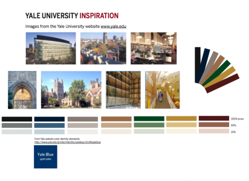
Before visiting Yale University, I imagined gray and tan stone Oxford-like buildings mixed with others of red brick, on dark green lawns and surrounded by dense shrubbery. I imagined gothic arches and signage using scrolly-type text. I imagined an environment reflecting tradition and intellect. I even imagined a place where Harry Potter and his fellow wizards would go to school. And that is exactly what we found when exploring the Yale University campus. One student said to us, ‘It’s like going to Hogwarts!’
We studied photos from the Yale University website and then took reference photos while visiting campus. We studied Yale buildings, inside and out, and courtyards that pepper the campus, complete with gorgeous lawns and rich, deep green landscapes. We examined the nuances of stone and brick color – from tan to gray to rich brown and red. Then we created an initial color palette.
Yale has a color identity; it’s based on Yale Blue. So we incorporated Yale Blue as a kind of brand identity color in the palette.
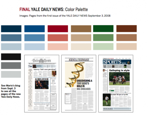
Once we pinned down the ‘environmental’ color for the palette, we returned to the brief for the redesign: The new Yale Daily News was to be elegant, refined, and reflect “gravitas” – like the New York Times and the Wall Street Journal. OK – not crazy, not colorful, not too loud. Quite the opposite. We learned that the Yale Daily News had regular readers who read a lot. The Yale Daily News was a bit like an old-fashioned newspaper. Therefore, the colors had to be subtle and understated, inspired in part by visions of old newspapers like those from the 1700s and 1800s—subtle with what looked like watercolor washes in images and on pages.
Watercolors – that was the solution for understated parts of the redesign. Deeper, saturated tones would be used to punctuate components that needed a slightly louder voice – like Sports. So we proceeded with the final color palette, drawing on the environment, and the philosophy of tradition, elegance, and gravitas.
The final color palette was almost identical to our initial palette. Six key tones carry the redesign. The 100% key tones along with Yale Blue are displayed in the Sports section logo, the features section, and drop caps and rules – color as punctuation. Subtle tones of 50% and 15% are limited to graphics, front-page teasers, Cross Campus (a list of shorts that tell the reader what is going on around campus) and fact boxes – that’s it. Color as punctuation, color as nuance, color as washes. The new Yale Daily News displays a color palette that reflects the Yale environment and the content of the newspaper – rich in tones, sophisticated in saturation and dilution. Color for the environment, color for tradition, color for content.
The New Typography
Reed Reibstein is a sophomore at Yale University, and works with the Design and Production team of the YDN; he interned with Garcia Media this summer, devoting a large portion of his time with us to the prototype of the Yale Daily News. His main interest is typography; we worked closely with him on our type scheme for the newspaper. Here he shares his experience:
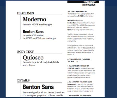
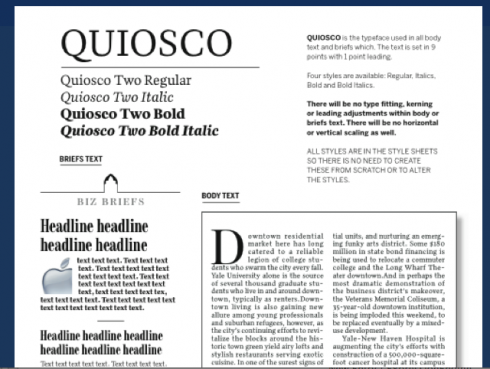
While the News employed the erudite Miller Headline and Daily in its previous design, its new typographic palette is much more flexible and durable. With four widths of Moderno FB, headlines will no longer need to be tracked or horizontally scaled to represent their story accurately—and the paper gains a touch of nineteenth-century grit to flavor its elegance. Benton Sans is a workhorse and a chameleon, able to be both authoritative in front-page captions and playful in “scene,” the hipster arts and living section. And Cyrus Highsmith’s Quiosco combines dynamic and unusual forms with supreme readability for a text face that Yalies will surely come to embrace.
The YDN no longer uses type by Matthew Carter, but the Yale School of Art senior critic’s work is still on display across the campus. His Yale typeface, a revitalization of Aldus Manutius’ Renaissance masterpiece, graces each university building through an omnipresent signage system. Paul Needham’s article, which I had the pleasure of designing, discusses Yale’s unique graphic identity in more detail: http://www.yaledailynews.com/articles/view/24465 .
Summer Internship Comes to an End
Reed Reibstein summarizes his experience as an intern with Garcia Media this summer:
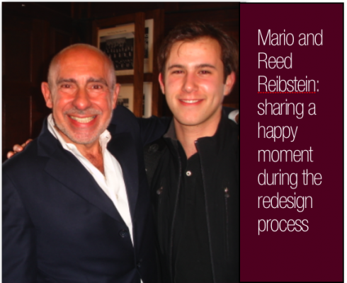
When I was first told that the Yale Daily News would be redesigned by Mario Garcia and Pegie Stark Adam, my jaw dropped. Six months later, after working closely with and getting to know the people behind the famous names, my jaw is still on the floor.
Working with Garcia Media this summer was my first experience working with a professional design firm, and it was truly an unforgettable one. With Mario and Pegie’s guidance, I learned about the “WED” process, delved further into typography, and got a crash course in making templates and style sheets. And, just as importantly, I had a fantastic summer, from exchanging e-mails about newspapers in Nigeria and England to spending a week in Ottawa getting the redesign to its final form.
It has been an intense several months creating the new look and feel of the News, and there is still much to do in sustaining and developing all the changes. But this project has been so rewarding and enjoyable that I am excited, not reluctant, to face the challenges ahead.
Tomorrow
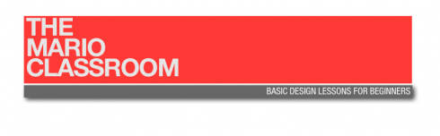
A three-minute video, the first in our Typography series part of TheMarioClassroom: Anatomy of a Letter
![]()
Still in New Haven, Connecticut, at Yale University, but soon starting the long trek towards Brisbane, Australia.