Update #1, Tampa, FL, Saturday, Feb. 4, 16:33.This is the weekend edition of TheMarioBlog and will be updated as needed. The next new post is scheduled Monday, Feb. 6
The Superbowl pop up from Bild
Frank Deville shares Bild’s mega pop up about the major US sports event, the Superfbowl, to be played this weekend. Americans have Superbowl fever, and, obviously, Bild thought it would interest enough of its readers in the German-speaking world.
Files and files of papers bring back the memories
TAKEAWAY: Time for office file cleaning, and the discovery of bulky files of another era. However, the scraps of paper brought back the memories. How will we reminisce without the tangible collective memory that those pieces of paper provide?
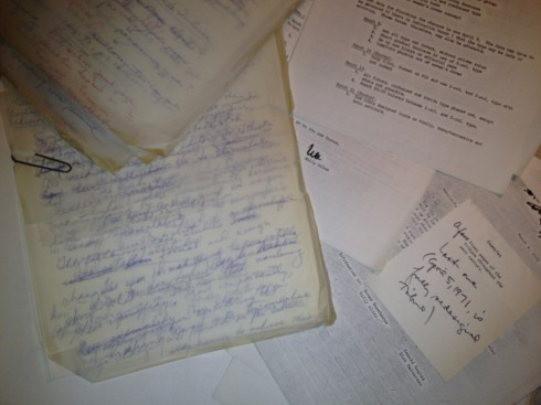
I had this thought suddenly and through pure observation: will we miss our contact with paper “memories” in the future?
As I organized things around my home office, stopping often to revisit a project of many years ago, it was a three-hour journey into another time, a very different era. For starters, as I read through my old “diaries”, I realized how much work I kept doing with US newspapers.
So much has happened and changed since those days.
What really caught my attention, with a sense of curiosity, was the dramatic transformation that has taken place in the way one writes a book today.
As you know, I am busy writing my first digital book, Storytelling in the Times of the iPad. It will be the 12th title that I will have published when it appears. Everyday, my able copilot, Reed Reibstein, Garcia Media art director/project manager, and I work feverishly to advance the manuscript. Reed edits, designs and plays the role of the audience. I especially ask him to think like a university student when checking the manuscript. Reed graduated from Yale University in May 2011, so he remembers well how students of today act and what they expect from their textbooks.
But back to my office cleaning detail: I encountered the manuscript and notes for my first book Contemporary Newspaper Design (Prentice-Hall, 1978), and what a surprise it was to revisit all my notes, along with letters and handwritten notes from a variety of art directors and editors who contributed pages for the book.
It just dawned on me that I have not collected a single piece of paper in relation to the writing of Storytelling in the Times of the iPad. Everything is on digital files, from correspondence, to quotes, to my own research, it is all there, chapter by chapter, edited, to be edited, illustrations, but all there. Not one scrap of paper.
Not that I am complaining, as I am one to move forward.
However, it will be difficult to recreate the “experience of writing the book” the way I have enjoyed it while reorganizing my home files. There will not be bulky files with yellowed and brittle pieces of paper that are an instant send off to the days when I was writing the book.
One scrap of paper at a time
Among the most interesting discoveries in my nostalgic sweep through the files for Contemporary Newspaper Design:
1. My outline was simple, with just phrases to guide me in my own organizing of the book: At The Beginning, Let’s Do It, Trial and Error……
2. Notes comparing the impact of television on printed newspapers with my handwritten sentence that read: Newspapers are not hurt by television but by their deplorable design
3. And in an interview with Frank Ariss, then art director of the Minneapolis Star Tribune, I asked what the most dramatic change would be for their redesign: “We dropped the word Minneapolis from the logo.”
4. On Bodoni, that iconic newspaper font, these were my thoughts at the time: “Bodoni is a beloved font by American newspapers. Bodoni will continue”.
Well, I am not swallowing my words on that one. I still think Bodoni deserves a place in the Newspaper Type Hall of Fame, and, indeed, I have worked with a variation of it as recently as the past 12 months with The Washington Post and its beautiful and elegant Postoni.. Indeed, that Bodoni has staying power. I had a scribble to remind me that the French Revolution had not taken place and Beethoven had not written any music yet but Bodoni was already in use. How many fonts can make that claim? And, indeed, I did have notes to myself about the rise of Futura “for those who want to be modern” (around since 1937, which would have made it a young 40 at the time of my notes).
5. I am still proud of having said, in my notes of 1977; “Newspapers simply cannot continue to look dull”.
6. A sign of the times, circa mid 1970s: I found myself, time and again, writing myself notes to make sure that my book made this point: Newspapers can be attractive while maintaining their immediacy. Today that statement would still apply, but the issue of interest would be that newspapers can continue to be, while embracing their digital extensions.
7. The idea that readers are quite accepting of change. I found one of my handwritten notes to myself that read: The Des Moines Tribune moved the Page One weather forecast that had been at the top, next to the logo, since 1909, with no major repercusions.
8. Who can forget those days when so many American newspapers turned to the “magazine look and feel”. One of the clippings I found in my book research file mentioned that James Bellows, of the Los Angeles Herald Examiner, planned to make the newspaper “pretty much a daily magazine of the news.” For whatever reasons, the Herald Examiner went out of business November 2, 1989/
9. As with the writing of any book, there are so many things that do not get into the book. Contemporary Newspaper Design was no exception, and I was quite happy to see that many of those themes did get into my lectures and presentations, and continue to be an important part of what I do and promote. Thoughts like:
Whether the reader becomes vocal about visual organization or not, he/she nevertheless perceives visual organization, or the lack of it . (By the way, this applies to digital design as well).
If order is perceived immediately, so is continuity/sequence within the design of a publication
In literature, point of view represents the perspective from which the author tells the story. Design also conveys a point of view. Ideally, a well designed piece evolves as a means of accurately presenting the point of view of the message.
A student recently asked me how he could design a page with “just type”. I answered that designing with just type can be challenging but exciting. Type can skip. Type can bite, or it can twist. It can jump. It can go underwater. It can “attack” the reader. The most creative approach to type is the one that hasn’t been used yet. ( I guess this is where the “type attack” phrase came from. The original question from the student was in 1978)
Award winning entries in Communication Arts (1980) included: Caslon, Baskerville, Bodoni, Garamond, Goudy.
Nice group: you still can’t go wrong with any of them, for sure.
10. The content of the message should be the designer’s first priority Some things never grow old.
So, as I get ready to edit the Multi Media chapter of the new book, I am feeling a bit nostalgic for the way we compiled printed copies of articles, handwritten notes from friends who contributed their materials to the book, the occasional personal note from a big name editor or designer.
Don’t take me wrong, I have all of that on the desktop of my MacBook Air, but I bet it will be a more difficult task to revisit it, to touch it, to feel it and to use it as a ticket to another era, the way I did yesterday while organizing my office.
Photo of the day
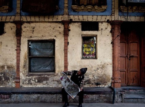
He obviously likes his newspaper in Delhi
Speaking of our love with paper, here is a photo published in today’s Bild, sent by our blog correspondent in Europe, Frank Deville.
How a newspaper name change gets showcased
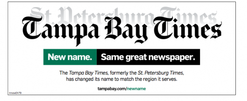
It is good to come home to one of my hometown newspapers, Tampa Bay Times (the former St. Petersburg Times). I admit that it is still a little bit of a shock to see that new name on the front page.
The Times changed its name January 1, but the marketing campaign to introduce the new name continues, as we see here. Passengers arriving at the Tampa International Airport sample an advertisement like this in the baggage claim area, for example.