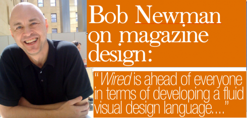
In our Three-Minute Interview today, Bob Newman discusses the overall state of magazine design in the United States, while offering us a glimpse of his favorite typographic fonts. Best overall: Wired.
Mario: Bob, you are one of the most accomplished magazine designers I know: how do you see the current state of magazine design in the U.S.?
Bob: There are a lot of great magazine designers working out there, but not too many editors that are willing to turn them loose. I guess that’s the same old story, but you would think that with magazine circulation and ad pages in decline it would be a good time to experiment with new structures and formats in the ways that many newspapers are beginning to think about. In the coming year or two you’re going to see much more experimentation and ground-breaking design in newspapers as compared to magazines, because they’re feeling the imperative.
Magazines are redesigning more quickly than ever, but in most cases it’s just a change in typefaces and rule widths and color. New York and Esquire have done some imaginative work in developing new approaches to sections and in playing with their covers. And Wired is way ahead of almost everyone in terms of developing a fluid visual design language that enhances and advances the editorial content seamlessly. There’s some of that going on in the new design of Radar, too, which is worth checking out. And I like the new National Geographic Green Guide. Its design is crisp and simple, and everything is well-articulated and easy to get through. Overall I’d say that this is a good time for technical and stylistic development in magazine design, but not a particularly good time for imagination and creative imagery.
Mario: Which magazines are your favorites in terms of their design, but also how they merge content and design?
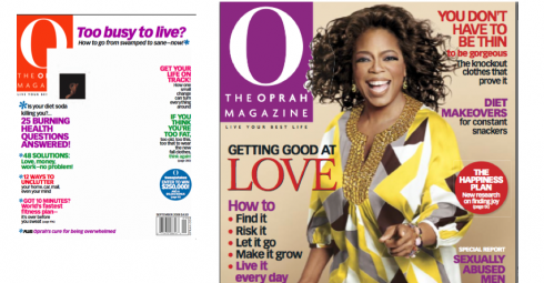
Bob: I think Wired is doing this the best right now. Their design is perfect for the subject matter; it’s smart, provocative, and creates a visual language that speaks directly to the reader. And it’s all done in a very intelligent editorial way. I also like Mojo, the British music magazine. They do a lot of stylistic design that picks up elements of old record covers, music posters, buttons, light shows and other music-related imagery. It’s fun and energetic. New York magazine is still brilliant and surprising every week, and there are some good things going on at Los Angeles magazine, too. And I have to mention The Stranger, the alternative weekly newspaper out of Seattle, which does 20 of the most amazing illustrated and graphic covers. Others: Latina, Radar, Green Guide, Audubon, Real Simple.
Mario: Which typographic fonts do you considerable indispensable?
Bob: I always like anything that’s bold, black and condensed. The bolder, blacker, and more condensed, the better. The Vibe Gothic family is perfect for me, also Aurora, Compacta, Akzidenz, you get the idea. I tend to like all the classics, simple, strong and elegant. Although I have to confess that I have a soft spot for the 70s British type designer Bob Newman, and not just because of the name. He did all sorts of cool/bad fonts like Frankfurter, Data, Pump, Horatio. And I like all those pop Milton Glaser fonts from that era, too, like Babyfat, Baby Teeth.
Those Page One Ads Continue to Make Splash
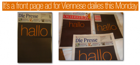
What a surprise to arrive at the Vienna International Airport this morning and to find that the front pages of three of the city’s daily newspapers just simply said HALLO, as telephone service provider Orange launched a campaign announcing that the existing One was now becoming Orange. The three dailies using Orange ad on page one are seen here: Die Presse, Osterreich and Kronen Zeitung. Rarely a week goes by when one does not find a full ad taking over Page One of newspapers worldwide. Is this the shape of things to come? Most certainly. I see it as one of the influences of the Internet on print, and, of course, a result of difficult economic times which makes those profiteable ads quite desireable. As for the readers—-as I have said here repeatedly—-they don’t seem to mind, simply look at the ad knowing that the real page one follows.
![]()
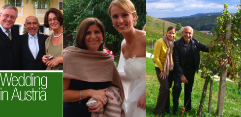
Now in Paris, where I stay the rest of the week. My apologies for not updating TheMarioBlog during the weekend; as I mentioned, I was in the breathtaking wine region of Austria, attending the wedding of Katrin Gasser, daughter of Dr. and Mrs. Hans Gasser (he is CEO of Wirtschaft Blatt, the financial daily in Vienna). My daughter Ana Barravecchio flew in from Florida to join me. I learned a special appreciation for the wines of Austria.