Update #2: Monday, Sept. 5, Dubai, 14:51
TAKEAWAY: The Times of Oman is perhaps one of the best recent examples of the power—-you may call it magic—-that an inspired, young, creative design department can have to turn the visual fortunes of a daily newspaper around. ALSO: Tidbits of interest about those American printed newspapers during the weekend. From scrolling and swiping to skipping. AND: Seen and captured during the weekend
Reporting from Dubai, in the United Arab Emirates, this week

It is coffee break time for Abdul Hamid Ahmad, editor in chief of the Gulf News and me as we plan a week of meetings/workshops/critiques
And the winner is…
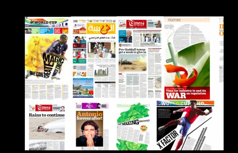
Assorted sample pages from the Times of Oman/Al Shabiba winning design team

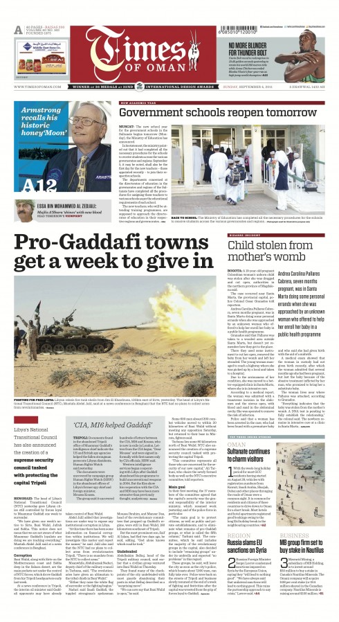
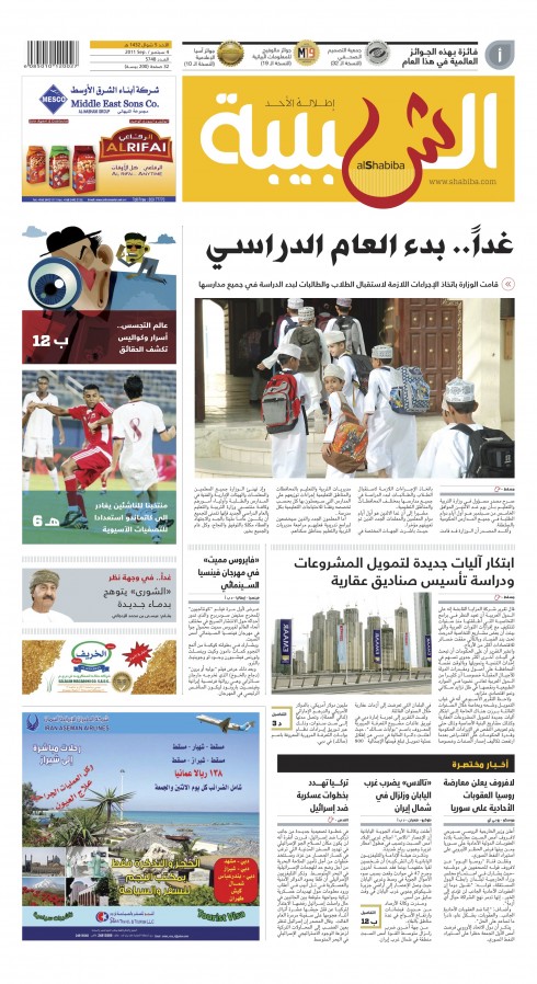
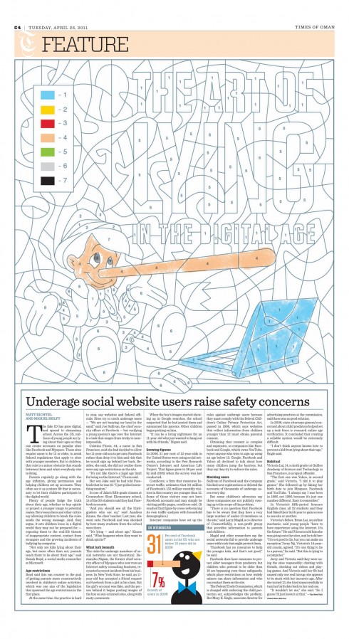
It happens frequently: either I read that another design award has gone to that small daily newspaper in a small country, the Times of Oman——or its sister Arabic language newspaper, Al Shabiba.
Inevitably, I exchange mails with Design Director Adonis Durado, the man behind the creative vision that has catapulted these newspapers from “non events” in terms of their design, to being on everyone’s top 10 list of the most exciting, dynamic visual presentations in print today.
I take pride in the fact that I convinced Adonis, one of our most talented design directors in the world, to come work at the Times of Oman when we at Garcia Media completed that redesign in 2008.
We knew that the key to sustaining and to enhancing what we had created was a good design director. Adonis, with whom I had worked in Dubai, with the creation of the weekly Xpress, had since moved to Thailand and taken a job with a design studio, non newspaper related. I also knew that Adonis’ heart was truly in newspapers, so my invitation came at the right time.
Since his arrival, Adonis has taken what we had given him as a foundation and moved it forward, built a talented and global design team that includes gifted informational graphic artists and illustrators, and allowed this newspaper, where there was NO culture of design, to step up as a leader in the field.
Most recently, Communication Arts magazine has awarded Times of Oman prizes for its feature pages. At the SND contest, the Times of Oman figured among the best designed newspapers in the world. It received 37 awards, including a silver and a JSR (Judges Special Recognition), while Al Shabiba got 8. Also this year, the two papers bagged two gold from WAN-IFRA Asia Media Awards and a bronze from Malofiej International Infographic Awards.
Communication Arts awards
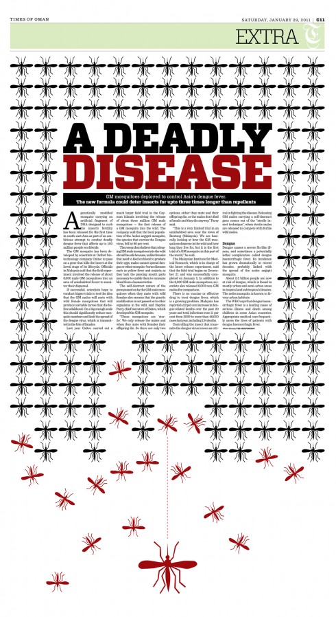
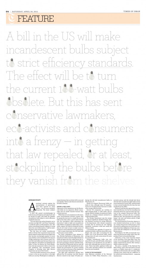
Here is one of the winning pages from Times of Oman in the Communication Arts contest
Three entries from Times of Oman are among the nine winning pages that will be showcased in Communication Arts’ September/October 2011 issue.
There, Times of Oman finds itself in the great company of the other winners in the Editorial Design category: The New York Times, GQ magazine, Elle Décor magazine, 9Threads and The Free Associates. This would have been an impossible thought only three years ago when the Times of Oman had one layouter in its team and design was not part of the newsroom’s vocabulary.
Here is how one of the judges in the Communication Arts contest described Times of Oman’s entries:
“There was a lot of work that was really inspiring; strong concepts, unexpected and beautifully executed.” ( Yolanda Santosa, Founder and Creative Director of Ferroconcrete)
Of related interest
In Oman: the two little desert trains that could
https://garciamedia.com/blog/articles/in_o/
TAKEAWAY: This is one of those incredible stories with a happy ending. In tiny Oman, the Times of Oman and its sister publication in Arabic language, Al Shabiba, have made it to the top of the SND Awards, ending up in second place for the number of design awards received. A year ago, the thought of this feat would have been unthinkable. Here is the story of two little newspaper trains that could——and did. And how!
Times of Oman goes for total rethinking, redesign
https://garciamedia.com/blog/articles/times_of_oman_goes_for_total_rethinking_redesign
TAKEAWAY: This Sunday, the Times of Oman will start a new chapter in its history with the unveiling of a new design, reorganization of content, and even a new logo.
Basic ingredients for iPad design stay close to the basics, plus more Times of Oman
https://garciamedia.com/blog/articles/basic_ingredients_for_ipad_design_stay_close_to_the_basics_plus_more_times_
HIGHLIGHT: Times of Oman and Al Shabiba prepare for launch of their new designs this weekend.
When print makes us work too hard
I must confess that my consumption of The New York Times these days is primarily through my iPad. I subscribe to the Times and would not miss one day’s edition, for sure, wherever I am. Because of my constant movement around the globe, it is obviously impossible for me to get a daily printed copy of the Times, which is one of the reasons I am so grateful for my iPad, which allows me to wake up in Hong Kong, or Delhi, or Sydney, and enjoy all that good stuff that only the Times provides.
However, while in New York City this past week, and with a printed “hot off the press” Times at my hotel door each morning, I indulged in that old fashioned ritual of reading the big sheets while sipping my hot coffee.
It was during this time that I discovered that, indeed, printed newspapers DO make us readers work.
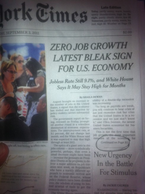
Take for example the Saturday, Sept. 3, edition: a front page story about the job situation in the United States starts there, but then sends us, in mid sentence, to B3. Yes, another section and three pages later. I know, I know. Story jumps have been a part of daily printed newspaper fare since the beginning of time. Readers always hated it, and told us so i focus groups. Research pointed to it as something to avoid, our own Poynter EyeTrack research indicated that the eyes stopped at the precipice of the jump and rarely MADE the jump. So why do we keep those jumps?
It is a question I have had for most of my 40-year career and it has not been solved, and now it is not going to happen.
But after encountering this experience with the Times the weekend, I did say to myself: there are no jumps when I read that same story on the iPad edition of the Times. I just swipe and get the rest of my text. Reading made easy.
Perhaps it will be the tablet—-that magnificent little platform that never stops to surprise—-that will put the final nail on the coffin of the awful jumps. I cannot imagine readers of the tablet generation jumping across sections.
While the debate among tablet developers, designers and editors, is scrolling versus swiping, perhaps we need to turn our attention to another S of consequence: skipping.
Which is what I did as I refused to go from A1 to B3 for the unemployment story.
An appealing Sunday page one: The Washington Post
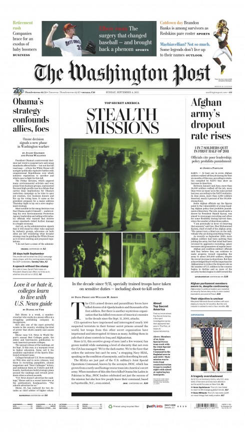
Sunday, Sept. 4, front page from The Washington Post
We quite like the page architecture, typography and overall play of elements on this page one Sunday from The Washington Post.. A good example of when all the elements come together well, with the centerpiece story set apart from the newsier part of the package. Those promos at the top, which was part of our work with the WaPo team in January, are holding up well, the soft pastel colors bringing attention to the navigation area without overpowering the rest of what the editors choose to display on the page. Thanks to Senior Designer Jon Wile for contributing the image.
Handelsblatt: surprise weekend cover
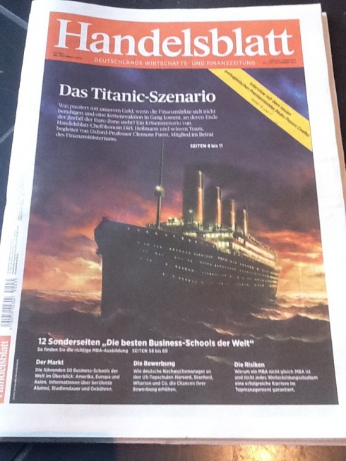
The weekend edition of Handelsblatt, one of Germany’s top financial dailies
I land in Frankfurt early Sunday morning and, surprise, a very different page one for our project Handelsblatt and its weekend edition.
Kudos to the team. Very seductive package, with the headline The Titanic Scenario. Inside, four page of assorted coverage about the European Union’s financial straits and exclusive interview with the new Portuguese Prime Minister Pedro Passos Coelho.
Also related: https://garciamedia.com/blog/articles/the_handelsblatt_relaunch_one_day_later
Good USA Today package
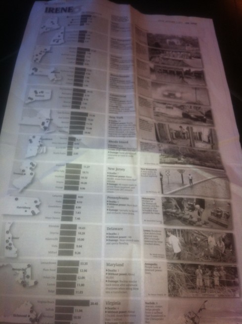
It is all about deciding how to tell that story, we often mention here.
This weekend edition of USA Today did a wonderful packaging of a story related to Hurricane Irene and its impact as its path crossed through 13 states. The page, titled Irene, presents a map, a graphic and a mini story, with photo, to summarize the state-by-state impact of the hurricane, including deaths, power outages and overall damage.
This was the ideal way to tell this story: visual, graphic oriented and affording a quick read of a story that would have been ignored by many as a traditional narrative full of numbers and facts.
The end-of-life media
Alas, finally a catchy name for media with appeal to what Tyler Brulé describes as the “silver society” set.
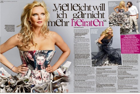
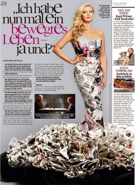
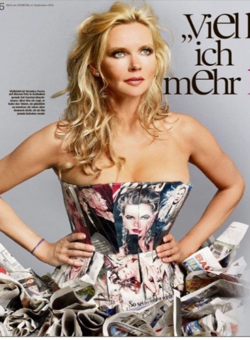
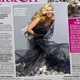
The fascination of editors and art directors with “newspaper dresses” never ends. We like it, too.
Frank Deville, our blog correspondent in Luxembourg, sends us these images from the Bild am Sonntag, of Germany, which carried a big photo spread and profile of actress Veronica Ferres, wrapping her stunning figure in what must have been hundreds of Bild pages.
The headline: What is news, Ms. Ferres?
A real fashion statement.
Previously in TheMarioBlog
Newspaper pages as fashion
https://garciamedia.com/blog/articles/newspaper_pages_as_fashion
TAKEAWAY: Newspaper pages have always held a special fascination for fashionistas who love to play “newspaper dress up”. Only this week the French fashion designer icon Jean-Paul Gaultier took over the French daily Liberation for a day and played with the newspaper pages, draping them all over journalists who served as models. Take a look.
Sunday readings: and now the newspaper as dress
https://garciamedia.com/blog/articles/sunday_readings_and_now_the_newspaper_as_dress
HIGHLIGHT: Forget the Kindle.Forget the newspaper on demand at the kiosk or on your iPhone.
Yes, it is the newspaper as dress that has the fashion world seeing black and white.
Meat lovers: get your knife and fork from La Vanguardia
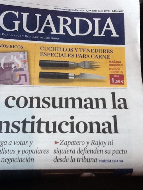
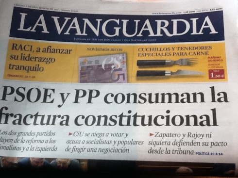
Those Spanish dailies know how to keep the readers coming back, and one way to do it, it seems, is through promotional marketing campaigns that have nothing to do with the selling of the newspaper specifically, and involve everything from books to CDs, and, in the case of La Vanguardia, of Barcelona, this weekend: sets of fork and knife, for 1,50 euros. It would take 12 weeks of weekend editions to collect a full set of 12. However, these are not just any fork and knife combination. A small story about the promotion, buried in an inside section, tells us that “the fork and knife in the promotion are highly recommended and endorsed by famous chefs Sergio and Javier Torres, whose restaurant displays a Michelin star.” In addition, and for an additional 10,95 euros, you can get a bamboo cutting board and, in addition, a box to keep all the utensils together.
Not to mention that you get to read 12 Sunday editions of that interesting daily, La Vanguardia.. Not bad.
