Update #2, Wednesday, April 20, Vienna, 16:45
TAKEAWAY: Progress following the redesign of a publication is measured day by day, as the team of editors and designers gets accustomed to the new styles; we revisit Lebanon’s An Nahar one week after it introduced a new look, new supplememnts ALSO: Pulitzer’s 2011 surprise
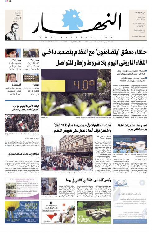
One week after its launch with new design and new content, Lebanon’s An Nahar pages show that the team is doing its daily gymnastics well, and producing interesting, well organized pages.
Here are four from today’s editions, sent by art director Ziad Kassis.
I evaluate the pages on a daily basis, paying particular attention to how photos are used.
Here is a newspaper that until a week ago never played photos larger than a tourist postcard, and that it would put three or more of those “postcards” on the same page. Stories lacked hierarchy: there could be two or more stories on a page with the same headline.
Although the tendency is still for the longer articles, a tradition with An Nahar editors, this is closely monitored now and you see that an effort is made to break up masses of gray text, although this will be an evolutionary process.
Take a look at these pages here, and I do offer you links below to see what the paper looked like before, in case you missed those posts.
Next: we now work on An Nahar’s soon to be launched redesigned online edition (www.annahar.com), and I am beginning the sketching process for the iPad edition, which may launch in the early fall.
Previous An Nahar redesign postings:
https://garciamedia.com/blog/articles/an_nahar_and_hindustan_one_day_after_launch_of_new_look
https://garciamedia.com/blog/articles/two_garcia_media_projects_launch_tuesday_an_nahar_lebanon_hindustan_india
http://www.creativematch.com/news/customized-typeface-for-lebanon-s/100106/
The Pulitzer 2011 surprise
The Pulitzer Prizes, those coveted Oscars of the journalism world in the US, have been announced and one category that was not awarded a prize is getting more attention than the ones which won, it seems.
For the first time in its 95-year history, there is no winner in the Breaking News category, although the Pulitzer Jury has named some finalists, including The Miami Herald, which had very strong entries for its coverage of the Haiti earthquake. As this is a newspaper I read regularly, I can tell that its coverage of that tragic event was superb, second to none. It is no wonder that some of The Herald’s journalists are so enraged by the Pulitzer’s decision not to award a prize. They all feel that losing to another candidate is easier than losing when nobody was given the award.
Fabiola Santiago, a reporter/columnist for The Miami Herald, wrote this on her Facebook page:
I don’t get this mad often, but The Miami Herald was ripped off of the Pulitzer Prize for Breaking News for coverage of the Haiti earthquake. Finalists and no prize awarded? Whatever shenanigans ensued in NY for this not to be so is only indicative of the fact that what ails the news industry is not only in the marketplace but within.This Pulitzer was as deserved, if not more deserved, than previous Pulitzers.
What the Pulitzer Jury’s decision has done in this case is to revive the debate about whether printed newspapers can provide breaking news anymore. We all know that newspapers have lost the time advantage when it comes to breaking news, but perhaps it is the term “breaking news” that needs to be changed. What newspapers do when they cover the news, once it has been broken, is a different story, as in the case of The Miami Herald and its 24/7 magnificent coverage of events in Haiti right after the earthquake hit in January 2010. Maybe it is time to rename the category, although I believe that not giving a prize for it this year is, in the eyes of skeptics, another nail in the coffin of the printed newspaper product. It should not be. It does not have to be.
As some cynics claimed: should the breaking news award should have gone to Twitter? Read The Washington Post’s piece by Melissa Bell on the subject, headlined “Pulitzer watch: Is there no more breaking news in newspapers?”
For those who came so close to winning, as in the case of The Miami Herald, this is no consolation.
Fabiola writes me an additional note:
“One of the ironic things is that The Herald is all about breaking news these days. When something breaks, whether it’s a traffic accident or an earthquake, we post online right away, and we update as story develops. It’s been the standard for a while now. In the case of Haiti, our reporters reported also on Twitter and Facebook, all part of keeping the community in South Florida and in Haiti connected. The online components in video were a huge part of the effort, culminating in the documentary “Nou Bouke.”
Note: Nominated as finalists in the Breaking News category were: Chicago Tribune Staff for its coverage of the deaths of two Chicago firefighters who were killed while searching for squatters in an abandoned burning building, The Miami Herald and El Nuevo Herald, a joint staff entry, for their coverage of a devastating earthquake in Haiti, often working under extreme conditions, and the Staff of The Tennessean, Nashville, for its coverage of the most devastating flood in Middle Tennessee history.
Of related interest:
Pulitzer Board Comments on No Breaking News Winner
http://www.mediabistro.com/fishbowlny/pulitzer-board-comments-on-no-breaking-news-winner_b33296
Few entries, no consensus, no Pulitzer Prize for Breaking News Reporting
http://www.poynter.org/latest-news/als-morning-meeting/128483/why-no-pulitzer-for-breaking-news/
Today’s pop ups

Bild Zeitung iPad edition: how the weather will be for Easter weekend
Bild: the best 50 iPad apps
The iPad News Aggregator is Here
http://mediamemo.allthingsd.com/20110419/news-me-the-ipad-news-aggregator-blessed-by-big-publishers-gets-ready-to-launch/?reflink=ATD_yahoo_ticker
WoodWing’s Xperience seminar May 24-25
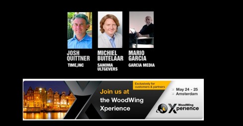
I am honored to be one of three keynote speakers at the upcoming WoodWing Xperience seminar in Amsterdam May 24-25
I did a previous keynote for a WoodWing Tour function in London in 2010.
For those interested in attending, here is more information:
May 24-25, 2011, Amsterdam, Netherlands
http://xperience.woodwing.com
TheMarioBlog post #755
Type as expression
TAKEAWAY: Type—-it is more than letters, numbers and punctuation marks. It is what gives our publications’ design that “ten seconds” of instant recognition, acceptance, rejection and, most importantly, when used well, what makes the information easy to read. Today we look at some interesting type considerations that go beyond an analysis of ascenders, descenders and serifs. Take a look at expression through type
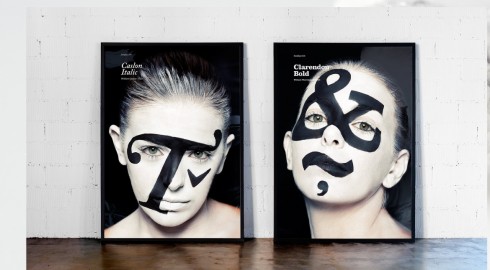
My blog post of today is totally inspired by a wonderful set of images on the website of Atipo (TypoJungle).
If you have not seen it yet, then you must visit the Spanish design house, Atipo, and look at the new faces of type.While the actual faces on which the type is applied are new, the fonts are not. In fact, they are quite classic. Take a look and see how those creative Spanish designers have put a new face on such familiar fonts as Caslon, Helvetica and Clarendon.
Of course, this creative approach to type use made me think of type and my own associations with certain fonts.
As designers, we have a greater awareness of type than our readers and users, as it should be. To them, type is only as beautiful and as legible as it needs to be. Period.
But notice that we in the design community drop the names of fonts as if talking about friends that we just spent the weekend with, or long gone pets that we adored as children, or, at our worst, with a sense of gossipy repudiation as in “God, can’t stand to see another magazine with …………on the cover!”. And, of course, whoever you are having this conversation with laughs and adds another even more terrible or tired font of the moment.
But, alas, there are those fonts that are forever revered like sports stars, movie stars or deceased Presidents.
Mention Didot, for example, and those around you smile—-images of fashion magazines of a certain era, refined and classic. Make a reference to Helvetica, and everyone thinks New York City Subways and, in my case, that forever printed in my subconscious Minneapolis Star Tribune of the late 1970s, a typographic poem to Helvetica by Frank Ariss
, who used it for every word printed, including the newspaper’s logo.
Mention Palatino, and, I hear what I have come to refer to as aPalatino laugh, memories of a long ago Poynter Type Talk conference in which the mere mention of that font made guru and type expert Roger Black go into heavy laughter. A definitive Poynter moment.
So, you see, we all have our type references, and we express them differently.
Type associations
After seeing the Atipo images, I started thinking, while running in Vienna today: what are some definitive type associations that I have. It came down to four, which I illustrate here.
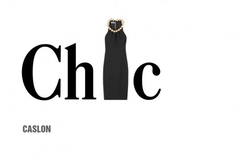
Caslon——one of my all time favorite typefaces. You can’t go wrong with Caslon, not if you wish to project a stylish, classic, ageless look. So, to me, Caslon is like a black dress by Coco Chanel. That Chanel dress is as elegant today as it was in the 1930s when the French couturier created them.
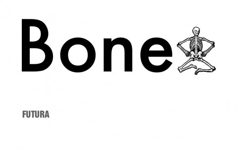
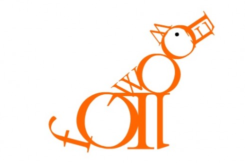
Futura——don’t ask me why, but I never liked it, and found it dehumanized, skeletal, so I immediately think of bones.
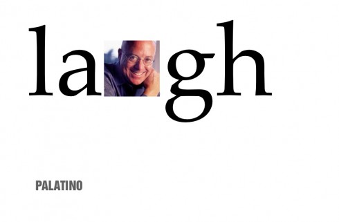
Palatino: It brings back the memory of media guru Roger Black and his hearty laughter after hearing the name of this font mentioned
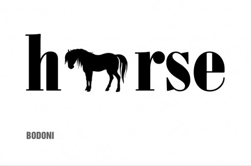
Bodoni——it was early in my career, in those days when 75% of all newspapers used Bodoni for headlines, and I heard an editor refer to Bodoni as a workhorse font. The image never left me.
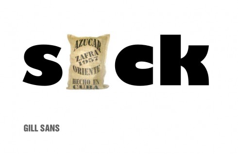
Gill Sans—-another one of those fonts in my never never list. Clunky, fat and reminds me of those sugar sacks that I used to see piled up to the ceiling in the sugar mill where my uncle worked in Cuba when I was a little boy.Nothing sweet about this Gill Sans.
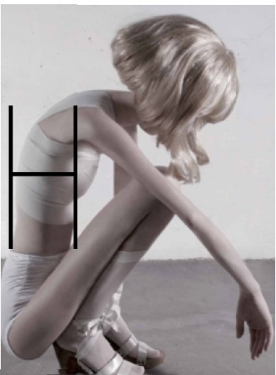
Finally, I make an association between this photo illustration that was used in the design of a feature page about anorexia in Lebanon’s An Nahar newspaper and Helvetica Thin. The photo is by Ivonne Thein, courtesy of Galerie Voss, Düsseldorf (Germany).
Type as art
Massimo Gentile, design director at Italy’s Il Secolo XIX, contributes some images from a fun personal project that he is working on, a tribute to jazz musicians through typography.
“ Here I am having a lot of fun with some of my favorite type fonts and my favorite jazz musicians, great artists of jazz, so I combine my two passions as I do these,” he writes.
jpeg_thumb.jpg)
jpeg_thumb.jpg)
jpeg_thumb.jpg)
Don’t miss these
From Roberto de Vicq Cumptich: Bembo’s Zoo
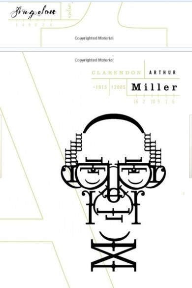
Roberto de Vicq Cumptich: Men of Letters (Arthur Miller)
For type as art, take a look at Roberto de Vicq Cumptich. He started with Bembo’s Zoo , and then continued with Men of Letters and People of Substance (http://www.amazon.com/Letters-People-Substance-Roberto-Cumptich/dp/1567923380/ref=sr_1_2?ie=UTF8&qid=1303174544&sr=8-2).