Updated Sunday, August 9, at 12:36 Frankfurt, Germany
TAKEAWAY: Swedish type designer, Örjan Nordling , joins us for a conversation about his creation, FF Dagny, a font that was inspired by work Nordling did with the Swedish daily, Dagens Nyheter. ALSO: Nigeria’s Next on Sunday pages: after the workshop AND:Pure Design download: Systematic Chaos PLUS: Download now entire Pure Design section on Type IT’S SUNDAY: Take a look at Jacky’s pick of the best of Bild Am Sonntag
Best of Next on Sunday; today’s edition
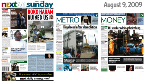
Here is today’s edition of Next on Sunday: front page is broadsheet, all inside sections are in tabloid format
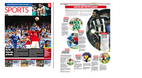
Sports section front page and an inside page, telling the story through graphics
<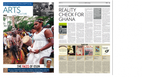
Arts & Culture section opener, and an inside page of book reviews
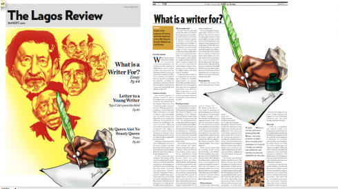
Front of The Lagos Review—the literary supplement—and a corresponding inside page
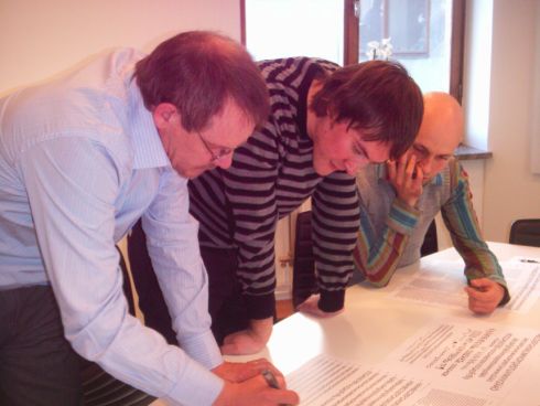
As readers of this blog may know, I have spent last week working in Lagos, Nigeria, with the talented team of the country’s new newspaper Next on Sunday—-which will soon launch its daily edition of Next. It was an intense week of mostly workshops to finalize stylistic details, to inspire the group, and to get everyone in the newsroom roused up and ready to confront the challenges of starting a new daily in a country where the approach to journalism has been historically less than professional. Under the superb guidance of their publisher, Dele Olojede, the team of Next is rising to the occasion: creating perhaps the first ever independent newspaper, with a voice all its own, not selling its heart, soul—-and editorial page—-to anyone or to any organization.
Advertising is slowly coming in, but what is impressive is the ability of the young team——many have never worked as journalists before—-to assimilate the concepts of storytelling, visual journalism and the effect of good journalism in a democratic society.
My colleagues Ron Reason and Christian Fortanet joined me while in Lagos, and they, too, have worked long days to teach the staffers how to do everything: from planning and following deadlines, to photo editing, storytelling techniques, better headline writing and, indeed, following a design style guide, to create visual consistency.
So I was quite proud to see today’s newspaper, the first one to emerge from our last workshop, and see that it is almost there. Good job, Next on Sunday team. Keep it up.
A type designer discusses the evolution of his creation
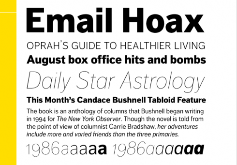
Here is FF Dagny: For the FontFont library several adjustments were made. The contrast in stroke thickness was reduced for better legibility in small sizes and characters were redesigned The family now includes a range of consistent weights from Thin to Black. The name Dagny is an abbreviation of Dagens Nyheter as well as an old nordic female name meaning “new day”.
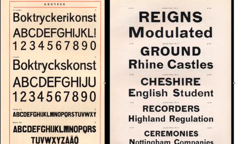
DN Grotesk was inspired from older typefaces with both German (Woellmer), British (Caslon) and Swedish origins.
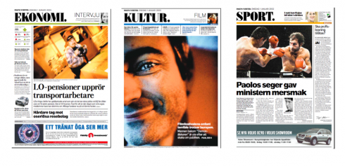
Pages of Dagens Nyheter show when DN Grotesk was first launched at time of conversion to tabloid, executed by John Bark
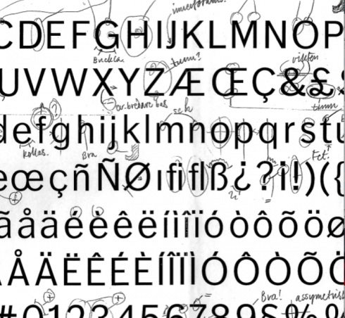
Correction sheet when working on DN Grotesk.
Pangea designteam: Örjan Nordling, Göran Söderström, Fredrik Andersson. –-Photo: Peter Rosén.
I first met Örjan Nordling in 2000, the year I was asked by then editor Joachim Berner to come redesign Sweden’s largest newspaper, Dagens Nyheter. I was extremely happy to hear that the DN had a long standing relationship with type designer Nordling and that he had been asked to come in to assist us with type needs. At that time, Nordling and I sat down to review priorities for an elegant and durable font. Nordling created ”DN Bodoni” exclusively for Dagens Nyheter. In 2002, the DN managers decided to convert the newspaper to the tabloid format (design executed by John Bark, of Bark Design). Again, Nordling was asked to come in and assist. This time, his assignment was to produce a suitable sans serif for Sweden’s largest daily newspaper.
This became DN Grotesk which now has evolved into FF Dagny.
Interview with Örjan Nordling
Mario: Orjan, how did FF Dagny come to be?
Orjan:
New times call for new demands. As mentioned, the change to tabloid at DN called for a more compact and space-saving typography. The use of a sans serif became increasingly important. The new DN Grotesk would be used primarily for headlines, subheads and introductions. The lower-case x-height should coincide with DN Bodoni’s. We found inspiration in specimens from, among others, Caslon and Son, the German Woellmer and DN’s own archives. We wanted a typeface with greater contrast, more dynamic lines and, especially, a larger x-height. Doric Grotesk was a face with such attributes. In DN’s archives we also found Consul Grotesk – the influence of German type has been pronounced since before the First World War. Consul Grotesk had notable details to make the new face more unique, for example the lower-case f with it’s backward-leaning top, the g and b as well as the characteristic oblique cuts of a, c, e and s.
Mario: What are some other specific characteristics of FF Dagny?
Orjan:
The lower-case x-height is approximately 10% larger than Akzidens Grotesk. This allows the use of smaller type but with good legibility in tact. The result is a more condensed face with a more open form. Both ascenders and decenders have been shortened for increased space-saving. The italics are used very rarely – they are in fact oblique and do not differ very much in basic form from the regular. Small details may be noticed in the slightly narrowing connections to stems, stems which slant towards connecting curves and the obliqely cut tops of certain characters.
Mario: What led to the evolution of the name from DN Grotesk to FF Dagny?
Orjan:
For FontFont Library the new font has been named FF Dagny. Dagny is an abbreviation of Dagens Nyheter as well as an old nordic female name, meaning ”new day”.
Mario: You mentioned that these are new times, how does that affect type design today?
Orjan:
My typedesign teacher in Basle, André Gürtler, taught us that every new time requires specific type for new needs. Therefore we must reinvent their function for shifting environment. Today type has become an important part in building visual brands as well as an integrated part in digital communication. It is hard to find various, good typefaces that fit both printed and webb applications even though major players like Microsoft and Apple contribute with some new typefaces, well hinted and perfect on screen. It should be many more options in choosing type for digital applications, though.
I would like to keep the good quality from old typefaces and transform them to new medias. Or even take the best from the past and make it new and fresh. Thats what we have tried to do with FF Dagny.
Facts about Dagens Nyheter
Dagens Nyheter is Stockholm’s major daily newspaper with approximately one million readers daily. DN is politically independent although liberal in character. DN was first published on December 23rd, 1864 and is today part of the Bonnier Group.
DN and the use of sans serif
The use of sans serif typefaces at DN has increased during the last twenty years – most commonly Berthold’s Akzidenz Grotesk, first together with Bauer Bodoni (until 1996) but even Berthold Bodoni (1997–2000).
Improvements in FF Dagny
Orjan mentions that when his typeface was accepted in FontFont Typelibrary some adjustments in the font were made in order to make it more successful and useful in bodytext. The contrast in stroke thickness was reduced for better legibility in small sizes. Characters were redesigned together with the FontFont designdepartment. Also the range of weights was increased. FF Dagny now consists of 6 weights from Thin to Extra bold. FF Dagny has all features in a fully equiped OpenType font from FontFont. The family has become more consistent with possibilities to use it in many applications both analog and digital. Also the typeface has been carefully hinted for better screen resolution.
About the designers
Örjan Nordling was trained at the University College of Arts, Crafts and Design in Stockholm and at the Basel School of Design. He is Creative Director and partner of designstudio Pangea design in Stockholm, founded in 1997. Nordling has designed Nordling BQ for AG Berthold, Berling Nova family for Linotype and custom typefaces for among others Dagens Nyheter and The Trade Union Federation. Nordling is a member of A-typI and the Stockholms Typographic Guild. In 2004 he received the Berling prize, inaugurated by the late Karl-Erik Forsberg.
Göran Söderström is a self-taught Swedish type designer and font developer. Employed at Pangea design since 2007, he spends most of his spare time designing his own typefaces. When not doing type, he likes to pick up one of his favourite instruments, the acoustic guitar or the acoustic bass guitar.
Systematic chaos: bringing excitement to the page without losing control
Pure Design: Download entire section: Type

Two articles of particular interest, both spotted by our intern Reed Reibstein (Yale University, ‘11).
Philadelphia and its newspapers: Profits, but…..
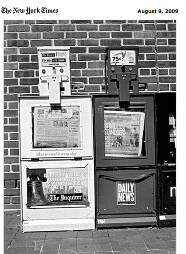
Will the Philadelphia Inquirer and its sister paper, Philadelphia Daily News survive? (Photo as it appeared in today’s New York Times)
The New York Times Sunday Magazine: What’s a Big City Without a Newspaper?
This piece discusses the financial difficulties of the Philadelphia Inquirer and Daily News and of the newspaper industry as a whole. A favorite quote and one that is timely in view of this week’s development with Rupert Murdoch’s titles beginning to charge for online news consumption:
As soon as possible, [Brian Tierney] wants to begin charging for online content. As he told me this, he banged a bagel on a conference table, which sounded like a rock as it hit. ‘You hear that? This bagel stinks,’ he said. ‘It’s got the same consistency inside and out, but if you went down to our cafeteria, it costs like $1.25. That’s what people pay for stuff like this, so you mean to tell me I can’t get them to pay that for online access to all the incredible stuff in The Inquirer and Daily News online? People who say that all this content wants to be free aren’t paying talented people to create it.’
Go here: http://www.nytimes.com/2009/08/09/magazine/09Newspaper-t.html?ref=magazine
Times New Roman lives on
New entry from FontBureau: Mike Parker’s Starling, inspired by Times New Roman
Financial Times: This is an article about the historical controversy over the real designers of Times New Roman:. It is based upon the research of Mike Parker of the Font Bureau, who has recently released Starling, a new version of Times New Roman that advances the theory that William Starling Burgess, today known as an aviator and yacht designer, is its original designer.
Starling, however, is quite a nice addition to the perennial parade of Times New Roman-inspired fonts that appear from time to time. We will devote some more space to Starling here in the days ahead, as we find it interesting and quite elegant. See more samples here: http://fontbureau.com/fonts/Starling
And I thought I would add Reed’s perspective, which is that of a student sometimes “forced” to use Times New Roman. Here it is:
I have to admit a certain dislike for Times, mostly bread out of its ubiquity—if professors specify a typeface for an essay, it’s always Times, despite its poor suitability for the eight-and-a-half by eleven page—but Starling, particularly its italic and black weights, is fresh enough that I would be eager to give it a spin. It is somewhat surprising that the FT would dedicate significant space to a rather arcane debate, but the article is overall quite good; the only lackluster part is its unimaginative headline: “The history of the Times New Roman typeface.
If any professors are reading this today, and with a new school year approaching, please take note: perhaps it is time to revise the course style sheets and allow, let’s say—-Starling—-as the new Times New Roman. Students with a great appreciation of typography and its history, such as Reed, would be very thankful.
Jacky makes his Sunday picks
![]()
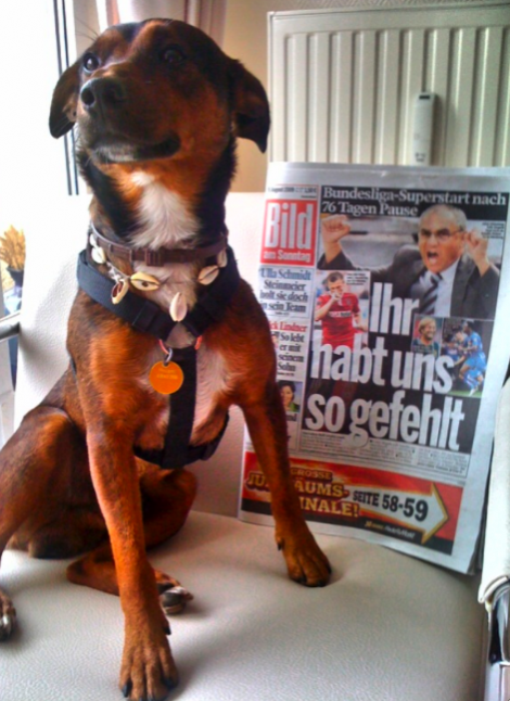
Jacky posing with his favorite Sunday newspaper: Bild Am Sonntag
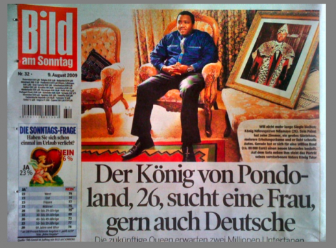
His first pick from today’s Bild: the king of Pondoland, 36, looking for a wife—-and perhaps a German one!
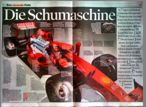
Jacky’s second pick today: this page about the incredible Michael Schumacher’s “machine” and the news that Michael is back!
One of the best things that we find almost every Sunday in Bild Am Sonntag is these double page graphics that tell a story. More than a “charticle” (where a chart tells the story without a narrative), this is almost like an “infostory” that combines photography with texts to explain a situation, in this case related to Schumacher’s decision to make a come back.
Who is Jacky?
Jacky belongs to Frank Deville. The Luxembourg-based pooch is an “avid reader” of the German newspaper, Bild Am Sonntag. We first introduced Jacky here last week, and many of you wrote to say that you found this dog exceptionally cute and smart. We agree, so now we will attempt to bring you Jacky’s pick of stories and interesting graphics in Bild Am Sonntag each Sunday—if Jacky wakes up on time.
Download entire first section of Pure Design: Words
Now that I have fully presented the first of six sections of Pure Design on TheMarioBlog, I am offering the entire initial section, “Words,” available for download—all 33 pages of it. This may be useful for those of you saving or printing out Pure Design and will be done following each of the remaining sections. At the end of our journey through words, type, layout, color, pictures, and process, I will publish the entirety of Pure Design in one file.
WAN’s World Trends 2009 Report

The 2009 edition of World Press Trends from WAN/IFRA is now available. I always like to review this report for its complete information on global circulation, advertising and online trends in our industry. All countries in the world where daily newspapers are published are covered in the publication.
This year the WAN/IFRA folks have decided to publish a print version but only make the book available on pdf.
Those interested go:
http://www.wan-press.org/forms/wpt2009.html
Follow me at www.twitter.com/tweetsbydesign
Follow the Marios

Two Marios. Two Views.
Follow Mario Jr. and his blog about media analysis, web design and assorted topics related to the current state of our industry.
http://garciainteractive.com/
Visit Mario Sr. daily here, or through TweetsByDesign (www.twitter.com/tweetsbydesign)
In Spanish daily: The Rodrigo Fino blog
:
To read TheRodrigoFino blog, in Spanish, go:
https://garciamedia.com/latinamerica/blog/
TheMarioBlog posting #328<