Updated, Monday, Sept. 21, 2009, at 10:10 EST
TAKEAWAY: Add “Save Futura” to the list of available causes to which you can add your name on Facebook and elsewhere. When Swedish furniture solutions store Ikea switched its preferred font from Futura to Verdana, one could hear the gasps from one end of the living room all the way to the basement study. PLUS: Civility in any language AND: The Obama design book?
Futura does not fit into any of Ikea’s rooms anymore
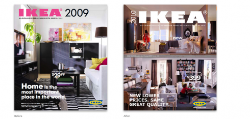
Before and after look at Ikea catalog: Futura (left), and the company’s newly adopted font, Verdana

Here is how Verdana looks on a typical two-page spread of the 2010 Ikea Catalog
Protests abound in the world today. One quick review of “causes” that people around the world embrace yields such interesting organized groups as those for “Save the Manatee” or “Esperanto Lives”. Add a new one that you can join (more than 500 have done so already) on Facebook: “Stop Ikea going Verdana”.
Yes, it is true, after more than 50 years letting Futura--one of the best known sans serifs—- tell its “build a room” furniture story through catalogs and other printed materials, the Swedish firm has abandoned that venerable offline font for, gasp, one of the first online fonts, Verdana.
Fort those who still shop through catalogs that arrive at their mail boxes, the new Ikea Catalog is now a Verdana showcase. Forget looking at the sofa, the coffee table or the bedroom armoire: stop and take a look at how Verdana has made it into page after page of those Ikea rooms. Verdana, born in 1996, and designed by Matthew Carter, was meant to be the one font with special characteristics to facilitate reading on the screen. It is the default font for almost all operating systems. You are probably reading this story in a Verdana alphabet right now!
Although you may approve, and even think that the sleek Ikea furniture designs belongs with the contemporary Verdana, there are plenty of our colleagues who simply won’t enter an Ikea showroom where Verdana appears.
Fans of Futura are not shy about expressing their discontent. A New York Times article titled , Typography Fans Say Ikea Should Stick to Furniture, let us hear from some of those fans, who believe strongly that Ikea has violated its own sense of aesthetics:
They should have first taken everything out of the carton and made sure nothing was missing and that they weren’t mixing up, say, a Bjursta with a Leksvik or a Muddus. Then they should have taken a look to see how it all would fit together (serifs, strokes and counters), and only then should they have taken the many parts (stems, extenders, legs, spurs and chins) and started to jostle them into place, making sure they had enough help for heavy lifting when anything resembling pressed board was involved.
The NYT writer, Edward Rothstein, goes further: “There’s a big difference between Wingdings and Bauhaus,” he writes.
Ouch, I can hear the screeching sound of that sleek Ikea black table being dragged over a marble floor across three rooms.
For samples of how Verdana looks on the Ikea catalogs, go here: http://idsgn.org/
Keep updated on this story. We hear that Verdana is being retrofitted for print as early as 2010.
Civility begins with “Usted”!
Something about people whose last names begins with the letter W and matters of incredibly rude behavior, it seems.
In the past few days we have seen the likes of politico Joe Wilson, singer Kanye West and athlete Serena Williams “lose it” momentarily and behave in a rather uncivilized manner towards others.
Wilson called President Obama a “liar” while the President addressed a session of Congress on the issue of health care.
West interrupted a stunned Taylor Swift, at Radio City Music Hall during the MTV Video Music Awards as she accepted the statuette for best female video. West ranted that Beyoncé should have won.
Williams lost her U.S. Open semifinal to Kim Clijsters because of a blistering salvo at a line judge who had called a foot fault on Williams.
Bad, bad , bad. What is good about these excessively bad behaviors, however, is that they are prompting the dialog about our ability to control our anger, and, more importantly, to treat others with respect, even when we disagree with them.
USA Today carried a cover story asking: What Happened to Civility? It was positive to see that some of the experts quoted stated that the majority of us still behave in a civilized manner, and it is only a few rotten apples who spoil it for the rest of us.
Now, in Spain, the debate about civility gets more focused.
In the Spanish language, as in many other languages, including German, which I am currently studying, there is a distinct way to address people formally or informally. Thus, if we used “tu” (du in German), for “you”, that means that we know our interlocutor rather well. If not, we would use “usted” (or “Sie” in German).
Well, there are many people who simply refuse to use the more formal way to address others. In Spain, it has become epidemic, writes a columnist in Barcelona’s La Vanguardia. The column, titled “El tuteo y otras hierbas” (roughly tanslated “The informal tu and other bad herbs”)
“From students in the classroom, to nurse assistants in nursing homes, to the cashier at the supermarket, everyone is into the informal “tuteo” and it does not feel right. Respect begins with knowing who is who and where one stands. The student sitting in a classroom has to treat the teacher in front of the classrom with “usted”, with a sense of respect. One knows more than the other. One is traditionally older than the other. If we as a society allow for this to happen, then we will pay for it.”
I guess in Spanish “civility” is identified quickly through the pronoun we use to address one another. In English, unfortunately, it is decided by the actions, which speak mountains of words.
Wilson, West and Williams are not making it easy for anyone to refer to them as “usted”.
Attention Alumni of the Alternative Press
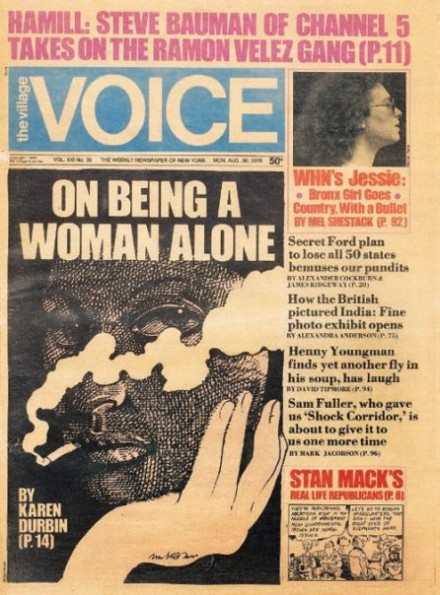
One of the Voice covers in the Bob Newman gallery of alternative press: some real goodies here.
Bob Newman invites us to take a look at these classic old-school Voice covers, from the 70s and 80s, art directed by Milton Glaser, Michael Grossman, and George Delmerico. These were collected from the Voice’s 50th anniversary issue collection. The Robert Newman Design page has collected four galleries of old Voice covers, including entertaining batches from former art directors Robert Newman and Ted Keller, and current AD IvyLise Simones. There’s lots of great progressive visual journalism here.
Bob says he would like to present some collections from other publications. If you have some covers that you’d like to share, please let Bob know and he’ll post them up (the only restriction, says Bob: they must be cool!)
Those interested, follow this link:
http://www.facebook.com/n/?inbox/readmessage.php&t=1041101325249&mid=1206754G1f07b0ecG2c80789G0
David Carr chimes in:
Going Deep in the Visual Archives of the Village Voice
http://mediadecoder.blogs.nytimes.com/2009/09/21/going-deep-in-the-visual-archives-of-the-village-voice/?scp=1&sq=Village%20Voice%20covers&st=cse
New look for Metro in Mexico City
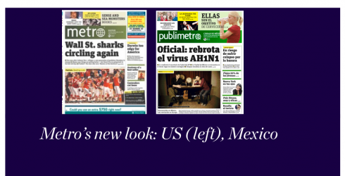
The design and page architecture is almost identical for both, recently redesign US Metro and Publimetro of Mexico
We discussed the new look for Metro in three US cities last week. Now, both Metro International (Publimetro) editions in Mexico City and Monterey, have introduced the new design last Friday. It looks to me as if the same design applies to all, complete with identical typography and page architecture.
Presently, two Metro editions appear in Mexico. Metro Mexico in May 2006, while the Monterey edition first appeared in November 2008. Circulation is approximately 200000.
More about free newspapers in TheMarioBlog:
https://www.garciamedia.com/blog/articles/the_free_newspaper_of_the_future_here_are_some_ideas

From the WAN/IFRA Executive News Service’
Monday 21 September 2009
– USA: Newspapers Have Not Hit Bottom, Analysts Say
http://www.nytimes.com/2009/09/21/business/media/21papers.html?src=linkedin
– USA: Ad Slumps Slows at Community Newspapers
http://www.mediapost.com/publications/?fa=Articles.showArticle&art_aid=113860
– USA: A Blogger Makes a Pitch for Supporting Print
http://www.nytimes.com/2009/09/21/business/media/21atlantic.html?ref=media
– UK: Only 5% of web users would pay for online news, reports survey
http://www.guardian.co.uk/media/pda/2009/sep/21/paid-content-newspapers-online-news
– UK: How social networking is changing journalism
http://www.guardian.co.uk/media/pda/2009/sep/18/oxford-social-media-convention-2009-journalism-blogs
– Australia: Admen’s advice: shrink The Age to tabloid
http://www.theaustralian.news.com.au/story/0,25197,26100294-7582,00.html
– China: GAPP plans overhaul of newspaper industry
http://www.chinadaily.com.cn/china/2009-09/21/content_8716304.htm
– Thomson Reuters Closer To Buying Breakingviews?
http://paidcontent.org/article/419-thomson-reuters-closer-to-buying-breakingviews/
– Can Bloomberg Save the Newspaper Industry?
http://seekingalpha.com/article/162428-can-bloomberg-save-the-newspaper-industry
– Let’s Talk: Journalism and Social Media
http://www.nieman.harvard.edu/reports.aspx?id=100058
And now the Obama design book
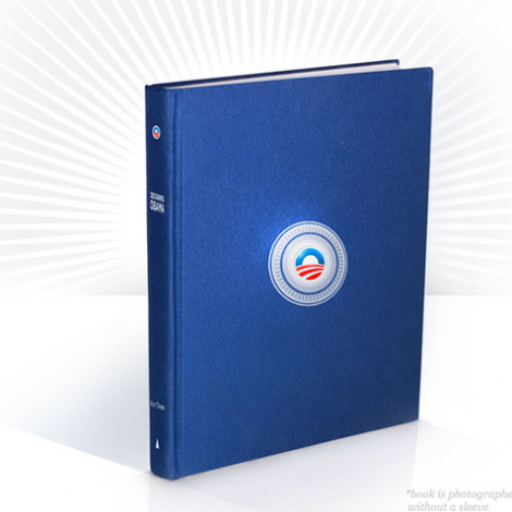
If you liked what you saw in the way of look and feel during the Barack Obama campaign, then you may wish to take a look at a book put together by Scott Thomas, the design director of the Obama campaign,who has collaborated with artists and designers to create Designing Obama, a chronicle of the art from the historic campaign. “Get the inside story on how design was used by the campaign, and scope out the pieces, created unofficially, by grassroots supporters,” reads the book’s initial publicity.
The 360-page book is full-color and hardbound, highly crafted with an embossed sleeve. Forewords written by Steven Heller and Michael Bierut.
Those interested in ordering: orders@designing-obama.com.
Ricardo Ferro’s newsroom photo flow site now in English
Those interested in reading more about Ricardo Ferro’s ideas for better photo assignment flow, planning and organization, can check his program NewsCONTROL written in File Maker Pro 10- for MAC or PC, English version, here:
https://www.garciamedia.com/blog/articles/newsroom_work_flow_redefining_roles_lead_to_right_models/
TheMarioBlog posting #373