TAKEAWAY: ‘As romantic comedies go, Friends with Benefits, deviates from the cliché. It is fast giddy fun with great acting. Typography, art direction and the iPad make cameo appearances, so does the ever impatient finger on the screen.
This art director had plenty of benefits
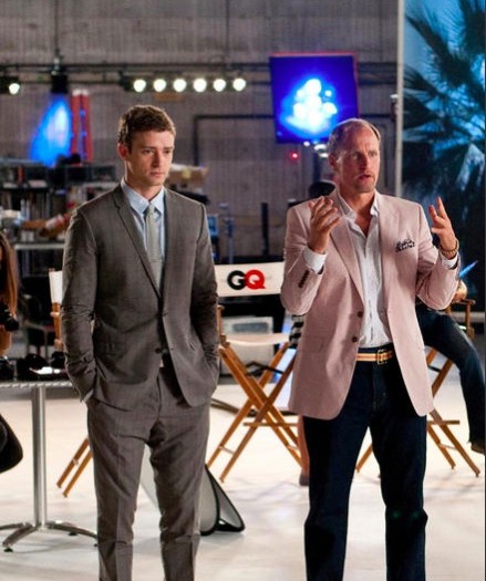
Justin Timberlake as a GQ Magazine art director and Woody Harrelson, his editor boss in Friends with Benefits (photo from Yahoo!Movies Images)
Our blog correspondent, Frank Deville, made this short video showing how the credits roll at the end of Friends with Benefits
In the new romantic comedy, Friends with Benefits, Justin Timberlake and Mila Kunis play likeable, attractive New York City people, who decide that enough is enough about all the complications of having and sustaining relationships, so, having said to hell with relationships, they make a pact that theirs will be strictly all about sex. And, although this is a fun ride with great performances by the two young stars, what caught my eye about the movie is that art direction, typography and the finger as protagonist (the type that swipes happily on the screen) all played great supporting roles.
You see, Justin Timberlake’s character ( Dylan Harper) is an art director who has just landed a dream job at GQ Magazine , thanks to the efforts of the pretty headhunter Jamie (Kunis). It is here that we see Dylan in action, looking at his design work on a giant screen, substituting stories, or exchanging funny lines with his editor, a wonderfull Woody Harrelson, who, like many editors we know, has a keen interest in throwing around the names of typographic fonts.
On his first day on the job, Dylan is greeting his staff, promising an open door policy and creating an animated—-New York-inspired—-logo presentation for GQ. The boss, meanwhile, wants to know what typographic changes Dylan has in mind for the new GQ website: “Enough of that Helvetica, right?,” he asks Dylan.
In another scene, the boss, happy with what he sees on screen, asks Dylan: What is that new font you are using?
“Times Roman,” Dylan tells him.
“Oh, that Times Roman is really good,” the boss responds.
In addition to type, the iPad has its cameo appearance, this time as Jamie’s so called Bible. When the couple make their pact to be friends with sex benefits, and NOT take the relationship further, Jamie brings in her iPad and they both put their hands on it to make their vow of sex-only official.
At the end, when the credits roll, the finger is protagonist, and we see the finger moving letters and names around on the screen.
All in all, a fun movie with great acting and some Hollywood fantasies: Dylan is one of the few art directors I have seen who always wears a suit and tie in the office, not to mention that GQ must have hired him at unheard of salaries (for art directors) allowing him to afford his ample, glass enclosed penthouse of a pad. In another scne, Dylan wonders out loud what would constitute a more appealing piece at the top of the screen, a serious story about global warning or one providing tips on How to Wear White Pants at a Cookout. You guessed it right: the white pants story won!
It is Hollywood, after all, complete with the expected—-and, in this case, well choreographed—ending.
Read the New York Times review:
http://movies.nytimes.com/2011/07/22/movies/justin-timberlake-in-friends-with-benefits-review.html
Reporting this week from Kuala Lumpur, Malaysia
It is back east to Malaysia for me and our Garcia Media Europe art director, Constantine Eberle, as we prepare a final prototype of the New Straits Times, with a planned launch of a new look on 11-11-11.
This week we also begin our work with the New Straits Times’ sister newspaper, Berita Harian, published in the Malay language; in addition, we oversee refinements to the online and tablet editions of the NST.
Of special interest
Archival photos of the Globe’s strangely webpage-like Newspaper Row storefront, 1912-1963
http://beta.boston.com/post/10139526149/archival-photos-of-the-globes-strangely
First paragraph: Long before the Web, The Boston Globe had a “homepage” of sorts – its old storefront downtown. Taking aadvantage of its location in a heavily trafficked block of Newspaper Row, the young daily brought the news to Bostonians in a whole new way: handwritten signs.