TAKEAWAY:This is part 8 of my occasional series 40 Years/40 Lessons, which I call a “sort of career memoir” capturing highlights and reminiscing about what has been a spectacular journey for me, doing what I love most. Today’s segment: all about the books I have written and how a desire to share ideas fueled each of the titles.
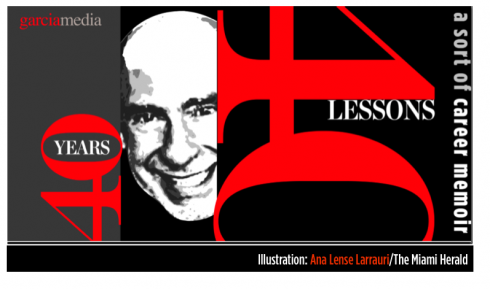
Illustration by Ana Lense Larrauri/The Miami Herald

The great American poet and novelist Sylvia Plath once said that “everything in life is writable about if you have the outgoing guts to do it, and the imagination to improvise.” Plath added that the worst enemy to creativity is self-doubt.
As I reminisce about writing the first page of what became my first book, The New Adviser: Learning the Craft (Columbia Scholastic Press, 1974), I realize just how right Plath was. I had no self-doubt, and, definitely tons of outgoing guts. I was also 27 years old and my third child and first daughter, Ana, had just been born.
I don’t think one is ever truly ready to write a book.
However, those who wait till they are, probably reach their end without ever writing it. Perhaps I should have waited a little longer to write each of my books. If so, some of the spontaneity that I now see in those texts would not be there. Perhaps we become more guarded with age.
The basis of book writing probably consists of a simple formula: one has a desire to share something (or, in the case of fiction writers, to tell a story) that one is passionate about , and, although there are always others who may know much more about it than you, they may not necessarily be interested in writing the definitive book on the subject, so you focus on getting your own views out there, writing as fast as you can and letting your writing start the dialog—-which usually happens quickly after the book is published.
About that first book
My intention was not to write a book. As the faculty adviser to the student newspaper at Miami-Dade College I was only four years older than my own students in the staff. I had replaced the legendary Barbara Garfunkel, who had been my own teacher and mentor. She left big shoes for me to fill, and nothing prepares you for the job of dealing with the day to day managing of how a student newspaper functions. The students attend classes and only work on the newspaper on a part time basis, between classes or after class. As the adviser, you are the full time person, the pole holding the flag, plus their teacher, managing editor, publisher, mentor, and, indeed, father confessor sometimes.
As I attended professional conferences with other college faculty advisers, it became obvious that we all shared similar problems and challenges. A day after returning home from one such conference, at the University of Minnesota, I sat at my Smith Corona typewriter, inserted a blank page, set the margins to 20 and 80 and started typing ideas on the page.
I remember the first line: So you are an adviser……
Those five words started my own chat with thousands of advisers who were not in the room with me. That was the spirit of the book, a chatty, informal, easy to read guide for the person suddenly pushed into the position of faculty adviser to a student newspaper. By the time I had two chapters completed, I drove across town to see Miss Garfunkel, my hands shaking a little as I put the pages on the table of her desk and told her what I was up to.
“I need an editor, Miss G,” I told her. She was looking down at the pages, her reading glasses perched perilously close to the edge of her nose, but with that chain that held them close to her chest in case they did fall. ” I have been writing for a few weeks and I think it is time you take a look, correct my English and give me some tips.”
The jovial and friendly Miss G signed up as my editor, a job she would hold for at least three more books. A few days later she returned the edited manuscript. Her neat handwriting appeared on the edges, between words, under paragraphs, and, in some cases, this meticulous woman had inserted full sentences that she had typed and glued to my manuscript.
I would learn much from Miss G for years to come, the ultimate mentor and friend. One of the lessons learned: everyone needs an editor, that extra set of eyes on the text. God knows I could use Miss G daily as I write this blog. Ironically, sometimes I feel as if she is right behind me, asking me to rearrange a sentence, or to choose a different word. She is missed.
Have manuscript, will travel
When the manuscript was finished, I remember tucking it into my briefcase without a clear idea of which publisher to refer it to. As it happened, I was attending a Columbia Scholastic Press Association gathering at Columbia University in New York City and did a presentation for journalism teachers. At the end, a gentleman named Benjamin Allnutt—-a member of the CSPA board at the time—-approached me and said:
“I liked your presentation a lot, and I think some of these ideas should be put together in a book for journalism teachers.”
“Thank you, sir,” I answered. “Matter of fact, I am already writing such a book and I can show you some pages if you wish.”
I will always remember that encounter as one of those lucky Mario moments, when you happen to be in the right place at the right time——with the right goods in your briefcase.
There will be many more moments such as that in my career. Each time, I felt luck was a constant companion, although hard work and perseverance probably had something to do with it as well.
The New Adviser went on to have two editions and it became a companion guide to faculty advisers to student publications across the United States.
The first big book
The incredibly long, frigid and white winters of Syracuse were conducive to taking the stairs of our two story home on Sheatree Lane and typing away in the spare guest room that served as my home office. I would type two or three pages, then pause to look outside the window, the white stuff descending from the sky in slow motion, the way I move at airports when I get there with plenty of time to kill, knowing you will eventually land, but not in a hurry to do so.
The book would become Contemporary Newspaper Design, first published in 1978, the last in 1993. I was that young professor of graphic arts at Syracuse University’s S.I. Newhouse School of Public Communications and I truly could not find a good book to use in my Newspaper Design class. What began as a series of lectures during my first year teaching the course, eventually developed into more of a book. I was blessed with many friends in the industry who contributed material. Like me, they were young and pioneering in a subject now referred to as newspaper design, but which was treated more like “newspaper make up or layout” in all of the literature of the time.
Robert Lockwood, Ed Miller, Nanette Bisher, Michael Keagan, Nigel Holmes, Randy Stano, Roger Fidler, Frank Ariss, Richard Curtis, and many others, freely provided me with copies of their best pages, and offered narratives of their struggles to push things through in an era in which newspaper art directors simply did not exist (at least by that title), and many newspaper editors considered design a word you simply did not use inside a newsroom.
Eventually, it was Prentice Hall which published the book, not that it was easy to get them to publish it.
When I first sent out a prospectus about my “potential book”, along with a table of contents, the reply was swift and direct and I will always remember the impact it had on me:
Dear Sir, thanks for sending us your book proposal, but there are only three colleges and universities in the country that offer a course for which your book might be adopted.
No, I was not surprised about this detail. But, not one to give up easily, I engaged the help of publisher friends in the industry, many of whom told me that their newsroom would by two to four copies of that textbook. I informed Prentice-Hall about that, and a contract arrived at my SU office. I am sure the guys at Prentice-Hall did not regret their decision, as the book went on to three different editions, including a Spanish one, published through the University of Navarra, in Pamplona, Spain, under the title, Diseño y Remodelacion de Diarios (1983).
These were not merely updates for each edition. In fact, I would almost rewrite the entire book, since things were happening quickly and the world of newspaper design probably had its fastest development and most far reaching impact during the 1980s and early 1990s. Design went from a whim that a rare publisher or editor pursued, to a necessary part of the storytelling process.
The busy 90s
The decade of the 90s was perhaps my busiest as an author, and I found myself writing almost every day, jotting down thoughts at the end of a meeting with editors and designers, or at the conclusion of a Poynter or American Press Institute seminar. Usually, critiques led to a list of topics that needed to be discussed further and I concentrated my efforts on those that I thought were important to a large segment of the people in our industry.
I never wanted to write books for designers, perhaps because I have no formal training as a designer, but also because I know that as a visual journalist, what we practice is not so much design per se, but design with a specific purpose: to communicate ideas quickly, and to translate the essence of the story before a reader reads that first word. With Contemporary Newspaper Design, my greatest satisfaction was to see the book adopted in editing classes at colleges and universities worldwide. I wanted editors and journalists to be exposed.
Not a week goes by that I don’t run into someone at a conference or a newsroom who will tell me that he/she read Contemporary Newspaper Design as a sophomore in college, and, some even in high school journalism classes.
It was in 1991 that I co-authored Eyes on the News with my colleague and friend, Dr. Pegie Stark Adam, as we both presented the results of the Poynter Institute’s Eye Track Research, followed by Newspaper Evolutions (1996) a case study book—-beautifully designed by Pegie Stark—- with highlights of some of my most interesting work of that period, the golden age of newspaper design. Newsrooms had acquired the maturity to accept design as an integral part of the storytelling process; art directors sat side by side with managing editors to make decisions, starting on Page One; infographics and illustrations soared and the beauty of typography was no longer the exclusive domain of glossy magazines.
If you wish to sample the golden age of newspaper design, just simply refer to any SND books with display images from the winners of its annual contest. I know I do from time to time and always emerge proud of the talent and genius of our designers.
Then came 9/11
I cannot separate the horrific events of September 11, 2001 from the writing of Pure Design. The two are linked in my mind because there would probably be no Pure Design if I had not stayed put in Santiago de Chile at the home of El Mercurio’s publisher, Agustin Edwards, when all flights were cancelled for a few days and nobody could go anywhere.
I tried to make the best of the situation, and my host was magnificent in the hospitality he presented me with, including daily trips to his personal library, complete with a collection of rare books among the finest in the world. It was there that I saw an edition of Aesop’s Fables, the little book that Mr. Edwards held in his hands with much care. When he started flipping through its pages, I was mesmerized by the illustrations, the handwritten letters, but, also, by how the master of the fables could tell a complete story in a mere few lines, sometimes 11, never more than 21.
The more I saw that book (which I revisited everyday), the more I came to the conclusion that I wanted to write a book with the briefness of the fables, and the visual simplicity that accompanied each of them.
I would not write chapters.
I would not have more than one illustration per topic.
I would try for a minimalist approach to both the writing and the visuals.
Pure Design appeared in 2002. Ironically, many college professors who liked the content would always ask me why I did not write longer chapters. My polite answer was consistent: It was not my intention to write a college textbook in the traditional sense.
I am currently in the early stages of talks to do Pure Design 2-—-which I would, again, do in a simple style, following the format of Pure Design , but moving more comprehensively through all the platforms. Who knows? In the era of Twitter-—with messages shorter than many of Aesop’s fables—-one could possible conceive a Pure Design version full of smart Tweets about our craft.
But I also toy with the idea of writing about storytelling in the era of the iPad and beyond.
One theme of all these books resonates with me today as it did when I wrote them: it is all about the story and how we, as designers, create a visual environment in which its contents are presented more clearly, with greater immediacy and, of course, attractively.
If you wish to download Pure Design, go here:
http://issuu.com/mariogarcia/docs/mario_garcia_pure_design.
Lesson:
Write that book you have inside of you now; don’t wait to have all the answers or to become “the expert”. Many of the experts I know started by sharing their experiences, which, in turn, helped them develop their expertise.
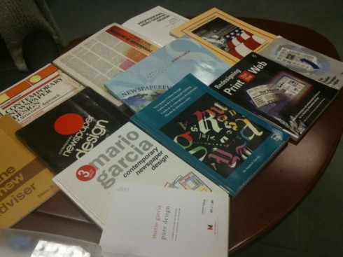
A special thanks to David Shedden, director of the Eugene Patterson Library at The Poynter Institute for Media Studies, for assisting me to gather the materials for this segment.
The New Adviser:Learning Craft. New York: Columbia Scholastic Press Advisers Association, 1978.
The New Adviser: Learning Craft. New York: Columbia Scholastic Press Advisers Association, 1981.
Contemporary Newspaper Design. ?Englewood Cliffs, NJ: Prentice-Hall, 1978, 1987, 1993.
Student Newspaper Designer. Norman, OK: Office of Scholastic Journalism Programs, University of Oklahoma, 1983.
Color in American Newspapers. St. Petersburg, FL: Poynter Institute, 1986.
Diseño y remodelación de periódicos. Pamplona: Universidad de Navarra.
Professional Video Graphic Design. (with Ben Blank). New York: Prentice Hall, 1986.
Newspaper Colour Design. Darmstadt, West Germany: The International Association for Newspaper and Media Technology, 1989. (published simultaneously in English, German, French and Spanish)
Eyes on the News. (with Dr. Pegie Stark). ?St. Petersburg, FL: Poynter Institute, 1991.
Newspaper Evolutions. ?St. Petersburg, FL: Poynter Institute, 1996.
Redesigning Print for the Web. ?Indianapolis, IN: Hayden Books, 1997.
Pure Design. ?St. Petersburg, FL: Miller Media, 2002. ?
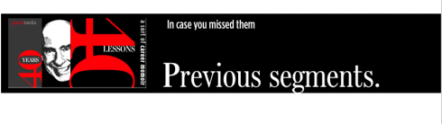
1.Mirrors.
https://www.garciamedia.com/blog/articles/40_years_40_lessons_1—a_look_in_the_mirror
2.Refugee.
https://www.garciamedia.com/blog/articles/40_years_40_lessons_2—refugee
3.Teacher.
https://www.garciamedia.com/blog/articles/40_years_40_lessons_3—teacher/
4.Mentors.
https://www.garciamedia.com/blog/articles/40_years_40_lessons_4—mentors/
5.Consultant.
https://garciamedia.com/blog/articles/40_years_40_lessons_5—consultant/
6.Eagle.
https://garciamedia.com/blog/articles/40_years_40_lessons_6eagke
7.Abroad.
https://garciamedia.com/blog/articles/40_years_40_lessons_7._abroad
Monocle’s summer newspaper out this week, plus the Metropoli magazine exhibition in Madrid
What a week ahead: the much awaited for Monocle Mediterraneo comes out July 29, and the Metropoli magazine exhibit is July 28. Be on the lookout for these events, which we will revisit.
Sun screen, sunglasses and…ink on paper
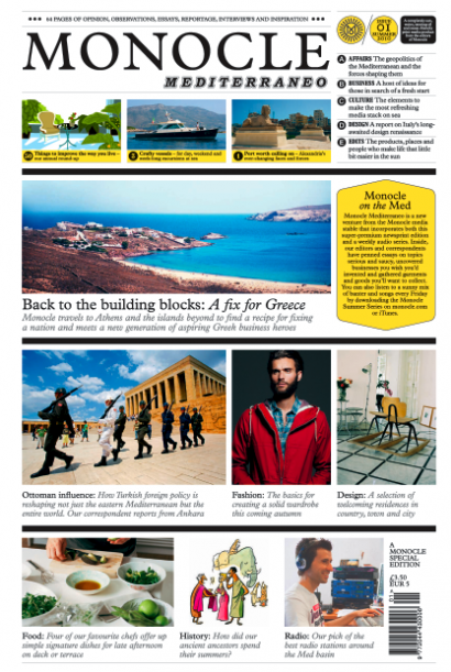
Here is the front page of the summer newspaper Monocle Mediterraneo, which appears July 29.
It is almost here, and, at least the front page is available for all to see, a pictorial invitation to sample the inside contents of the summer’s most awaited happening in newspaper land.
Tyler Brule’s Monocle Mediterraneo is colorful, and uses the front page to map out this journey under the sun for beachgoers in the Mediterranean beaches, but also at airports. It will also sit alongside the world’s major dailies in Italy, Spain, France, Greece, Turkey, Portugal and Lebanon .
The format is tabloid, 64 pages, and, of course, there are digital components for those with their IPads handy—-although Tyler himself suggests not taking Apple’s gadget by the pool, where it could be splashed, or the suntan lotion may come in contact with the precious screen. “Sunscreen, yes; iPad screen, no” read the headline of one of his recent columns for the Financial Times. He would prefer that you place your mojito by your side, get comfortable and go leisurely page by page , dreaming of that other beach where you are not this summer, or getting tips on how to get your autumn wardrobe ready, or letting four chefs give you ideas for that perfect dish on deck this afternoon. And because Tyler’s newspaper encourages everything that has to do with ink on paper, you may also read about the romance of postcards, with a piece by our friend and favorite author,
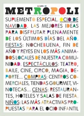
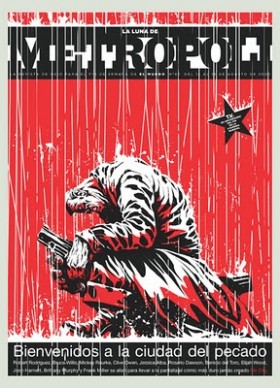
The covers of Metropoli magazine are the stuff of posters.
And we see those posters, which appeared in the Spanish newspaper El Mundo, in the offices of art directors worldwide. They are the covers that we all wished we had created, the ones we turn to for inspiration when the muse is taking a coffee break somewhere. Some of them take type to the next level——think a place with a big screen above the moon; others will turn the cover of the magazine into a cigarette box—-think Marlboro and a story about the dangers of you know what; then there is the one where the logo transforms itself into wrinkled and disheveled letters as in a poster outside a bullfight arena where it has rained for days; oh, and let’s not forget the one after 9/11, which is used on the exhibition poster, by the way.
The man behind so many of these magnificently conceptualized covers is the talented Rodrigo Sanchez, who for years has been art director of the supplements at El Mundo in Spain. These days he is Art Director for all magazines of the Unidad Editorial Group.
An exhibit of the best of Metropoli opens July 28 and runs through September 11 in Madrid at Instituto Europeo di Design, at Fundacion Diario Madrid,
C/Larra 14.
TheMarioBlog post #602