It is 11 pm in Paris, and CNN has just broken the news: In New York, the Dow Jones plunges below 9000, its lowest level in five years. Here is how The New York Times website updated the story, just before I go to bed here:
The Dow Jones industrial average lost 678.91 points, or 7.3 percent, on the day, while the broader Standard & Poor’s 500-stock index ended down 7.6 percent. The technology-heavy Nasdaq was down 5.47 percent. And the reasons, by now, are a familiar litany — concerns about the credit markets, a slowdown in consumer spending, worries about the economy as a whole and the financial sector in particular.
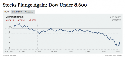
Not only are the reasons for the plunge a “familiar litany,” as The Times describes it. The presentation of such news becomes a sort of visual litany as well. For days now we have seen front page after front page of dailies worldwide with an arrow that starts on column one, then drops dead on its head on column six. Not to mention the collage of photos of traders in places as distant as Sao Paulo and Sydney or Frankfurt and Buenos Aires.
When does a powerful image become a visual cliche? True, this is a story of major proportions: a tsunami, an earthquake and a hurricane, all wrapped into one. For the editor and designer planning page one for tomorrow’s newspaper, the options are as few as for those rescuing the banks worldwide.
I spent the day at a financial daily, La Tribune, of France. The art director, Eric Beziat, was proud of his front page yesterday, a combination photo and infographics, all arrows pointing down, of course. Little did we know, after lunch Paris time, that he would be faced with an identical story for tomorrow morning’s front page.
We had even discussed the topic: how many times can we use the fever chart with the arrows pointing down on Page One?
Not that I have the answer, mind you. However, I am already looking at those fever charts popping up in front of me as I peruse various news websites to get more information on this depressing financial story. It is one chart after the other. Yes, I know the Dow plunged below 9000. All of these websites have made their point. Tomorrow’s newspaper will even be LATER coming in with the news.
So what to do about a front page graphic? If we have exhausted the “visual litany” of an arrow facing down, or the sad faces of traders looking up at a screen, then what could be some good solutions?
Ideas that come to mind:
The type attack: Play with a type attack, a short narrative in large type that gives a synopsis of what this later bit of bad news means to the average citizen seeking a loan for a car, home or to go to college.
The local photos: If there is a story about how ordinary people are taking the news in Main Street, then a photo of local people may be more meaningful that traders in far away cities. Play up the quotes.
The illustration: This is one time when an illustration on Page One may save the day. If you have a great illustrator on board, ask him/her to capture the spirit of the story.
The editorial cartoon: Indeed, nothing new about a cartoon on Page One: it was done routinely in U.S. newspapers of the 1950s. Well, if you find an editorial cartoon that captures what this financial turmoil is all about, then, put it on Page One to go with the rest of the news package. Surprise the reader. Better to see a cartoon there than another graphic with an arrow pointing below 9000. Save the graphic for an inside page.
It is not easy to avoid visual cliches, especially for a story that is evolving during deadline. But we can try, and, with a little effort, it can be done.
And, yes, I was ready to draw an arrow to illustrate this blog entry, but pulled it out in the last minute. I was ready to commit the same sin I was preaching against, which goes to show that we are all going to be tempted by the obvious.
Visual litany does not have to be, especially when the arrows are not likely to point north anytime soon.
HOW ABOUT YOU? I would love to see what you do on your front pages of Friday, Oct. 10, as you cover this latest plunge of the Dow. Send me those pdfs to post them here, or links where they can be seen. I am sure many of you will come up with incredibly creative solutions. Share them with the rest of us!
Making music on Page One
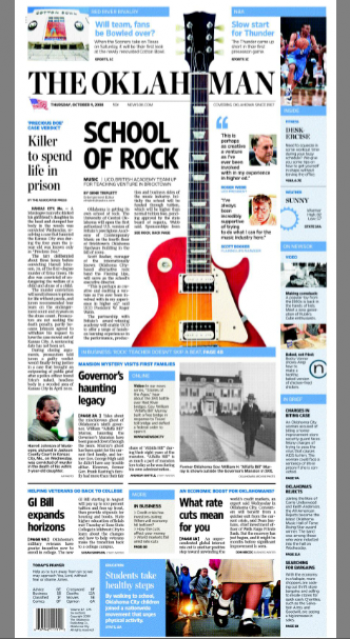
Speaking of visual surprises on Page One: The Oklahoman’s team has just sent me this front page of today with a lead story about the announcement of the first authorized U.S. version of Britain’s prestigious Academy of Contemporary Music, which will open in Oklahoma City’s Bricktown district in 2009. Very local. Good news in the midst of a bad-news cycle. Visually, the editors and designers were not afraid to experiment here.
TheMarioBlog posting # 115