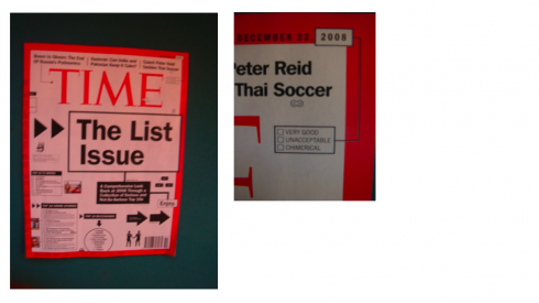
At first I thought it was a wrap around ad on the cover of TIME, the big poorly spaced headline, then assorted miniature boxes with type too difficult to read, sprinkled like candy grains on a cupcake. Then I took a second look. No, this was no advertisement. It was the cover story, with the title The List Issue: a comprehensive look back at 2008 through a collection of serious and not so-serious top 10s.
Of course, any lists of top 10s of anything immediately capture our attention, and this is no exception. However, when you try to read the text on some of those lists, well, at least the over-60 set of readers——myself included——gave it up.
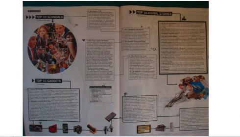
The inside pages are a bit better, but the type for the boxes of lists does not increase in size, making it very difficult to get through what was, content wise, a very good idea, and an entertaining feature.
To me, the entire package, from the magazine’s cover to the 11 pages devoted to the story, was perhaps an attempt at ridiculing lists of all kinds—-which the popular press seems to have a preference for. In this TIME collection of the top 10 of everything one could find anything from the top 10 discoveries (Snow on Mars was #1), to the Top 10 Break Ups (yes, you guessed right, Madonna and Guy Ritchie stole the #1 spot), to the Top 10 songs (give #1 to Kanye West’s “Love Lockdown”).
While the content was entertaining, the design bordered on being a poor imitation of a Monopoly game board, a sort of parody of design. While we applaud the editors’ decision to tell this story in a non-narrative form, it is the design that probably kept many potential readers away. Shame.
Oh, yes, the one good thing was a corner of the TIME cover, next to the date, where 2008 is highlighted and the reader can check one of three boxes to describe 2008: very good, unacceptable, chimerical.
If TIME editors had done the same for their cover, I would have placed my check mark next to UNACCEPTABLE.

To read TheRodrigoFino blog, in Spanish, go:
https://garciamedia.com/latinamerica/blog/

Today Rodrigo Fino writes about the fact that NOBODY is invisible in the Internet
![]()
In Dubai with the Gulf News the rest of the week.
TheMarioBlog posting #154
Update, Sunday, Dec. 14, 2008, 10:45 am, Frankfurt, Germany
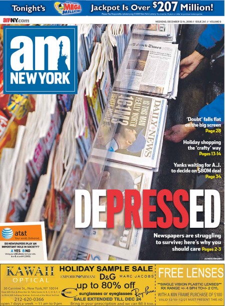
NY free newspaper on why the press is important
One of New York’s free newspapers, am New York, devotes its cover story to the dismal state of newspapers everywhere, and reminds its readers about the importance of the press.
Here is a portion of the story, which you may read in its entirety here:
http://weblogs.amny.com/entertainment/urbanite/blog/
In the last week, the Tribune Company announced it will file for bankruptcy, the Rocky Mountain News in Denver is likely to close and the Miami Herald may be up for sale. This comes after years of shrinking newsrooms from the smallest weeklies to behemoths like The Los Angeles Times.“What this means is fewer voices, fewer opinions presented in fewer ways, all of which has a tremendous impact on the public discourse in a very dangerous way,” said Mary Boyle, a spokeswoman for Common Cause.
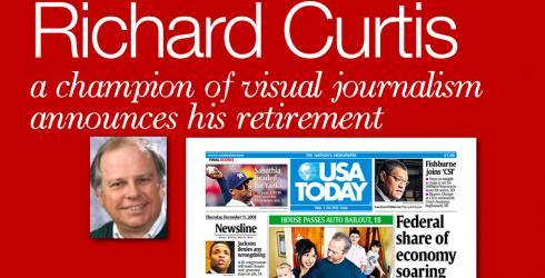
TAKEAWAY: We wish Richard Curtis well as he leaves USA Today; also today, our Weekend Sequels: how The Miami Herald looked as a tab (sketches only), one week of new front pages for Wirtschaft Blatt, and the Chicago papers cover a governor’s scandal.
Enjoy your retirement years, Richard
He was there for the birth of USA Today in 1982, and he is still there today, nurturing the baby he helped bring into life and where he has mentored a generation of designers and infographic artists. In a sense, Richard Curtis was there at the creation, and now he is ready to say goodbye to USA Today and to the industry, and go for a well deserved retirement.
We will miss you, Richard, as you have been an inspiration to all of us in the profession. You have left your mark. USA Today continues to be one of the most imitated newspapers worldwide. It is, in many ways, a point of reference. Tell me about it: you could be doing a focus group in a remote corner of Australia, but if the prototype has a variety of colors, someone will immediately say: “That’s like USA Today. ”
Not to mention weather maps. The moment that USA Todayintroduced its giant weather map, with color coding for various temperatures, there was no return to the simple quarter page weather story. Small countries like Austria wanted to have a USA Today-style weather page, even if the page would be larger than the map of the country. It did not matter, there was that weather page from USA Today hanging from the editor’s hand as the model.
But it was in the area of infographics where USA Today helped write the book through daily examples. It pioneered in the concept of telling stories without words. Secondary readings, too, were a part of what distinguished USA Today from so many other newspapers in the 80s and 90s. Today, all of these elements are common place and we owe much of it to the legacy and examples of USA Today.
You were there to present them all to us, Richard, and to train a team that would implement these ideas daily. I imagine after 26 years of this, it is as good a time as any for you to get away from your Mac and pursue other interests.
As far as I am concerned, you are one of the champs of visual journalism. If we had Oscars and Pulitzer Prizes to give to those who have contributed the most to our craft (we should, but that is another story), then I would be sending you both prizes today. For sure, a bottle of Veuve Clicquot champagne to share when I see you next, and my very best personal wishes to you and your family.

The Miami Herald as a tabloid?
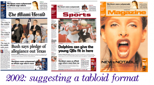
This week one of our blog postings lamented the possible sale of The Miami Herald, as I reminisced about the personal ties I feel for the newspaper in the city I consider home, where I arrived as a Cuban refugee in 1962.
Several of you wrote me very kind personal notes about that Herald blog entry, and two of you inquired as to how I imagined The Miami Herald in a tabloid format.
Not only did we imagine it, but, working with my Buenos Aires team, headed by Rodrigo Fino and Paula Ripoll, we also went as far as to do some mock up sketches of how The Miami Herald could transform itself into an elegant tabloid. The year was 2002, and the discussion did not go very far, as we embarked into a major redesign of the newspaper as a broadsheet.
Here is our handy work. Tell us what you think.
For the original Miami Herald blog entry:
https://www.garciamedia.com/blog/articles/If_i_could_purchase_the_miami_herald/
Wirtschafts Blatt: first week of new look
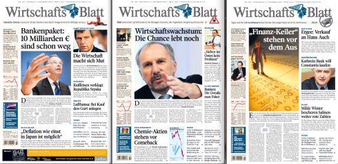
One week of the new look, what the managers of the WB call a “soft launch”, and the reaction is positive.
The front pages of Austria’s financial daily are basically a navigator to the top economic news of the day, with only ONE story that is read with full text on page one.
Notice the three levels of navigation:
1. The strip under the logo.
2. One story to read, usually the lead piece.
3. Secondary navigators with some lines of text.
4. The summary navigator, usually towards the bottom of the page.
The WB is also experimenting with different ad positioning, as shown on this page where a “belt ad” crosses the page, with editorial content above and below it, as in this inside page shown here.

For original blog entry about the WB, go here:
https://www.garciamedia.com/blog/articles/in_austria_wirtschafts_blatt_introduces_new_front_page/
Scandal on Page One
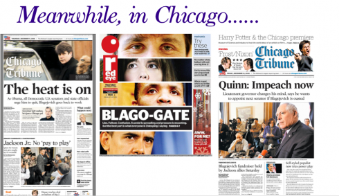
We show you here front pages from The Chicago Tribune and Red Eye which caught our attention this week as we followed the story of Illinois Gov. Rod Blagojevich, whom federal prosecutors charged with bribery for allegedly trying to sell to the highest bidder the Senate seat left vacant by President-elect Obama . The Red Eye does it best. Hard to resist picking up this front page to see what it is all about.
TheMarioBlog posting #153