

I admit I am a CNN addict. Especially when I travel outside the US, it is a good way to keep informed about events both at home and in the world. It is also true that I have become disappointed lately with the way the network tackles a subject and beats it to death—clubbing us over the head with it, too. When a major news event breaks, it seems that the rest of what happens stops to matter and CNN's coverage saturates it.
However, I often turn to cnn.com to catch up with stories I may have missed, and, primarily , to watch videos of breaking news events.
That is why I was so interested to see that its much talked about website redesign had been unveiled.
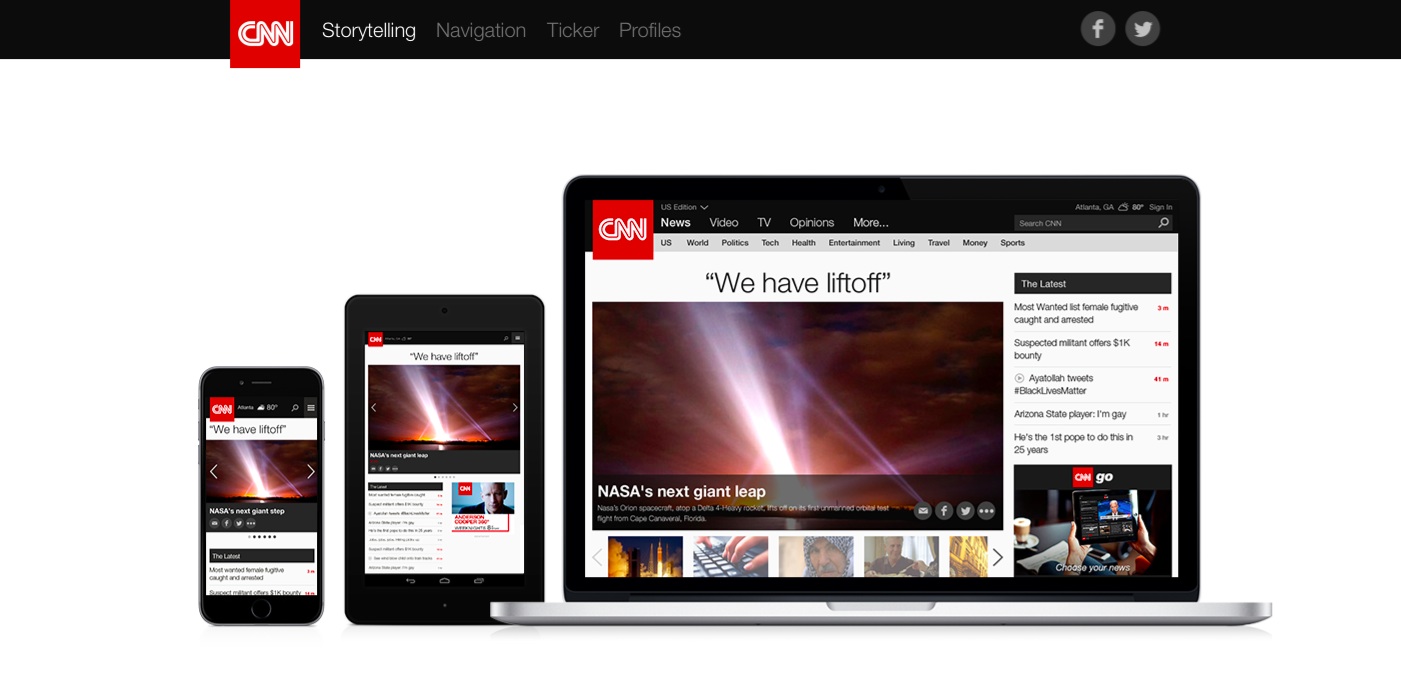
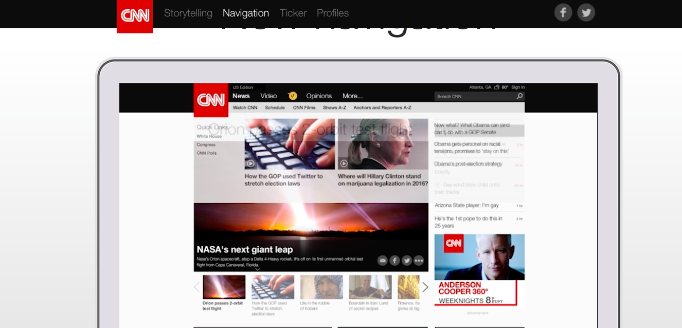
A highlight of the new redesign of CNN is definitely its navigation. It works at three levels as follows:
The Big Buckets—
News
Regions
Video
TV
Features
Opinions
More…
The Secondary Buckets—each of the items in the big bucket above will have several topics under it. For News, for example: World, Sports, Technology, etc.
Videos—one of the reasons I often turn to CNN.com—are now easier to locate and it seems there is also more of them included, a big plus for this news website.
Various categories, such as The Latest, News & Buzz, and The Editor’s Choice, facilitate accessing other headlines.
The new look is carried consistently across all platforms: mobile, tablet, desktop. And while the design of the new cnn.com is generally clean and easy to follow, I do question why the lead story headline is so big and set in what appears to be a clunky, poorly spaced sans serif font.
Other than that, it is heads up for this new cnn.com. Take a look at their own guide for the new product:
http://edition.cnn.com/interactive/2015/01/marketing/cnn-next/index.html
Of related interest
CNN Web Redesign Alternative
http://www.heavy-backpack.com/archives/articles/cnn-web-redesign-alternative
CNN's Redesign Will Color Code News, Like A “Mood Ring
http://www.fastcodesign.com/1673282/cnns-redesign-will-color-code-news-like-a-mood-ring
Boston 1795 time capsule included newspapers
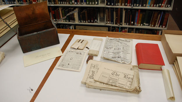
A 220-year-old time capsule containing coins, documents and newspapers left by Revolutionary War figures like Samuel Adams and Paul Revere was opened by Massachusetts officials on Tuesday.
The newspapers were folded in such a way that the names of the publications weren’t always visible, but one might have been a copy of the Boston Evening Traveller — a newspaper operation that was eventually absorbed into the current Boston Herald.
Curious note: A portion of one of the papers that was visible showed a listing of the arrivals of whalers from various ports to Boston. The unveiling of this time capsule reminds us about one more reason to keep those printed editions of newspapers around: they can be touched 220 years later!
For more:
http://www.nbcnews.com/news/us-news/massachusetts-officials-open-220-year-old-time-capsule-n280971